
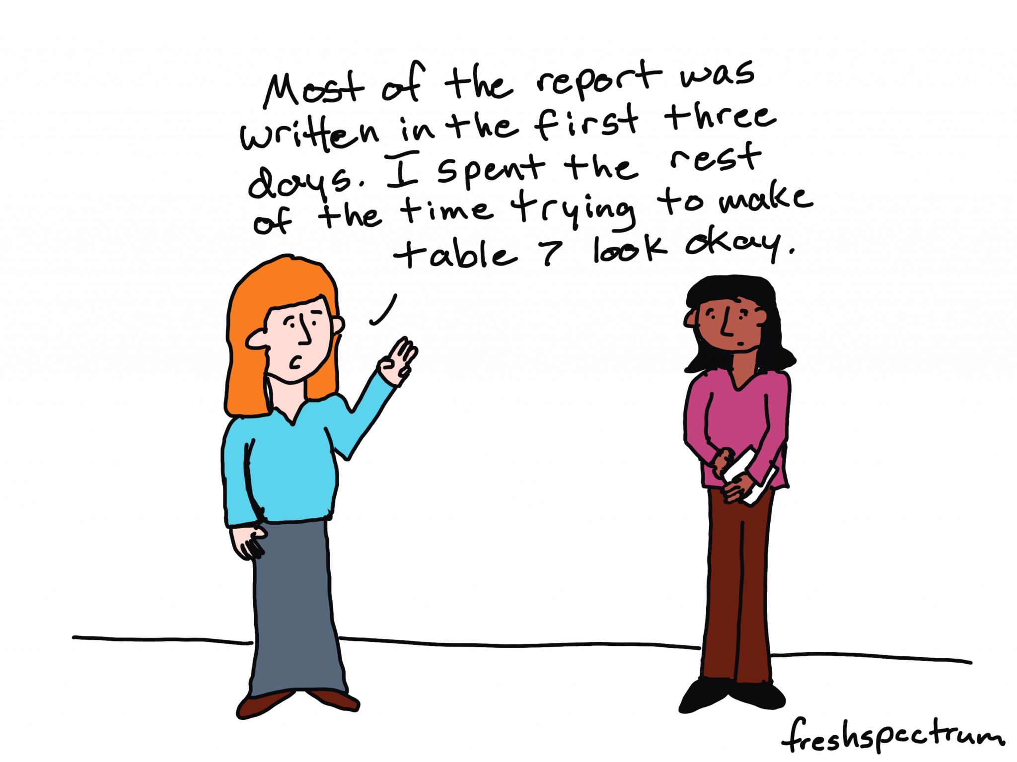
Most people design their everyday reports, briefs, and knowledge products the wrong way. Not because they’re bad at design. Because they’re trying to write and design at the same time.
It’s a multitasking problem.
Writing is hard. Design is hard. Doing both simultaneously — in the same document, on the same deadline — means you’re doing neither as well as you could. And it doesn’t matter how good you are. Even experienced designers produce worse work when they’re splitting their attention between content and layout.
The fix is simple: split the tasks.
Write in Word (or Google Docs). Design in PowerPoint (or Canva). When you’re writing a word processor offers better tools for editing, tracking changes, and collaborating on content. Design first tools, like PowerPoint and Canva, are far better for layout, visual hierarchy, and producing something that actually looks well designed.
Template Design First.
For most data folk, design is the thing that comes after your write. And that’s fine if you’re writing a long report you don’t really expect most people to read. As someone who writes and designs (and illustrates) I find it far more effective to start with the design using dummy text and sample images.
Quick note here: the way I approach templates with my clients has changed a bit since I originally created the templates I share below. Now-a-days I focus on limiting the number of textboxes/graphical elements, often by group things together. This makes accessibility and compliance work far simpler.
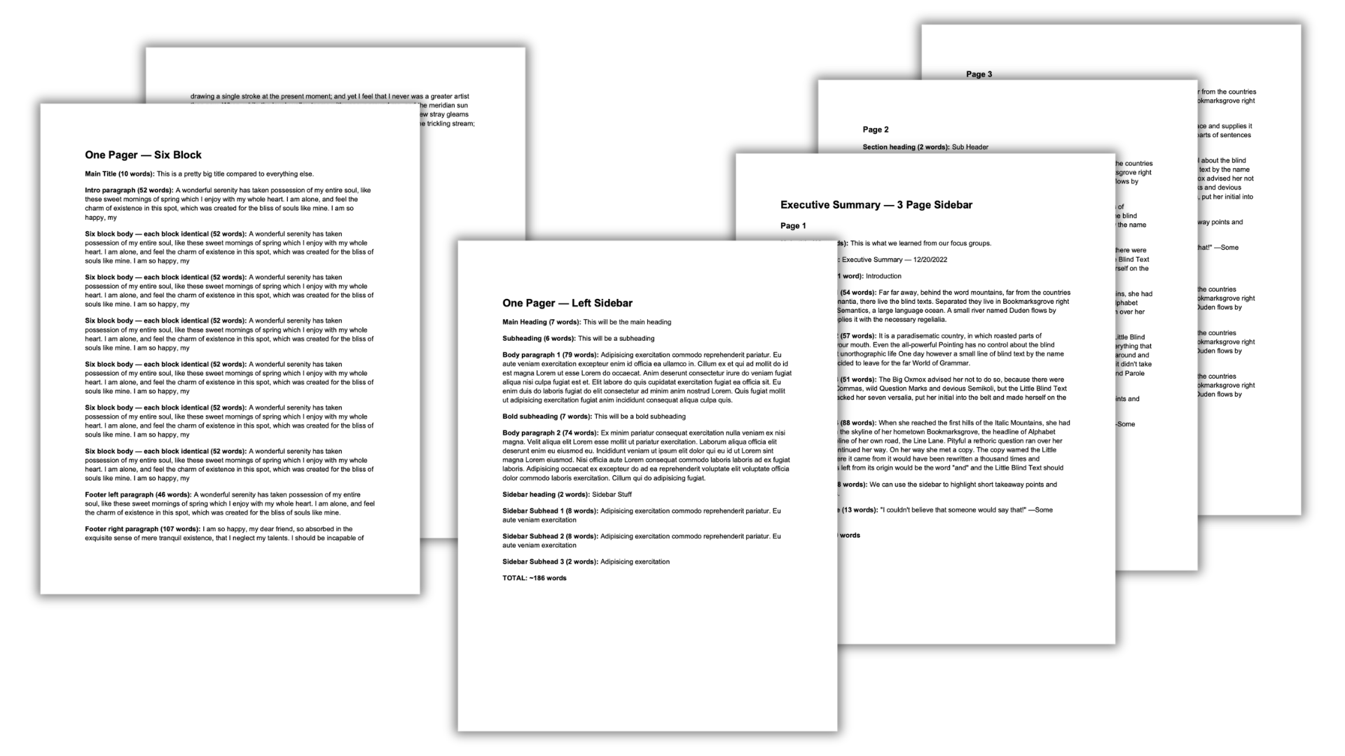
Writing Worksheet Second.
Once you have your designs, you can take the dummy text you used and put it into a Word document. This will then become writing worksheets you can pair with each design. Use these writing worksheets like you’re an old school newspaper editor. There is a certain character count for each block, the writers goal is to hit that (more or less).
Usage starts with writing.
With actual use, once a template is chosen, you can then go straight into the writing part. Just remember that writing too little, writing too much, taking out sections, or adding new sections in can quickly break your design.
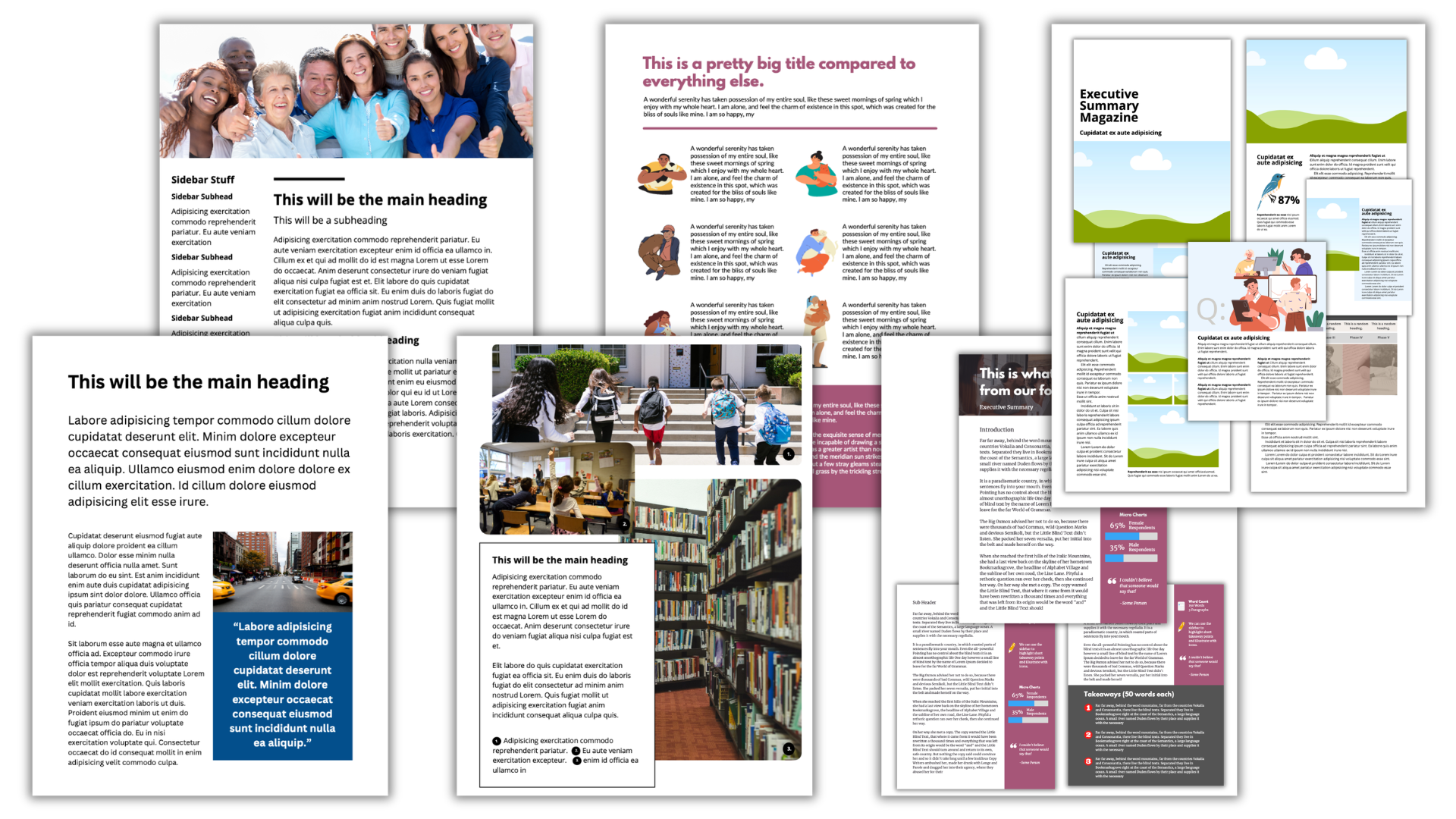
Sample Templates:
Here are 6 different templates so you can see how it works. The PowerPoint is the design, the Word Doc is the worksheet. Each one is downloadable.
One Pager – Fact Sheet
A simple fact sheet that layers information. The main points should be included in the first big paragraph while the quote and the photo should engage the reader.
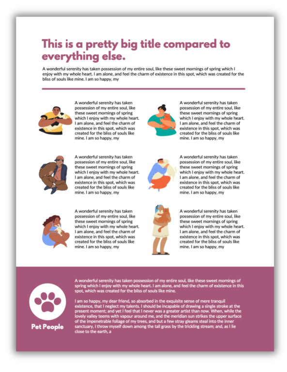
One Pager – Six Block
A lot of one-pagers feature what are essentially big bullet points. This one treats each point like its own separate thought with a specific illustration.
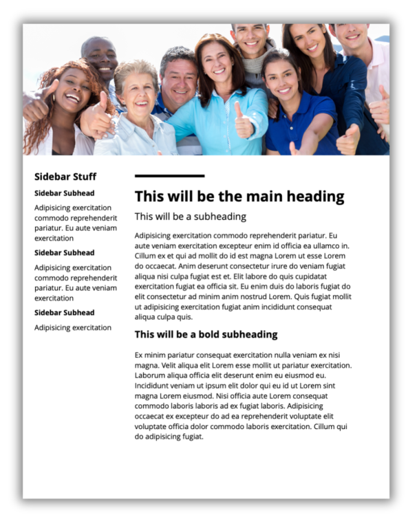
One Pager – Left Sidebar
This kind of one pager template is useful for case studies, tutorials, or interview highlights where the sidebar is used to provide tags, terms, categories, etc.
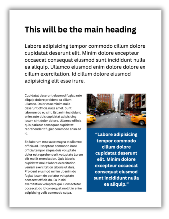
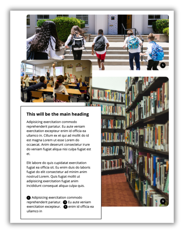
One Pager – Photo Illustrated
This one pager puts photographs front and center. The text block acts like a large caption.
Executive Summary – 3 Pager
This template is just a simple 3 page executive summary. It features a sidebar on each page and ends with a takeaway block.
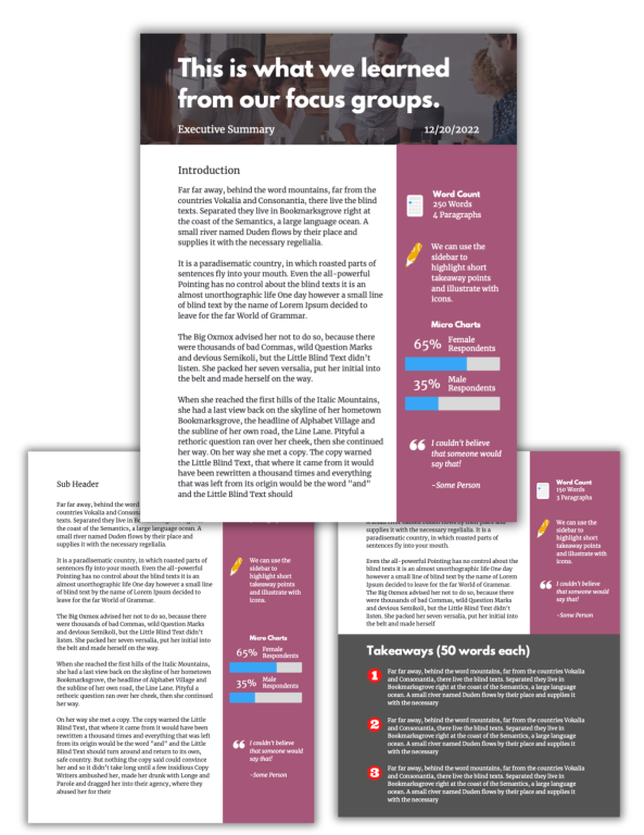
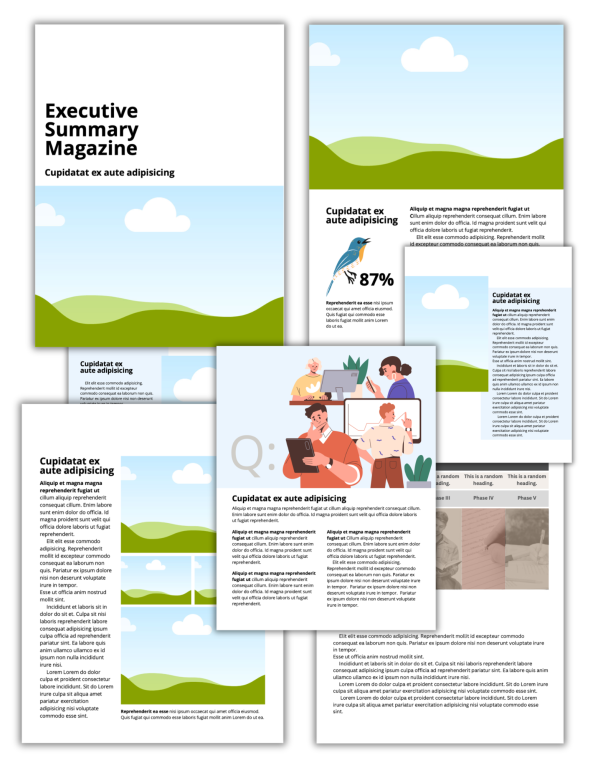
Executive Summary – Magazine
This template mirrors a contemporary magazine format. It is highly visual and very readable.
I find this approach really helpful, as you get enough structure to focus your thinking and avoid the random circular brain dump, without being a straight jacket.
An ex boss once commented on an A3 one-pager we’d been sent as “it looks like the Indonesian graph parrot has vomited on the page”. Harsh, I thought, but entirely fair.
That’s certainly an image Isabelle 🙂
I can’t say I’ve ever heard of an Indonesian graph parrot.
Thanks for sharing!
Thanks so much for these designs! I often find I can identify good and bad designs, but really struggle creating my own from nothing. These will give me a huge boost!
Thanks Ann!
Definitely reminds me of my favorite Ira Glass quote:
“Nobody tells this to people who are beginners, and I really wish somebody had told this to me. All of us who do creative work, we get into it because we have good taste. But there is this gap. For the first couple years you make stuff, it’s just not that good… Your taste is why your work disappoints you… The most important thing you can do is do a lot of work. It is only by going through a volume of work that you will close that gap, and your work will be as good as your ambitions.”
I’m sure you’re not alone in that feeling. The way evaluation goes, unless we consistently make time for it, we don’t have enough of a chance to do the volume of creative work it takes to close the gap.
Love this Chris!
Thank you!
Thank you Rita 🙂
Thank you so much for these Chris, this gives me such a good jumping off point, much appreciated!
Thank you Christine 🙂
Love the photo illustrated. I’m always trying to add the caption to each image. Now I will use this approach. A cleaner look.
That’s great Tonia, if you do use it will you share the example with me? I pulled inspiration for that particular one from a reference book but haven’t had the opportunity to actually use it!