Today’s report review took me a strange direction. What started as a simple report review ended up becoming a full working paper, but more on that shortly. This post is in two parts: In the US if a hospital wants to be tax exempt it has do a few things to meet IRS requirements. One […]
Articles
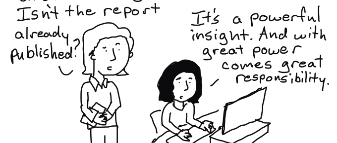
Reports are Comic Books, Insights are Spider-Man
Spider-Man started in a comic book. Nowadays you’ll find Spider-Man in big budget movies, stage shows, theme parks, children’s books, halloween costume contests, popular memes, backpack designs, and bedroom sheets. The character traveled over the years from a concept in Stan Lee’s mind to become a household name across the globe. All sorts of good […]
Theory of Use
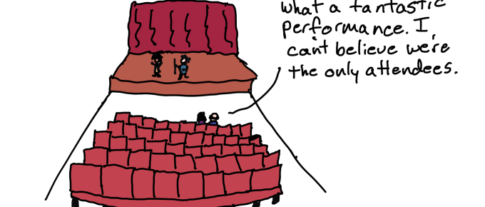
Never before in history have we had so many tools and channels we could use to deliver research and evaluation insights directly to people who could actually use them. And yet, most organizations still rely on outdated and ineffective dissemination strategies. Now it’s easy to bash the organizations, but the truth is that our research […]
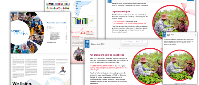
Report Review: UNDP Annual Report 2025
I’ve been working a lot on testing and improving my theory of use framework. Basically I take reports that should have pretty broad reach then run a kind of external dissemination audit. It’s not quite the same as the dissemination audits I give my clients because with those I have a lot more insider information. […]
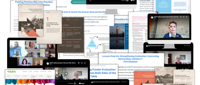
Simple But Effective Resource Page Illustrations – Before and After
This is one in a series of before and after designs. With this particular post I am sharing lessons from an actual client project. You can see other before and after posts in the series by following this link. How it Started – SECPI Resources I started working with SECPI (Strengthening Evaluation Contracting Partnerships Initiative) at […]
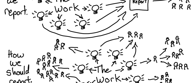
Dissemination Systems Change
How to shift your organization away from Report Factory and towards a strong Insight Ecosystem. I. Moving Beyond Performative Dissemination I believe that most evaluation teams write reports with the best of intentions. They work late nights cleaning data, discovering insights, drafting narrative, and obsessing over clarity. Most people don’t get into research or evaluation […]