

So I'm an information designer with a quantitative background who doesn't care that much about …
Main Content
Latest Blog Posts
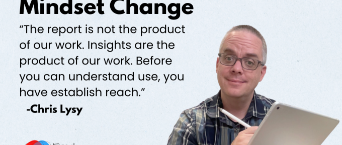
Theory of Use
Never before in history have we had so many tools and channels we could use to deliver research and …
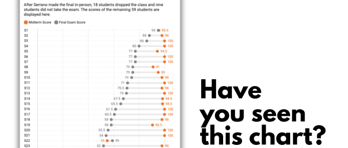
4 Lessons from a Viral Chart
Have you ever heard of social objects? I talk about them every once in while here, but probably not …

Evaluation is a dangerous profession.
Evaluation is a dangerous profession. Not dangerous as in it requires hard hats or tethers. But …
Continue Reading about Evaluation is a dangerous profession. →
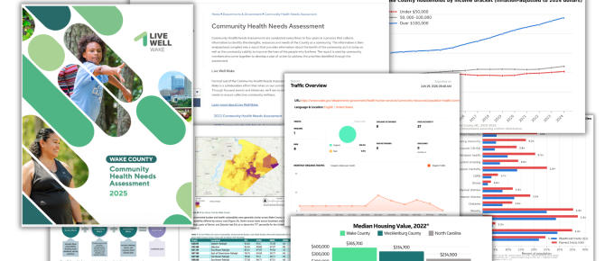
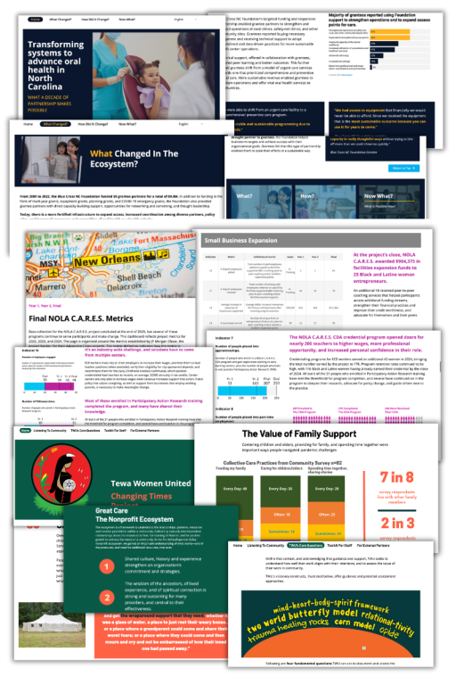
Report Review: 2025 Community Health Needs Assessment – Wake County, NC
Today's report review took me a strange direction. What started as a simple report review ended up …
Continue Reading about Report Review: 2025 Community Health Needs Assessment – Wake County, NC →
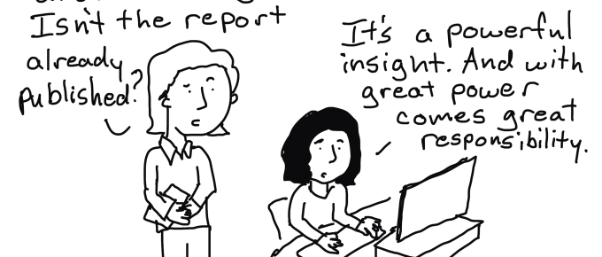
Reports are Comic Books, Insights are Spider-Man
Spider-Man started in a comic book. Nowadays you'll find Spider-Man in big budget movies, stage …
Continue Reading about Reports are Comic Books, Insights are Spider-Man →
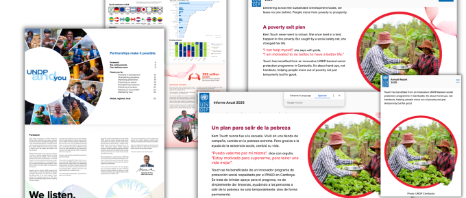
Report Review: UNDP Annual Report 2025
I've been working a lot on testing and improving my theory of use framework. Basically I take …
Continue Reading about Report Review: UNDP Annual Report 2025 →
Simple But Effective Resource Page Illustrations – Before and After
This is one in a series of before and after designs. With this particular post I am sharing lessons …
Continue Reading about Simple But Effective Resource Page Illustrations – Before and After →
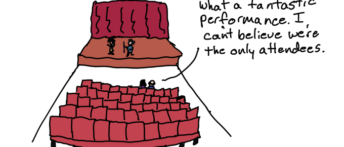
Dissemination Systems Change
How to shift your organization away from Report Factory and towards a strong Insight …