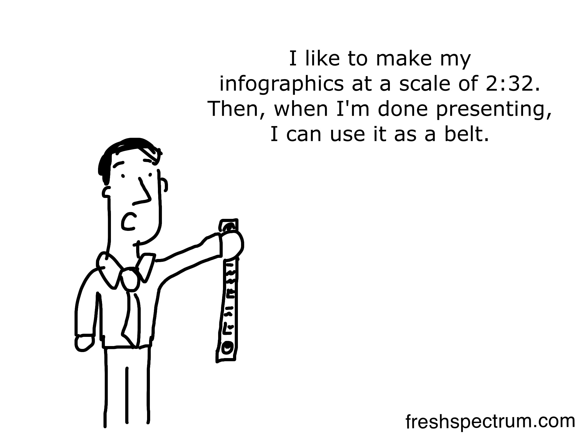
Want to design an infographic but don't know how to use illustrator (a.k.a. the thing most designers use for infographics)? You have a lot more options these days with template based sites like …

5 new cartoons, who cares if you’re not a visual person
I've heard, "I'm not a visual person," quite often lately. Sometimes it takes other forms... "well it just doesn't appeal to me, maybe I'm old school." All that might be true. I'm not going to …
Continue Reading about 5 new cartoons, who cares if you’re not a visual person →
7 Data Visualization Cartoons, is it a fad and what is qualitative visualization?
"I have a question, is all of this just a fad?" This was asked a couple of weeks ago while I was giving a presentation on interactive data visualization and infographics. My answer, which I base …

Engaging stakeholders with 7 cartoons, including 6 new ones
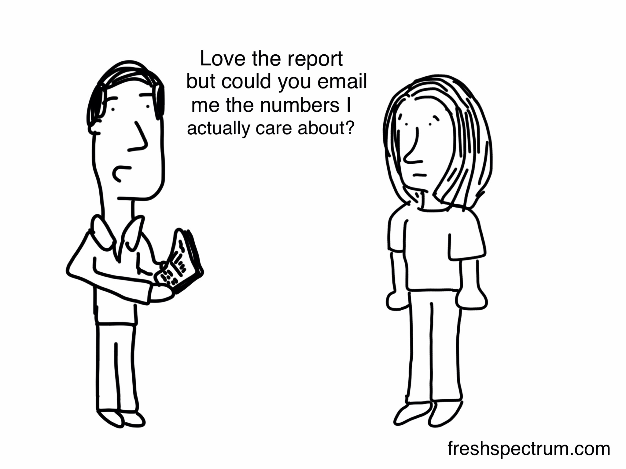
One of my favorite things about evaluation is that there is a need to communicate findings and evidence to a wide variety of audiences. It's not enough to just do the evaluation. You need to make …
Continue Reading about Engaging stakeholders with 7 cartoons, including 6 new ones →
On Interactive Data Visualization, Illustrated
This past week the latest edition of New Directions for Evaluation started hitting mailboxes. The issue covers Data Visualization in Evaluation (it's part 1 of 2). In it you'll find an article written …
Continue Reading about On Interactive Data Visualization, Illustrated →

If heat maps could talk #dataviz
If heat maps could talk... …

Choropleth DC and Wyoming
Doesn't the word choropleth just roll off the tongue? Did you know that DC has about 50 grand more people living in its borders than Wyoming? Am I asking questions because I'm too lazy to …

Choropleth maps and data visualization instacritics
It's pretty easy to tear down a data visualization. Between Tufte's traveling show and any number of solid data visualization blogs, we're creating a hive of instacritics that are currently laying …
Continue Reading about Choropleth maps and data visualization instacritics →
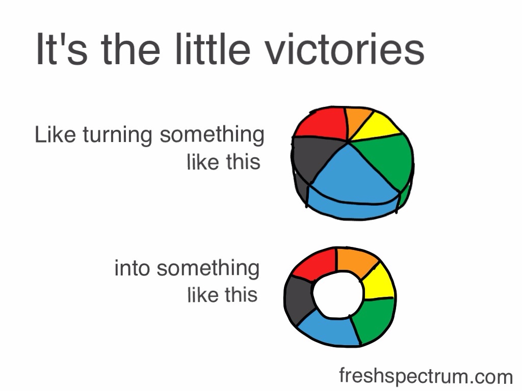
Simple strategy: from 3D bar chart to donut chart
People don't use pie charts because they think it's the most effective way to display the data. They use pie charts because it is an acceptable way to add a little color to a technical piece of …
Continue Reading about Simple strategy: from 3D bar chart to donut chart →

Hans Rosling in 3 Cartoons
Trying something new here, let me know if you like it! Check out www.gapminder.org to see him in action! …
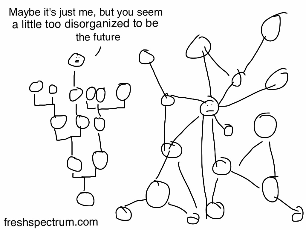
The Power of Networks
My initial updates to Eval Central are complete, so back to cartooning! Are networks an evolution in the manner by which we organize and process complexity? Manuel Lima of Bing makes the argument …

Lessons Learned at #eval11 Visual Data and Stakeholder Engagement
I have always been comfortable working with numbers. Mix that with my eagerness to learn new software packages and develop some level of programming experience and you will find someone whose career …
Continue Reading about Lessons Learned at #eval11 Visual Data and Stakeholder Engagement →