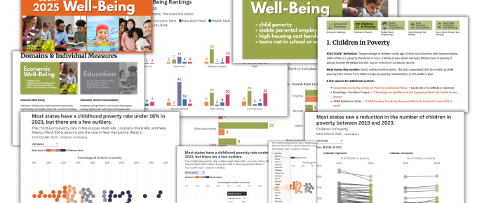
This is one in a series of before and after designs. With each post I take a real publicly available resource or report and adapt the writing, format, structure, and illustrations in order to increase …
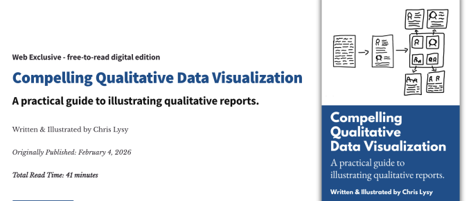
My qualitative dataviz book is now live! (and free)
Compelling Qualitative Data Visualization, my latest free-to-read book, is now live. Here is a little synopsis. What's the book about? In the book I talk about my approach to illustrating …
Continue Reading about My qualitative dataviz book is now live! (and free) →

8 reasons why you should join my report design workshop community.
Before I was an information designer I was just a data guy. I learned to design because I got tired of seeing good evaluation work quickly fade into obscurity because it was poorly reported. Now …
Continue Reading about 8 reasons why you should join my report design workshop community. →

Inform, Engage, Inspire, with data visualization.
Are you the kind of person who likes to nitpick other people's charts? I'm really not. I wasn't there when they decided to use that chart. I don't know what factored into their decision. As far …
Continue Reading about Inform, Engage, Inspire, with data visualization. →

Data Storytelling starts with Data Story Finding
You may have heard a data expert or two talking about data storytelling. But before you can tell a story, you need to find a story. This post walks through some strategies on how to do just …
Continue Reading about Data Storytelling starts with Data Story Finding →

How to edit a PDF graph.
In this post I am going to show you how to edit a vector based PDF graph. You'll also learn why you might need to so such a thing and how to discover if your PDF graph is indeed vector based. In …

What is the difference between a Histogram and a Bar Graph?
If you want to be taken seriously as a data professional, there are some things that you just need to know. The difference between a Bar Chart and a Histogram is one of those things. This post is …
Continue Reading about What is the difference between a Histogram and a Bar Graph? →
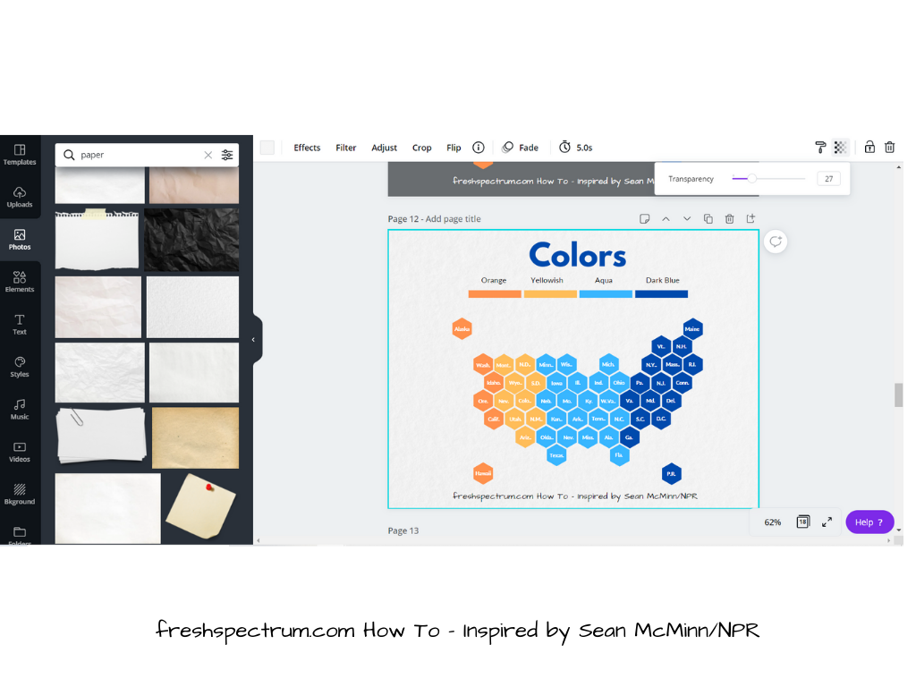
How to Create a Hex Tile Grid in Canva
In this series of data design posts, we draw inspiration from charts in the news and other spaces featuring data visualizations. Then we recreate the charts using easy freemium tools. In this post …
Continue Reading about How to Create a Hex Tile Grid in Canva →

Chart Guide: Dot Plots [graphic novel blog post]
A bar chart and a scatter plot had a little baby. In this short graphic novel guide I'll walk you through dot plots, why they exist, and how to use them. Want more step by step …
Continue Reading about Chart Guide: Dot Plots [graphic novel blog post] →

Confession Time: I’m not a reader [graphic novel blog post]
In today's graphic novel blog post I talk about the underlying challenge that drives my work. …
Continue Reading about Confession Time: I’m not a reader [graphic novel blog post] →

Chart Choosing Advice [Graphic Novel Blog Post]
If we chose clothing the way we chose charts, we would all look the same. How dull. My contention, there is no single right chart or wrong chart, that said, here is how I go about …
Continue Reading about Chart Choosing Advice [Graphic Novel Blog Post] →

Cone of Uncertainty Cartoons
So I live in North Carolina, luckily a bit in-land, not by the coast and not in a flood plane. With an impending Hurricane Florence, I'm a bit worried about the people in the eastern part of the …