
Silence in design makes sense sometimes. So when I make a chart for a federal client's report, it's not me speaking. So most likely, I should not be seen in the design. In these instances you …

The Future of Data Visualization: Three Predictions
Prior to the holiday season Ann K Emery asked a group of us bloggers to come up with some data visualization predictions for the upcoming year. Here are 3 of my own predictions based on some of the …
Continue Reading about The Future of Data Visualization: Three Predictions →
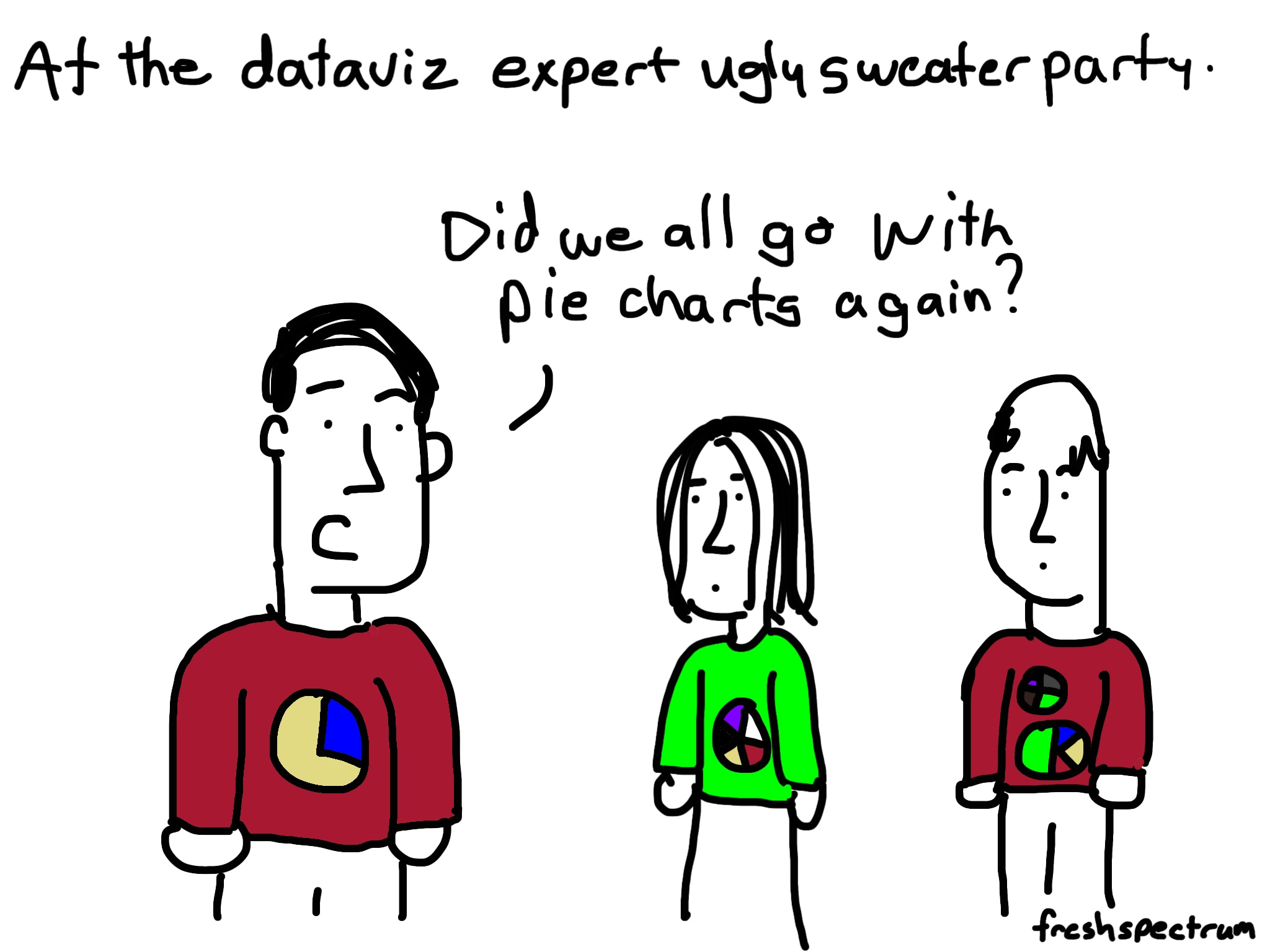
It’s a #dataviz Christmas cartoon post
This kind of cartoon post happens when you're writing about data visualization in front of a Christmas tree. An Infographic to Santa Santa's naughty list dashboard Dataviz Sweater Party …
Continue Reading about It’s a #dataviz Christmas cartoon post →
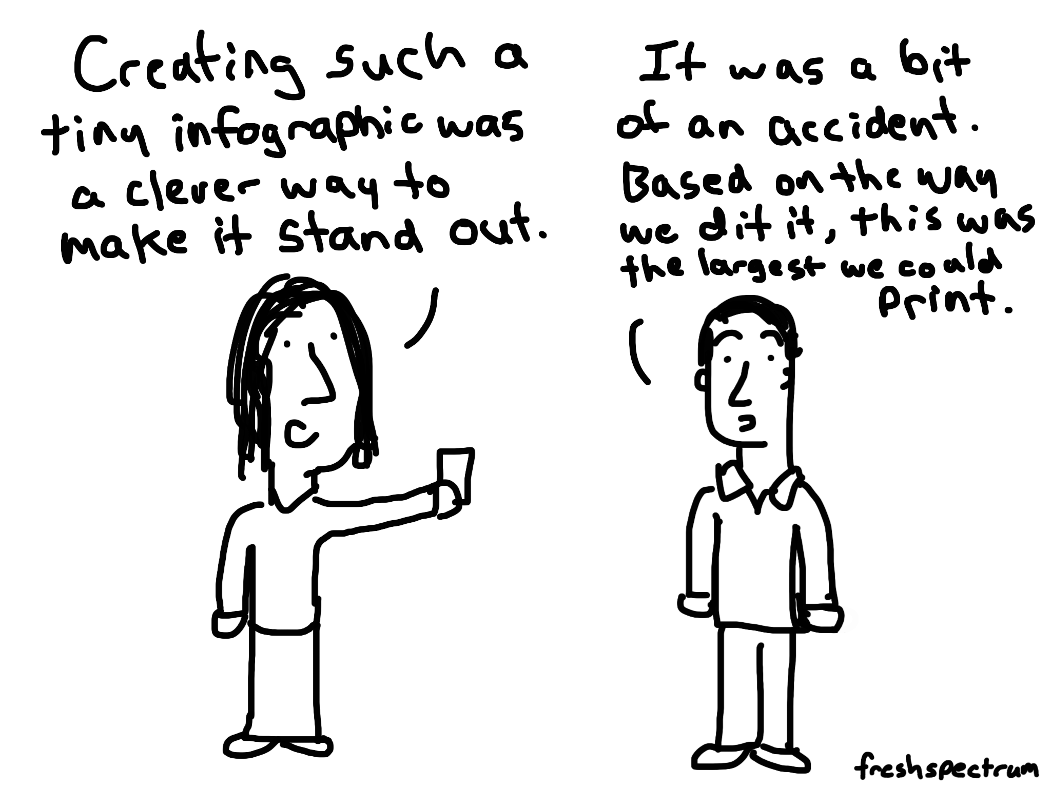
Why you should create a minimum viable visual
The infographic was not going to be a finalist in any design competition. The font was tiny. The few colors just didn’t seem to gel. It was printed small with strange dimensions. Definitely not …
Continue Reading about Why you should create a minimum viable visual →

The four words that can kill any visual project
I don’t like it. Data visualization experts love to talk about effectiveness, which chart type is better than which other chart type. And while I think the discussion can be helpful sometimes it also …
Continue Reading about The four words that can kill any visual project →
Build a Qualitative Dashboard
Why is it that so many attempts to visualize qualitative data start by quantifying the data? Qualitative data is special because it's deep and rich. There is huge value in learning lots about a …

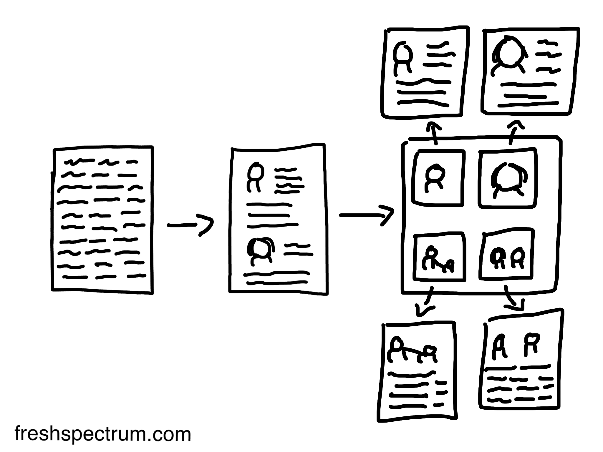
Easy Stackable Infographic
Here is an easy way to create an infographic using power point. This time for web publication. If you publish a set of images stacked on top of one another they appear as a single image. So to …

Building an Alternate Index Infographic
There is no single way to create an infographic. Styles depend greatly on the content, audience and purpose. Today's post is the first in a longer series focused on practical data visualization. …
Continue Reading about Building an Alternate Index Infographic →
My top 7 most engaging posts
Many of you are new here so before anything else let me just say, thank you for following. Since you've likely not seen them, I thought it might be a good idea to let you know about some of my …
The Four Tableaus and other question responses
At the end of last week, I received some extra questions from the attendees who viewed my coffee break webinar. I've responded to each individually but thought I would share the responses with you as …
Continue Reading about The Four Tableaus and other question responses →

Stop Wasting Data
[Update] On Thursday, July 31 I presented this little webinar as part of the American Evaluation Association's coffee break webinar series. If you missed it, AEA was kind enough to give me a copy of …
Freshspectrum’s new look and an upcoming AEA coffee break webinar
If you're reading this on the web, I'm sure you've noticed that the site has a new look. If you're reading this via email or RSS, head over to the main site and check it out …
Continue Reading about Freshspectrum’s new look and an upcoming AEA coffee break webinar →