
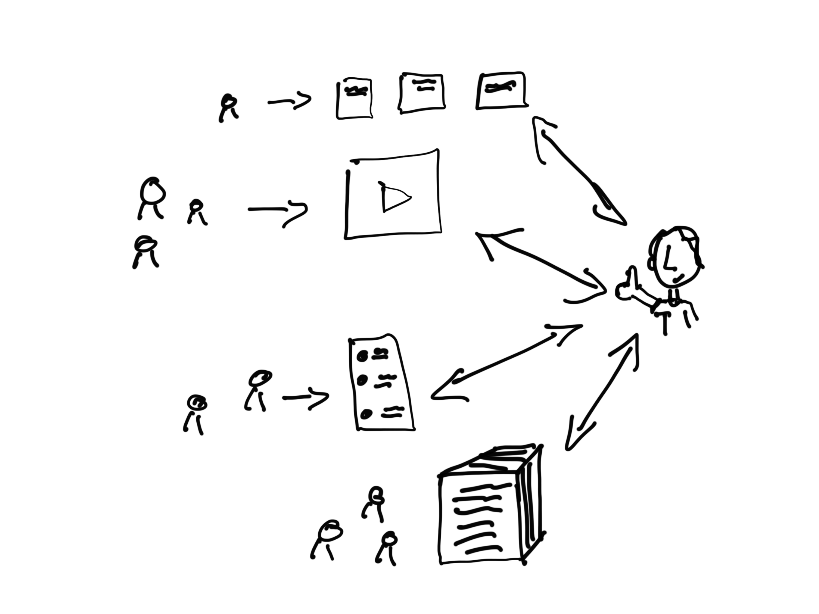
Infographics, social images, and visual reports are used to adapt and tailor concepts, ideas, and reports for specific audiences.
Articles
Governance Strategy
Before you can implement your content strategy you should know who is responsible for creating content and who has the authority to approve the work for publication. This will help you to develop your internal process, secure time, and determine professional development requirements.

Content Roadmapping
A content roadmap is your overall strategy. It helps you systematically formulate your plan based on reaching your audience at just the right times.

Audience Profiles
Understanding your audience takes some research and thought, but it’s worth it. The product of those efforts, audience profiles, make everything else easier. From overall strategy to design and evaluation.

11 cartoons and posts you may have missed
So as promised, I’ve been focusing a lot of attention on building my creative workshop for data people. But while I haven’t posted here, I’ve still been cartooning. So I thought maybe once a month I would send give you a little summary post featuring some of my creative work from around the web. Many of […]

Gone Workshoppin’
So there’s this thing I gotta do. You know that whole creative workshop for data people thing that I started? I’ve come to the realization that if I want it to be successful, I need to give it everything I’ve got. So freshspectrum’s going to go quiet for a bit. Not sure for how long, […]