
So as promised, I’ve been focusing a lot of attention on building my creative workshop for data people. But while I haven’t posted here, I’ve still been cartooning. So I thought maybe once a month I would send give you a little summary post featuring some of my creative work from around the web. Many of […]
Articles

Gone Workshoppin’
So there’s this thing I gotta do. You know that whole creative workshop for data people thing that I started? I’ve come to the realization that if I want it to be successful, I need to give it everything I’ve got. So freshspectrum’s going to go quiet for a bit. Not sure for how long, […]

The secret sauce of an RSA Animate.
The secret to a great whiteboard animation is a fantastic talk. It’s not a way to make boring talks interesting, but rather make already great talks spreadable through a new channel. Check out some of Andrew Park’s work at Cognitive. When you do, think about how many of the talks really need the animation to […]
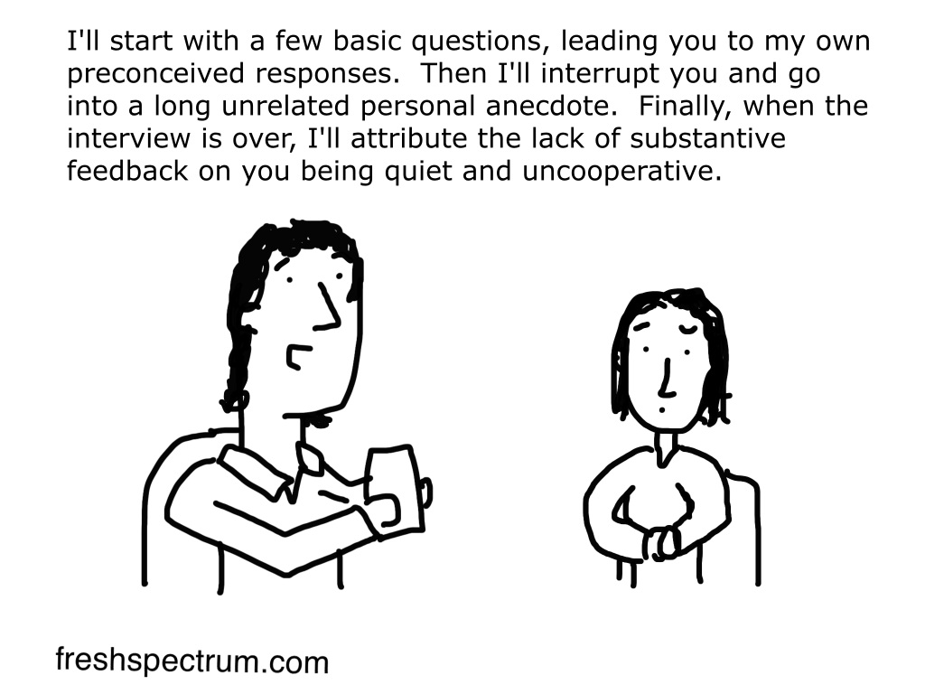
Don’t be a qualitative bully.
Today’s cartoon comes from a set I created for Michael Quinn Patton.

Why you shouldn’t decrease your data-ink ratio.
From Edward Tufte’s The Visual Display of Quantitative Information: A large share of ink on a graphic should present data-information, the ink changing as the data change. Data-ink is the non-erasable core of a graphic, the non-redundant ink arranged in response to variation in the numbers represented. Then, Data-ink ratio = data-ink / total ink used to […]

Hans Rosling as a performer.
I think we tend to undervalue Hans Rosling as a performer while hyping his data visualization. When you first watched his early *TED talks did you think, “Maybe I should create a bubble chart?” Or did you think, “I wish I could captivate an audience like that?” Originally for me it was the former and […]