
The gap starts small. What we see is pretty much what we know. The questionnaire, the response rates, the frequencies, and the datasets. We can see it all, from top to bottom, nothing …
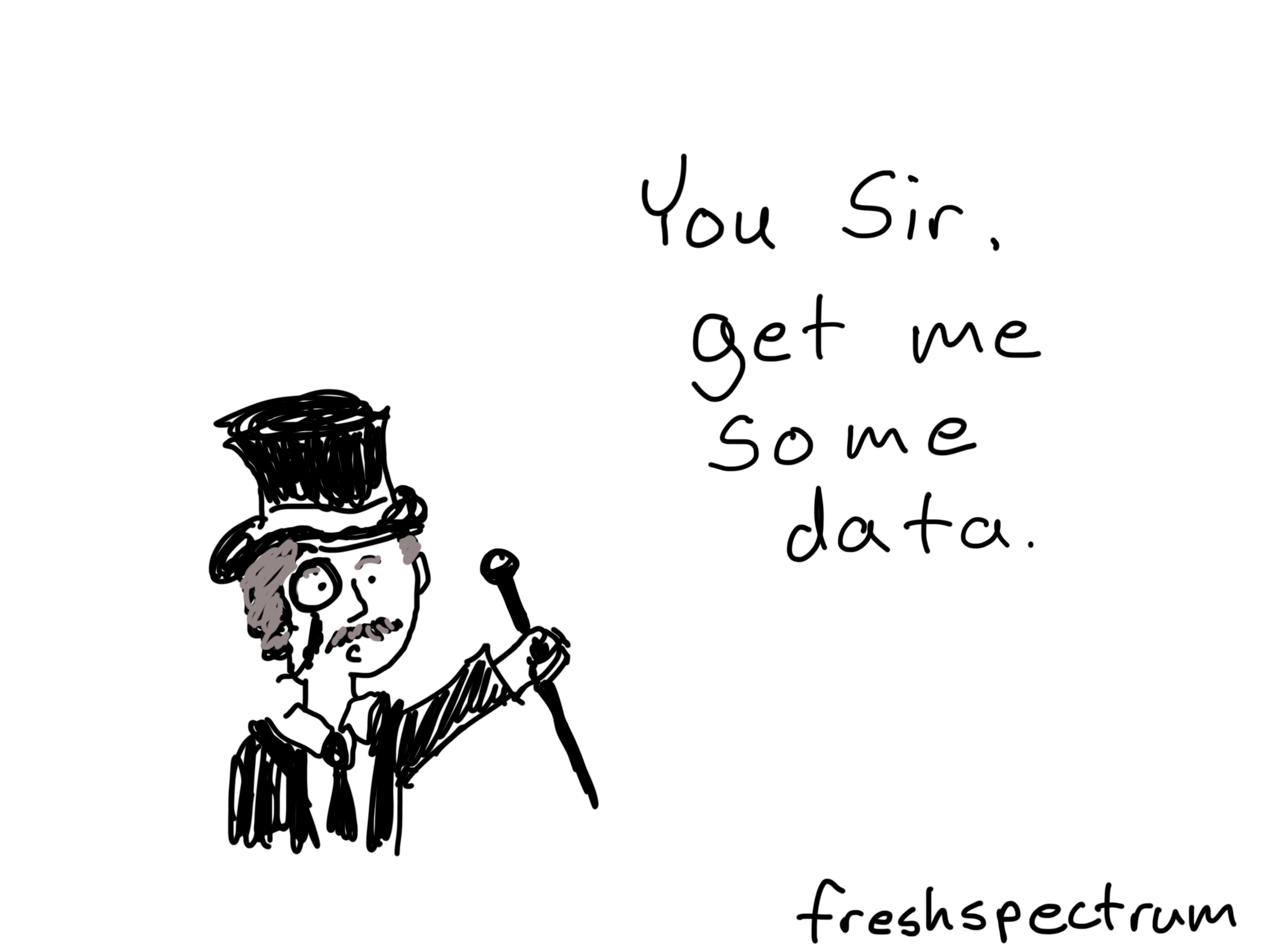
The “You Sir” Data Interface
"You sir, bring me some data." Most organizations access their data through people. Real, live, people. Somebody, most likely somebody at a senior level, asks for data. Then somebody else …

When keeping it simple is stupid.
When I was a young kid my uncle had a stroke. A middle aged man with a wife and three daughters, it changed his life completely. Not so long after his stroke my uncle came to live with us, …
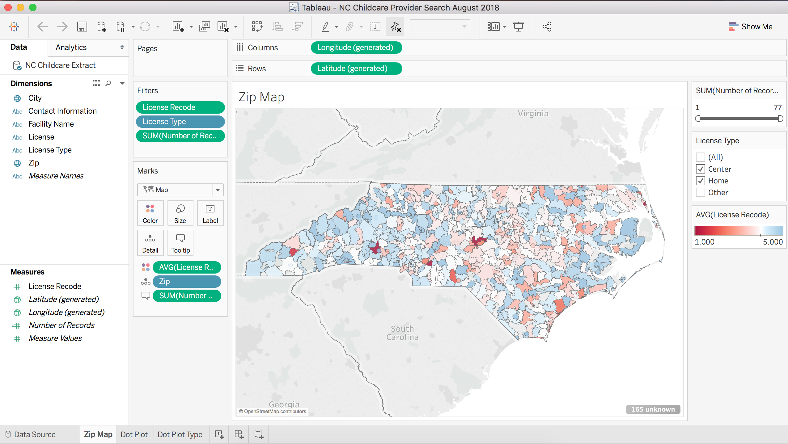
Cleaning and Recoding in Tableau Prep
In late April of this year (2018) Tableau released a new tool called Tableau Prep. So what is Tableau Prep? You know all that very unsexy data prep stuff you have to do before you can create …
Continue Reading about Cleaning and Recoding in Tableau Prep →

How to use Tableau as a Simple User Interface for Data
Let's not overthink Tableau. It's a tool, and as a tool it can do some pretty cool things. But only if you have a reason to use it. Over the upcoming weeks I'm going to focus on specific …
Continue Reading about How to use Tableau as a Simple User Interface for Data →
It takes a village, to get the most value from Tableau
Okay, so Tableau is technically something that one person can use effectively to support their work. But most of the time, to get actual value for the time/money commitment, it probably won't be …
Continue Reading about It takes a village, to get the most value from Tableau →

Data Visualization Lessons from a Bad Chart
My favorite bad chart sat nearly undisturbed for years in the kitchen cabinet of my former workplace. It was an almost ordinary looking bar chart adorning the side panel of a big yellow box of Lipton …
Continue Reading about Data Visualization Lessons from a Bad Chart →

Data Halloween Cartoon Post
Happy Data Halloween Everyone! Which cartoon is your favorite? You can vote by retweeting, just click on the cartoon to be taken to the individual tweet. Zombie Evaluators 3D Pie Chart Jack o …

Learning new things is hard.
I get it. You already know Excel. Tableau is just plain confusing (and annoying, and expensive). I've been there. But Tableau can do things that Excel cannot. Like directly weave a bunch of …
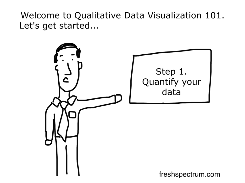
Quantitative Qualitative Visualization
Most "qualitative data visualization" is really just quantitative data visualization. There are tons of qualitative researchers and evaluators who have spent careers fighting the notion that their …
Continue Reading about Quantitative Qualitative Visualization →

A dashboard you can’t update.
My preferred way to create a dashboard is to start with something simple, crude even. Then over time, adapt. The faster the dashboard goes live, the better. This is the way most web software is …

Can you influence your dashboard?
A lot of organizations get tied up with the whole "car dashboard look." That's all surface area stuff. Real dashboards give us access to information we can use to make decisions. Our actions …