
This is one in a series of before and after designs. With each post I take a real publicly available resource or report and adapt the writing, format, structure, and illustrations in order to increase the accessibility. You can see other before and after posts in the series by following this link.
How it Started – 2025 KIDS COUNT Data Book
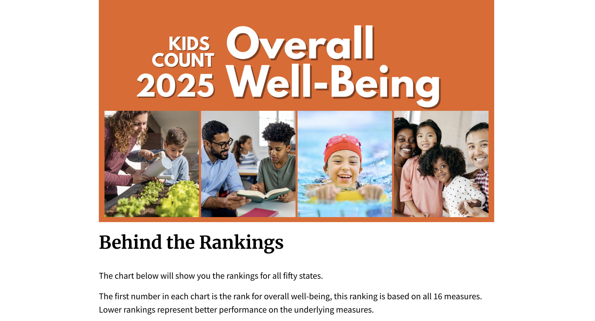
Every year since 1990, the Annie E. Casey Foundation has ranked all 50 states on how well children are doing. The 2025 KIDS COUNT Data Book looks at 16 measures across four areas of life: economic well-being, education, health, and family and community. States are ranked from 1 (best) to 50 (worst) based on how they score across all four areas combined.
The data is pulled from a few different federal data sources. The data is then standardized, ranked, and shared. The full resource exists as a pdf report, data tables, press releases, an interactive report, and more. These resources are then used to help inform policymakers and advocate for policy change that improves the lives of kids.
The Problem – Too many clicks, not enough data.
I know there are some people reading this who are looking at that before image and thinking that it looks quite nice. And I agree, it does look nice. It’s also incredibly useful when attempting to inform policy, to break down the data into simple to share soundbites. And these rankings do just that and have for over 35 years.
My issue is with the structure of the interactive data book. I think the real power of an interactive report is in being able to share more data while making it feel like less. This doesn’t really do that. Instead it takes the same data you’ll find in the pdf and makes you click more to get to it.
The interactive also uses a lot of BANs (Big Ass Numbers) and isolates the data for individual states. But with a few basic interactive visuals, we can take the same data and bring it all together in a form that puts everything in context.
Let’s walk through the original so you can see what I mean.
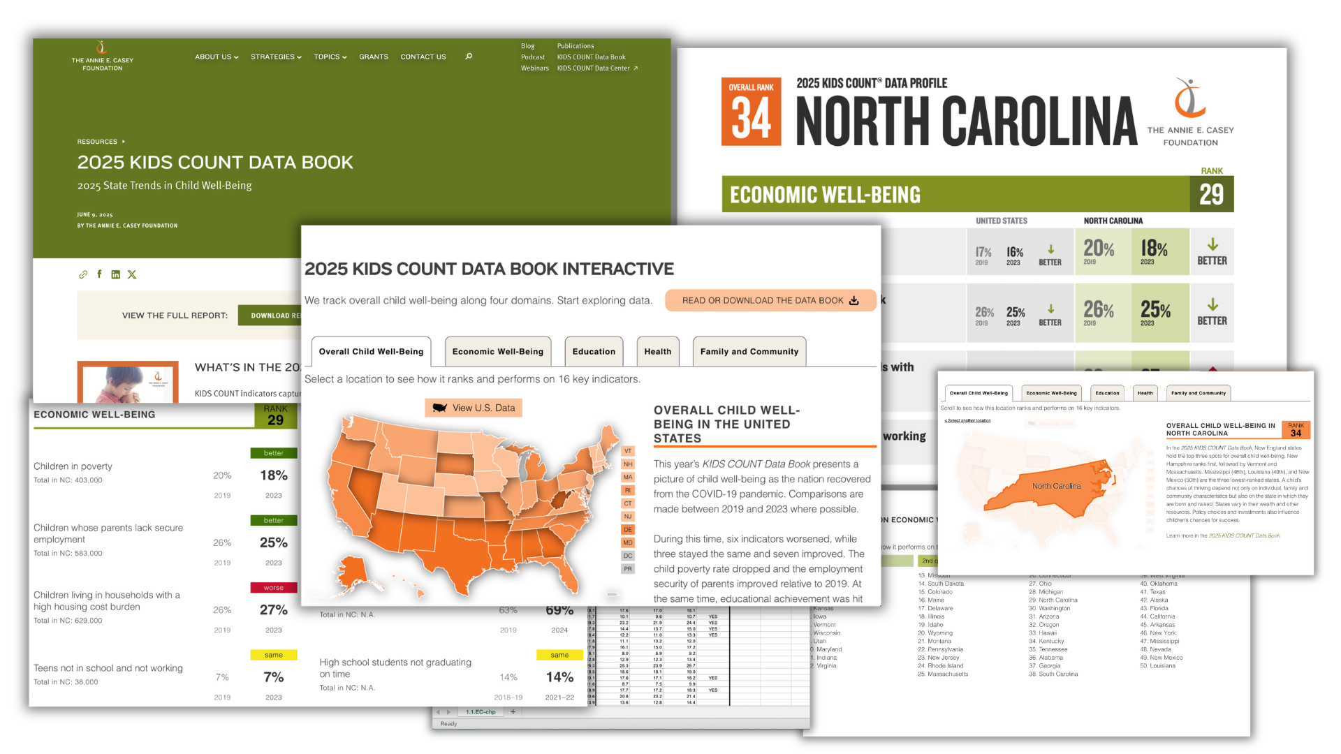
On the main page of the interactive data book you’ll find a map that’s color coded (by shade) based on the state’s overall ranking.
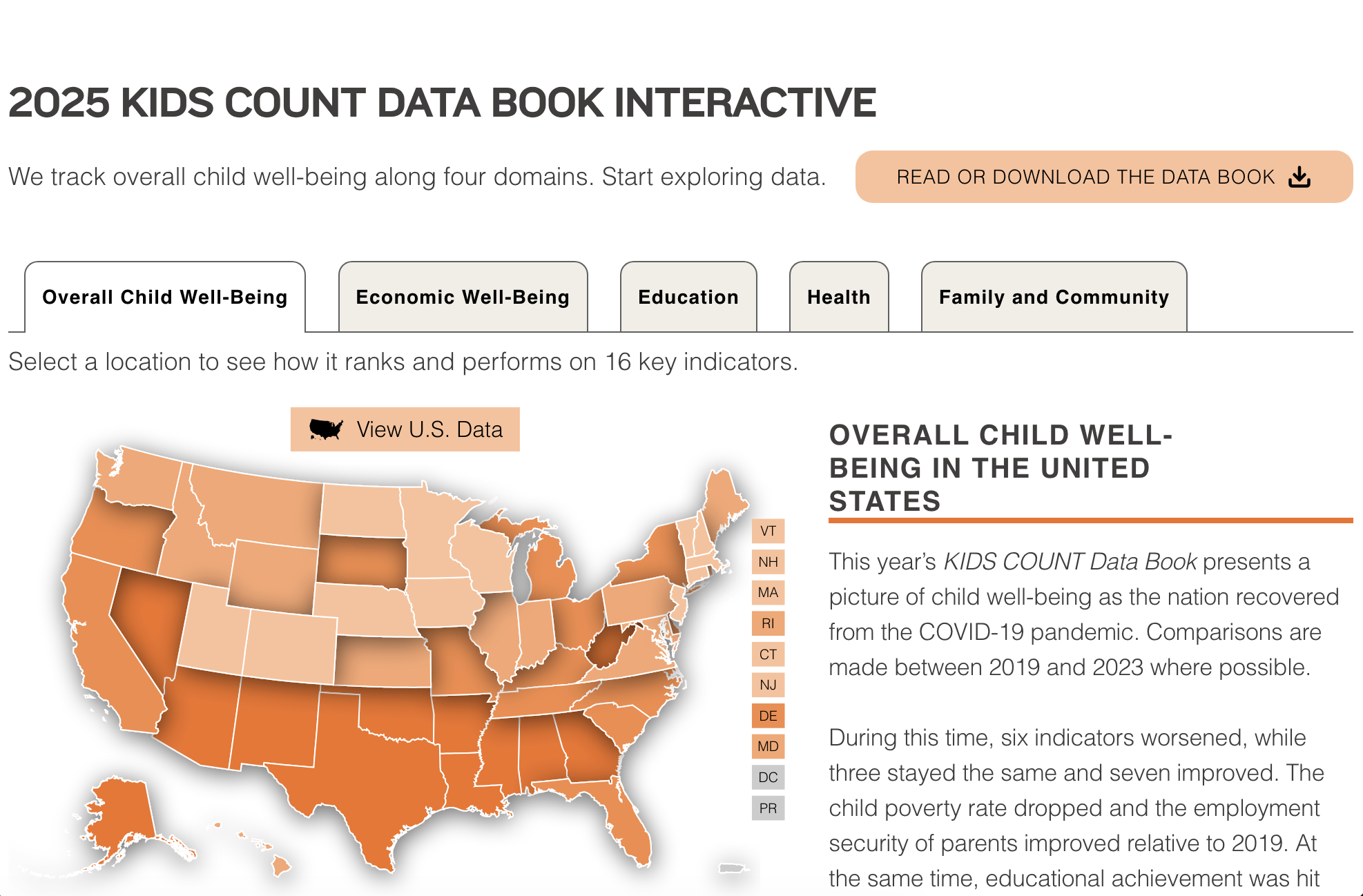
Scrolling down the page you get the individual states ranking and you can also see that the colors are based on quartile.

Each individual state in the map is clickable. By clicking one the state comes into focus.
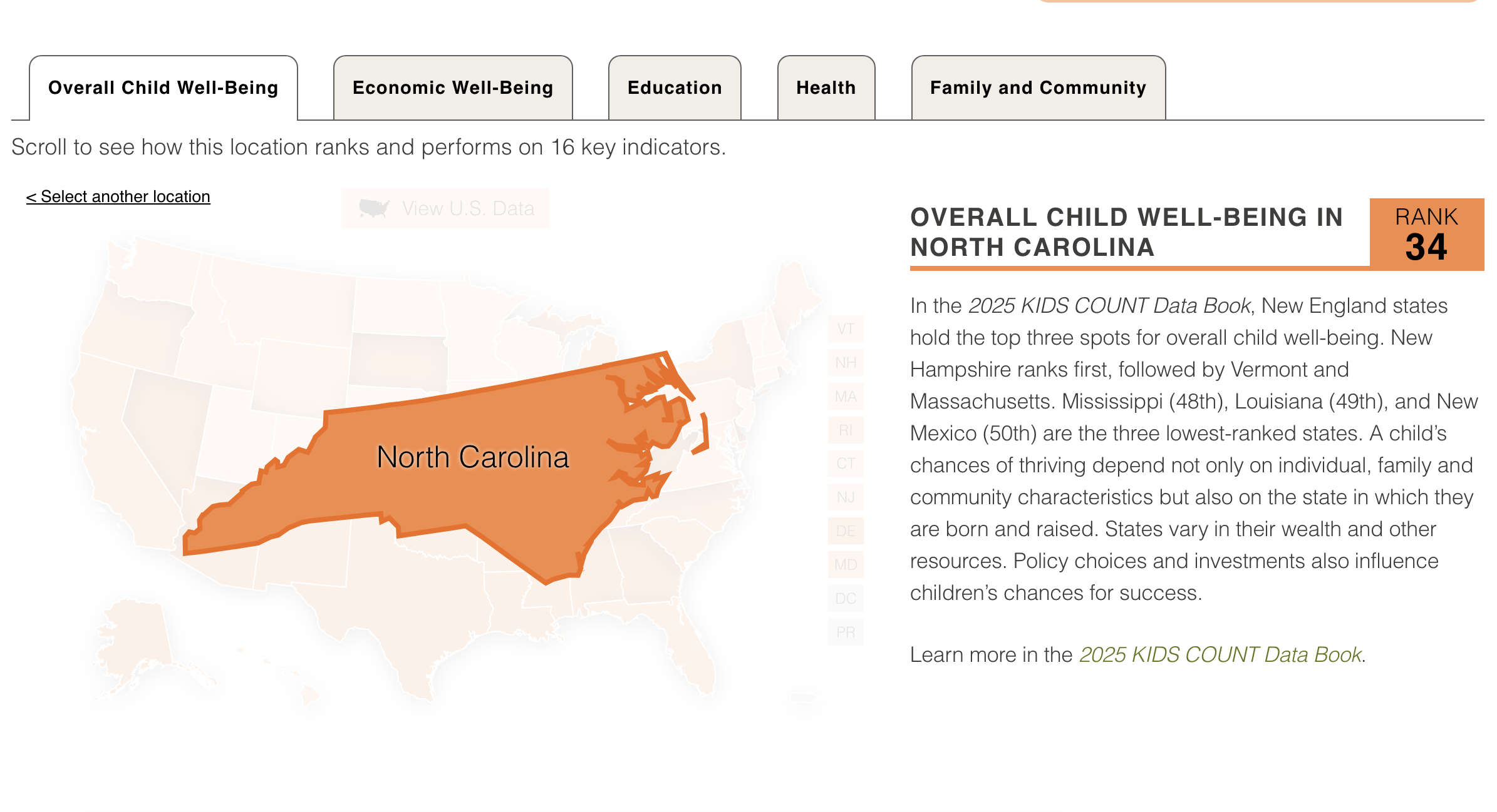
Underneath the state you get to see the rankings for each of the four domains with the data for each individual indicator.
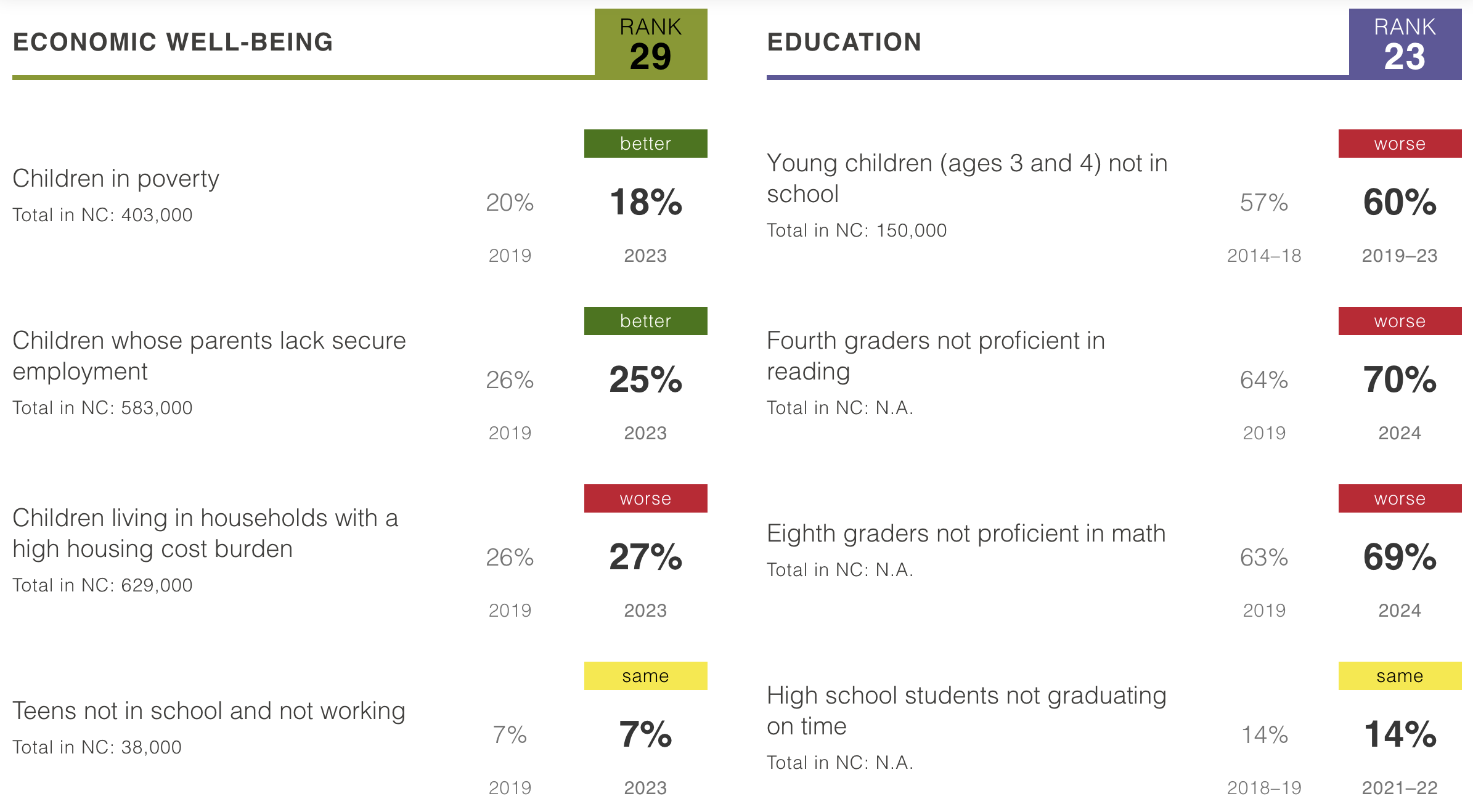
You can get into each category by clicking on the tab across the top where you find a similar map and ranking table to the overall one.

Clicking on a state here will give you a little bit more detailed data in the form of bar charts. There are also a few comparison categories.

Let’s look at the PDF for a minute.
Pretty much all the main data is shown in the pdf report for ALL states in just a few pages of the appendix. Here is a table that shows all rankings for all the states and all the domains, together at the same time. It does not feel overwhelming.
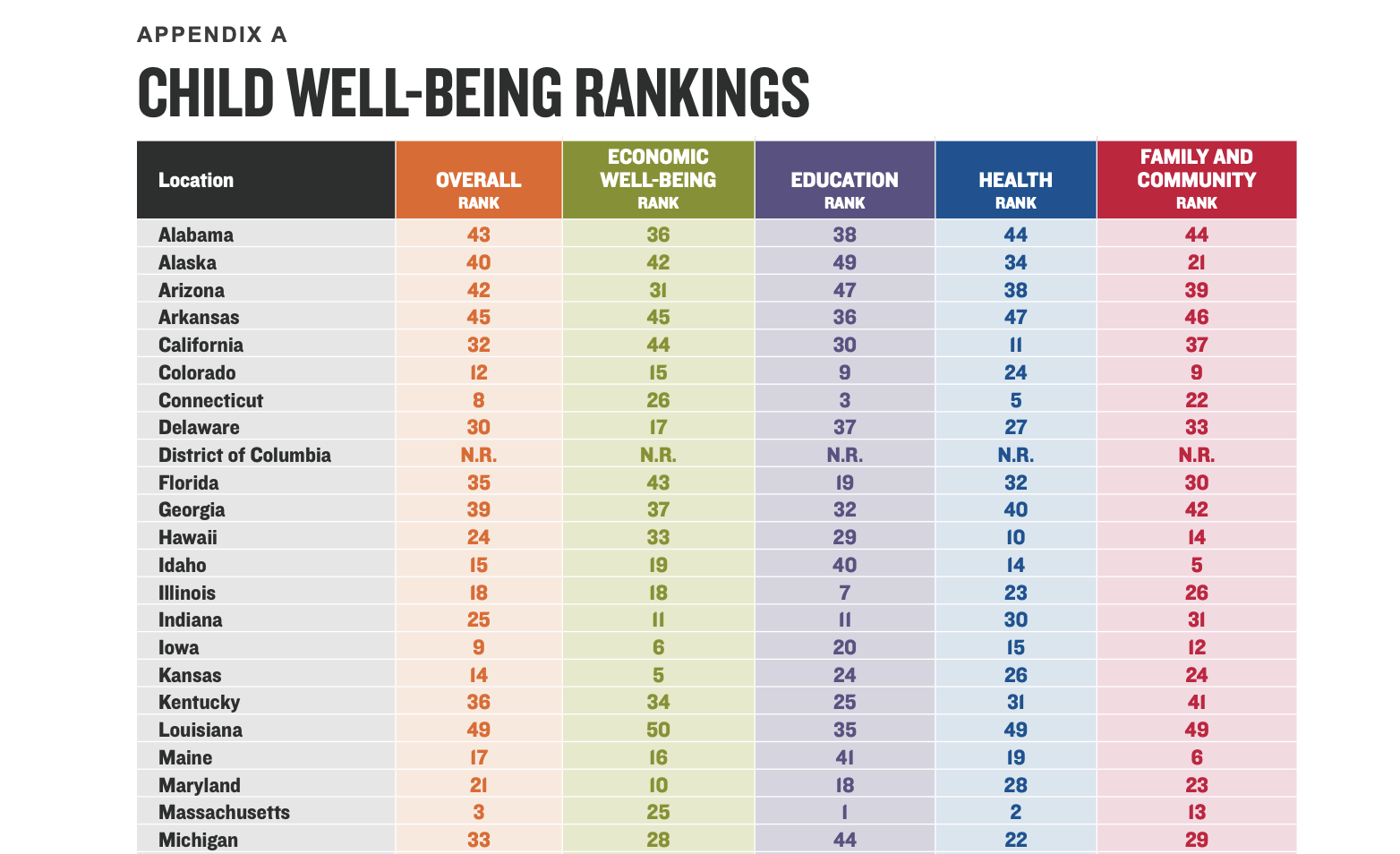
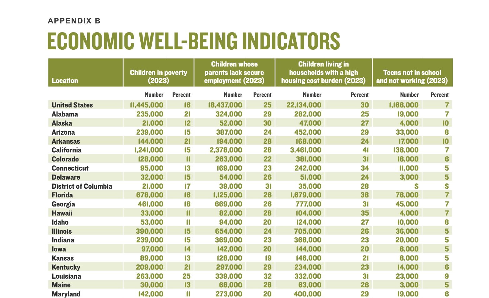
There is also a table for each of the individual domains. This gives all the states and all the data. Compared to the online version, with this table you can actually look at your state’s data and compare it against the data of other individual states.
What’s the point of an interactive?
Right now the interactive version is just an alternate way to show the data found in pdf. It’s not in a narrative format that encourages you to read. It doesn’t give you much in the way of additional context or show the data in formats that encourage comparison.
There are a lot of people who have this idea in their heads that interactivity makes something more engaging. But the vast majority of the time, it just hides stuff away and forces you to click if you want to see anything.
Let’s try something different.
Digging into the data.
On the main landing page for the Data Book there is also a button for Auxiliary Data Tables.
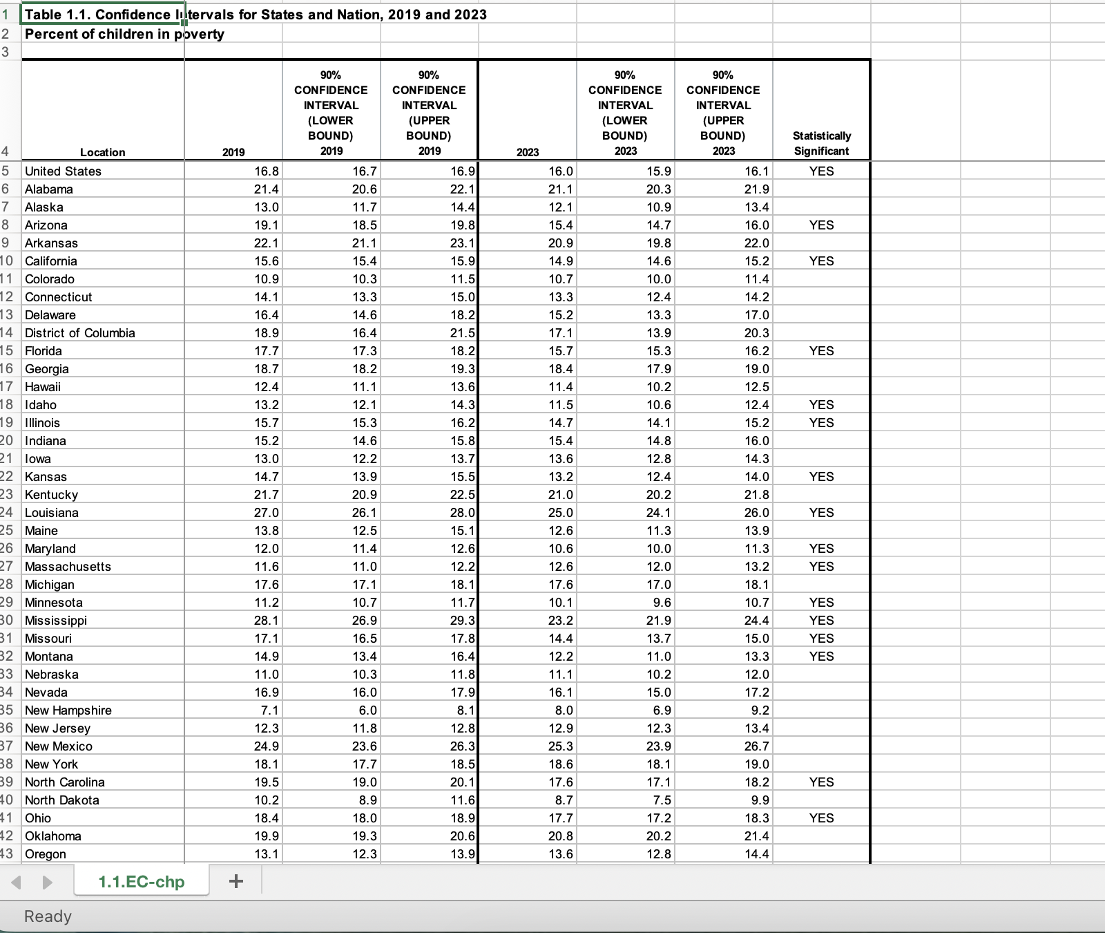
There is an Excel sheet for every one of the 16 indicators. In the excel sheets you’ll see two years of data with confidence intervals. With sampled data like this even a 1 percent drop between two years isn’t always enough to be statistically significant. And with a different sample, the rankings could be wildly different. Especially on certain indicators and for low population states.
My goal here isn’t to dispute the rankings. They are defensible and useful. But for this prototype I do think there is a lot more value that could be had by comparing the actual indicator data between states instead of just comparing the rankings.
Certain stories can hide in rankings that can be quickly uncovered by just showing all the data. But before I do that I want to go in and create a consolidated data table. This will just give me more options when it comes time to visualize.
Playing with charts and graphs.
I spent a lot of time trying out different types of charts. I used flourish for this as I’ll end up embedding the charts as interactives on my report page. But finding just the right chart can take time and a lot of data restructuring.
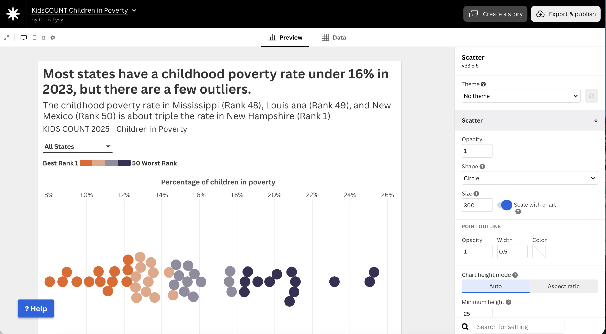
I love using dot plots for showing distributions. But since a lot of the data would overlap I turned it into a beeswarm so all the individual circles would be shown. I think there is a value in focusing first on just showing the latest year of data so the comparison you make is between the states.
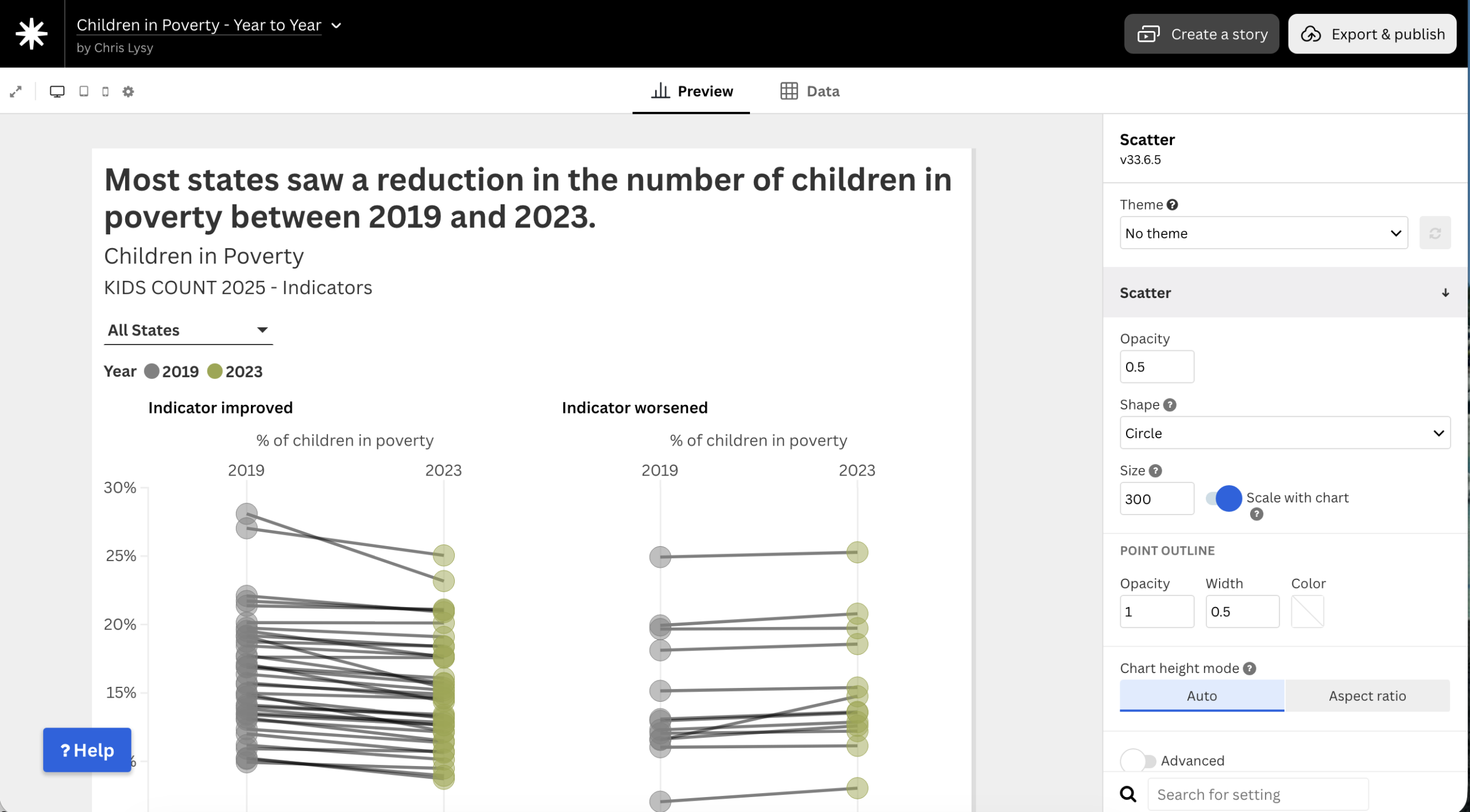
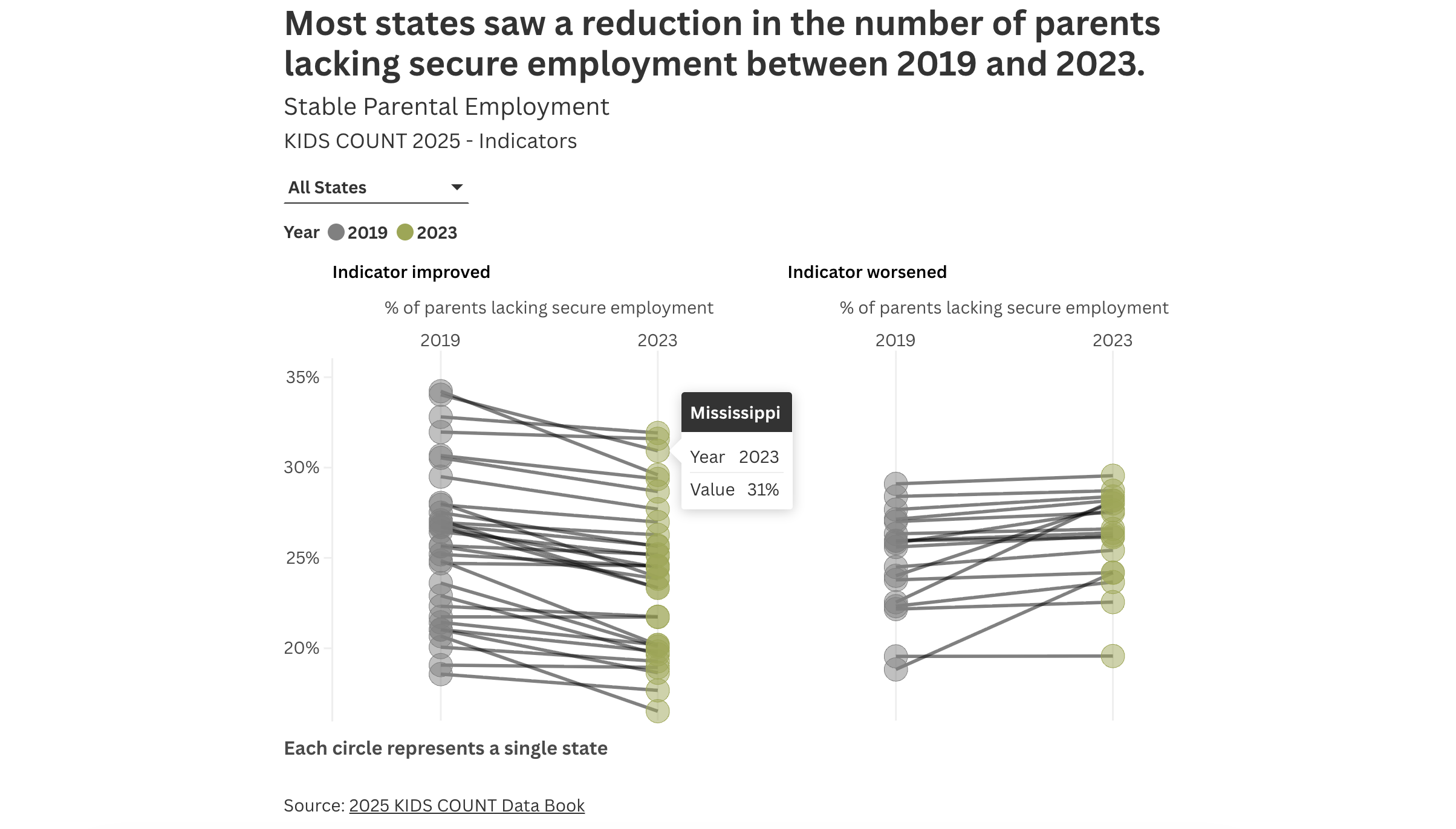
For the year to year comparisons I used another dot plot, this time with both years and connected to make a kind of slope graph. I also split the chart to separate the states that showed improvement and ones that showed the indicator worsening.
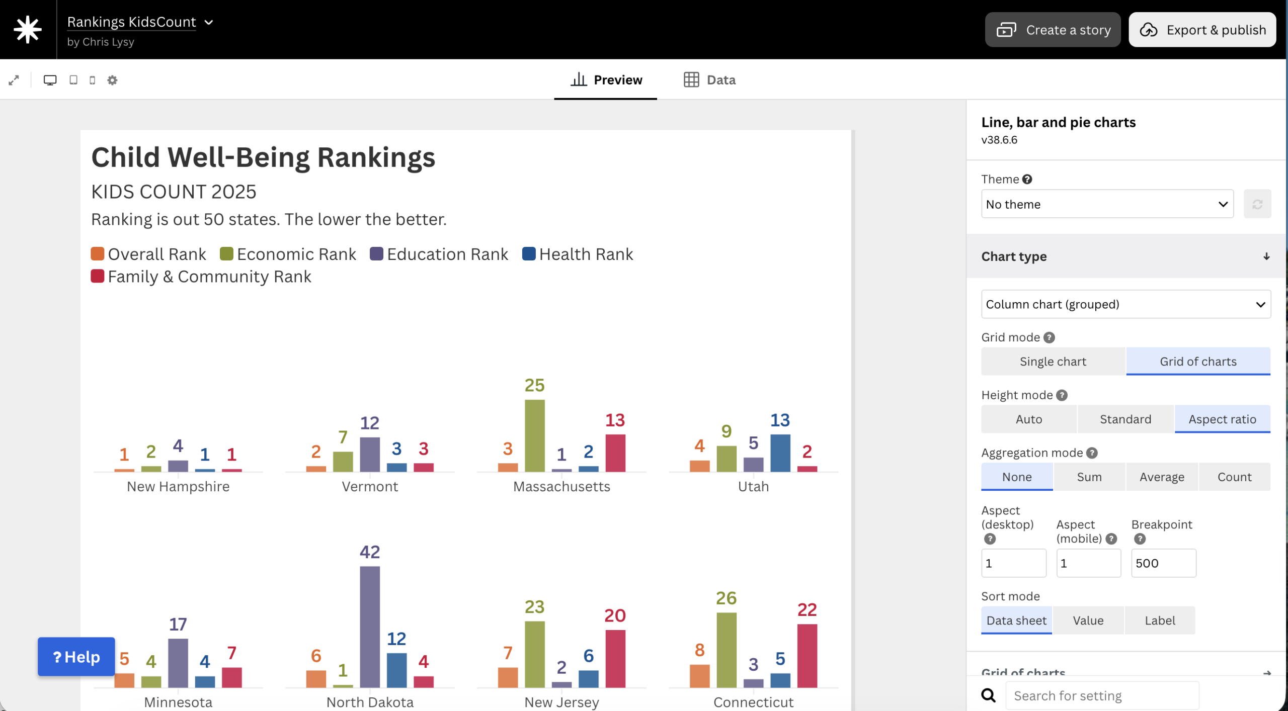
In addition to the indicator level data I think it would also be nice to have a big interactive chart on the front page to show all the rankings for all the states and all the domains.
I liked these column charts. Even though it’s not a traditional way to show rankings, I like how you can put the set together and get a picture across all the indicators. Certain stories start to come out pretty quickly.
Take Massachusetts for example. It’s overall ranked number 3, but has an economic rank of 25. North Dakota has an economic rank of 1 but an education rank of 42. While New Hampshire is at or near the top for every domain.
These kinds of differences always make me a curious and push me to dig deeper into the data. I didn’t really see any of that when looking at the original tables.
Building out the interactive.
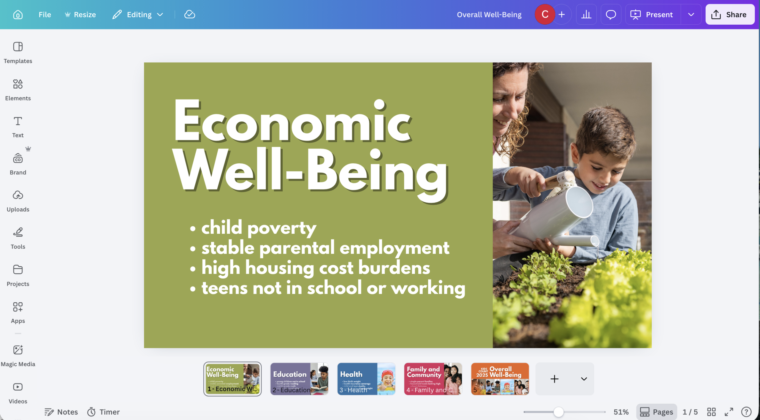
I wanted the structure of my prototype to be simple. I was thinking that it made sense to split it into five pages. The first would be an overall page where I would set everything up. I would also have one page for each of the four domains. But given that this is just a prototype I decided to only actually create one of those domain pages.
But I’m still going to pretend that all four pages exist, so I need featured images for each domain page and one for the main. I tried to parallel the KIDS COUNT images, which I believe were created with the same stock library. I also used their colors.
below the intro block on the front page I embedded my big rankings visual.

Then I followed that up with a simple menu for each of the domains.

The top of the Economic Well-Being page will have that same visual, an in-page menu, and then an intro to the section.

I also decided to mirror the front page chart after the beginning section. But I only included the Economic Rank and the Overall Rank. The indicators that will follow are a dive behind the rankings.

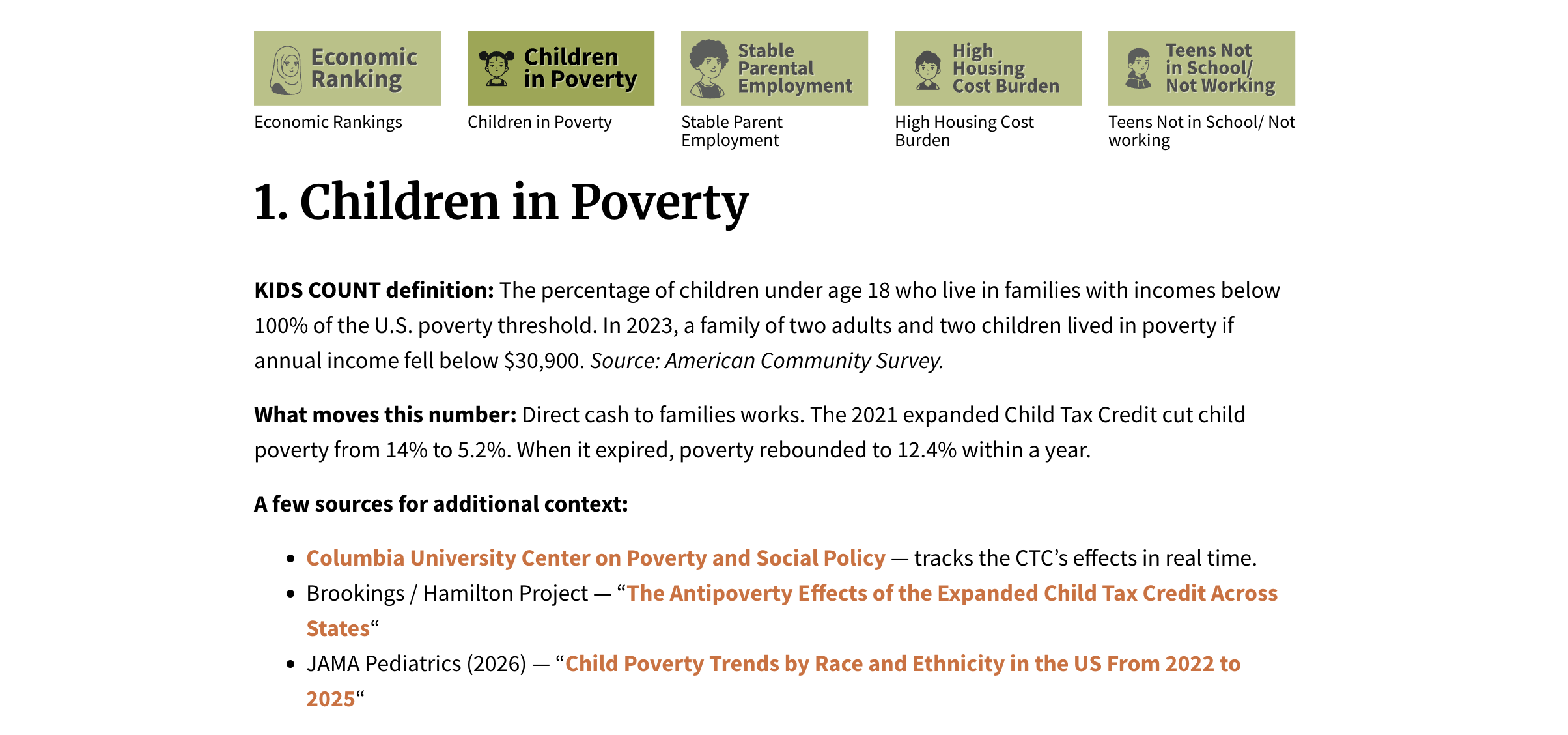
At the beginning indicator I give the indicator definition. Then I decided to take a little more creative license and add some additional info. What types of things do we know from research that could move the number? And what are some of the sources you can visit that would give you even more context on the indicator.
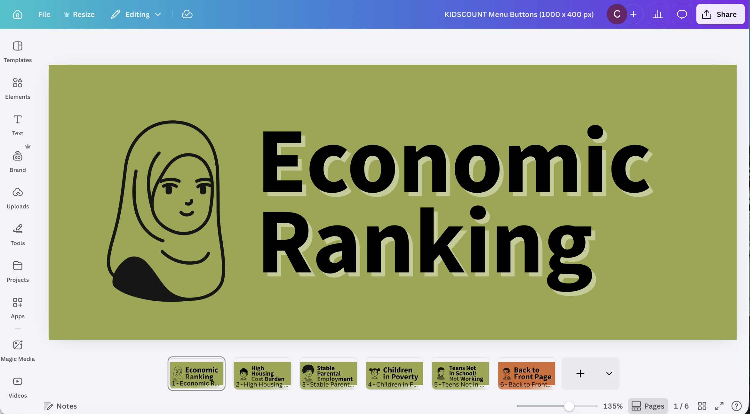
The page got a little cumbersome so I added a little repeating menu section using anchor links. This lets you jump up and down the page with a click. You don’t have to use the menu, you can just scroll, but it’s there if you need it.
Next up are both of the individual indicator charts. You’ll notice that if you mouse over a circle it tells you state, the value, and the rank of the state within that indicator. It also gives you “Rank Range” which I created from the Confidence Interval. Basically Nevada is currently ranked #34, but due to sampling error it is likely to be somewhere between rank 29 and rank 34.

You don’t have search to find your specific state if you don’t want to. There is also a little filter box at the top of each chart that lets you choose the state you want to see. If you select a state from this it will isolate that state in its current position in the chart.

One of the things that gets lost in rankings but you can see pretty quickly in visualizes like these is when a state is improving, but might have have changed much in terms of rankings. You’ll find quite a few examples of stats that improved considerably on an indicator but saw little to no change in the rankings.
And that’s it really. Same two charts repeated over and over again for each indicator. And now instead of just a few data points with big numbers you get to compare against hundreds, without adding a lot of complication.
What stories can you find in the data?
One of the things I found interesting is that when you consider the confidence interval, the range of possible ranks for Vermont on the percent of teens not in school and not working is somewhere between 2 and 42…yikes!

Let me know what you think.
This is one of those changes that might appeal more to people who like data. If someone just wants to pull a ranking, original approach is probably better. But for my tastes, I always want more data when I can get it.
