
My favorite bad chart sat nearly undisturbed for years in the kitchen cabinet of my former workplace. It was an almost ordinary looking bar chart adorning the side panel of a big yellow box of Lipton tea. It was the kind of chart that would be overlooked by most, but for some reason it always […]
Articles

Last Minute Presentation Design
So you did it again. You had months to draft your story, create your slides, and practice your talk. But here you are, a few days away from the big moment and not even close to ready. But don’t worry, all is not lost. The Assumption So I am going to assume that you have […]

Data Halloween Cartoon Post
Happy Data Halloween Everyone! Which cartoon is your favorite? You can vote by retweeting, just click on the cartoon to be taken to the individual tweet. Zombie Evaluators 3D Pie Chart Jack o Lantern No trick or treating at foundations. Machine Learning Witch Hunt Explaining RCTs to a two-headed monster. Toads are not People, so […]

Learning new things is hard.
I get it. You already know Excel. Tableau is just plain confusing (and annoying, and expensive). I’ve been there. But Tableau can do things that Excel cannot. Like directly weave a bunch of different data sources, living in different databases and on different servers, into the same dashboard. All with automated updates. Or creating a […]
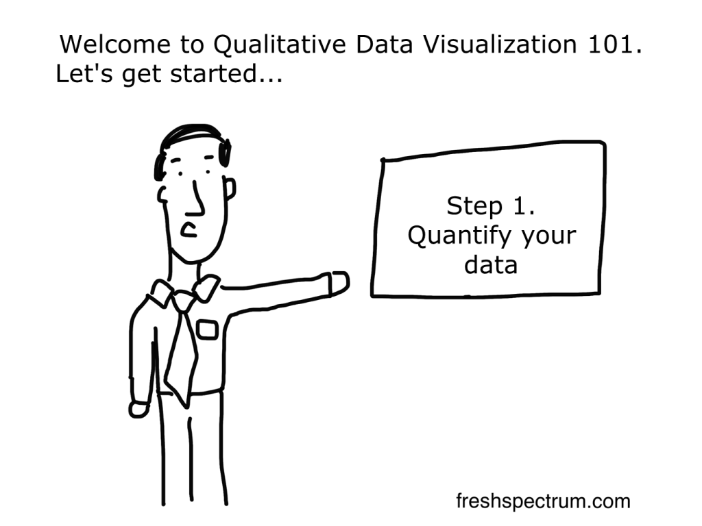
Quantitative Qualitative Visualization
Most “qualitative data visualization” is really just quantitative data visualization. There are tons of qualitative researchers and evaluators who have spent careers fighting the notion that their data should be presented numerically in summary tables. Using words like most and few instead of something that would be artificially precise. Down with word clouds (a.k.a. visualized […]

A dashboard you can’t update.
My preferred way to create a dashboard is to start with something simple, crude even. Then over time, adapt. The faster the dashboard goes live, the better. This is the way most web software is built. Always in beta, changes are then made based on the needs of the users. Many organizations put in most […]