I originally wrote this post in April of 2022. I’ll keep updating as time goes on and Canva adds improvements. This current update is from December 2023.
What has changed since 2022.
1. Canva allows you to add alternative text for all your images.
Not only that, but it has a handy little “Suggest for me” that will write a description using AI. This is an essential element for accessible design.

2. Canva is starting to get better at heading tags.
Okay, so it’s not quite there yet when it comes to tags. If you create a Canva “Doc” (not a report or anything else but a Doc) and download to PDF, the heading tags set in Canva will go with the document.

Unfortunately, the same is not true if you create any other kind of Canva design and export to PDF.

3. Canva downloads technically pass generic automatic accessibility tests.
This is because the tags and structure Adobe looks for in the automated checker exist. But they are just not logical. So is it accessible…not really. You have to do some work after download to ensure your PDF will be accessible.
4. Acrobat Pro Autotag problems.
If you have Acrobat Pro there is a feature that lets you autotag your document. It’s a pretty awesome feature for setting reading order.
But there is a catch. If you use Autotag, all your alternative text will disappear.
So it’s a tradeoff. Use autotag and your reading order/tags will get better. But just make sure to go through and redo the alternative text.

5. Keep an eye on the latest Canva Accessibility Features.
The thing about blog posting about web based software is that it changes all the time. Some of the things I complain about in this post will almost certainly get better in the future. At least I hope they will.
If you want to check, here is the help section in Canva where Accessibility Features are discussed.
Original Post [updated slightly but most things stand]
As much as I love Canva, there is definitely one spot where the tool absolutely fails. And that spot is accessibility.
When you work with a lot of government clients the topic of accessibility is almost always at the top of the considerations list when choosing your software. Making your reports accessible to those in your audience with disabilities is certainly the right thing to do. But it can also be a legal imperative.
If you just create a report in Canva and then export to PDF, that report is likely not accessible.
Does this mean you have to stop using Canva?
No way, Canva is still a super useful tool in so many other ways. But you do have to take additional steps after creating your reports to improve your product’s accessibility.
In today’s blog post.
- Why Canva Fails at Accessibility
- The Wrong Argument
- A Canva PDF Example
- How to run Accessibility Checks on your Canva Report using Adobe Acrobat Pro
- How to run Accessibility Checks on your Canva Report using Microsoft PowerPoint
- Tips for making Accessibility easier when designing in Canva
- If anyone at Canva is reading this post
- The Accessibility Law (aka Section 508)
- What makes a website or report accessible?

Why Canva Fails at Accessibility
We don’t have to dig too deep to find the flaws.
When you share visual content digitally, it needs to be readable. So that means when you have an image, you need to have alternate text for those who cannot see the image. Just like you would caption a video for the hearing impaired, you need to add text to your pictures.
The readable text also has to be understandable. If you deliver a pdf with a bunch of text boxes and alternate text, you need them to show up in the proper reading order.
Inside Canva, you currently cannot set the reading order or put in alternative text.
December 2023 Update: You CAN now use alternative text. You can still NOT set the reading order.
The Wrong Argument
Some people argue that Canva is a graphic design tool, not a content delivery platform. You don’t embed alt text into an image file, you set the alt text when you share the image (for example, you create the image using Canva then set the alt text when sharing via WordPress or Twitter).
But here is the problem with that argument.
Now, as the days move forward, Canva is transitioning into even more of a content delivery platform. You can present a slidedeck directly from canva or share an infographic with a link.
But even beyond that, if you are creating reports using Canva and sharing them as PDFs, you are already past the point where alt text should be added (which you can and should set now) and reading order set.
A Canva PDF Example

So for this test I just used a Canva template, applied all pages, and then downloaded the 10 page report as a Standard PDF.
Next I’m going to open the PDF report up in Adobe Acrobat Pro.
How to run Accessibility Checks on your Canva Report using Adobe Acrobat Pro
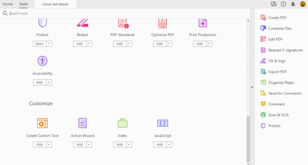
Once open in Acrobat Pro I’m going to click on the “More Tools” button and add Accessibility.
Then you’ll want to run an “Accessibility Check.”
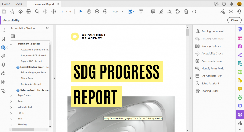
Initial Structure and Alt Text Check
The big surprise is that the document will come out fairly clean. The exported pdf is structured in a way that Adobe recognizes.
Images in Canva’s stock photo library must have a hidden alt text setting based on the document name that translates when you convert to PDF.
But here is a problem. If you were to use any of your own uploaded images, or if you simply wanted to change the alt text on the Canva images, then you would be out of luck without a tool like Acrobat.
Reading Order
So reading order requires a manual check, and you can instantly see a big problem.
Check out page 4. If someone were to try to read this with a screen reader they would hear the text in the following order.
- The alt text for the picture of the guy on the right side of the page.
- The footer text in the bottom right of the page.
- The paragraph under the page header.
- The last paragraph on the page.
- The second to last paragraph on the page.
- The page header “Message from our leaders.”
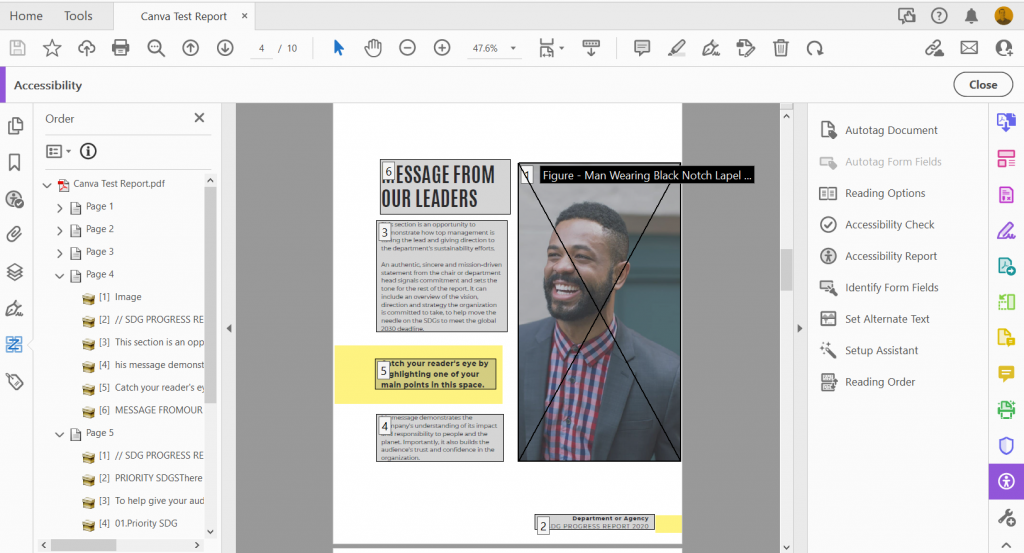
To make this document accessible, you are going to have to go page to page manually adjusting the reading order.
Color Contrast
This is another manual check. Let’s go through and see the color combos that need to be legible.
In this report we have…
- Black Text on a White Background
- Black Text on a Yellow Background
- Yellow Text on a White Background

There are a few ways to check the color contrast, but one is to use this contrast checker tool by WebAIM.
- Black Text on a White Background (Pass! 21:1 contrast ratio).
- Black Text on a Yellow Background (Pass! 18.35:1 contrast ratio).
- Yellow Text on a White Background (Fail! 1.14:1 contrast ratio).
Yea, not a big surprise that the yellow on white Table of Contents header would fail. But if you change out the yellow on white then the contrast is just fine throughout rest of the report.
How to run Accessibility Checks on your Canva Report using Microsoft PowerPoint
So if you are serious about accessibility I would definitely advocate for Adobe Acrobat Pro. Yes it costs money, but Adobe continues to be a leader in accessible design.
That said, you can also check accessibility with PowerPoint.

The first step is to export your Canva report into Microsoft PowerPoint. Just click on “Share” then “More…” and then scroll down to Save as “Microsoft PowerPoint.”
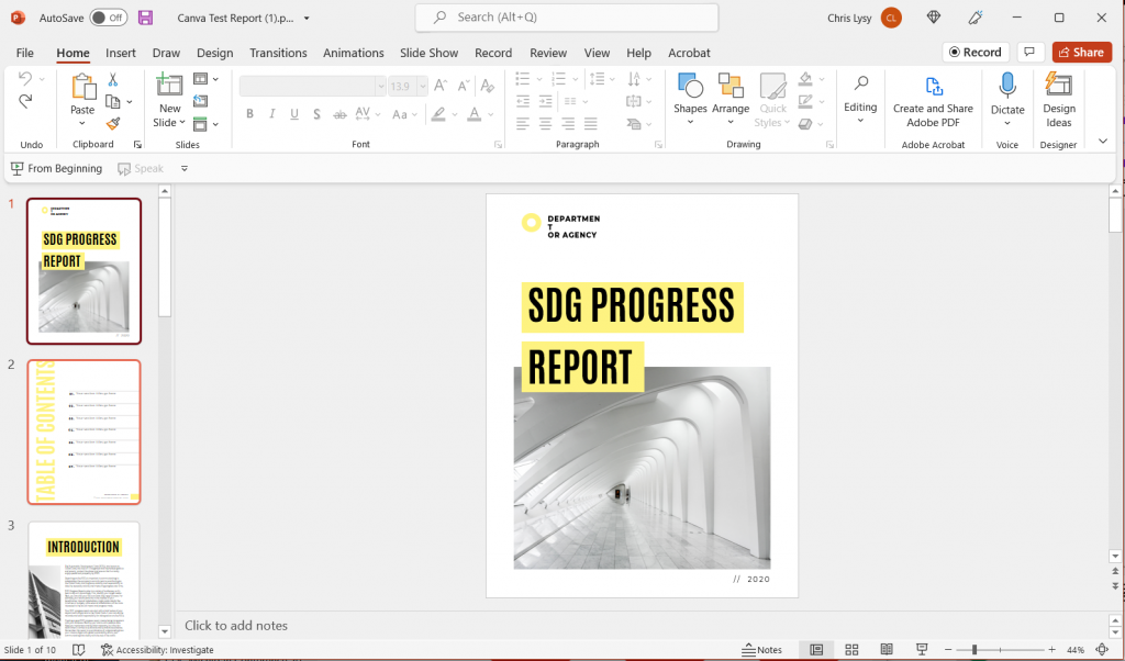
The conversion isn’t always perfect. I find that the biggest challenge is usually with the fonts. So you’ll have to do a manual check, scrolling through the document and tweaking any problem spots. You might just need to stretch a text box here and there or reduce a font size.
Another thing to note is that while Canva, or the PDF, would only show you the parts of your file that were within the margins, PowerPoint will show you certain elements that fall outside. For instance, the picture on the Introduction page hangs off the side. The stuff outside the margins won’t print (or be shown when in presentation mode), so this isn’t something that needs fixing. Just don’t freak out.
Once the document looks more or less the same as it did in Canva, go ahead and run your accessibility check.
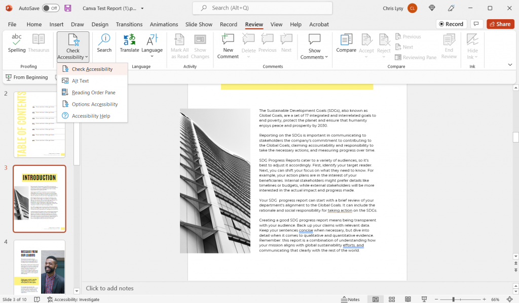
You’ll find the “Check Accessibility” options in the Review tab. Just click the button to run the inspection.
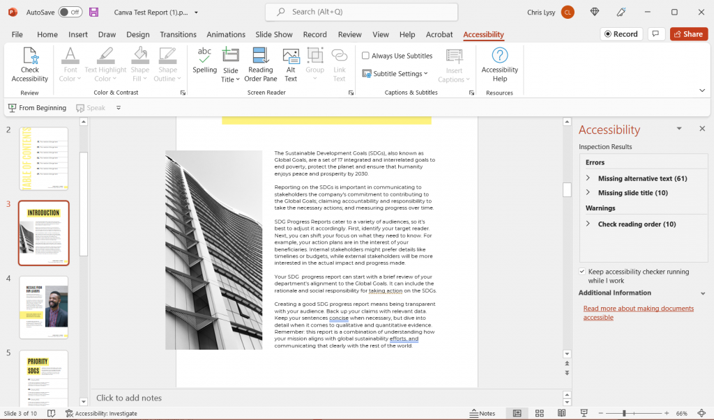
You’re likely going to find more errors in PowerPoint than in Adobe.
Adding Alt Text
In the Adobe PDF exported from Canva, only the pictures counted as images that required alternate text. PowerPoint is not so sure. It wants alt text for every single color block in addition to the pictures. It also wants you to put in a page title for every page.
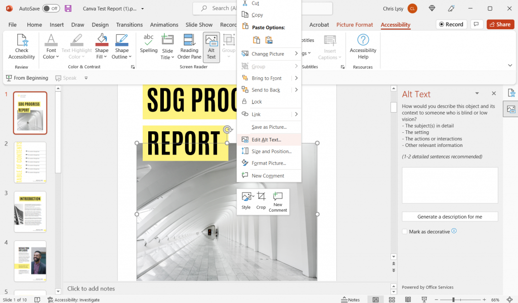
If the image doesn’t convey any information (i.e. all the yellow boxes in this report) just click the box below the entry field that says “Mark as decorative.” It will show up with blank text and not be read by a screen reader.
You’ll notice that all of the images that add automatic Alt Text in the PDF version do not in the PowerPoint version. So the setting that sets up alt text when exporting into PDF doesn’t do the same for the PowerPoint save.
Adding Slide Titles
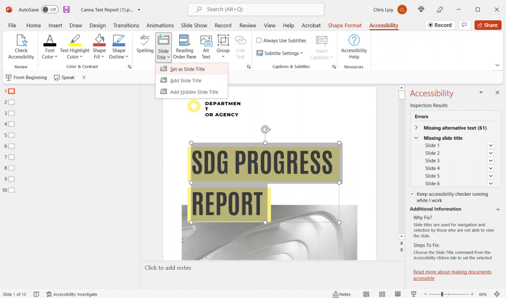
If you plan to deliver this report as a PowerPoint, you should also add slide titles.
To add slide titles, go to the slide with the missing slide title. You have three options. You can set an existing text box as the slide title. You can add a slide title. Or you can create a hidden slide title (one that will be read by a screen reader but not seen in the document).
One thing to note, in the conversion from Canva to PowerPoint, some of the text boxes might have been split into two. Some are also grouped with background elements (like the yellow boxes). In order to be set as a title, you’ll want to combine the title text into one box. You also need to ungroup the elements to even see the “set as slide title” option.
Setting the Reading Order

Okay, reading order in PowerPoint is a bit of a mess. Especially if you have overlapping elements.
It works the same as setting the reading order in Acrobat. Just move elements up and down based on when they should be read.
But here is the thing that will drive you a little nutty. All the decorative elements will show up here, and if your design has overlapping elements (like a title overlapping a picture) you are going to be limited in how you display your reading order.
Why? Because for some odd reason changing the reading order also changes the page display order. And when things overlap, the reading order starts from the back of the group of elements. So if you want a title to slightly overlap over a picture, that picture is going to be read before the title.
Color Contrast
Okay, so this one doesn’t show up in the Accessibility screen, but it’s still an important step. Just follow the same directions as were written out for the PDF approach.
Tips for making Accessibility easier when designing in Canva
There are certain design steps we can take in Canva that will make our Accessibility lives easier.
- Use as few text boxes as possible. Meaning, it’s way easier to have one long text box with several separate paragraphs than to have every paragraph in its own text box.
- Design with the reading order in mind. Sure, it might feel stylish to put the title in the middle right of the page blended overtop of an image. But that’s just going to be more annoying to make accessible.
- Group together decorative elements. By grouping together decorative elements you turn what could be a bunch of elements that need alt text, to a single a element.
If anyone working at Canva is reading this post.
You don’t need to match Adobe on accessibility features. But please advocate for the following features.
The ability to add alternative text to visual elements for use in PDF export, and for web display.- A reading order pane.
- An explicit tagging feature (with several levels of header tags & paragraph tags). [Starting to get better, but currently just functions just for Docs > PDF. As of December 2023]
The Accessibility Law (aka Section 508)
The concept is pretty simple, if the federal government is providing services and programs over the web, those programs and services should be accessible by its employees and the public, regardless of any disabilities one might have.
This means that the reports you deliver digitally should be readable through a screen reader (including any visuals).
Section 508 (Federal Electronic and Information Technology)
On August 7, 1998, President Clinton signed into law the Rehabilitation Act Amendments of 1998, which covers access to federally funded programs and services. The law strengthens section 508 of the Rehabilitation Act and requires access to electronic and information technology provided by the Federal government. The law applies to all Federal agencies when they develop, procure, maintain, or use electronic and information technology. Federal agencies must ensure that this technology is accessible to employees and members of the public with disabilities to the extent it does not pose an “undue burden.” Section 508 speaks to various means for disseminating information, including computers, software, and electronic office equipment. It applies to, but is not solely focused on, Federal pages on the Internet or the World Wide Web. It does not apply to web pages of private industry.
For more of the legislation you can visit the Rehabilitation Act page on the U.S. Access Board website.
What makes a website or report accessible?
It’s not a checklist or a button.
The best place to start digging into the topic is to check out the Web Content Accessibility Guidelines (WCAG) 2.1. I pulled the following principles from that page.
Understanding the Four Principles of Accessibility
The guidelines and Success Criteria are organized around the following four principles, which lay the foundation necessary for anyone to access and use Web content. Anyone who wants to use the Web must have content that is:
- Perceivable – Information and user interface components must be presentable to users in ways they can perceive.
- This means that users must be able to perceive the information being presented (it can’t be invisible to all of their senses)
- Operable – User interface components and navigation must be operable.
- This means that users must be able to operate the interface (the interface cannot require interaction that a user cannot perform)
- Understandable – Information and the operation of user interface must be understandable.
- This means that users must be able to understand the information as well as the operation of the user interface (the content or operation cannot be beyond their understanding)
- Robust – Content must be robust enough that it can be interpreted reliably by a wide variety of user agents, including assistive technologies.
- This means that users must be able to access the content as technologies advance (as technologies and user agents evolve, the content should remain accessible)
If any of these are not true, users with disabilities will not be able to use the Web.
Looking for resources to help you with Accessibility?
Whether you are looking for tools or just more information, you should definitely check out webaim.org.

What a wonderfully though walk through! If folks have specific questions about making the charts on their canva designs accessible (including how to write good alt text for charts) a group of data viz a11y advocates has compiled an amazing repo of resources: https://github.com/dataviza11y/resources
Thanks for sharing Amanda 🙂
Canva is a great tool for design activity but unfortunately in some operations it’s not enough(