
Do you know how to design a good one page report? Do you know how many words fit nicely on a single page? Do you want to know how to find good one pager templates? This post is for you! How …
Theory of Use
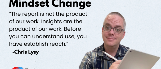
Never before in history have we had so many tools and channels we could use to deliver research and evaluation insights directly to people who could actually use them. And yet, most organizations …
Virtual Community of Practice: Quick Launch Guide
Summary: This guide will walk you through five steps for launching a simple but effective virtual community of practice. Running a successful Community of Practice can take a significant amount …
Continue Reading about Virtual Community of Practice: Quick Launch Guide →
How to Create a Logic Model in Canva
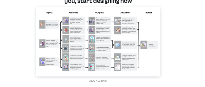
Summary: You don't need fancy tools to create basic logic models. In this post I'm going to walk you through the visual creation of a logic model. If you want to learn more about developing the …
Continue Reading about How to Create a Logic Model in Canva →

Canva Free, Canva Pro, or Canva for Teams?
Is it worth upgrading your Canva Free account to Canva Pro? Is Canva for Teams a different thing? Is Canva Pro really free for Nonprofits & Schools? Updated March 10, 2025 So if you read …
Continue Reading about Canva Free, Canva Pro, or Canva for Teams? →

Canva Slide Decks and Slide Docs
For the past 5 or so years Canva has been my go to tool for all sorts of everyday designs. This includes the presentations that I used to design in PowerPoint. Why Canva? Because I find the …

How to open a PDF in Canva (3 simple ways).
Did you know that you can open a PDF using Canva? For years and years, the PDF has been the status quo way to share any kind of research or evaluation report. I think that's changing a little as …
Continue Reading about How to open a PDF in Canva (3 simple ways). →

How to Use Icons in Reports
Icons can be a really easy and effective way to illustrate reports and visualize qualitative data. In this post I'll share some examples, give you some icon use tips, and talk about some specific …

How to create dot plots, violin plots, and beeswarms, the easy way.
In this video I'll show you step by step how to use a tool called Flourish to create beeswarms, dot plots, and violin plots. While you can create dot plots in Excel, this is definitely my preferred …
Continue Reading about How to create dot plots, violin plots, and beeswarms, the easy way. →

How to create a simple qualitative spotlight infographic with Canva
In this video I'll show you step by step how to create a simple spotlight graphic. This can be a really easy way to illustrate interviews in qualitative reports. This particular graphic was created …
Continue Reading about How to create a simple qualitative spotlight infographic with Canva →

How to create an annotated column chart with Excel and Canva
In this video I'll show you step by step how to create a simple infographic. We start with a column chart in Excel (a.k.a. bar graph or bar chart) and then bring it into Canva for …
Continue Reading about How to create an annotated column chart with Excel and Canva →

What is Card Sorting? UX Methods for Data People
Card sorting is a user experience research method useful in discovering how people organize and prioritize different topics. The method is pretty simple. You start with a set of topics on …
Continue Reading about What is Card Sorting? UX Methods for Data People →