
I drew this one with just the sillyness in my head, but then I thought more about it. I think presentation white space is the banter you have with your audience at a time when you could be presenting. And the quiet moments, the pauses, and any time spent laughing together. Those moments do indeed […]
Articles
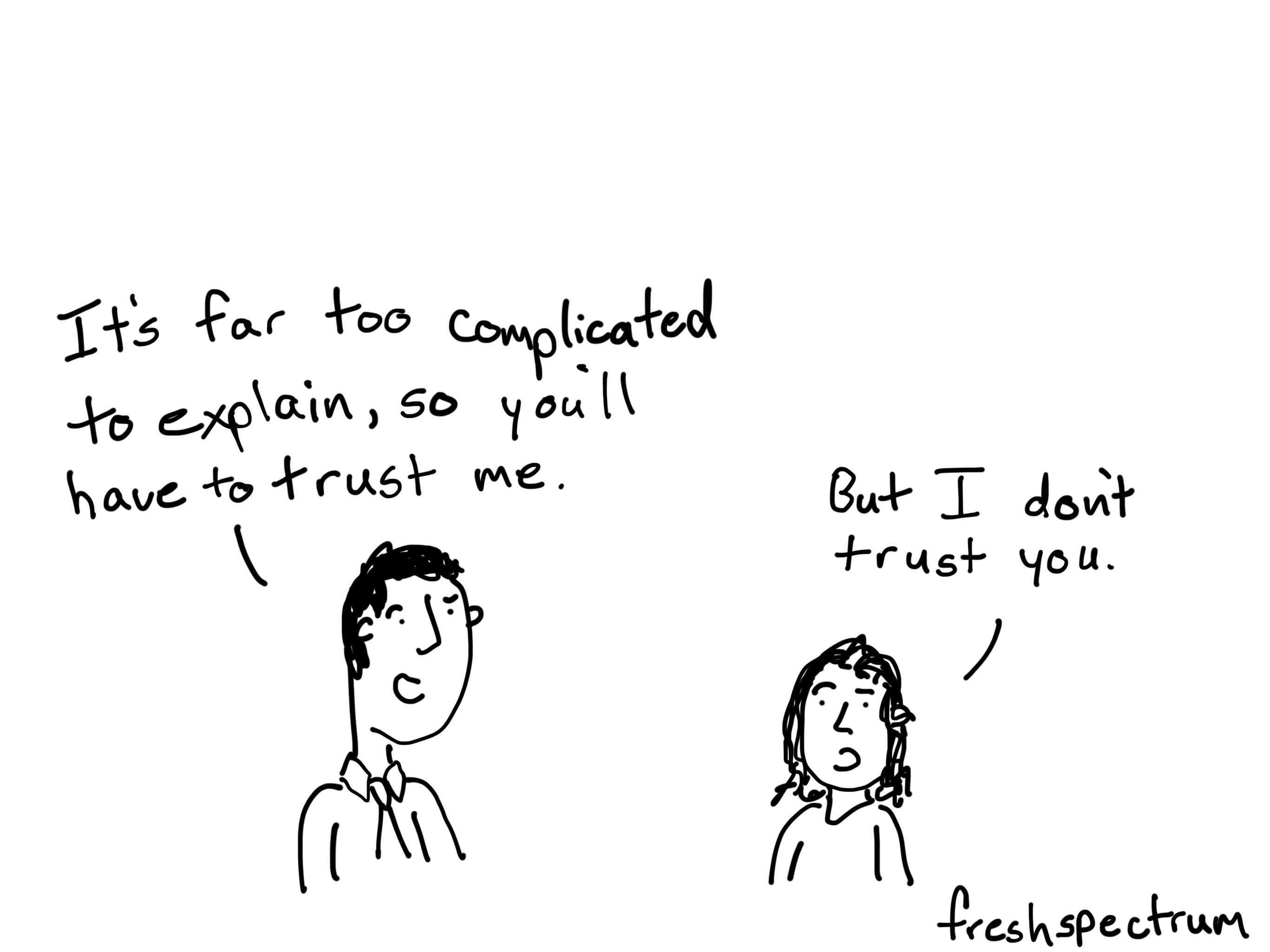
Hey academics, people don’t trust you.
A guest post (by William Faulkner, João Martinho, and Heather Muntzer) put up on my friend Stephanie Evergreen’s blog sparked a big discussion in the comment section. I’ll paraphrase a little… Stats People – You don’t understand anything. Confidence intervals really stand for blah, blah, blah, blah, blah, blah, blah, blah, blah. So this is […]

Speaking Developer, inspired by @wesadvance
This cartoon was inspired by developer Wes Vance of Apollo Studios. I asked him to explain one his biggest challenges working as a web developer. He answered with the challenge developers face in talking tech with their clients. It helped inspire the above. The client won’t know unless we teach them. It’s much easier to […]

Evaluation after the parade, inspired by @jasonravitz
Jason Ravitz, who is an Evaluation Manager for K-12 Outreach at Google, got in touch to offer an idea that inspired the cartoon up top. What do you think of my attempt? Here is his original suggestion, do you like any of his captions better than the one I chose? KEY IDEA: Evaluation should be […]

The Evaluation Soup Assumption
I created this video for one of my workshop modules. I always liked the soup metaphor when talking about the differences between summative and formative evaluation. With this video I tried to take it one step further.

Creating an Interactive Infographic
So my latest diydatadesign module focuses on creating an interactive infographic using a free easy-to-use web tool called Adobe Spark. For the example I decided to create an evaluation related infographic featuring 5 of my favorite evaluation cartoons. I thought you might appreciate it so I’ve shared it below. Interested in learning how to do it […]