
Researchers and evaluators have developed some bad reporting habits. This post seeks to dispel some of the myths that keeps those bad habits thriving. In today’s post: Myth #1. Your final report should be 8.5 by 11 (or A4). Myth #2. Illustration is not required. Myth #3. Your report can serve all audiences. Myth #4. […]

Data Storytelling starts with Data Story Finding
You may have heard a data expert or two talking about data storytelling. But before you can tell a story, you need to find a story. This post walks through some strategies on how to do just that. In today’s post. The Graph is NOT the Story. What is data storytelling? Being able to find […]

How to edit a PDF graph.
In this post I am going to show you how to edit a vector based PDF graph. You’ll also learn why you might need to so such a thing and how to discover if your PDF graph is indeed vector based. In this post: First, a little data backstory How I turned this graph… …into […]

What is a Slidedoc?
Slidedocs are versatile reporting tools that are an almost ideal format in the visual heavy digital world. In today’s post. What is a Slidedoc? What is a Slideument? Is it the same thing? The advantages of creating a slidedoc. The disadvantages of creating a slidedoc. Tips for Creating Slidedocs A few example Slidedocs. Shortcut: Creating […]

How to report on the web. My Splash Model strategy.
Today’s post outlines a modern reporting strategy that I call the splash model. In today’s post: A recap, why it’s time for a strategy change. Avoiding the Social Media time suck. Your big three audiences. Big splash content. Byproducts and adaptations. Serve the 1st tier first. Then serve the 2nd tier. 3rd tier by extension. […]

Slide Style Infographics – 4 Takeaways [and a free-to-watch workshop session]
Have you ever created an infographic? No? Why not? Infographics can be a fun way to deliver information to different audiences. They can also be really easy to put together. Yes? Which type? There are all sorts of different infographic styles and formats. Today’s post features highlights from one of my pro workshop sessions. During […]

Stop Reporting Like it’s 1999
Today’s post is a reflection on contemporary reporting, and how for many organizations, it looks almost identical to the approaches we used in the late 90s. In today’s post: Why I think it’s time to kill the “let’s just stick a pdf on a resource page” information sharing paradigm. What has changed in the digital […]

How to make a pie chart in Excel
This is the fourth in a series of posts on chart design in Excel. In each post we will take on a different chart type. Today we’ll go with a chart that is widely used but often maligned by chart experts, the Pie Chart. What you’ll find in this post: An Oversimplified How To How […]

How to embed Tableau dashboards, without hiding them from Google.
Okay, long story short. If you are presenting to a public audience, don’t just plop the embed code on your website. And if you don’t feel like reading about why, skip to the bottom of the page for how I would suggest you embed Tableau dashboards (and lots of other embeddable things). Short story long? […]
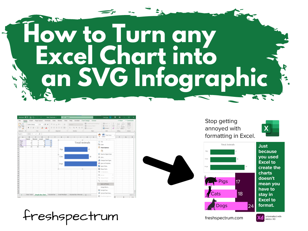
Find Excel Chart Formatting Annoying? Do this instead.
Ever get annoyed with formatting after you create a chart in Excel? It’s pretty easy to create a chart in Excel. A couple of button clicks and poof, there you go, chart created. But if you want to create a chart that actually looks good, you often have to do a bit more work. For […]

What you will learn if you join my workshop.
Just a note before I jump in. The pre-launch discount for my workshop expires tomorrow (9/8) at 12PM eastern. The workshop will never be cheaper! Over the years, when a colleague would take a workshop at a conference, I would ask them what they learned. And then I would ask, “was it worth the money?” […]
It’s not about the charts.
If you just want to create better charts, don’t join my workshop. I have no desire to compete with my friends Stephanie Evergreen and Ann K Emery on fundamental visual reporting and chart literacy. If you just want to code with R or Python, don’t join my workshop. Two suggestions. David Keyes for all things […]