Have you ever heard of social objects? I talk about them every once in while here, but probably not enough given how important I think they are in the spread of information. Social objects are anchors for conversation. They can be ideas, concepts, stories, physical objects, or anything else we can talk about.
My cartoons are social objects. They often leave my blog posts and have lives of their own, traveling around anchoring presentations and lessons on different evaluation concepts. A good cartoon can give a group of people something to talk about.
Cartoons are not an easy thing to get into for most data folk. So it’s good that charts, infographics, quotes, and long boring pdf reports can also be social objects. I came across a clear example of this just the other day.
Brown Professor Suspects Majority of His Class Used AI to Cheat
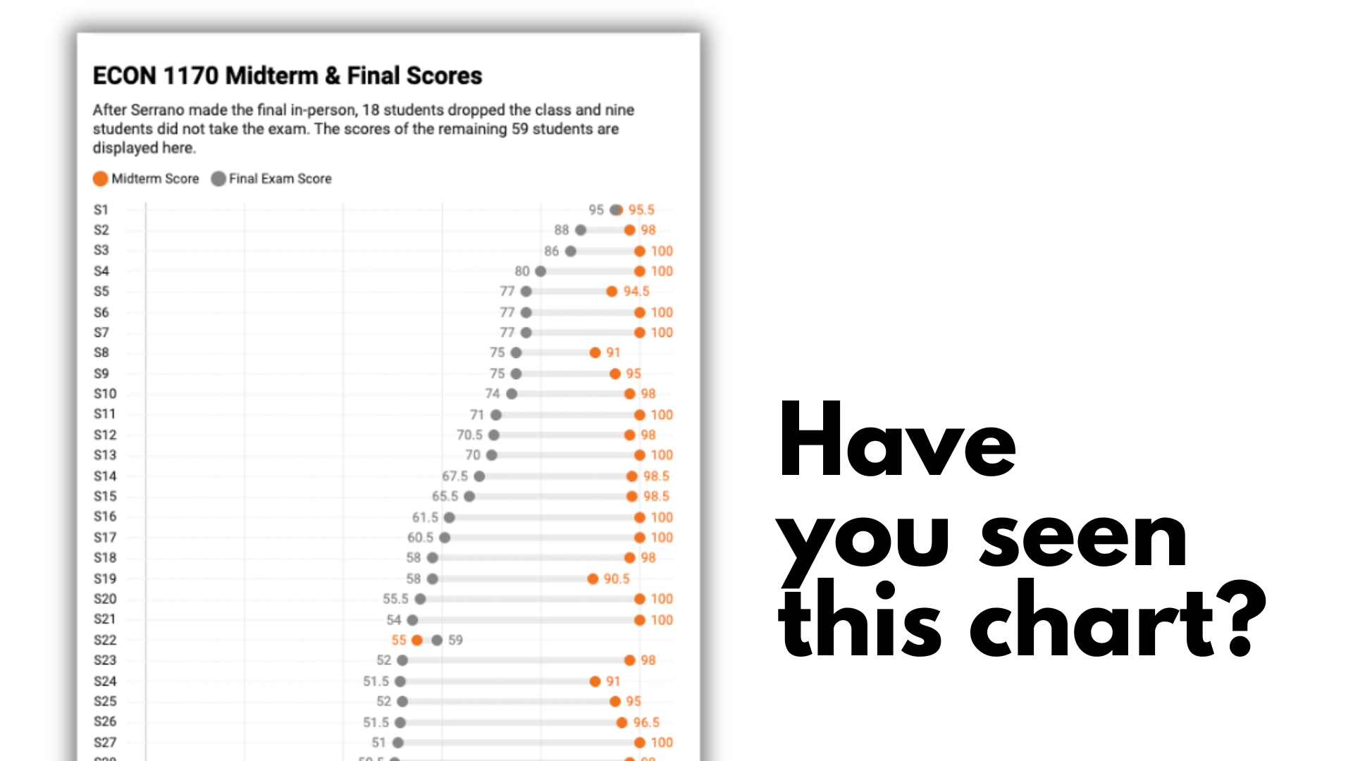
This chart popped up in LinkedIn feed just this past week. In short, it comes from a story about how an Econ professor allowed his students to do their “closed book” midterms at home and they did really well. Too well…
So the professor had them take the final in person. A bunch of students promptly dropped the class. For the rest, almost all of them did worse on the final than the midterm. The differences were stark.
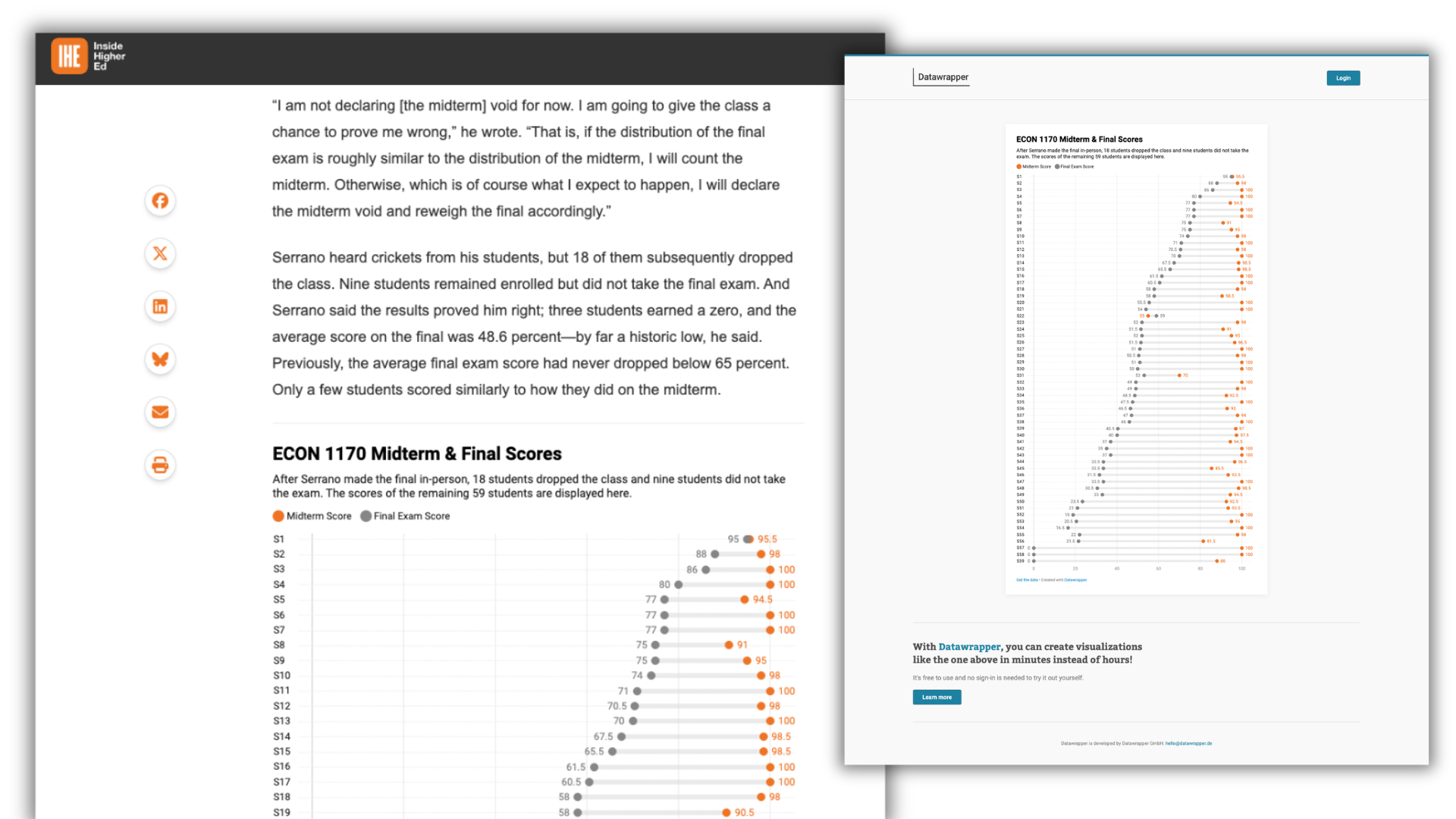
The professor then brought it up with admin at his school, who didn’t jump into action, so he brought it to the press. The chart that has been spreading comes from this Inside Higher Ed story written by Emma Whitford. It’s a dumbbell plot that shows all the students scores who took both tests created with datawrapper.
Lesson 1. A good chart can become a fantastic social object.
A simple reverse image search in Google can give us a sense of how far this image spread. It won’t give us a complete accounting as it’s capped at about 300. But we can confirm that this chart has been shared at least 300 times. Likely lots more than that.
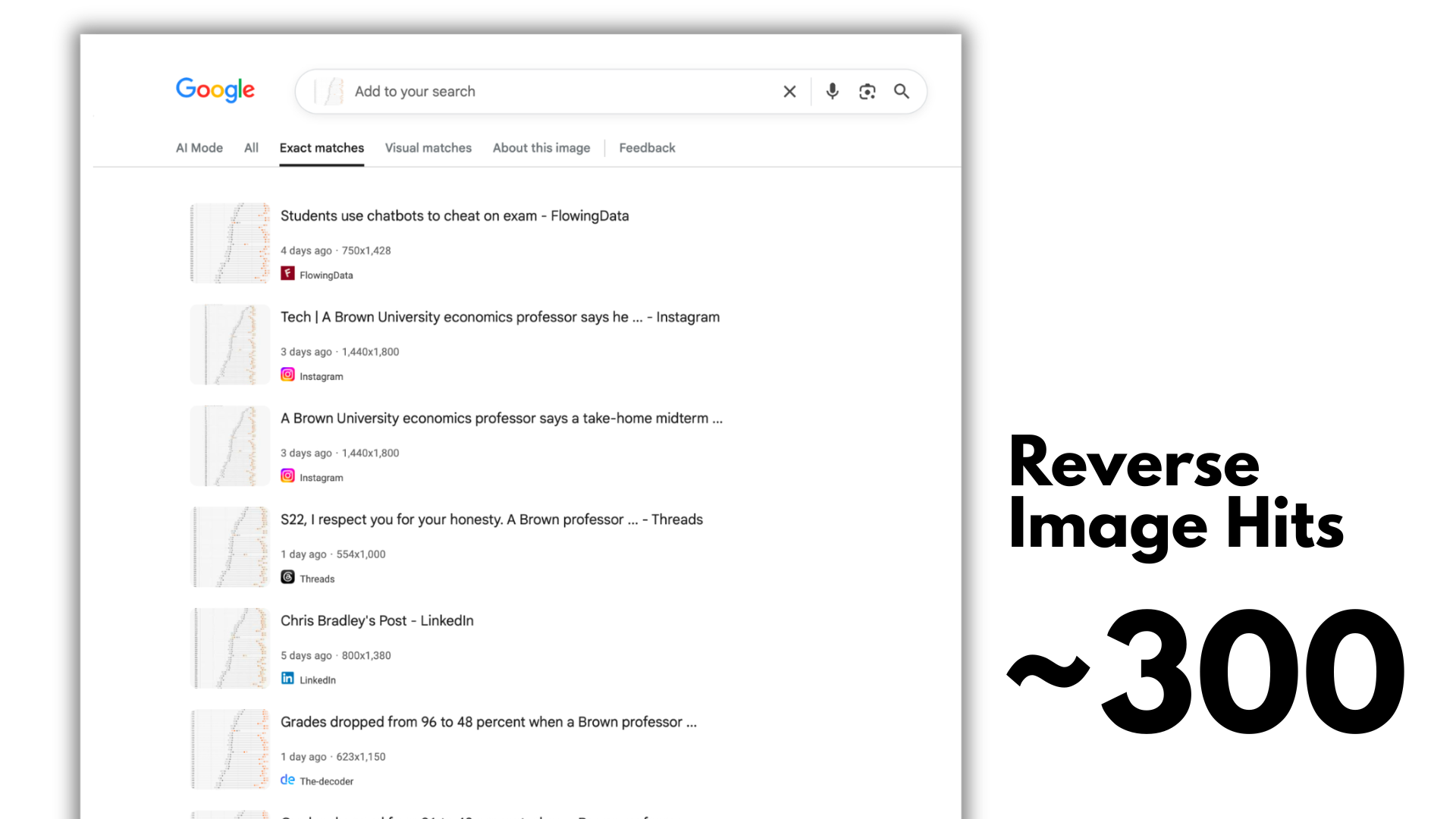
We can see further evidence just by Googling the headline or the title in the chart. You can try it yourself, just do a Google search for “ECON 1170 Midterm & Final Scores.” It’s not just simply people sharing the chart. You’ll find bunches of articles, social media posts, and even videos talking about this story.
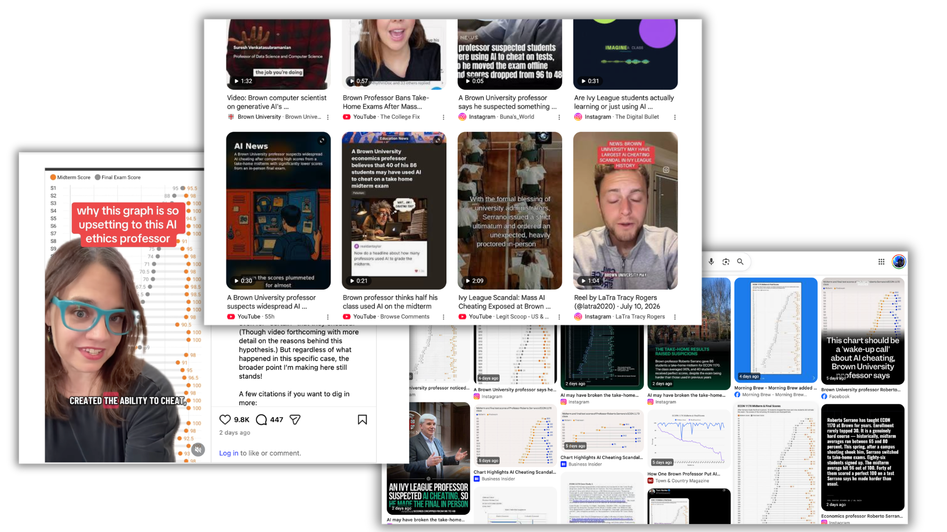
Lesson 2. The Chart IS the secret ingredient to the article’s success.
You might think that the story itself was the reason this article went viral. But here is a bit of extra context that sets this whole thing up as a kind of natural experiment.
The IHE article was not the first article about this. That article went live on July 8, 2026.
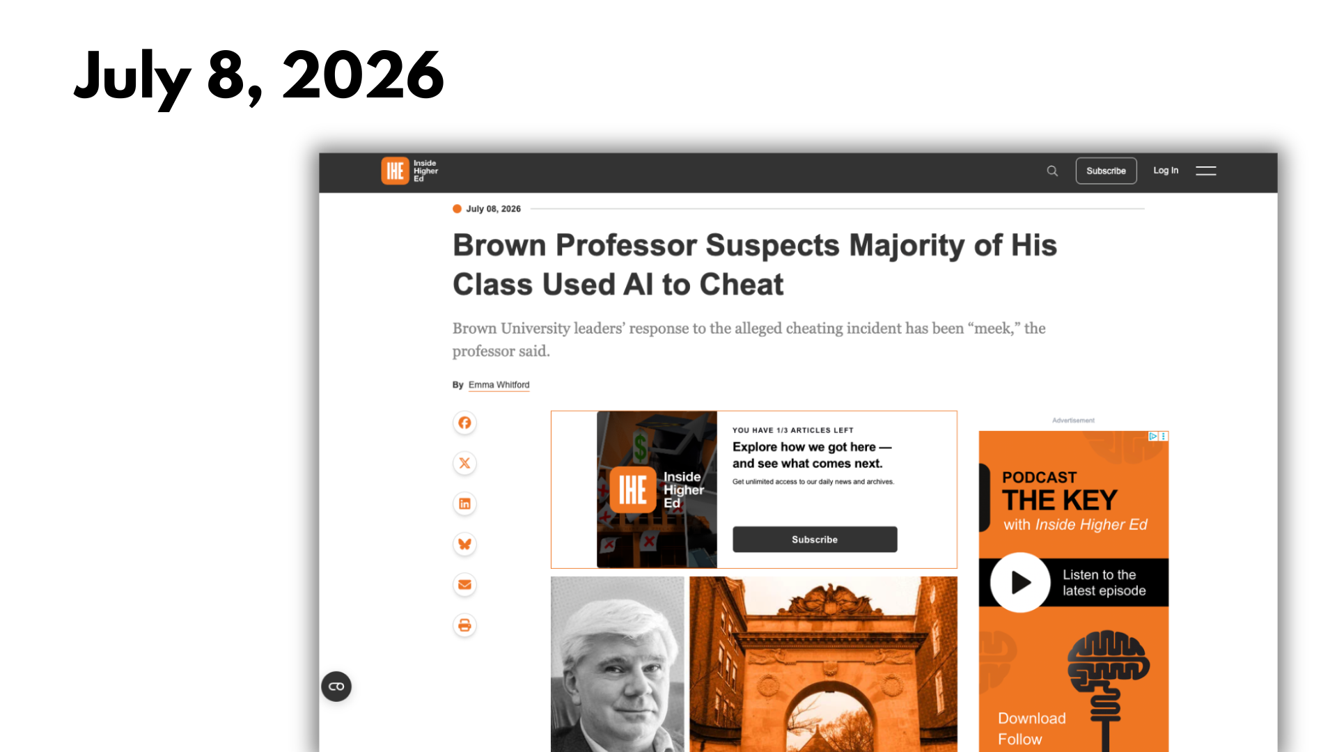
The same basic story was first published by Spanish newspaper El País on June 27 (Spanish Version) and June 28 (English Version). This is Spain’s top newspaper with a much greater reach than IHE. Only three newspapers in the US have a higher readership.
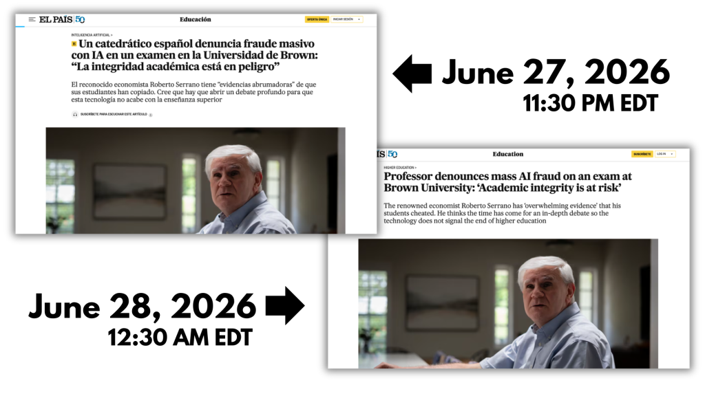
This article had photos (and a PDF copy of the actual Midterm). But it didn’t have a chart. Instead, it shared the data in a paragraph using descriptives.
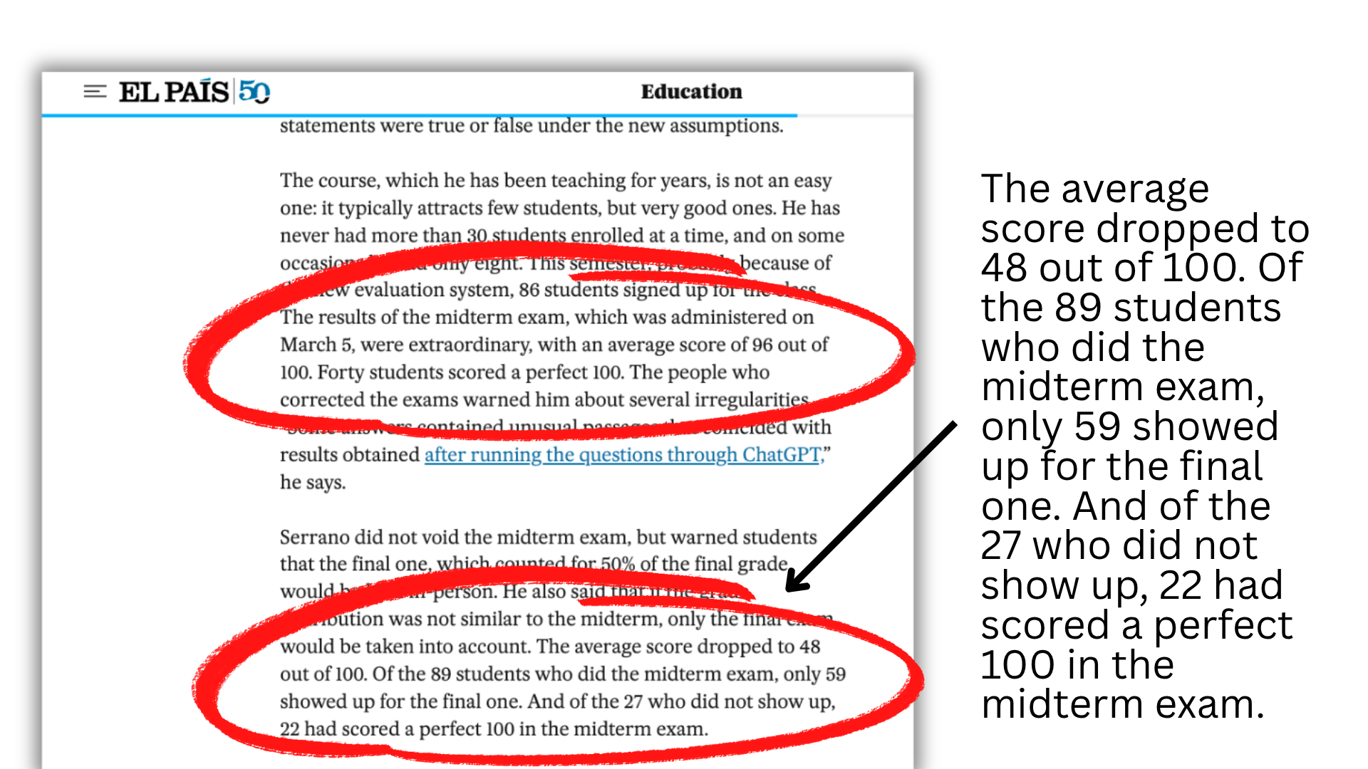
Additionally, the chart was NOT the featured image in the IHE article. A featured will often show up in a feed when someone shares a link. With both the IHE article and the El País article, the featured image is just a photo.
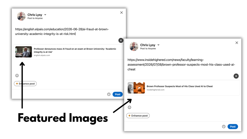
Just like with the chart we can get a general sense of reach just by using a reverse image search in Google with each of the photos. And what we discover is around 65 results for each one, not even close to the 300+ we had with the chart.

Lesson 3. This chart was not designed to be viral.
There is a lot of data viz guidance out there about adding descriptive headers and clear annotations. But if the data tells a good story, the extra text doesn’t really matter as much as you might think.
Look at the full chart. Notice that it doesn’t say anything about AI. It doesn’t mention the school. It doesn’t even note that this chart comes from an Inside Higher Education article. The only attribution is from Datawrapper. And neither the Datawrapper link or the downloadable data linke back to the source.
But none of that stopped this chart from spreading. This isn’t like one of my cartoons that you can simply right click save. This chart was embedded in the original article. The way it becomes a sharable image is for someone to use screen capture. And if you screencap this chart it loses its link to the Datawrapper page as well as the underlying data.
This chart was built to provide context inside the article, with the idea that it would be accompanied by the appropriate context you get from the written pieces of the story.
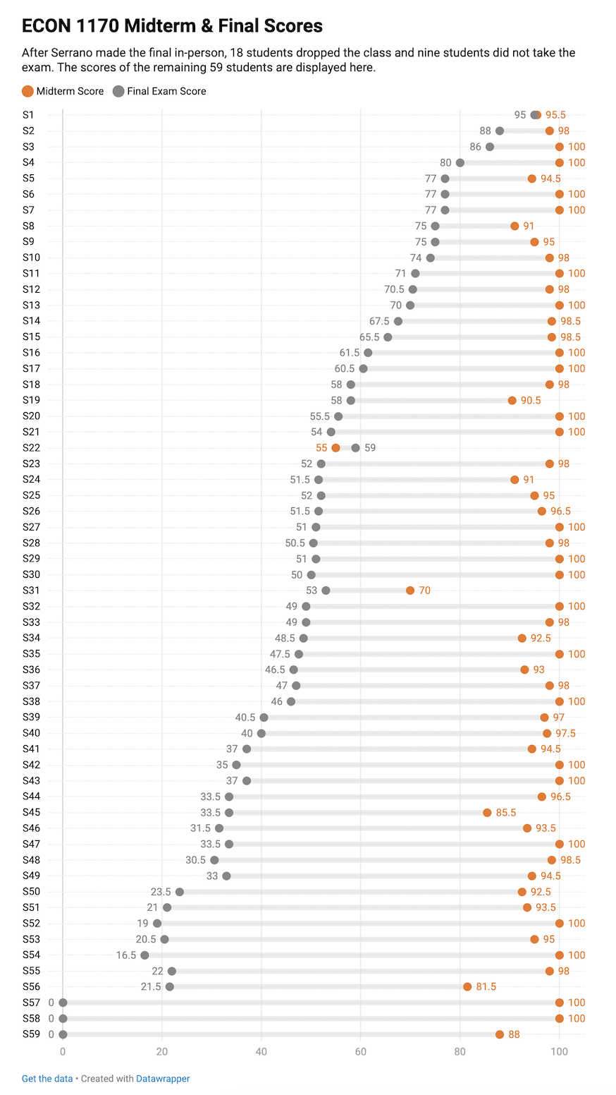
4. This is how a chart can leave its past behind and start its own life as a social object.
There are lots of my cartoons that get used by people who would likely have never read the original articles the inspired the cartoons. Most of my best comics are illustrations of concepts I talk about in blog posts. But the more they get used, the more they become their own things. It’s why I always make sure I sign my comics with my website, so when gets detached there is still a way for people to find their way back to the source.
This chart is already showing signs of the disconnect.
First, anything you see on Social Media likely comes from a screenshot of the original chart. So the metadata is disconnected.
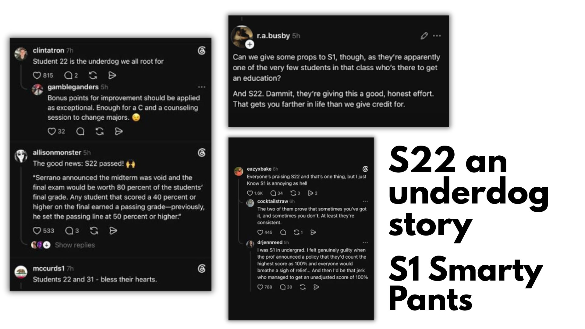
Second, there is a meme-worthy story in the data that is totally separate from the underlying analysis in the article. That is the plight of Student 22. The only student who had a better final grade than midterm. Honorable mention to Student 1, the top student who did amazing on both tests.
Bonus Lesson 5. Beware of Copycats
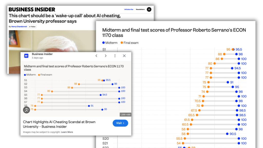
This is just an aside, but there is also a Business Insider article. It took the data directly from the IHE post (and sourced it in its own branded datawrapper chart). It even adapted the chart for social media and reshared as if it’s original work.
When capturing screenshots for this post, I even got paywalled by Business Insider from seeing it anymore.