So by now, you might have guessed that I really like Canva.
Usually I consider myself to be software agnostic. I’m always on the lookout for the best tool for the job. But the thing is, now-a-days, I find that I’m just almost always in Canva. It’s just made my designer life that much easier that I find myself always using the tool.
- Infographics > Canva
- Social Media Images > Canva
- Reports > Canva
- Videos > Canva
- What about Logic Models and Theory of Change? I’m pretty sure you can guess.

In today’s post.
- A rundown of creating (and adapting) a basic results chain logic model using Canva.
- A rundown of creating (and adapting) a basic theory of change using Canva.
- A rundown of creating (and publishing) a web-based interactive logic model using Canva.
- A couple of Canva templates so that you can start where I finished.

Guides for developing logic models and theory of change.
Just in case it wasn’t obvious, this is not a guide on how to fully develop a logic model or theory of change for your program or organization. There is a lot of hard thought work behind the scenes that goes into developing models beyond the finished diagram.
- Here is a UNICEF Methodological Brief written by the amazing Patricia Rogers – Theory of Change
- Here is a well-loved guide (created in 2004) from the W.K. Kellogg Foundation – Logic Model Development Guide
- This one is for those who want the CDC Approach to Creating Logic Models
- If you want an overly simplified approach, I created a guide – How to create a basic logic model [activity book]
- Or perhaps you would like to create a Theory of Change using guidance from NCVO – How to Build a Theory of Change
Now that that’s out of the way, let’s jump to putting the metaphorical pen to paper.
A Simple Results Chain Logic Model – Example from the W.K. Kellogg Foundation

Okay, so as a starting point I’m going to use this example logic model found in the Kellogg Foundation logic model guide.
Recreating the Logic Model using Canva
When it comes down to it, most basic logic models are really simple to design. It’s just a bunch of shapes, arrows, and lines. This is so many people just end up creating these things in Word or PowerPoint. Because it’s easy enough to do.

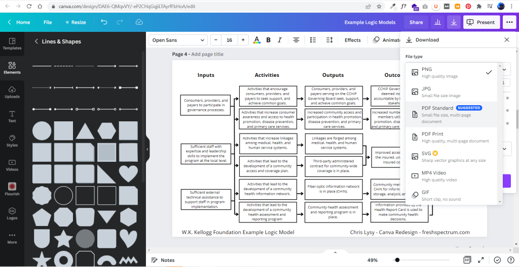
So that’s where I started. I’ll just replicate a logic model from the guide using shapes and text boxes.

It didn’t take too long to create something that looked really similar to the original. And because it’s now in Canva, I have a lot of download options. If I just want an image I’ll usually download as PNG. If I want something printable, then I’ll download as a PDF Standard.
Adapting your Canva Logic Model
The nice thing about Canva is that it’s pretty easy to duplicate and adapt your logic model, trying out different styles. I find the outline boxes to be a little visually jarring. So instead I replaced the outline boxes with some solid color light gray boxes.

The shapes exist separately from the text, so you just insert the rectangle and send it to the back to set behind the text blocks. If you spend a lot of time moving the boxes around it’s a good idea to group the individual text/shape pairs.

Color coding the logic model.
Once you have the base shape and text there are all sorts of alterations you can do to the design. I know there are a lot of evaluators who like to color code different elements. That’s certainly simple enough to do.
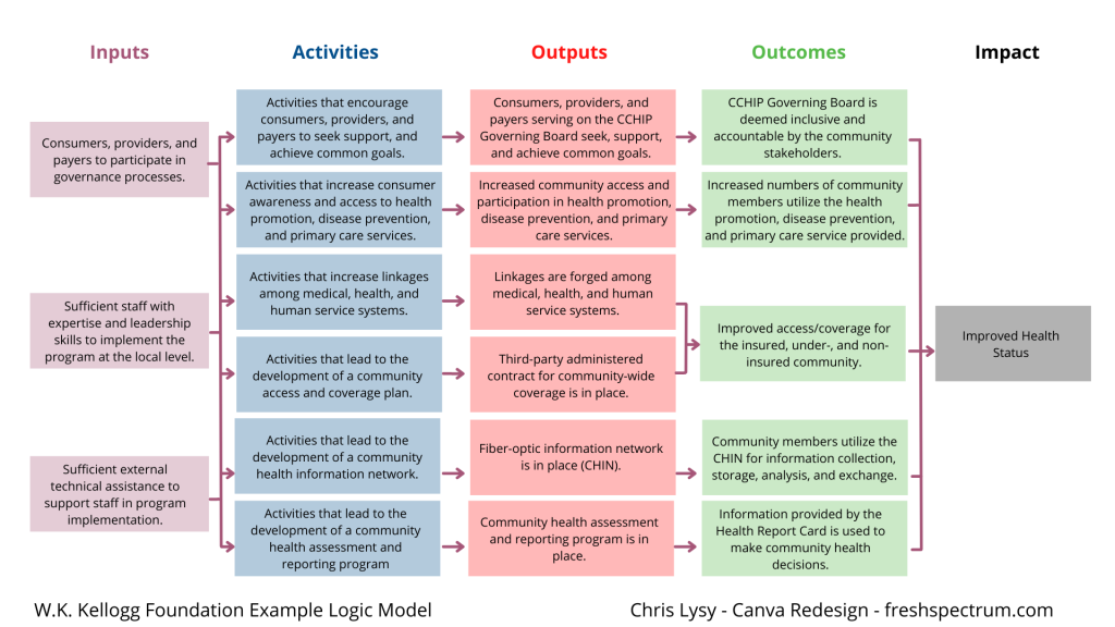
Occasionally you’ll want a softer color, especially for background elements. One way to do that is just make the boxes slightly transparent.

Photo annotating the logic model.
If you find yourself creating a lot of different logic models annotating with some photographs and background elements can really help you to differentiate. Especially if the photographs pair well with the actual project. I created this corny version with just some Canva stock photos.
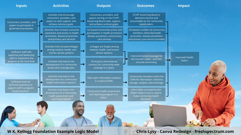
I use a Canva a lot, so I’ve made the investment in a pro account (~$10/month at the time of this post). Given the amount of stock content I use and the bonus features, this is well the worth the subscription cost. One of the features I like to use is the background remover. It’s a nice way to make certain stock images fit almost anywhere.

Coding Logic Model Elements
If your logic model is still being developed and fine tuned it can be a good idea to code the individual blocks. This makes it a lot easier to talk about individual elements.

For this I just shrunk the text and offset it to the right of the gray boxes. Then I darkened the side to create a space for codes.

Icon Illustrating your Logic Model
My favorite way to adapt a logic model is to simply icon illustrate the individual elements.
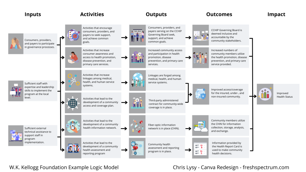
Just move from element to element looking for icons that somewhat illustrate each block of text. There are all sorts of icon styles available within Canva.

A Simple Bottom Up Theory of Change – Example from NCVO
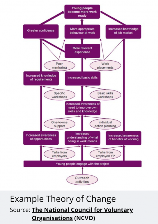
Okay, so maybe you are less of a logic model person and more of a theory of change person. Let’s do the same thing we did for the logic model with this NCVO example theory of change.
Recreating the Theory of Change using Canva
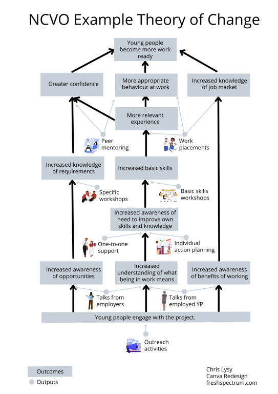
This starts off just like the logic model. Just recreate (or create) your theory of change using Canva shapes and lines.

Adapting your Canva Theory of Change
For this one I am only going to icon illustrate. But I’m also only going to icon illustrate the outputs (not the outcomes). I find collections of different shapes to be just a bit dull, so I replaced the ovals with icons and little circles to anchor the arrows. It’s a really simple tweak but the whole theory of change feels more open to me now.
Turning our Results Chain Logic Model into an interactive web page using Canva
A few years ago I created a prototype of an interactive logic model in a prototyping tool called InVision. I then recreated the same prototype as a PDF. But recently Canva has rolled out a Beta version of a website builder. So since I already had a logic model created I thought I would try adapting it into an interactive.
So that’s what I did, and you can check it out by clicking this link.
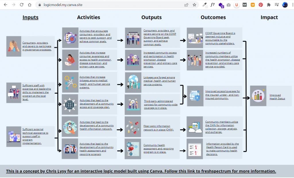
A little bit of copy and paste and poof, now I have an interactive logic model. The goal of this tool is to create a way to walk a reader through the model, piece by piece. This creates ample space for additional context and conversation that just won’t fit in a traditional model.

Not only can you publish your design to a canva site domain for free, you can also purchase a fresh domain or publish to an existing domain you own.

Want to start where I finished? [Templates]
No need to start from scratch. Now that I’ve created some basic templates, you can start where I finished.
Step 1. Before you click on my template links below, visit Canva.com and log in to your account.
If you do not have a Canva account, sign up for one (it’s free!). If you are not logged into a Canva account you will not be able to open the template links appropriately.

Step 2. Now that you are signed in, follow one of the template links below to create a copy inside your own Canva account.
Here is a link for the Logic Model Starters template.

Here is a link for the Theory of Change template.
Step 3. Tweak away, it’s on your account now.
If Canva says you need request my permission, go back to step 1. You should NOT need my permission to use the template links. Also make sure you are logged into Canva on your computer’s default web browser.

I never thought about using Canva for LMs and TOCs. I would definitely take advantage of a one-day workshop on this.
Thanks Ebony, I’ll keep that in mind 🙂
Thank you for creating and sharing these templates!
You are very welcome 🙂
Yes, but no but….:-)
Symmetrical ToC are by definition suspect, prioritising (intentionally or unintentionally) aesthetics over accurate and evaluable modelling of a change process.
ToC design choices need to weigh communicability (=simplicity) against evaluability (=detail), and all too often communicability dominates
Could you use some less symmetric examples?
Hey Rick, I’ve never seen this particular definition 😉
“Symmetrical ToC are by definition suspect”
Also not sure I agree that evaluability always means detail. Perhaps referencing a good resource would give your perspective more weight.
I know you have loads of expertise (not sarcastic, I know you are an expert). With this post I started with a set of mainstream guidance documents. Could you give me a less symmetric example you think would add to this post?
Thanks Chris – as always, a very accessible step by step with many improvements that are simple, but make a huge difference – like the icons. The process of developing a ToC is as important (or for me more important) than the output – but we often end up spending too much time/energy on the output – the diagram. by your making it accessible with a more visually appealing ToC, we can focus more on on those important discussions of how change happens (or not).
thanks!