
Only a person who is congenitally self-centered has the effrontery and the stamina to write essays. –E.B. White. The same could be said for people who blog. Last year was a shitty year. And in a way, I think I lost my voice. With a return to blogging, I am going to try to find […]

What’s the deal with the Berlin Wall in my coworking space?
The white words on the front of the wall spell out a name. A picture documenting the wall following the fall by Edward G. Murray. When you see the wall for the first time, you would process the heart and guess that the word on top is the end of the word Love! But it’s […]

The Triangle’s Creative Diversity Problem.
I grew up in what was, and what still is, the whitest county in the Baltimore-Washington Metro Region. And to this day every time I leave my North Carolina suburb and travel up to my hometown of Westminster, MD I am jarred by the complete and utter lack of cultural diversity. The question about how […]
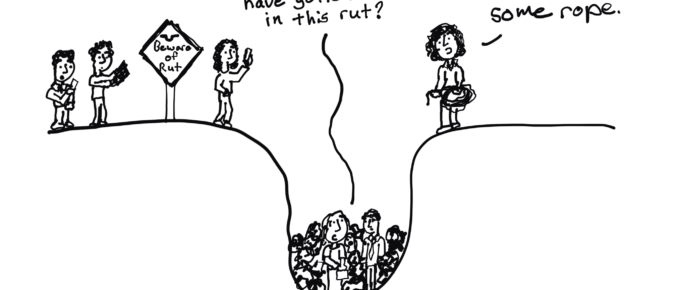
Searching for Un-Rut Stuckers
Makers of Change are everywhere. They are the people you turn to when you get stuck in a rut. They are the ones who seem to “get it” when you talk about change. When everyone else runs away from things that are different and new, they run towards it. They are the people who can […]

Why the world needs you to become a catalyst.
Years ago I launched a digital workshop. My goal was to teach evaluators and researchers how to design, based on the challenges that evaluators who design would face. It was exactly how I found success, and built a following, during my own research and evaluation career. The workshop was filled with short courses, activities, and […]
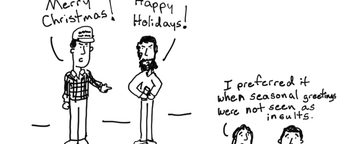
Evaluating Christmas
Anyone else having a Christmas problem? I think there must be something wrong with me. I just don’t understand Christmas, I guess. I might be getting presents and sending Christmas cards and decorating trees and all that, but I’m still not happy. I don’t feel the way I’m supposed to feel. Charlie Brown, you are […]

A Kind of Cartoon Obituary
Two days ago my dad died. But just as I live the rest of my life, I know that there is nothing too serious for cartoons. So here is a set based on the lessons I learned from my dad. It’s not his full story. It’s more a handful of lessons I have taken to […]

Touching the Brain, Welcome to the Age of Engagement
So back in 2016 I was provided the opportunity by the awesome Visitor Studies Association to deliver my first ever keynote. If you ever get the chance to hang out with a bunch of Museum evaluators, you should. They are cool people. Out of all of my presentations, I think it was one of my best. In […]

Data Visualization Lessons from a Bad Chart
My favorite bad chart sat nearly undisturbed for years in the kitchen cabinet of my former workplace. It was an almost ordinary looking bar chart adorning the side panel of a big yellow box of Lipton tea. It was the kind of chart that would be overlooked by most, but for some reason it always […]

Last Minute Presentation Design
So you did it again. You had months to draft your story, create your slides, and practice your talk. But here you are, a few days away from the big moment and not even close to ready. But don’t worry, all is not lost. The Assumption So I am going to assume that you have […]

Data Halloween Cartoon Post
Happy Data Halloween Everyone! Which cartoon is your favorite? You can vote by retweeting, just click on the cartoon to be taken to the individual tweet. Zombie Evaluators 3D Pie Chart Jack o Lantern No trick or treating at foundations. Machine Learning Witch Hunt Explaining RCTs to a two-headed monster. Toads are not People, so […]

Learning new things is hard.
I get it. You already know Excel. Tableau is just plain confusing (and annoying, and expensive). I’ve been there. But Tableau can do things that Excel cannot. Like directly weave a bunch of different data sources, living in different databases and on different servers, into the same dashboard. All with automated updates. Or creating a […]