Slidedocs are versatile reporting tools that are an almost ideal format in the visual heavy digital world.
In today’s post.
- What is a Slidedoc?
- What is a Slideument? Is it the same thing?
- The advantages of creating a slidedoc.
- The disadvantages of creating a slidedoc.
- Tips for Creating Slidedocs
- A few example Slidedocs.
- Shortcut: Creating Slidedocs Using Canva
- Additional Slidedoc Resources
What is a Slidedoc?
Slidedocs are visual documents developed in presentation software that are intended to be read and referenced instead of projected.
Slidedocs – Nancy Duarte
Every time I think about slidedocs I get this little tune in my head from schoolhouse rock. “A man and a woman had a little baby.” But instead it becomes, “a slidedeck and a document had a little baby.”
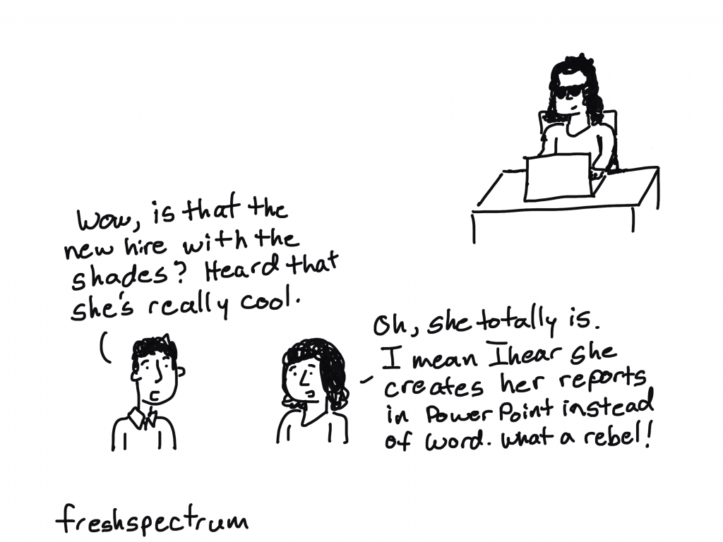
Slidedocs are reports created with PowerPoint. They’re designed to be read, not seen behind a presenter on a stage.
What is a Slideument? Is it the same thing?
So both terms merge two words, slides and documents. But they refer to two different things.
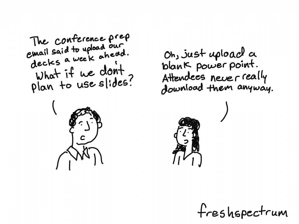
Slideuments, as discussed in 2006 by Garr Reynolds, are by-products of a pretty common conference organizer request. You know when you give a presentation and the conference organizer asks for your slides?
Slides are slides. Documents are documents. They aren’t the same thing. Attempts to merge them result in what I call the “slideument” (slide + document = slideument). Much death-by-Powerpoint suffering could be eliminated if presenters clearly separated the two in their own minds before they even started planning their talks.
“Slideuments” and the catch-22 for conference speakers – Presentation Zen
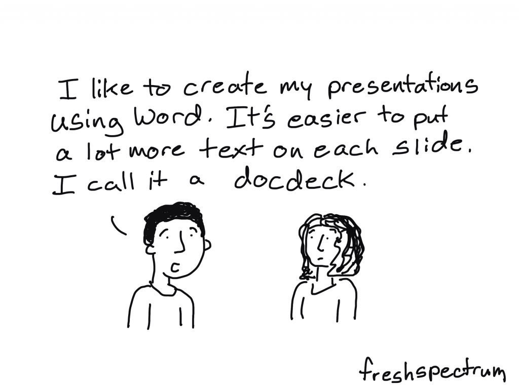
Modern presentation slidedecks are visual and rely on the presenter to deliver the words. So when a presenter gets asked to share those slides, it can make them feel like they need to up the number of words on the slides or else they are just delivering a bunch of out of context images. This results in a bullet heavy slidedeck that is not quite a report and not quite a presentation.
A Nancy Duarte Slidedoc is a type of visual report. It is intentionally created using presentation software and designed to act as a stand alone report. It is not designed as a presentation.
The advantages of creating a slidedoc.
- You probably already know how to use PowerPoint (you don’t need to learn new design tools).
- It’s way easier to work with visuals in PowerPoint than it is to do so in Word.
- PowerPoint is also Microsoft, so software conservative (we only use Microsoft stuff) organizations don’t need as much convincing to try it out.
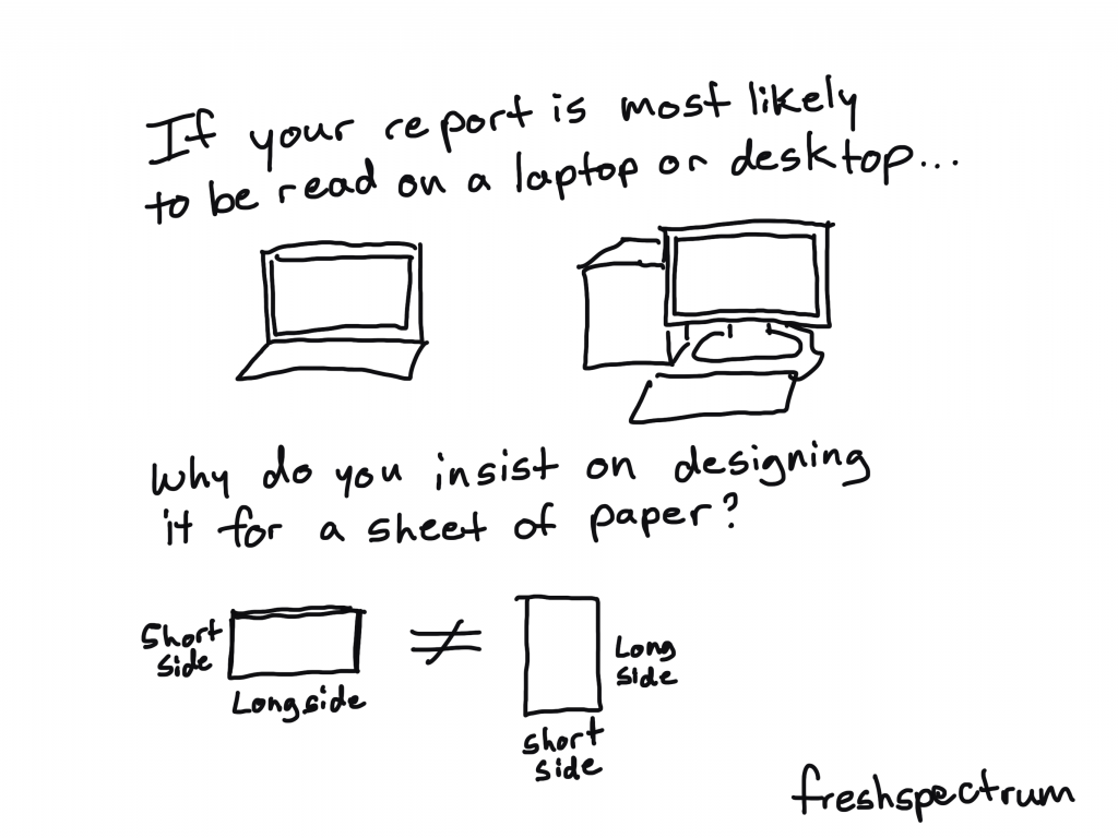
- Presentation decks are wide format and that is a superior format when most reports are going to be read using computer screens (laptops/desktops).
The disadvantages of creating a slidedoc.
- “Track changes” works better in Word than with PowerPoint or PDFs.
- Lots of data people still have issues reporting visually, no matter the tool.
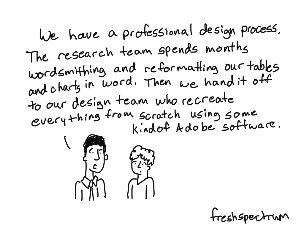
- PowerPoint can be a pretty effective design tool, but it doesn’t match the power of some Adobe Creative Cloud tools.
Tips for Creating Slidedocs
In a Slidedoc, Ann recommends titles that contain the takeaway message. In a slide deck, you can just have the main title. The amount of text for Slidedocs she suggests is full sentences or even paragraphs as it is a report that simply happens to be made in slide software.
Ann K Emery on Data Visualization and Slide Design [Podcast]
Here are some of my tips.
- Think like a presenter. One idea per slide, but share enough text so that it can be read without any additional interpretation necessary.
- Break down confusing slides into multiple slides. It’s better to have more slides that are less confusing than it is to have less slides that are more confusing.
- Just like people skim regular word reports, they skip quickly through slidedocs. Using headers is important (with takeaway messages). If they are interested enough, they’ll stop and read the rest of the text on a slide. But if the page isn’t relevant, they’ll skip it, and that’s okay.
- Use Section Breaks. Break your slidedoc into sections. When each section is about to start use a section title slide. I like to flip the background color for these title slides. It makes the report feel less like one big long narrative.
- Export some of your slides as stand along infographics. One of the benefits of a slidedoc is that your slides are perfect featured image dimensions. So create some pages with the idea that they can be exported as stand alone featured image infographics. These are great for sharing on social.
- Create navigation guides. It’s easy to get lost in slidedocs, so creating a little bar at the bottom of the pages that show which section you are in (and how many sections are upcoming) can be really helpful for your audience.
A few example Slidedocs.
This first example was created by a friend and former colleague, Encompass Senior Communications Specialist, Crystal Cason. I asked Crystal what advice she would give to others considering designing slidedocs.
The key thing for me when helping folks structure their content for slidedocs is to get a really clear outline before going into it. Ideally, if you can “chunk” your information into sections, and then focus on one key message per page (that ideally includes narrative + some visual element), you’ll end up with a really nice end product that users can easily digest.
Crystal Cason

Here is a spread of pages to give you a sense of what it looks like. I really like the way Crystal uses color to differentiate text on the pages. If it were all the same color the pages would like more intimidating. She uses simple section break slides that include these little mini tables of contents. I also really like the section indicator at the bottom of the page.

If you want to see a little more of Crystal’s work, she was also behind this slidedoc and this slidedoc.
The next example is one of my own. When I create eBooks these days I usually opt for a slidedoc format. You’ll see it at play in several of my eBooks including this one on UX Evaluation.

Here is a spread of pages. The format is a really simple repeating structure that features a lot of white space.

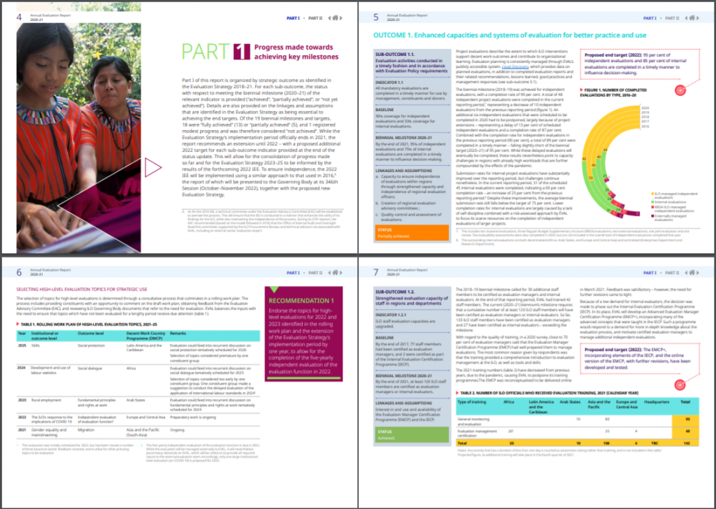
One more example would be this Annual Evaluation Report from the International Labour Organization.

The report feels very much like a well-designed and polished annual report. Compared to the other two examples, this one features a lot more text. But it does feature repeating patterns and more charts/visuals than you would find in a lot of large organization evaluation reports.
Shortcut: Creating Slidedocs Using Canva
My favorite Slidedoc shortcut is to use canva.
Search Canva for presentation templates (there are a ton). I prefer to use the 4:3 presentation format (you know, the old presentation size). You could use the widescreen format, but a 4:3 prints better (if anyone does decide to print the slidedoc).
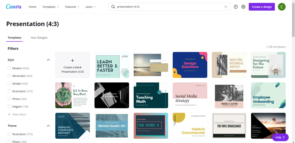
Choosing a template that includes a bunch of internal pages is the easiest way to go.
Since these templates are really designed for a traditional presentation, reduce the font size. People don’t read slidedocs while sitting far away from the screen. You can use 12 point font, but I still tend to keep the headers fairly large.

The cool thing about Canva, is even if you start with Canva you don’t have finish in Canva. You can “share” your presentation as a PowerPoint, downloading it to your computer. If you do this, just remember to check it before sending it forward. Sometimes in the shift from Canva into PowerPoint the formatting will get a little askew.
If you just want something that looks exactly as you create it, you can always opt to download it as a PDF.

Additional Slidedoc Resources
- Already mentioned, but definitely download Nancy Duarte’s Slidedoc on Slidedocs.
- A few years ago Nick Visscher wrote a guest post for Depict Data Studio on How to Write Your Reports in PowerPoint Instead of Word: Nine Tips for Getting Started.
- Speaking of Ann, she worked with then AEA ED Denise Roosendaal for an AEA Vision Slidedoc. They shared a bit about their process in this AEA365 post. DVR TIG Week: Ann K. Emery and Denise Roosendaal on Fonts, Photos, and Colors: Three Techniques that Reinforce Branding

I’m officially convinced! All future reports will be slidedocs. Thanks for the nudge!
It’s inevitable.