This past week the latest edition of New Directions for Evaluation started hitting mailboxes. The issue covers Data Visualization in Evaluation (it’s part 1 of 2). In it you’ll find an article written by yours truly on recent developments in quantitative visualization.
I tried to cover a few things, but the topic that has captivated me the most over the last few years has been interactive visualization. And I mean captivated. I’ve been pushing myself on the technical end so much that I’m technically a Systems Analyst now.
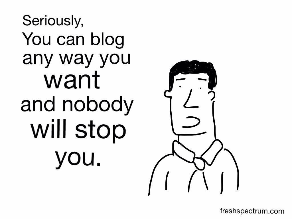
The natural constraints of a paper journal didn’t give me an opportunity to dive into the practical side of the subject, but that’s why it’s nice to have a blog. This post is the first in a series I have planned on data visualization. Call it an introduction to interactivity, hope you like it.
Social Media Makeover
Before we get into interactivity I wanted to let you in on a new idea I’d like to try out. I want to do a few social media makeovers, taking published data sets and PDF reports and reinterpreting them for the social media world. Depending on the set or report, you can expect cartoons, infographics, and interactive visualizations.
I need partners!
If you have a report or data set and would like a little free web dissemination support, here’s your chance. Send me an email: freshspectrum @ gmail .com. This isn’t a standing offer so act quickly.
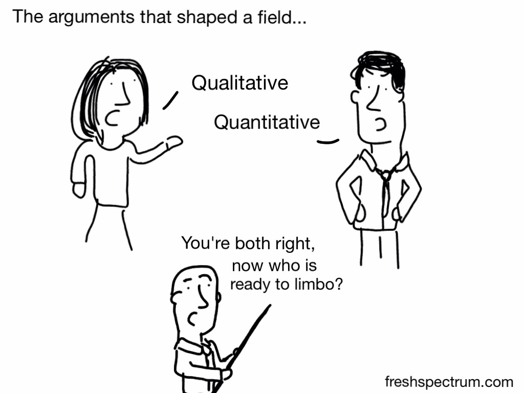
My two requirements; the report must contain good evidence (qualitative, quantitative, whateverelseitative) and most importantly, it must be something you think is really important to share with the world. I’m not looking to decorate junk.
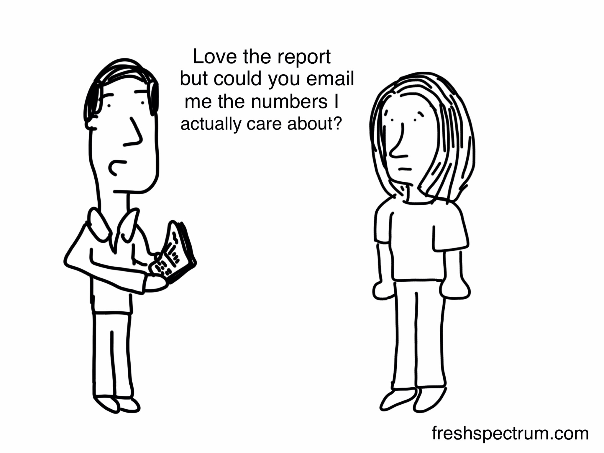
The numbers I care about
What we call a data set is just a collection of individual bits of data. We tend to analyze these bits in aggregate. For all the complaints about 200 page reports, they’re far easier to understand than 2,000 page reports.
But what we should remember, is that often those little bits can have far more meaning than the aggregate when presented to the right audience. Interactivity can allow us to share those bits efficiently and effectively.

Visual Information Seeking Mantra
To call interactive data visualization a “recent development” is a little strange. We can find literature on the subject in the computer sciences going back decades. Just check out some of the academic work by Ben Shneiderman.
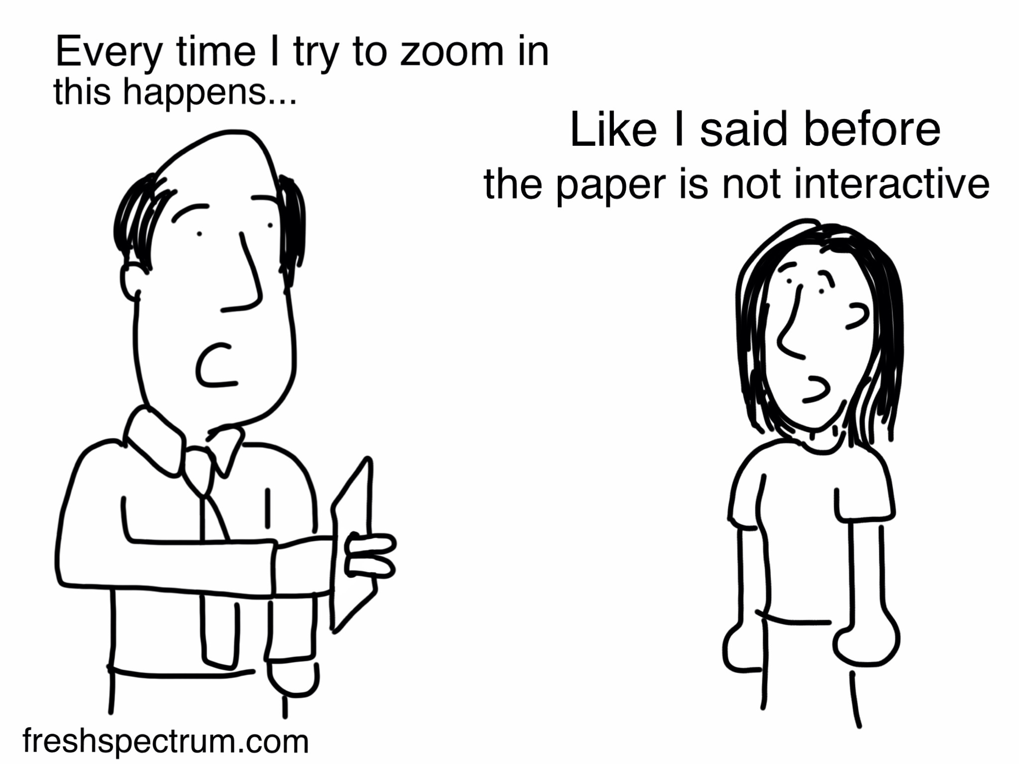
Even though it’s easy to find good examples today, interactive visualization is still a novelty in most fields. I think there are a few reasons for this…

Paper is the default
Technical Manpower
Ben Fry, founder of Fathom Design and the creator of some sleek interactive visualizations, said it tongue-in-cheek in 2011 when discussing one of his major contributions.
Processing seeks to ruin the careers of talented designers by tempting them away from their usual tools and into the world of programming and computation. Similarly, the project is designed to turn engineers and computer scientists to less gainful employment as artists and designers.
With all the demand for good computer scientists and engineers, is a career in data visualization a worthy endeavor?
Interactive visualization requires a mix of expertise in data analysis, graphic design, and programming (at least it has in the past). It’s tough to find individuals with competence across all three. Not surprisingly, the well known design shops tend to work in teams.
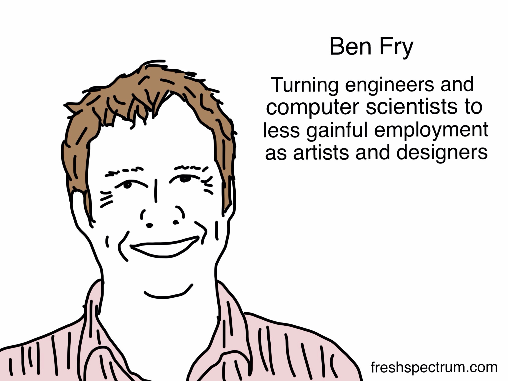
Eyeo 2013 – Ben Fry from Eyeo Festival on Vimeo.
The Web’s Adolescence
We’ve come a long way in these past 18 years since the web went all commercial. But we have so much further to go.
Unlike news media, the ivory tower model has not been turned on its head. The publishing platforms of old are as popular and profitable as ever. Publish or perish has yet to extend to social media.
Social media changes the way we can disseminate evidence, but until web publishing becomes more than a hobby for a relative few academics, we will not see its full potential.

Journalism’s influence
Personalizing the audience
When we write reports we tend to write for “states” or “counties” or “communities” as if they were a single entity. Anyone who has worked with “states” or “counties” or “communities” knows that they are certainly not a single entity.
Interactivity offers a pathway to reach many specific audiences.
A different perspective
I’ve spent a good bit of my professional life staring at data sets, asking questions and running analyses. Playing with data is the best way to understand data. Of course, not everyone is comfortable staring at numbers in a table and asking questions with code.
Setting up your data in an interactive visual format can give your audience new perspective and an opportunity to answer their own questions.
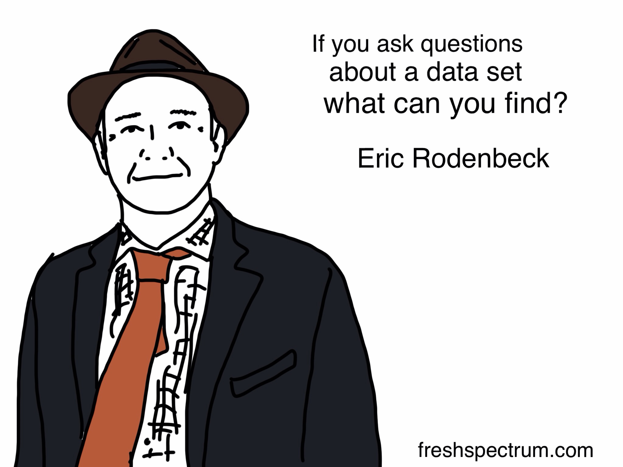
Eric Rodenbeck speaks at TEDx Silicon Valley 2011 from TEDx Silicon Valley on Vimeo.
Practical and Affordable
I believe that interactive data visualization can be both practical and affordable. I hope to prove that to you (eventually).
Earlier on I asked for partners. If you would like to work with me, shoot me an email freshspectrum @ gmail .com.
As always, looking forward to your comments below! And stay tuned for more data visualization posts in the coming weeks.