
Last week I got to hang out with my friend and data visualization rockstar Stephanie Evergreen, who stopped by my company for a day of talks. Her ability to connect with academic audiences is just amazing. At one point during the day I remember turning to look into the crowd and I could just see lightbulbs […]
Articles
Cartooning Every Day
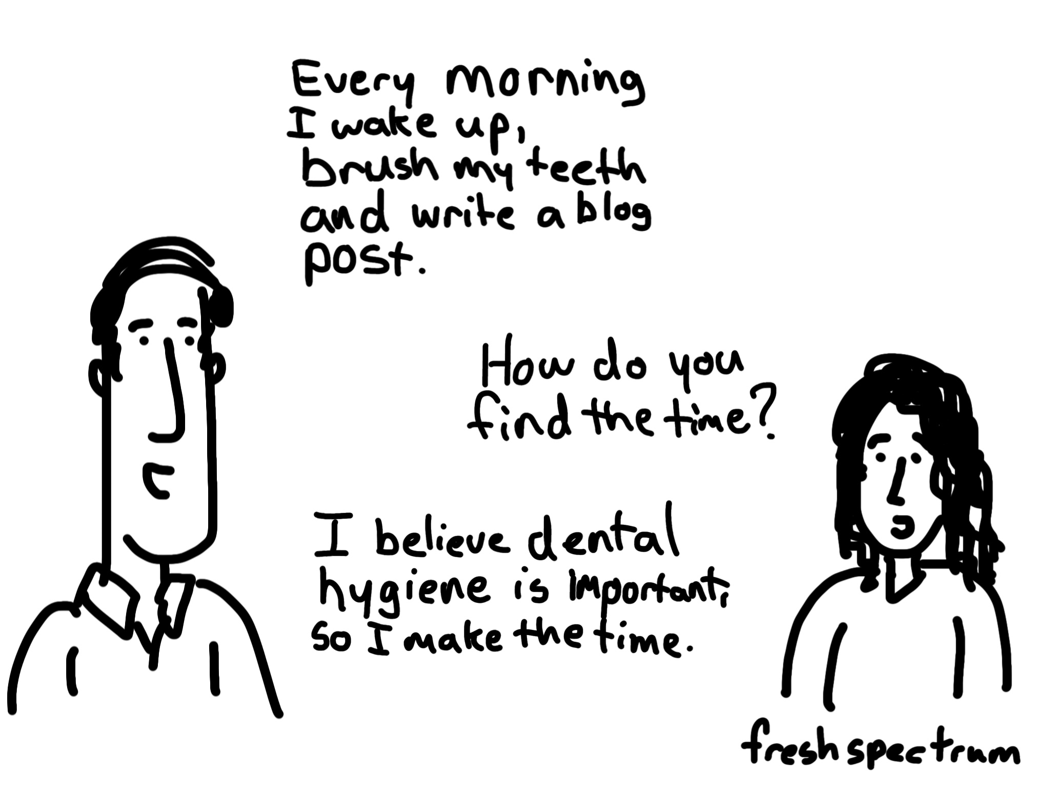
So I know I’ve been quiet lately. You know how it is, something comes up, you overextend and then all of a sudden you are knocked out of a habit. Then once you’re out, it can be really hard to get back in. For me there is only one way out. Cartoon my way! Daily […]

The Future of Data Visualization: Three Predictions
Prior to the holiday season Ann K Emery asked a group of us bloggers to come up with some data visualization predictions for the upcoming year. Here are 3 of my own predictions based on some of the things I already see happening (a.k.a. projections). What are your predictions? Let me know in the comments. […]

Qualitative cartoons from MQP’s latest book
Michael Quinn Patton just came out with the fourth edition of his Qualitative Research and Evaluation Methods book and in it you’ll find 9 of my cartoons. The new cartoons are based largely on a series of ruminations added to each chapter (you can find a few rumination examples over at better evaluation). Today’s post […]
It’s a #dataviz Christmas cartoon post
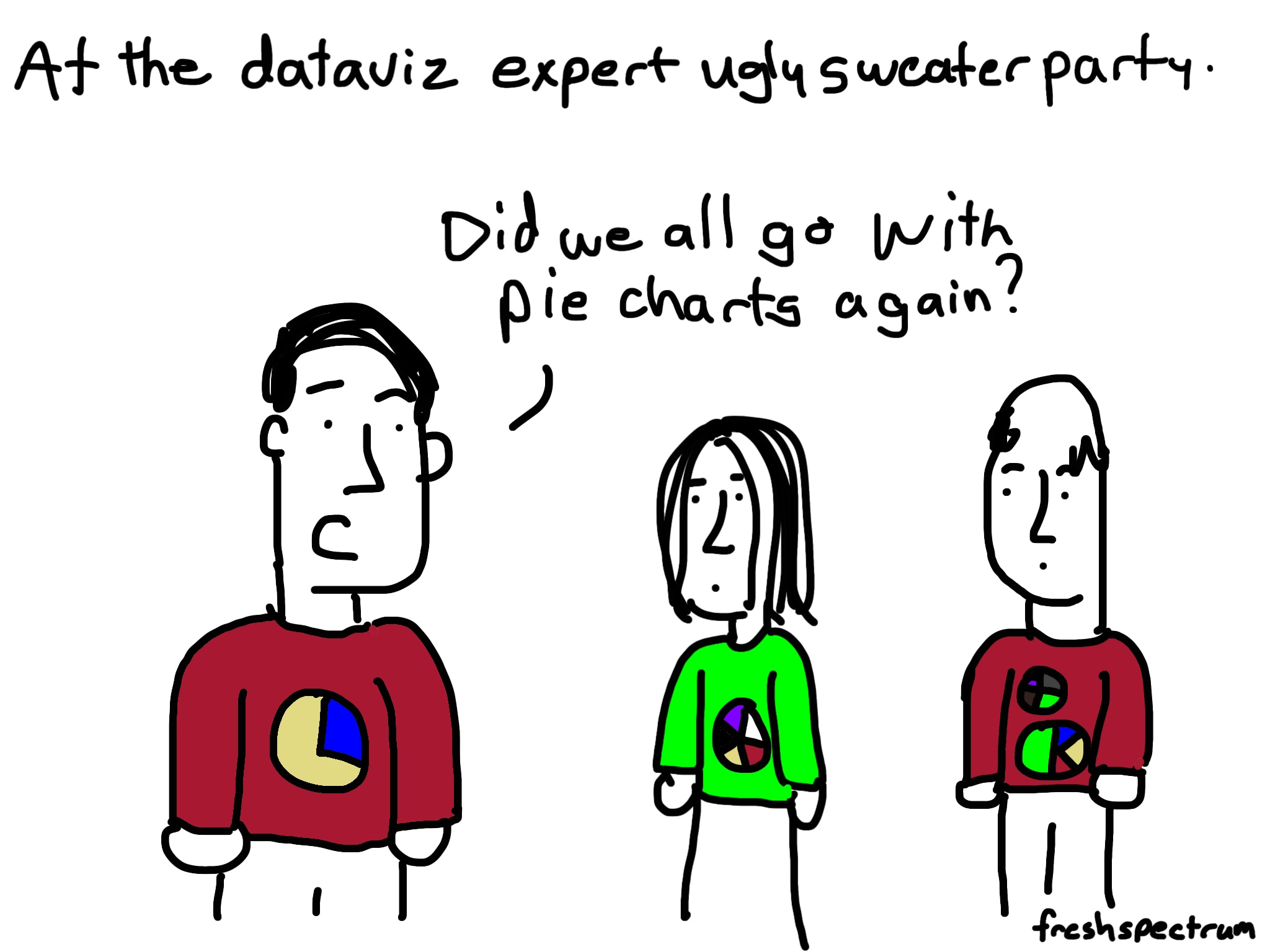
This kind of cartoon post happens when you’re writing about data visualization in front of a Christmas tree. An Infographic to Santa Santa’s naughty list dashboard Dataviz Sweater Party

Thankful for the attention
One of the things I’m thankful for this year… In a sea of competing voices you’ve chosen to listen to mine. For those of you in the US, have a nice Thanksgiving! And for everyone, have a nice week 🙂