This is one in a series of before and after designs. With each post I take a real publicly available resource or report and adapt the writing, format, structure, and illustrations in order to increase the accessibility. You can see other before and after posts in the series by following this link.
How it Started – Building Capacity to Evaluate Child Welfare Community Collaborations (CWCC) to Strengthen and Preserve Families
For this week’s Before and After I was looking for a large federal program evaluation that featured a collection of diverse grantees or program sites. The one I settled on is an evaluation of a multi-year, multi-grantee, Child Welfare project.
This project supports the Office of Planning, Research, and Evaluation (OPRE) in the Administration for Children and Families (ACF), U.S. Department of Health and Human Services, in its work with the Children’s Bureau to advance the evidence around collaborative approaches to preventing child abuse and neglect.
Description from the CWCC project page.
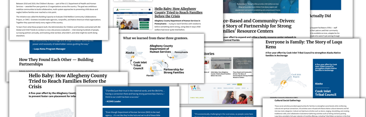
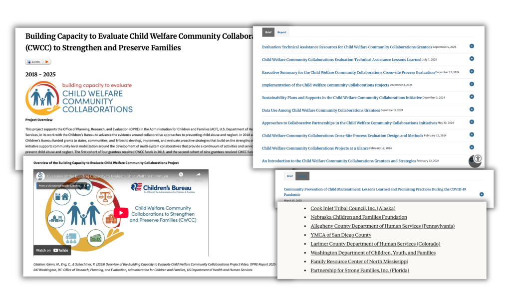
It’s more of a collection of pdf briefs than a singular report. There are ten briefs listed on the main page, each one is about 15-20 pages long. There is a also a single 13 page “report.” Outside of the main page (through claude.ai) I found an additional 8 grantee briefs (again 15-20 pages each). I’m assuming there should be 5 more to cover all 13 grantees but I figured I had enough to get started.
The big problem (it’s more than fragmentation)
Well, first, that’s a lot of briefs. I’m not sure if someone up high told the team they couldn’t share a report over 20 pages and this is just kind of what happened. But it’s really hard to dive into a report when it’s so fragmented. The best place to start seemed to be the executive summary.
They administered 405 interviews across the 13 grantees, so that’s a lot of qualitative data. But the executive summary had ZERO quotes. Instead there were just collective findings, visuals, and summarizations. The same thing with most of the research briefs (although there were a couple exceptions).
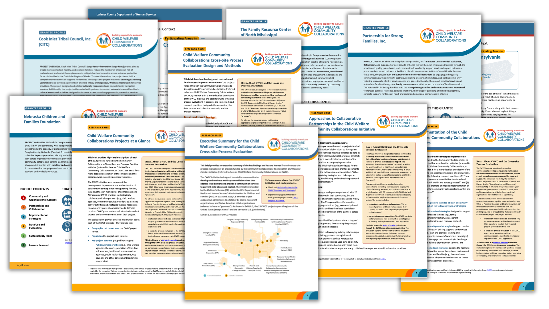
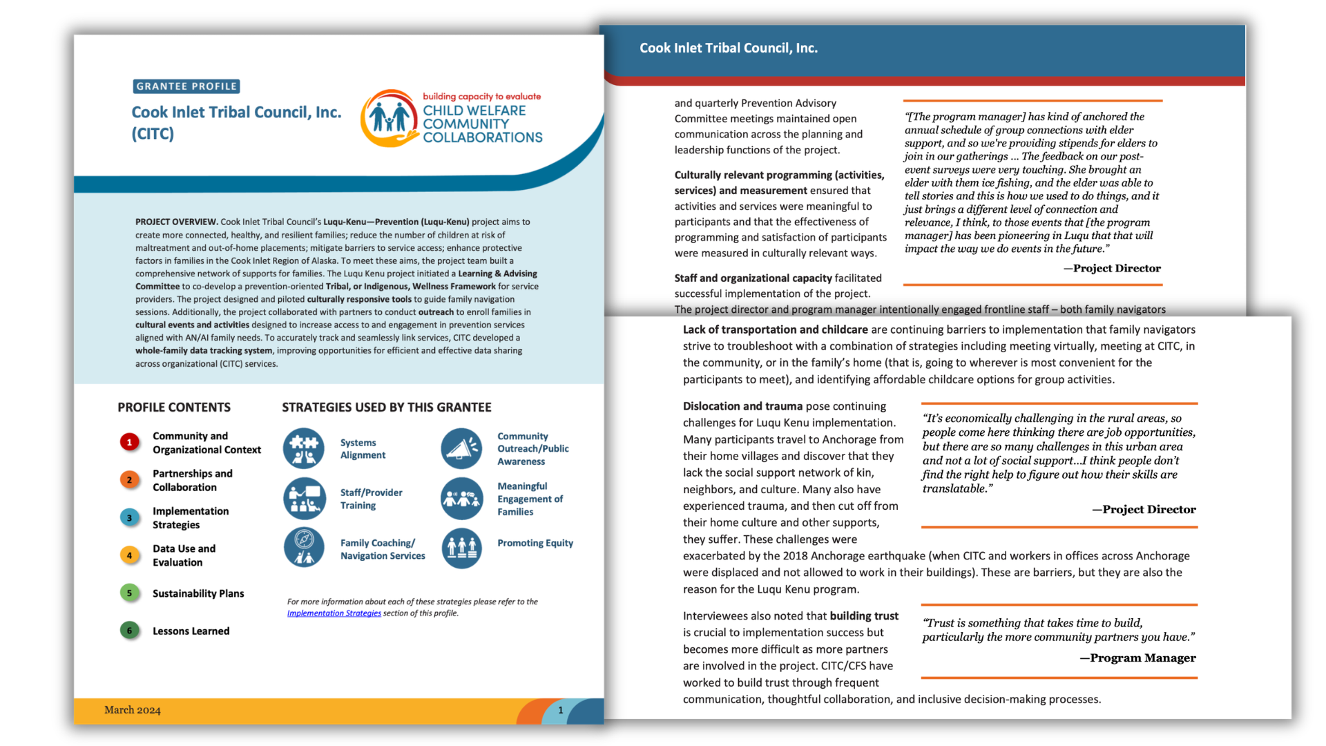
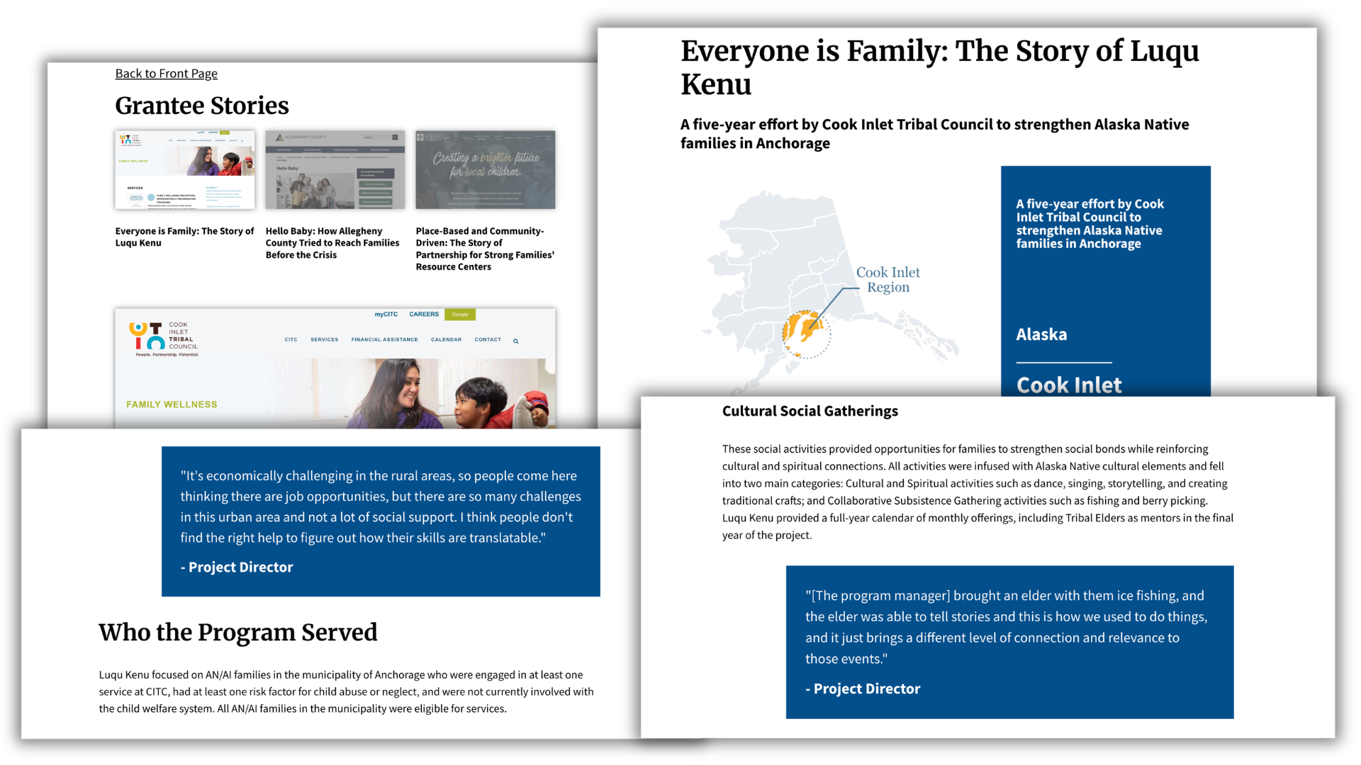
If you wanted to find the actual voice of the program directors, managers, partners, and staff the best place to find it was in the Grantee Profiles. Not only did they give voice to the program staff, they also told real stories about the programs.
Of course, they did this at a grade 19+ reading level, but that seems to be a normal thing with most reports I read.
A real world example of why I hate most qualitative visualization.
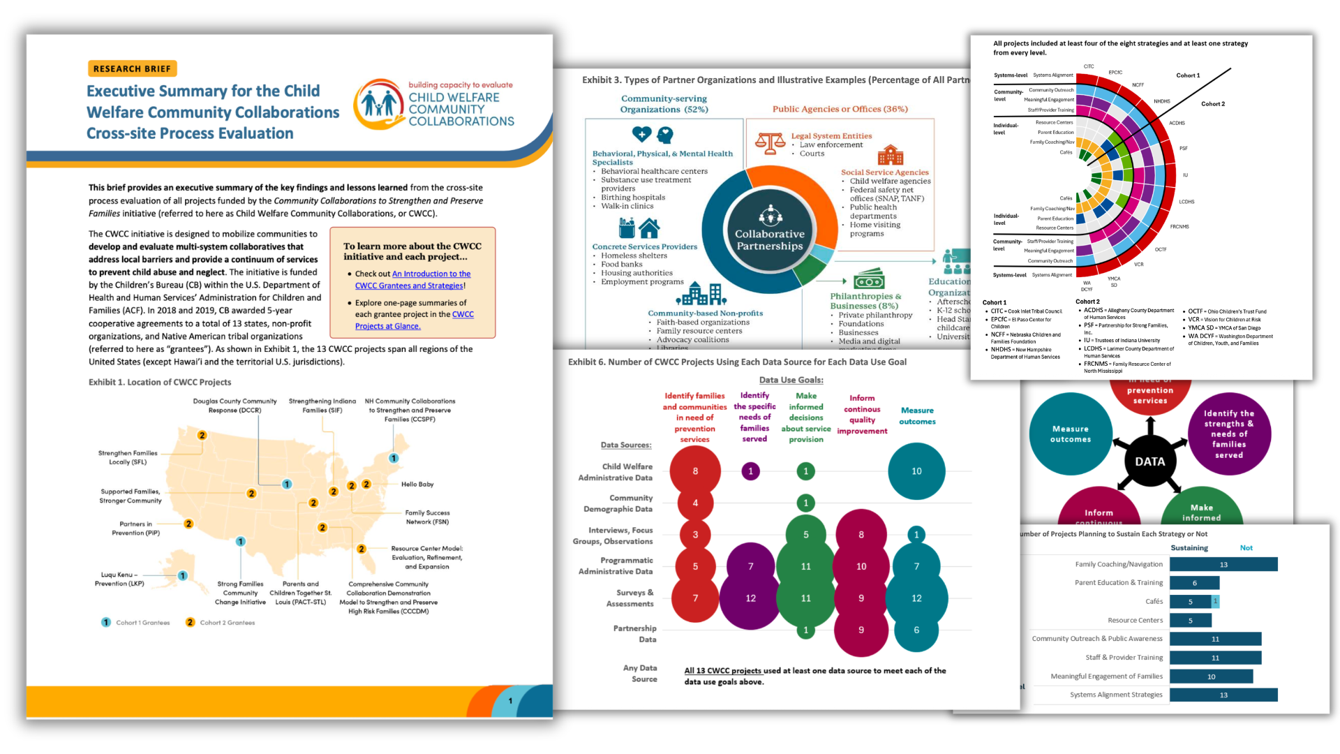
If you’ve read my book on Qualitative Data Visualization, you might know that I think about qualitative visuals differently than most. I think the power of qualitative visualization happens when you use it to make qualitative more approachable. Not by replacing powerful qualitative data with overly simplistic charts.
If you can replace your visualization with a simple table, and that table is far easier read than your visual, you should probably stick with the table. Pretty much every visual in the executive summary is just a fancy frequency table. And I wouldn’t mind it as much if they had at least included actual quotes as well.
Reverse Alchemy – Turning Gold into Lead
I ran a little comparison between one of the grantee profiles and summary lessons in the executive summary. Here are some examples of what I found.
On Trust:
Executive Summary: “Building trust at multiple levels is the foundation of community efforts to prevent child maltreatment.”
CITC Profile: “Trust is something that takes time to build, particularly the more community partners you have.” —Program Manager
On Flexibility/Meeting Families Where They Are:
Executive Summary: “Be flexible and tailor services to the specific needs of families.”
CITC Profile: “And what I hope [family navigators] could be here is connecting with participants as people, recognizing that change readiness is complicated, and sometimes you just need to connect with somebody on a human level before you’re ready to do [the work in the program].” —Project Director
On Community Voice:
Executive Summary: “Engage individuals with relevant experience in the design, implementation, and evaluation of prevention strategies and value them as equal partners.”
CITC Profile: “‘Nothing about us without us.’…It’s not an original quote of one of our leaders, but it is a familiar, repeated theme among tribal partners in our community.” —Program Manager
Step 1. Rewrite
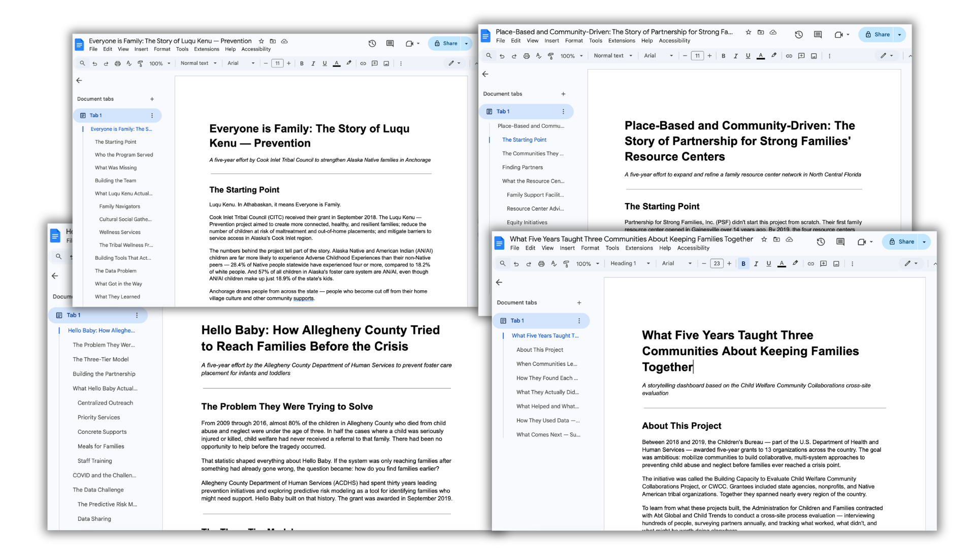
To make the project a little more manageable I decided to focus on just three grantee profiles. I used claude.ai to adapt each grantee profile into blog style format with a more approachable reading level.
The original profile reads at approximately grade 19+ (college graduate level). The new blog version comes in at grade 9.8. Average sentence length dropped from 30.6 words to 16.1 words. Average syllables per word dropped from 1.9 to 1.6 (with fewer bureaucratic/academic terms).
I asked the AI tool to keep all the quotes. Then after I was done with that, I took the three new blog style grantee profile stories and the executive summary and asked claude to rewrite an executive summary. But this time answering the five evaluation questions while focusing just on the three grantees.
I realize this is a bigger jump than most of my other before and afters, because I’m essentially re-doing the main executive summary. But it didn’t feel right to just reconfigure something I really didn’t like in the first place.
Step 2. The Structure
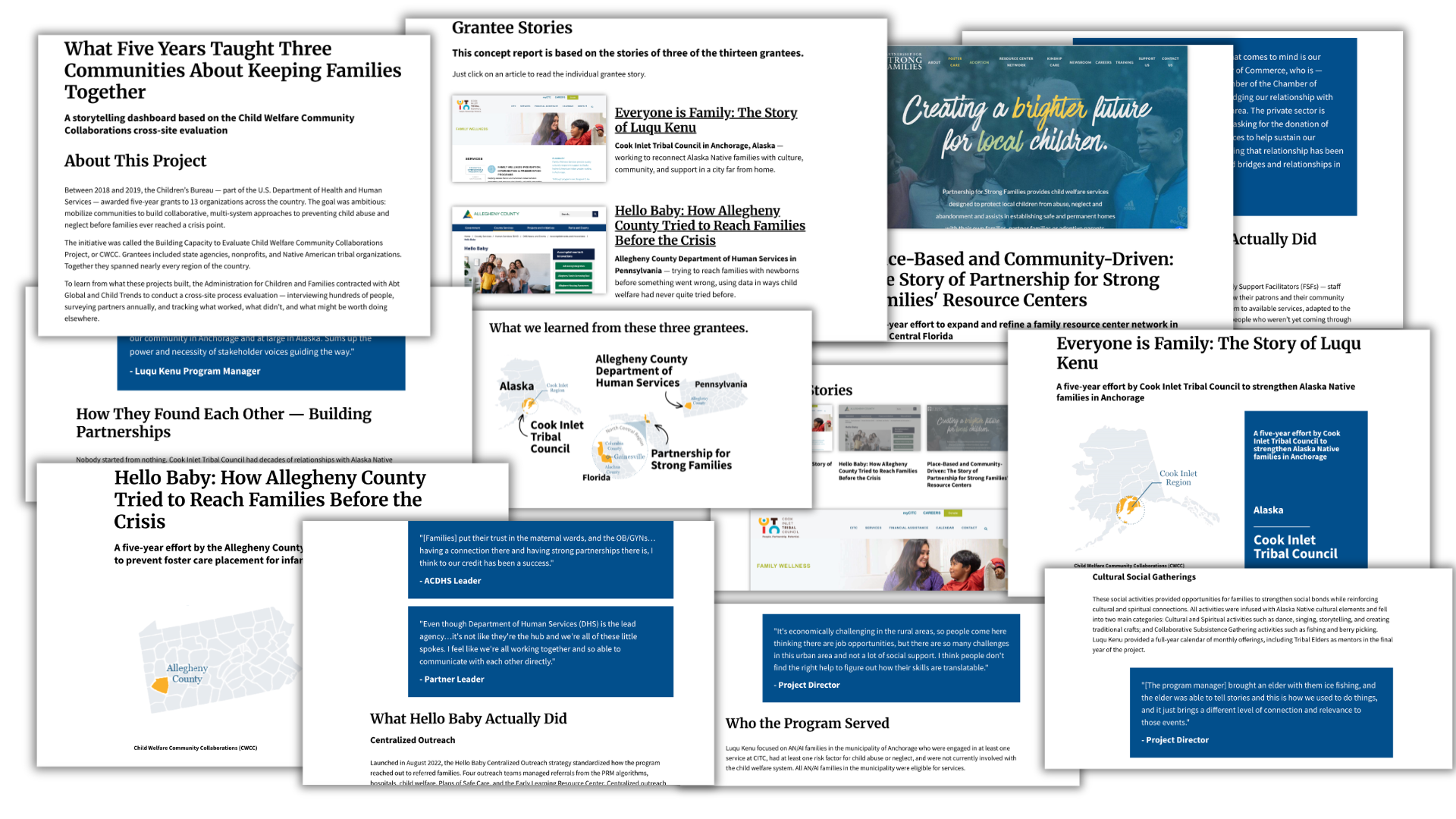
Now I have three individual stories and one summary post. If I had the time, energy, and source material I would have rewritten all 13 individual stories. So I wanted to structure this storytelling dashboard in a way that it could accommodate lots more stories if I had them.
With my new approach the landing page will be the executive summary. But it will also include a menu where you could click and read each of the three individual grantee stories.
Step 3. Style
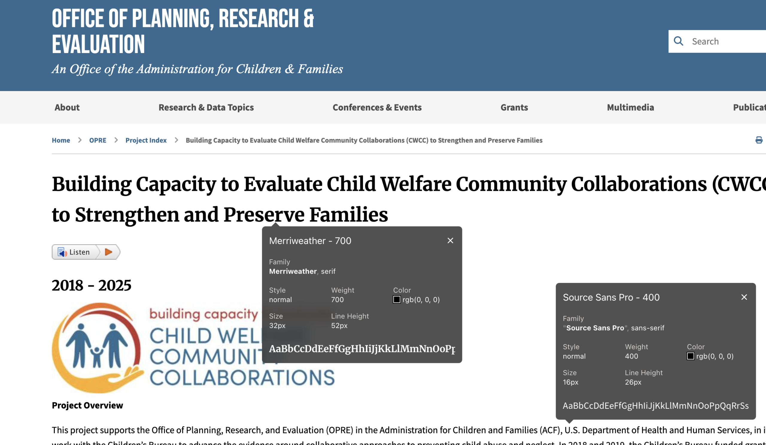
I’m doing a lot to this in terms of rewriting, so I don’t plan to mirror the original design too much. I did go ahead and use the same header font (Merriweather – 700) and body font (Source Sans Pro – 400). But I just decided to use my own dark blue as the spotlight color.
Easy Illustration
I decided to just go really simple with the illustration (this was already a much bigger project than I had planned going in).
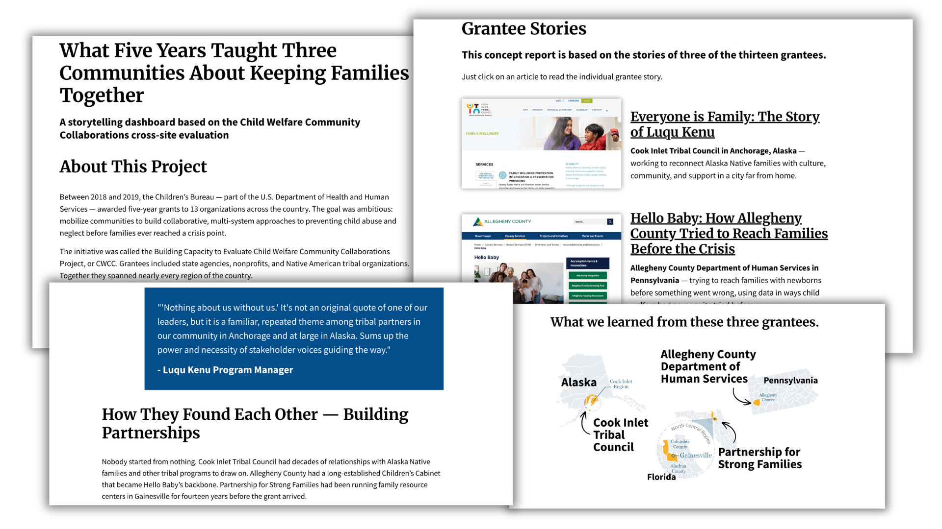
I needed featured images for each of the three grantee stories. These would be used in the menus and the top of each individual page to support navigation. Since just about every little project has a web page these days, I just took a few screen captures.
I also integrated some of the map visuals from the reports. The large country map with all grantees for the landing page (executive summary). And the individual state maps for each of the three grantees.
The quotes themselves are going to play a pretty significant role in breaking up the text, structuring the work, and engaging readers. All I really have to do is to use big color blocks, slightly larger font size, and white text so the quotes stand out from the body.
If you’re only going to use quotes, and not other images, make sure they don’t blend in with everything else. If the quotes are good, that’s all you really need most of the time.
Now to bring a selection of quotes back to the landing page.
Once you have the individual quotes on each of the grantee pages, we can just bring a selection of these quotes to the main executive summary/landing page.
It’s okay to have some duplication, especially when that duplication tells the reader there are more quotes where they come from.
Want to see the final after version?
Just click here to see the live prototype.
One final thought – the trouble with turning primary sources into secondary sources.
This thought came to me while I was doing this before and after, and I just can’t get it out of my head.
When we do qualitative work, we collect primary source data. Then, through analysis and summary, we turn that primary source data into a secondary source. After that, we often cut off access to the underlying primary source materials (which we often call raw qualitative data).
This is the opposite of what historians do. They put a lot of value on primary source materials. Secondary materials, like biographies, are not seen as having nearly as much value as primary source materials for future study.
I understand the idea behind qualitative inquiry. We are taking lots of information and making sense out of it. But that raw material, filled with stories and real world experience, is incredibly valuable. Perhaps we need to put a little more work into preserving that resource.
Chris! I’ve followed you for years, and we even met a few times at AEA. I just want to let you know that the work you did using UNICEF as an example was EXCELLENT!! UNICEF has been one of my main clients for the past seven years, and so I was super excited to see and read your interpretations of the recent Strategic Plan. I work a lot in the “chang e strategies” areas (i.e., SBC, gender/disability, and innovation), and these are super tricky to weave into the sectors (Education, WASH, and protection). Anyhoo, at the end when you said “you are not your job”…I felt so seen. ? The annihilation of the evaluation sector has been so brutal. Just want to say THANK YOU. Tristi Nichols
Thank you Tristi, what a very kind comment 🙂