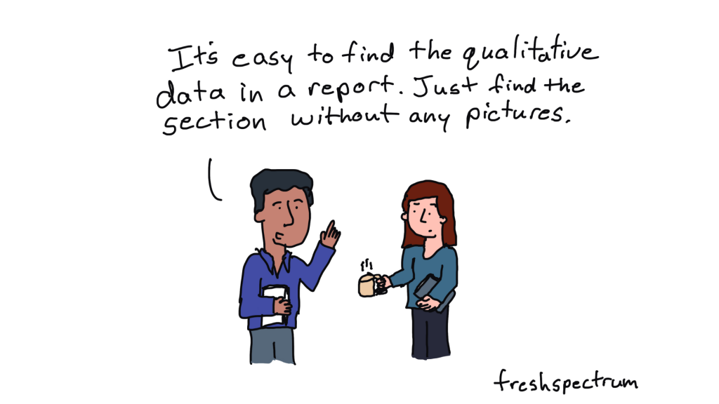
Now let’s get into specific, actionable techniques you can use to illustrate your qualitative work. These are things I do regularly in my own practice, things that work.
Start Simple: Color Blocks and Text
The easiest illustration technique? Put text on a colored background.
This is perfectly fine. Have a colored background, flip the color of the text to white (or dark, if the background is light), and maybe add an icon in the corner if you want. You can build this in Canva, in PowerPoint, anywhere. Really simple. Don’t overthink it.
Sometimes the illustration is just a color block and a little icon or drawing. It doesn’t have to be photos of real people. It can be drawings of people. It doesn’t even have to necessarily represent the person—it just has to be somewhat related.
Using Artifacts
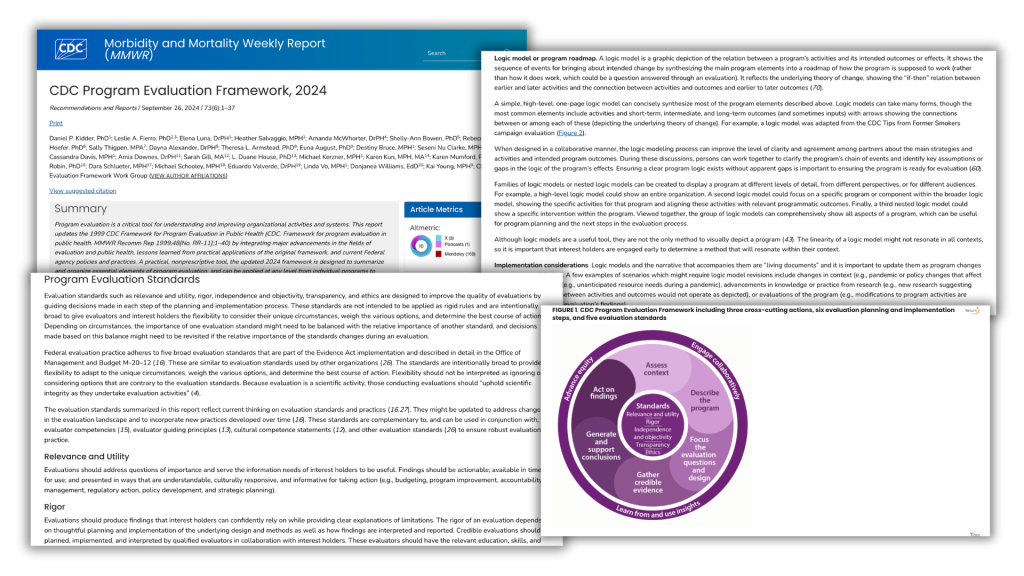
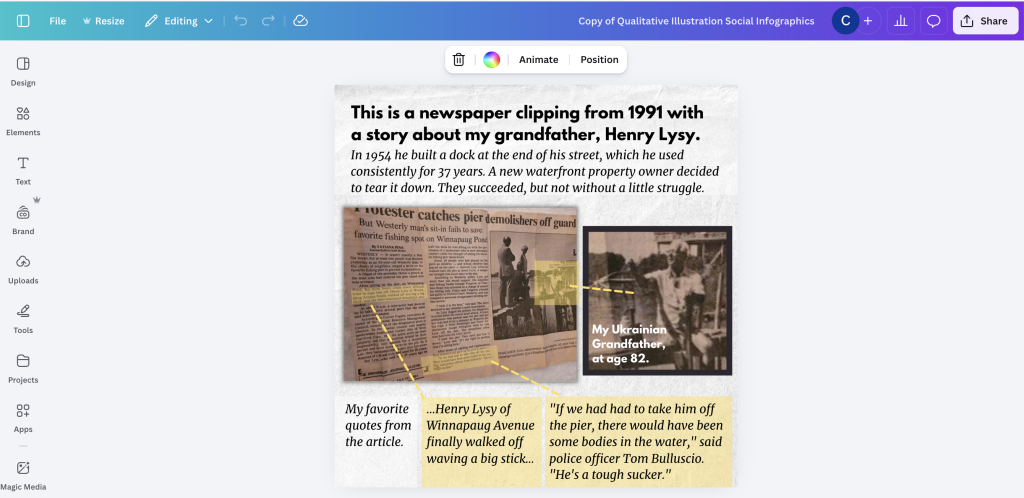
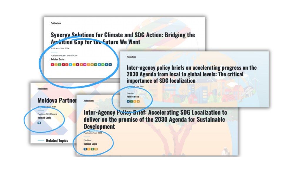
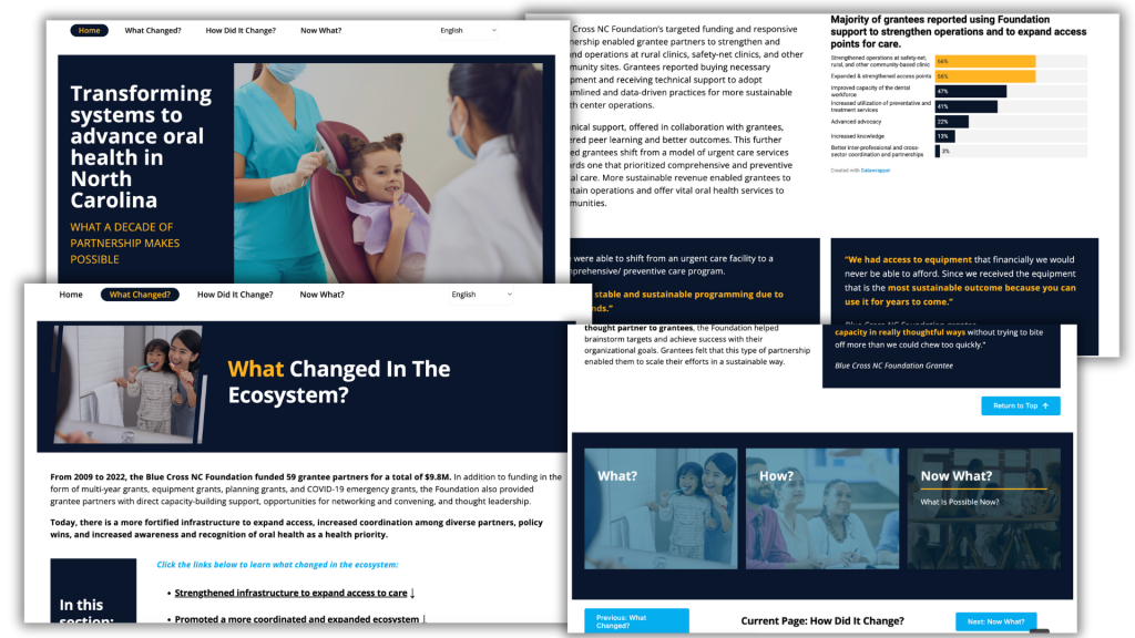
Artifacts are incredibly useful and often overlooked. I’m talking about screenshots—screenshots of articles where you circle important parts, screenshots of websites, of reports, of actual pages, of social media posts, of data dashboards, of software interfaces.
I’m also talking about physical items like interview protocols, handwritten notes, workshop materials, survey instruments, sticky notes from sessions, whiteboards with notes on them.
Take pictures of these things. They add authenticity and context to your work.
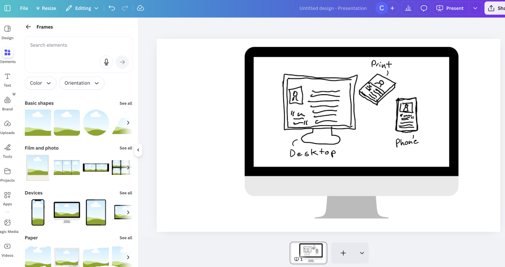
Framing Screenshots
In Canva or Adobe Express, you can find computer frames, phone frames, tablet frames. Drop your screenshot into the frame and suddenly it looks polished—like a computer displaying your screenshot rather than just a floating image.
This is a really simple way to make screenshots look intentional rather than hastily grabbed.
Working with Existing Images
Erasing backgrounds is now just a button click in Canva or Adobe Express—both have free tools for this. And this opens up huge possibilities. You can remove the background from a person’s photo and drop them into a better background. You can layer multiple elements together, create collages, put people in front of colored blocks where you can add text.
Your pictures don’t have to be perfect anymore. You can pull people out and drop them into nice backgrounds where you can put text on top, whereas the original photo might have made that much harder.
You can also apply filters and effects to make photos feel more cohesive across your report, even if they came from different sources. Make photos black and white, add blur effects, apply color overlays, adjust brightness and contrast, create vintage or modern looks. These little touches help everything feel like it belongs together.
And don’t forget about photo frames and annotations. Add borders or frames to photos. Use arrows and callouts. Circle important details. Add text annotations. Create before/after comparisons.
Annotations are really powerful for turning a picture or photo into something different, for guiding people through things. Annotations on top of photos, annotations on top of maps—they can really help guide somebody through a visual and add something different.
Building Visual Systems with Icons
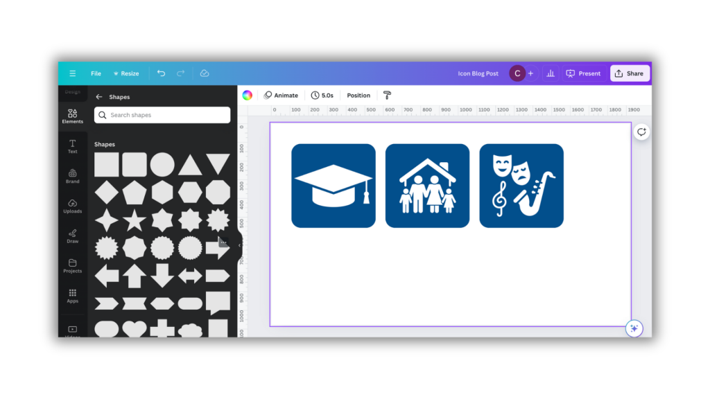
Icons can become the backbone of your visual organization. Here’s how to think about it: if you’re talking about five indicators, find or create five icons—one for each. Then use them everywhere. Use them in section headers, next to relevant quotes, in summary boxes, as navigation elements. Every time someone sees that icon, they know which indicator you’re discussing.
And icons can work at different sizes. Small icons work inline with text, marking items in lists. Medium-sized icons work as section markers and callouts. Large icons work as full section breaks and chapter dividers. Because they’re vector-based SVGs, you can scale them infinitely. Take a small icon, blow it up huge, add a colored background, maybe pair it with a quote from someone—and it becomes an interesting visual.
Think about where you can use icons throughout your work. Use them for organizing—marking different sections or themes. Use them for tagging—showing which codes or categories apply to different content. Use them for indicating—pointing to specific program sites, populations, or topics. Or just use them for decorating—adding visual interest to otherwise plain sections.
Quote Visuals
Quotes are the heart of qualitative work. Here’s how to visualize them effectively.
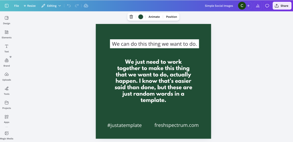
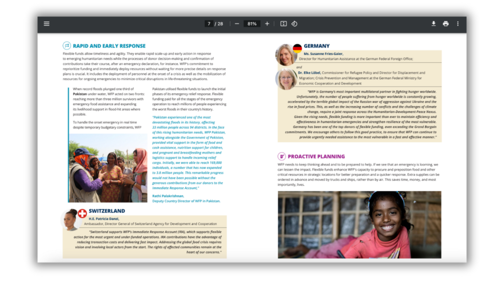
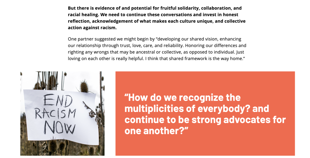
The most basic approach is a quote box. Choose a background color, add the quote in larger text, include attribution showing who said it and their role, and maybe add a small photo or icon if you want. Simple, but it works.
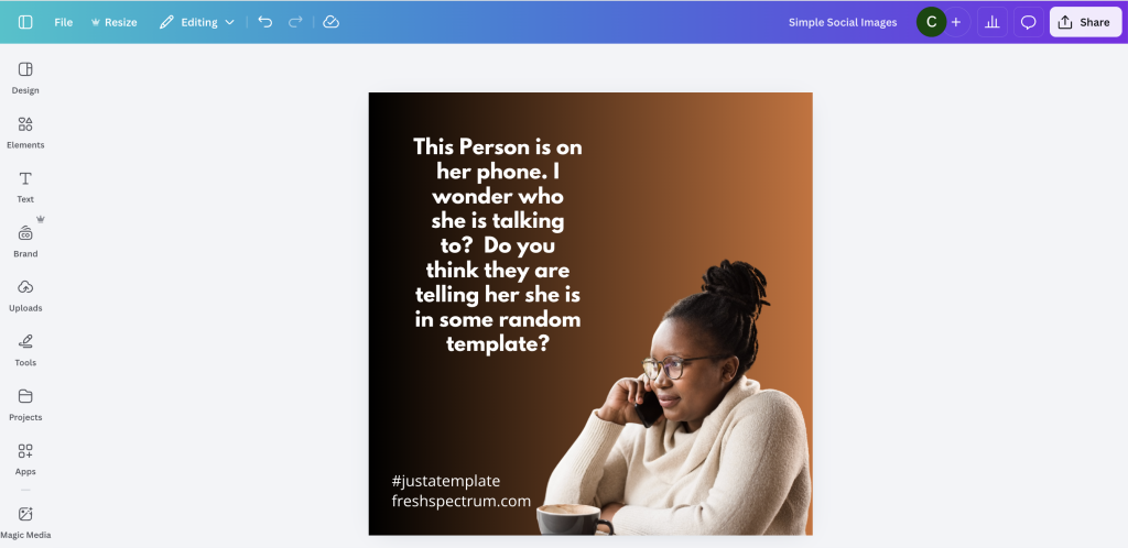
You can also pair quotes with images. Find a relevant photo or illustration and place the quote over or beside the image. Use a semi-transparent overlay if the text is hard to read against the image. Just keep the quote prominent—that’s what people are there to read.
Think about how radio shows like NPR start their episodes—with a particularly profound quote that gets you interested in the story. That’s your lead into your qualitative section. What’s your lead-in quote? Put it at the top with an icon and a visual, and that becomes a visual you can share. It doesn’t have to be super detailed, highly artistic, or professionally photographed.
If you interviewed ten people, structure it so each person gets their own visual. Use consistent formatting for each one. Include their quote, maybe their role, add an icon or simple illustration. This creates a pattern—ten people, ten sections, and each person gets the same treatment, the same visual weight.
Working with Questions
Remember the key principle: illustrate questions, not answers.
Take a key question from your research and put it in a color block or over an image. Make it prominent. Let it create curiosity that pulls readers into the text. Questions beg answers. When you’re reading a report and there’s a question, you want to know how somebody answered it. The question itself can be your visualization—your simple illustration strategy is to take questions and drop them in.
You can also pair questions with relevant icons. Use a question mark, or an icon representing the topic, or a simple illustration of the concept. This gives the question visual weight without requiring complex design.
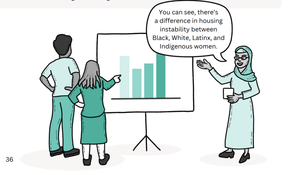
Charts for Qualitative Data
Yes, you can use charts with qualitative work. Not to quantify everything, but to complement your narrative.
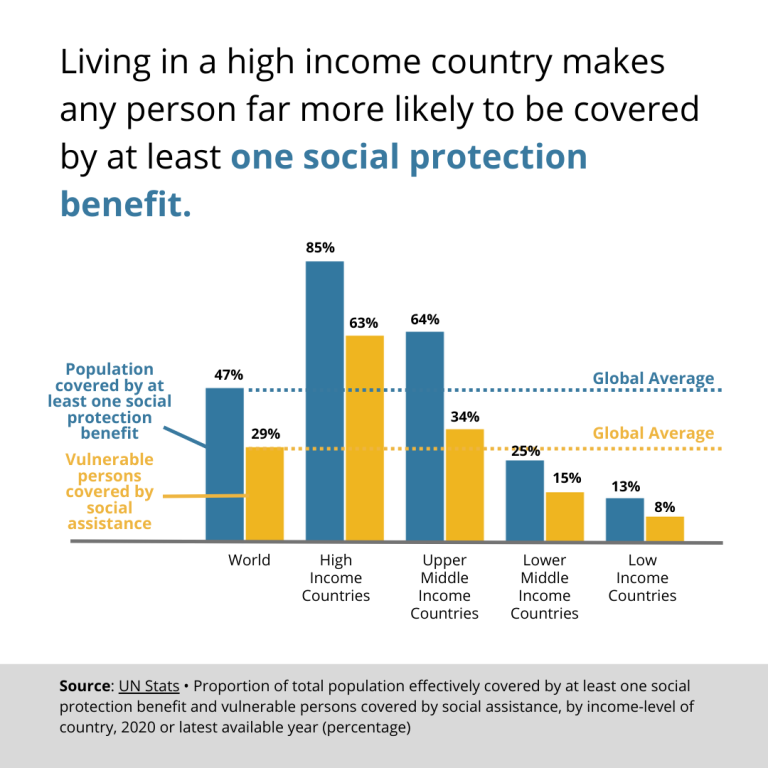
Pictograms work great for small sample sizes—anything under 50 participants. Show people as icons. If fifteen out of twenty participants mentioned something, show twenty person icons with fifteen filled in. It’s simple and honest.
Grid plots are like bar charts but made of dots. They’re more tangible for small numbers, easy to see proportions, and they look less like you’re overselling the precision of your data.
Heat maps let you create simple matrices showing themes across different groups, frequency of codes, or presence and absence patterns.
And timelines are fantastic for arranging information chronologically. You can show events mentioned in interviews, project milestones, historical context, or before-during-after comparisons.
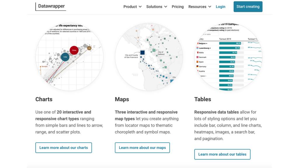
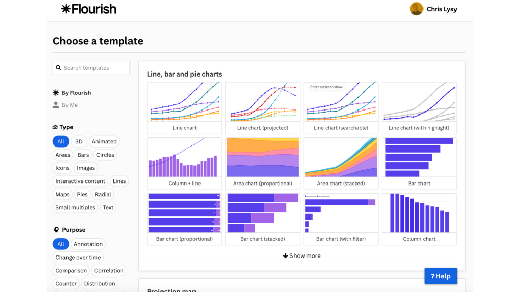
I recommend two tools for creating these kinds of charts. Flourish at flourish.studio is template-based, easy to use, integrates with Canva, and handles various chart types. DataWrapper at datawrapper.de was built for journalists, has strong accessibility features, is excellent for maps, and has a simple interface. Both have free tiers, and both are designed for people who need to illustrate stories, not for data scientists. They’re perfect for evaluation and research work.
When you have small sample sizes, embrace it. Use actual counts instead of percentages. Use visual representations of individuals. Use simpler chart types with more narrative integration. A pictogram showing “twelve of fifteen teachers mentioned this” is more honest and often more compelling than a pie chart of percentages.
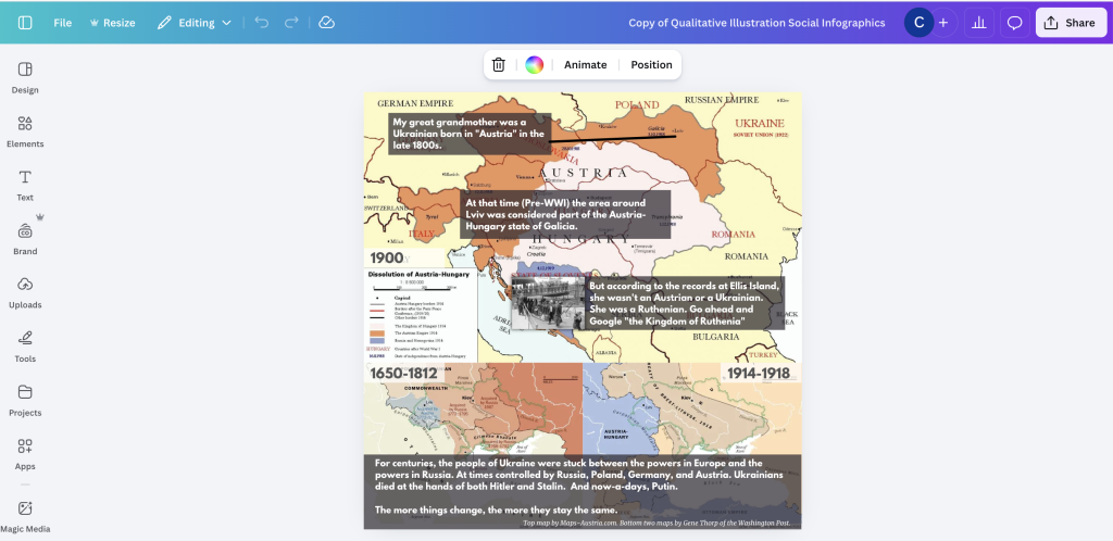
Maps
Maps add context and enhance understanding in ways that text alone can’t.
There are three main types of maps you’ll work with. Choropleth maps let you color in regions—states, counties, countries—to show geographic distribution and broad patterns. Point maps put dots on locations, showing program sites, where participants live, or interview locations. You can vary the dot size to show quantities. And location maps give you actual place views with 3D buildings, street-level context, specific addresses, and real geographic features.
Use maps when you’re talking about different program sites in different geographies, showing community context, illustrating reach or coverage, or providing geographic background. If you’re working on a New Orleans project, grab pictures of New Orleans. Get specific when location matters. Use generic or universal maps when you’re talking about broader patterns.
I like DataWrapper a lot for maps. It makes the process straightforward and handles accessibility well.
Text-Based Visuals
Not every visual needs an image. Sometimes text styled well is enough.
You can pull out facts and statistics, put them in color blocks, make them big and bold, and add a small icon. You can take your key findings, summarize insights, style them differently from body text, use color to distinguish them, and make them skimmable.
Questions work as text visuals too—as we discussed, they engage people. Style them to stand out, use them to organize sections, let them create curiosity.
And if you’ve coded your qualitative data, you can create a visual for each code or theme. Just the code name and maybe an icon, used to separate sections throughout your report.
I’ve seen reports use hashtags or labels in colored blocks—things like #StudentVoices, #TeacherPerspectives, #CommunityImpact. Simple, visual, organizes content, and can be repeated throughout the report to create consistency.
Integrating Visuals into Your Methods
Here’s a powerful strategy: build visual creation into your research process itself.
Ask participants to create things for you. Have kids draw their homes. Have participants sketch concepts. Request visual representations of ideas. Then use these drawings in your report. They’re authentic, they’re directly connected to your work, and they give voice to participants in a unique way.
Card sorts create their own visuals. When you do prioritization activities, the sorted cards become layouts you can photograph. You can show individual responses and compare across participants. The physical arrangement of cards tells a story.
Have participants create timelines showing their own experiences. Photograph the results and use them as illustrations. They show individual perspectives in ways that written quotes can’t always capture.
Sticky note activities from brainstorming sessions, idea organization exercises, voting or prioritization—all of these can be photographed and used as visuals in your report.
And document your process as you go. Take photos of the room setup, pictures of materials you’re using, screenshots of virtual session tools, images of workshops in progress. These aren’t just nice-to-have. They provide authentic, relevant visuals that ground your qualitative work in the reality of how it was conducted.
Working with Limited Resources
You don’t need a big budget to do this well.
For tools, Canva Free gives you tons of icons, templates, and basic features. Adobe Express has background removal and templates. PowerPoint is more capable than you think for basic graphics, and Google Slides works similarly. Flourish and DataWrapper both have free tiers for charts and maps. And your smartphone? That’s your camera for photos and quick documentation.
For finding images, your own photos are the most authentic. Participant-created visuals are directly relevant to your work. Free stock sites like Unsplash and Pexels exist, though use them carefully. Icon sites like the Noun Project and Flaticon have huge libraries. And Canva elements include a massive library even in the free version.
If you do have budget, consider working with artists. Freelance illustrators are often less expensive than you’d think. Visual recorders can document workshops in real-time. Graphic designers can help with key pieces. And community artists are especially valuable if you’re working with specific communities—they bring cultural knowledge and perspective that enhances your work.
Sometimes folks on your own staff have artistic interests. I’ve seen organizations develop internal talent this way, supporting people who doodle in their free time to develop skills that benefit everyone’s work.
The Process
Here’s my typical workflow, and it might help you think through your own approach.
I write first. Get your content down before you worry about visuals. Then identify key moments—where do visuals belong in this narrative? Determine the purpose of each visual using the framework we talked about: is it organizing, spotlighting, engaging, or enhancing?
Generate options next. Form storm a bit. Don’t settle on the first idea that comes to mind. Then create simply—start with basics and add complexity only if it’s needed. Test readability by asking yourself: does it work? Would you stop here if you were skimming? Finally, refine based on what you learn.
Don’t try to design everything perfectly before you start. Create something, see how it works, iterate. That’s how you get better.
The Mindset
Remember these things as you work:
Start simple—color blocks and text are fine.
Be systematic—use patterns and consistency throughout your report.
Think about purpose—what should this visual do? Don’t overcomplicate things because simple often works better.
Use what you have—smartphone photos are legitimate visual content. Build over time by developing your visual library as you work on multiple projects.
And ask for help when you need it.
Illustration doesn’t have to be hard. It just has to be intentional.