Additional menu
Dissemination that Actually Works
Chapter 5: Putting It All Together
We’ve covered the concepts, the types of visuals, the techniques. Now let’s talk about how to actually apply all of this systematically to create qualitative reports that people actually want to read.
The Power of Patterns
The trick to organizing is to be disciplined. You’re using visuals to create order through patterns. You have to think holistically—through your whole report, not just at individual sections.
The Organization Trap
Here’s a trap: you can use all different types of visuals, all sorts of colors and styles, but when you see them all together, nothing stands out. It feels like a rainbow-colored chart where you have all these colors, but nothing pops.
The question is always: Are you creating a pattern that makes sense?
Creating Visual Systems
Think about how well-designed guidebooks work. They establish patterns that readers learn quickly and rely on.
Color coding by section is one of the most effective patterns. Each major section gets its own color, and that color appears consistently throughout—in headers, in backgrounds, in accents. Readers learn the system quickly and start to associate that color with that content.
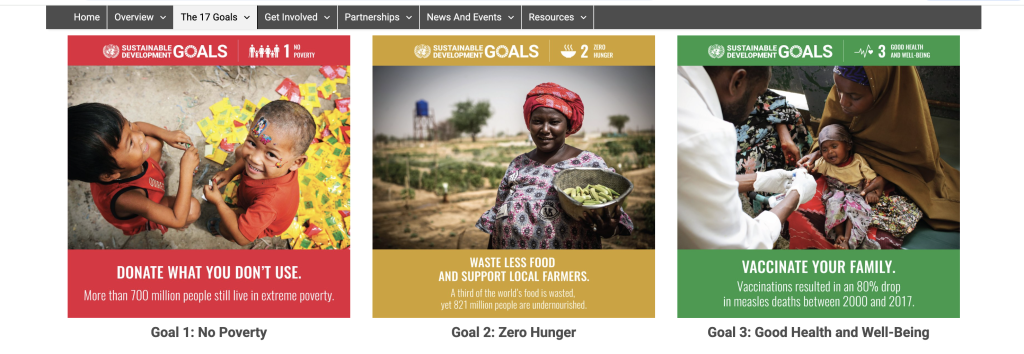
Icons work the same way. Give each theme or indicator its own icon, and then use that icon wherever that topic comes up. Make it small when it appears in lists, large when it marks section breaks. Keep it consistent throughout, and readers start recognizing those icons instantly—they know what they’re about to read before they even start reading.
Layout patterns create expectations that make reading easier. When case studies are always formatted the same way, when expert quotes always get the same treatment, when key findings always appear in the same style—readers know what to expect. They develop a rhythm for moving through your report.
When you establish these patterns, you create comfort. People know what they’re looking at. They can navigate your report intuitively, finding what they need without having to figure out a new system on every page.
Section by Section Strategy
Let’s walk through how to approach different parts of your report and think about what each section needs.
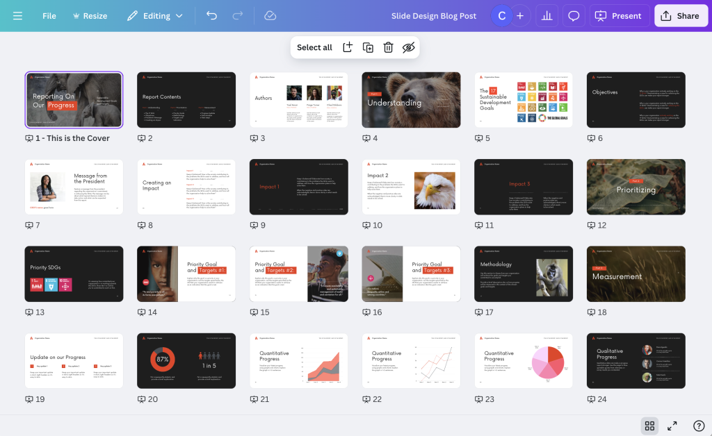
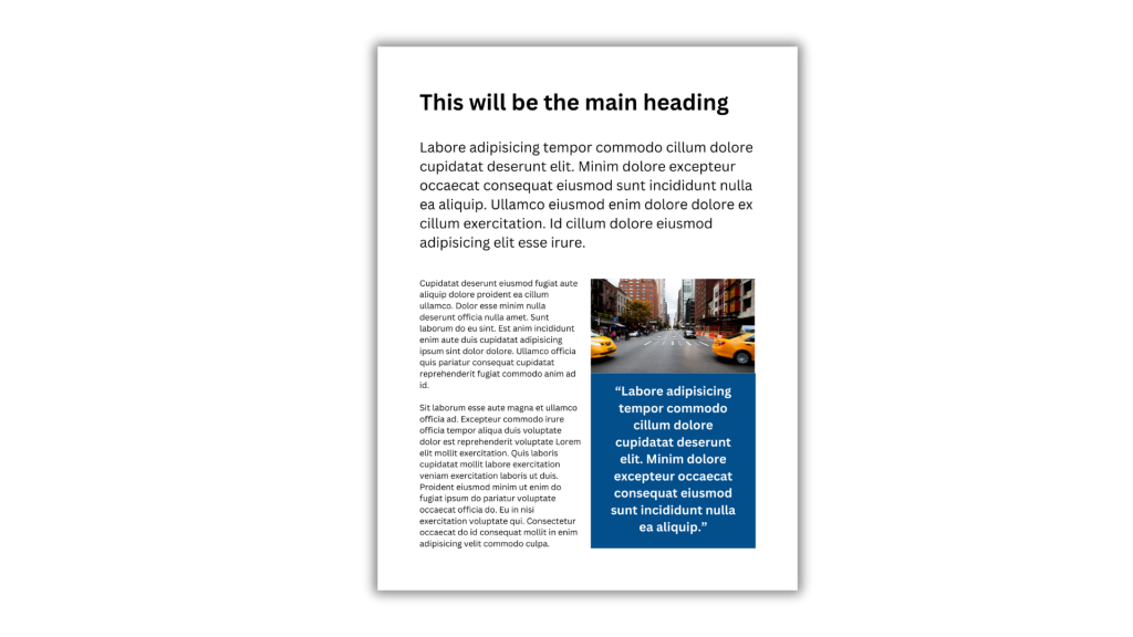
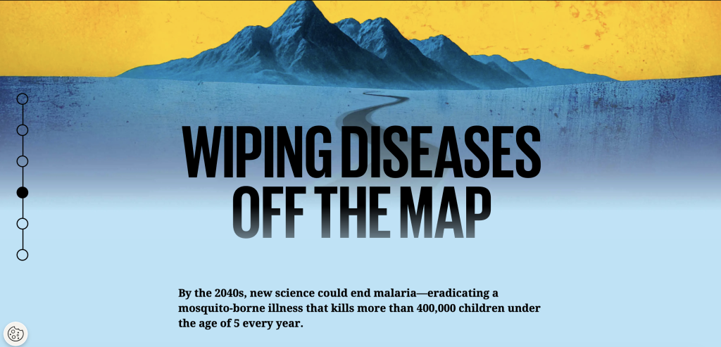
Your executive summary or introduction has one job: get people interested and give them the headline. So your visual strategy should start with a compelling image—photo or illustration—and pull out one to three key findings in visual callouts. Keep it clean and uncluttered, and use this opening to establish your visual system that you’ll follow throughout the rest of the report. Here’s one approach that works: put a large photo at the top, add brief text introduction in bigger font than body text, then create three colored boxes with key takeaways where each box has an icon matching themes you’ll develop later in the report.
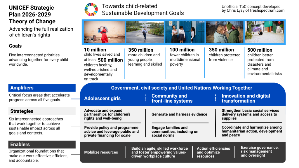
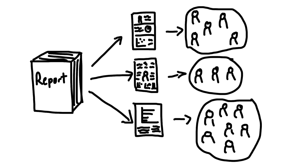
Your methods section needs to build credibility. Think about using process diagrams or timelines, photos of data collection if that’s appropriate, maps showing sites or reach, and icons for different data sources. You might create a timeline showing research phases, a map of interview locations, photos of focus group setup or materials, and icons representing different participant groups.
The findings sections with qualitative content—this is where most reports fall flat, so here’s how to fix it. If you’re organizing by themes or codes, give each theme its own icon and start each section with a large icon or illustration paired with the theme name and a brief overview, maybe a compelling quote. Within each theme, include multiple quotes from different participants where each quote sits in a styled box rather than just body text, with photos or illustrations between quote groups and callouts for key insights.
If you’re organizing by participants or case studies instead, create a consistent format for each person or case. Put a photo or illustration at top, include their name, role, and context, tell their story or perspective, and highlight pull quotes from them. Then repeat that exact format for every participant. This creates pattern and equality—every voice gets the same treatment, the same visual weight.
If you’re organizing by questions, make each research question a section that starts with the question as a visual. Show different responses, use icons or images to break up those responses, and highlight particularly insightful answers so they stand out.
Integrating Quantitative Data
If you have survey data or other quantitative findings alongside qualitative work, don’t separate them completely. Instead, pair quantitative charts with qualitative quotes. Show them how “the survey showed X, and participants explained why…” Put a chart showing a pattern right next to quotes illustrating that pattern. This enhances your report—it adds context through pairing different types of data.
When you do use quantitative visualizations, keep them simple. Use pictograms for small sample sizes. Use grid plots instead of bar charts. Create clean timelines. Keep charts uncluttered and focused.
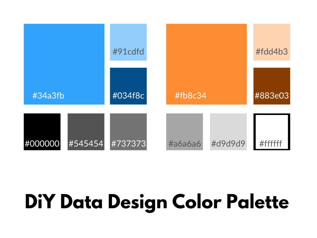
And make everything feel cohesive by using the same color palette as the rest of your report, the same fonts and styling. Your charts should feel like part of the story, not separate data dumps that interrupt the narrative.
Conclusions and Recommendations
Your conclusions and recommendations section has one purpose: make sure key takeaways stick with readers after they close your report.
Revisit your visual system from earlier in the report. Pull out key recommendations in styled boxes. Use icons from earlier sections to tie back to themes you’ve already established. End with a compelling image, maybe one that looks forward rather than back.
Here’s one approach: create numbered recommendations where each one has an icon. Include a final large image or illustration that captures the forward momentum. Make your call to action visually distinct so it doesn’t get lost.
The Two-Page Spread Thinking
If you’re creating a print report or PDF, think in two-page spreads—what people actually see when they open a book.
You need to balance visual weight across those spreads. If the left page is heavy with text, the right page should have more visuals. Don’t put all your photos on one side. Create visual balance so eyes move naturally across both pages.
Think about natural breaks too. Major sections should start on the right-hand page when possible—this feels like a fresh start to readers. The left page can preview what’s coming or transition from what came before.
Keep consistent elements in predictable places. Put headers in the same spot. Keep page numbers in a predictable location. Use color coding or icons that help orient readers as they flip through pages.
The Digital Report Approach
If your report is primarily digital—a website or interactive PDF—you need to think differently about how people will experience it.
People scroll fast when they’re reading digitally, so break up your content with shorter sections and more frequent visuals. Give them something to stop for every few paragraphs. Use progressive disclosure where you start with summary or overview and allow expansion for details. Not everyone needs to read everything, and visuals help people navigate to what they care about. Consider adding interactive elements like clickable charts or maps, expandable quotes, tabs for different perspectives, or photo galleries.
Every section needs a featured image in digital formats. On websites, this is standard practice. Treat your digital reports the same way. Main sections get large, compelling images. Subsections get smaller but still present visuals. No section should exist without some visual anchor. Images help with scrolling navigation—they’re landmarks that help people know where they are in your report.

Making It Skimmable
Remember: most people won’t read your report start to finish. They’ll skim, stop at interesting bits, skip sections that aren’t relevant to them. So design for skimmers.
Think about visual hierarchy. Your most important content gets the biggest text, the most visual space, and prominent color or styling. This is what skimmers will catch as they flip through pages or scroll down screens. Important content—not the most important, but still significant—should be styled differently from body text through pull quotes, callouts, and highlights. This is what you want skimmers to notice even if they’re moving quickly. And your supporting detail, your body text, is for people who want depth. It should be readable but not fighting for attention with everything else.
Create intentional stopping points where skimmers will pause. Large visuals work because people can’t skim past a big photo—it forces a pause, and then they read the caption or nearby text. Color changes that break up the white background signal “something different here” and make people slow down. Questions are hard to skim past because our brains want to answer them or find the answer, which pulls people into nearby text. And pull quotes, when styled to stand out, give skimmers the good stuff directly—often your most compelling content in an accessible format.
The Accessibility Question
When you’re systematizing visuals and doing things with purpose and intention, it usually becomes easier to make your work accessible.
Think about your alt text strategy based on what each visual is doing. For organizational visuals, use simple descriptions like “Icon representing Theme 1: Student Experiences.” They’re structural, so just describe what they are. For spotlighting visuals, include the key information—if it’s a pull quote in a visual, the alt text should have that quote, not just “blue box with quote.” For engaging visuals, describe what makes it engaging, and if it’s a question, include the question to capture the curiosity it creates. For enhancing visuals, describe the additional information provided. For charts, describe the pattern or finding. For maps, describe what it shows. For timelines, outline the sequence.
Use proper heading structure in your document. H1 for your main title, H2 for major sections, H3 for subsections. Don’t skip levels. This helps screen readers navigate and helps everyone scan the document structure.
Make sure your text is readable with high contrast between text and background. Don’t rely only on color to convey meaning—use other visual cues too. Test readability with actual users when you can.
Think about your user. How would someone experiencing this through a screen reader understand it? Would they get the key information? Would the organization make sense? Talk through your work as if you’re reading it to someone who can’t see it. This helps you figure out what’s essential and what’s decoration.
Common Mistakes to Avoid
Too much variety is a common problem. When you use a different style for every visual, every color imaginable, and no consistency, nothing stands out and everything feels chaotic. Fix this by establishing your visual system—pick three to four colors, choose a consistent icon style, create regular patterns—and stick to it throughout your report.
Not enough variety is the opposite problem. When every page looks exactly the same, nothing stands out and it becomes visually boring. Fix this by creating hierarchy. Make some visuals bigger, some smaller. Make some sections more visual, some less. Vary between photos, illustrations, and graphics so there’s visual interest.
Visuals that don’t add anything are wasted space. Generic stock photos that could go with any report, decorative elements that don’t connect to content—these don’t help your readers. Every visual should serve a purpose: organize, spotlight, engage, or enhance. If it doesn’t do one of those things, cut it.
Making it harder to read defeats the entire purpose. Text over busy images you can’t read, too-small fonts, poor contrast, cluttered layouts—these make your report worse, not better. Prioritize readability above everything else. Fancy doesn’t matter if people can’t read it. Test with actual users.
And don’t forget about print if your report might be printed or viewed as a PDF. Designing only for screens means your report might look terrible when printed. If it might be printed, design with that in mind. Check how colors print and make sure text is readable at print size.
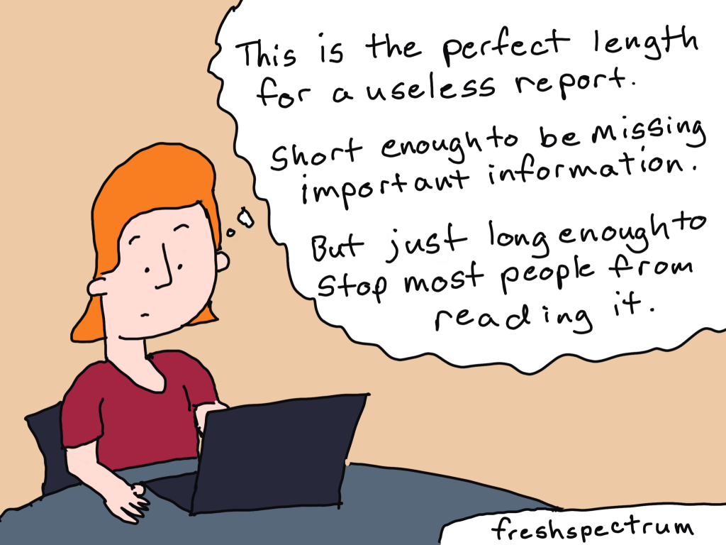
The Length Question
People always ask: “Should I make my report shorter?”
Here’s my answer: stop trying to make your report shorter. Make it easier to read.
A ten-page report that’s wall-to-wall text is harder to read than a twenty-page report with white space, visual breaks, clear sections, and images and callouts. Don’t compress everything to hit a page count. Give your content room to breathe.
Layer your information for different audiences. Skimmers who spend two to three minutes should get main points through headlines, pull quotes, key visuals, and callout boxes. Readers with general interest who spend ten to fifteen minutes should get good understanding through section overviews, representative quotes, and charts and graphs. Readers with high interest who can spend an hour should be able to dive deep into full narratives, multiple perspectives, and detailed findings.
Design so all three audiences can get what they need from the same report.
Building Your Visual Library
Over time, develop resources you can reuse and build on. Collect icons that match your work and build sets for common topics. Organize them in folders and reuse them across projects. Develop two or three go-to color palettes, document the hex codes, and use them consistently across reports. You can adjust for specific projects, but start with a tested base that you know works.
Create templates for common sections—layout templates, quote box styles, chart templates, case study formats. Having these ready to go makes future reports faster to create.
If you work with specific communities or settings, build a library of relevant images. Get permissions documented as you go. Organize by topic or theme so you can find what you need when you need it.
Working with Others
If you work with professional designers, share this framework with them. Explain the parts of O.S.E.E. (organizing, spotlighting, engaging, and enhancing). Be clear about the purpose of each section. Then trust their expertise on execution—that’s what you’re paying them for.
With your team, establish visual standards together. Create a style guide that everyone can reference. Share responsibilities where it makes sense—maybe one person handles photos, another works on icons, someone else focuses on charts. Review work together for consistency.
When working with community partners, engage community artists whenever possible. Include participants in visual creation when appropriate. Honor cultural visual traditions rather than imposing external aesthetics. And pay fairly for artistic work—it’s skilled labor that deserves fair compensation.
The Practice
Getting good at qualitative visualization takes practice. Here’s how to build the skill.
Start small. Pick one report to try this on. Don’t try to revolutionize everything at once. Learn what works for you through doing it.
Iterate as you go. Create version one, get feedback from colleagues or stakeholders, adjust and improve based on what you learn. Each report gets better than the last.
Study others. Look at well-designed reports from organizations whose work you respect. Screenshot things you like. Analyze what makes them work—is it the color choices? The layout? The way they use icons? Then adapt those techniques to your own work.
Build confidence gradually. Start with simple techniques like color blocks and icons. Add complexity as you become more comfortable. Celebrate improvements along the way. And don’t compare your work to big-budget productions from organizations with full design teams—compare it to where you were last month, last year.
Your Action Plan
Here’s how to start applying this to your next report.
Before you write, decide on your visual system. Pick your colors—three or four that work well together. Choose your icon style—simple line drawings, or filled shapes, or whatever matches your organization’s aesthetic. Plan where visuals will go by thinking about every major section getting some kind of visual element. Think about your O.S.E.E. purposes for each section—which ones need to organize, which need to spotlight, which should engage, which will enhance.
As you write, note where visuals should go in brackets or comments. Collect relevant images as you work—if you’re out doing interviews, take some photos. Save good quotes that would work well with visual treatment. Think ahead about what would make good pull quotes or callouts.
After you write, create your visuals systematically rather than randomly. Start simple with colored boxes, icons, and basic photos. Add complexity where it serves a clear purpose, not just because you can. Test readability by showing it to someone and watching where they stop, what they skip, what catches their eye.
Before you share your report, check consistency across the whole thing. Verify accessibility with proper alt text and heading structure. Get someone to skim it and tell you where they stop—those are your effective visuals. Make final adjustments based on what you learn.
The Bottom Line
Qualitative data visualization isn’t about making pretty pictures. It’s about making your qualitative work accessible, compelling, and impactful.
When you:
Use visuals to organize your content systematically
Spotlight your key findings so people notice them
Engage readers with questions and curiosity
Enhance understanding with additional context
You transform your qualitative reports from walls of text that people skip over into stories that people actually read, understand, and remember.
Your qualitative work matters. The stories you’re sharing, the voices you’re amplifying, the insights you’re communicating—they deserve to reach your audience effectively.
Don’t let poor visualization be the barrier between your important work and the people who need to hear it.
Start simple. Be systematic. Serve your content.
The rest will follow.
Footer
Get the weekly newsletter
I share practical stuff. I write from the heart, human to human. I respond when people hit the reply button. Lots of evaluators and other data folk appreciate it. If that sounds nice, join us.