Additional menu

Chapter 3: Three Types of Visuals

When I say the word visual I’m usually thinking of three basic types, photographs, illustrations, and graphics. Don’t worry if the lines blur—it’s more of a spectrum than separate categories. Graphics can be illustrations, illustrations can include photos. 

But for the sake of this chapter, let’s think about them as three different things.  Each with certain advantages and disadvantages.  Knowing these characteristics can help you make an informed choice the next time you go to include a visual in your report.

Illustrations from Universal Principles of Design

Photographs: Specific and Real

Photographs are your most concrete visual option. They show real people, real places, real things.

Beyond People

Photographs don’t just have to be of people. They can be:

Places – The building you visited, the community you worked in, the setting where things happened

Objects – Tools, materials, artifacts that matter to your work

Artifacts – Your survey instrument, the table setup before a focus group, the room layout, the sticky notes from a workshop

Your smartphone is pretty good these days. You can use the elements you have in the room, the things you’re doing, and take pictures of them. What’s the room like? What’s the day like? What’s the building like that you’re going into? These are ways to introduce some element of what you’re doing into the images so you have stuff you can use later.

This usually requires some forethought—thinking ahead about what you might want to show.

I use screen captures a lot in my blog posts. While not technically a photograph (since I'm not using a camera) they play the same role.

Technical Stuff

Most photographs are JPEGs or PNGs. These are pixel-based images, which means the size of the photo has a direct connection with the quality. The bigger the size, the better the quality, because it’s based on little colored dots that make up the picture.

When you shrink a high-quality photo, it looks fine. When you blow up a small photo, it gets fuzzy and pixelated. So if you’re taking photos you plan to use, take them at the highest quality your device allows.

Common Uses

Expert Quotes – When you have an expert quote, you put the quote with the expert’s picture. You can usually find leaders’ pictures on organization websites, individuals’ pictures on LinkedIn profiles. I snag LinkedIn profile pictures all the time.

Backdrop for Text – Sometimes photographs of situations become the backdrop for an image, with text overlaid on top. You see this constantly on social media—a compelling photo with text that creates a shareable visual.

Specific Examples – Photos are really specific. They’re examples. They might be examples of something everyone can relate to, but they’re still very particular. If you’re talking about a certain program site, a certain city, you grab pictures of that specific place.

With Permission – If you have permission to take people’s pictures doing things, do that. Especially for qualitative work, because it’s highly relevant and useful. Sometimes pictures are clearly just someone’s snapshot, taken in the moment. That’s totally fine—it grounds your work in reality.

The Stock Photo Challenge

Stock photos can feel disconnected if they don’t match the audiences you’re talking about. They can be too generic, too polished, too obviously “stock.”

On the plus side, there are lots of places on the web to find really nice stock photos these days.

If you’re working with a large organization make sure to check with their communications’ team.  Many have their own photo collections you might be able to use.  


Illustrations: From Simple to Sophisticated

Illustrations range from stick figures drawn in a notebook to elaborate watercolor paintings by professional artists. 

Illustrations from the Universal Principles of UX
This visual comes from Dan Roam's Show and Tell book.

File Types

Illustrations can be JPEGs or PNGs (pixel-based, where size matters), but they can also be:

SVG (Scalable Vector Graphics)

EPS (Encapsulated PostScript)

AI (Adobe Illustrator files)

These are vector graphics—computer-generated images based on math rather than pixels. This is why an icon can be tiny or billboard-sized and it’s the same file size. It’s based on mathematical formulas, not dots.

Vector graphics tend to look clean and polished with sharp lines. That’s why computer graphics often have that crisp quality—they’re mathematically precise.

The Spectrum of Illustration

Simple sketches – Quick drawings that capture an idea, even if rough

Detailed drawings – More refined artwork that takes time and skill

Participant drawings – Ask participants to draw pictures as part of your research

Artistic renderings – Professional illustrations with distinctive style

Stylized graphics – Icons, simplified representations, visual metaphors

The beauty of illustrations is they can do things photos can’t. They can:

Show things that don’t exist (concepts, futures, abstractions)

Protect privacy while showing people

Create consistent visual systems

Simplify complex ideas

Add emotional tone through style choices

This image comes from a Habitat for Humanity report, featuring drawings from children who were asked to draw their homes.

When Illustrations Work Better Than Photos

Sensitive Topics – You can touch on things with illustrations that you cannot do with photographs. When you’re talking about sensitive issues, an illustration can represent an idea without exposing real people.

Universal Representation – A simple illustrated figure can represent many people. A photo is always one specific person.

Conceptual Content – Abstract ideas, processes, feelings—these often work better illustrated than photographed.

Consistency – If you’re creating a visual system across your report, illustrations can be styled consistently in ways that photos can’t.

The Artistic Challenge

Illustrations tend to be harder to create if you’re just getting started or trying to improve your skills. This is where you might want to work with an artist, or get a lot of practice, because it tends to be more artistic.

But don’t let that stop you. Simple illustrations—even stick figures with some thought put into them—can be incredibly effective.

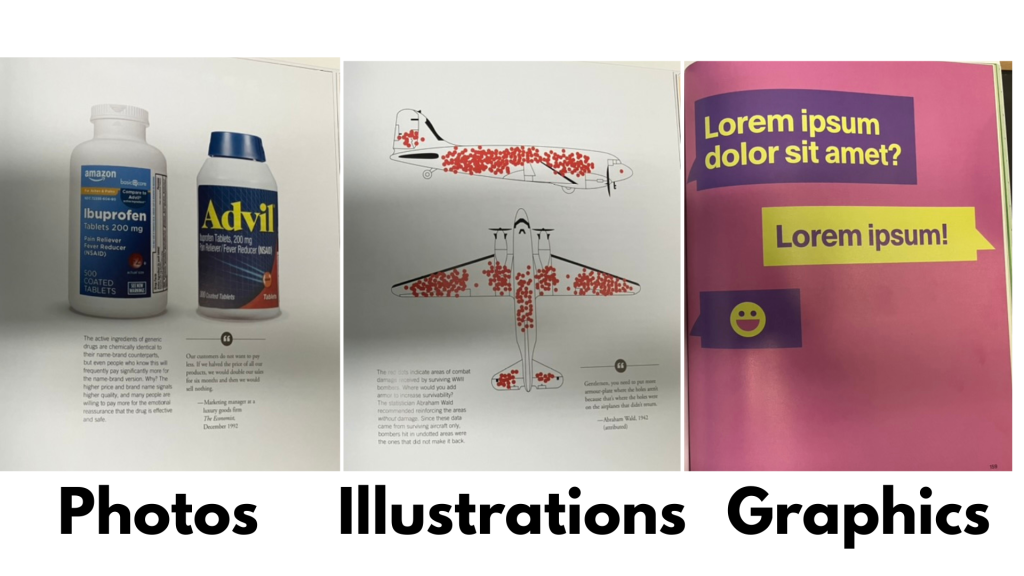
Graphics: Icons, Charts, and Digital Elements

Graphics are usually the SVG, EPS, and Adobe Illustrator files—digitally produced, vector-based, meaning they can scale infinitely.

I know what you’re thinking…isn’t this just a different type of illustration…ummmmmm, yes….  Like I said before, lots of overlap.

I tend to group together styles that look like drawings into the illustration category.  And then computer graphics, charts, and icons into graphics.  

Icons

Icons are some of the most useful graphics because they can be small or large:

Small to tag individual ideas or points

Large to separate sections

Medium for callouts and annotations

They can be simple or complex. And because they’re vector-based, you can scale them up or down without losing quality.

Where to find icons:

Canva has tons (free and premium)

The Noun Project (icons for specific words and concepts)

Flaticon (lots of icon sets)

Other royalty-free icon sites

Icons work well because:

They can be more universally recognizable

They can organize information systematically

They add visual interest without photos

They can sometimes carry meaning across cultures

They’re easy to use consistently

Charts and Maps

Charts, graphs, and maps are graphics. They’re better as SVGs for scalability, but often end up as JPEGs or PNGs (which is why Excel charts get stretched and look fuzzy—they’re not designed for that).

For qualitative work, certain chart types work particularly well:

Heat maps – Creating matrices

Pictograms – Using person icons to show frequency

Grid plots – Dots filled in to show distribution

Timelines – Events arranged chronologically

Process charts – Steps or flows

When you have small sample sizes (N under 100, definitely under 50), pictograms and grid plots can be super useful. They make numbers feel more tangible.

Icon arrays can be more than just grids of the bathroom person. Take this example from a NY Times story that feels more like a painting.

Text as Graphics

Sometimes the simplest graphics are just:

Text on a colored background

Words on a textured backdrop

A quote in a color block

A hashtag or code label

A simple statistic highlighted

If your goal is to organize—to get people to stop and read, or to separate sections—sometimes all you need is a different colored block to break from the white background.

You can have a simple quote. You can have simple stats. These can be used as illustrations in your work to separate sections.

Emojis and Other Elements

Don’t forget about:

Emojis (when appropriate for your audience)

Shapes and lines

Patterns and textures

Borders and frames

Badges and callouts

These are all graphics that can enhance your visual communication.

Mixing and Matching

You don’t have to choose just one type. The most effective visual reports mix:

Photos for specific examples and reality

Illustrations for concepts and universality

Graphics for organization and data

You can layer them:

A photo with graphic overlays

An illustration with text elements

Icons combined with photographs

Charts paired with photos for context

Creating Collages

With tools like Canva, it’s easier than ever to:

Erase backgrounds from photos

Drop people into different settings

Layer illustrations over photographs

Add text to any image

Create frames and borders

Apply filters and effects

What used to require significant graphic design skills is now accessible to anyone willing to experiment.

The Key Question

For any visual you’re considering, ask:

What type of visual best serves my purpose here?

Need to show a real person or place? → Photograph

Need to represent a concept or protect privacy? → Illustration

Need to organize or display data? → Graphics

Want to create emotional resonance? → Mix them thoughtfully

Don’t default to one type just because it’s what you’re comfortable with. Push yourself to try different approaches. Your qualitative work will be richer for it.

And remember: you can start simple. A colored box with text is a graphic. A stick figure is an illustration. A smartphone photo is a photograph. You don’t need professional equipment or advanced skills to begin using all three types effectively.