What Wake County’s “Healthiest County” Designation Actually Measures
An Analysis of the 2025 Wake County Community Health Needs Assessment
Chris Lysy — FreshSpectrum | June 2026
Abstract
Wake County, North Carolina opens its 2025 Community Health Needs Assessment (CHNA) with a celebrated claim: it has been ranked the healthiest county in North Carolina by the County Health Rankings & Roadmaps Program. This paper examines what that designation actually measures. Drawing on U.S. Census Bureau American Community Survey data, CDC PLACES census-tract data, and a systematic analysis of the CHNA report itself, we demonstrate that Wake County’s improving aggregate health statistics are substantially driven by population compositional change — rapid in-migration of high-income households — rather than by health improvements distributed across the county’s existing lower-income residents. Within the same county that holds the top health ranking, residents of the poorest census tract quartile are twice as likely to report fair or poor health, twice as likely to smoke, and nearly four times as likely to experience food insecurity compared to residents of the wealthiest tract quartile. This disparity is not acknowledged in the CHNA’s framing. We further find that the CHNA contains no year-over-year accountability analysis, presents time-series data only for indicators where Wake County compares favorably to peers, and reports all disparity indicators as single-year snapshots without trend lines. The result is a document that conflates a county getting wealthier with a county getting healthier.
1. Introduction
Every three years, nonprofit hospitals in the United States are required by the Internal Revenue Service under Section 501(r)(3) of the Affordable Care Act to conduct a Community Health Needs Assessment. In Wake County, North Carolina, this requirement is fulfilled jointly by nine lead organizations through a collaborative called Live Well Wake, producing a single shared assessment that satisfies IRS compliance obligations for Duke Raleigh Hospital, UNC Rex Healthcare, WakeMed Health and Hospitals, and several other partner organizations.
The 2025 Wake County CHNA, authored by the North Carolina Institute for Public Health at UNC-Chapel Hill, opens with a letter that sets the interpretive frame for everything that follows:
“Wake County was ranked as the healthiest North Carolina county for Population Health and Wellbeing in the 2025 County Health Rankings & Roadmaps Program and is consistently ranked as one of the best places to live, work, play and learn in the US. This success is largely due to the collaborative efforts of various partners, including those involved in the development of this Community Health Needs Assessment and the residents of Wake County.”
— Wake County 2025 CHNA, Opening Letter
This framing — attributing the county’s health ranking to the collaborative work of Live Well Wake and its partners — embeds a causal claim that the report’s own data does not support. Between 2010 and 2024, Wake County added approximately 155,000 households, of which roughly two-thirds landed in the household income bracket above $100,000 in real 2024 dollars. During that same period, the county’s aggregate health statistics improved. This paper examines whether those two facts are related, and what the CHNA’s analytical choices reveal about how the community health needs assessment system functions in rapidly growing affluent counties.
1.1 The Compositional Change Problem
Population health statistics for a geographic unit are averages across that unit’s residents at a given point in time. When the composition of a population changes — when higher-income, healthier residents move in while the denominator of lower-income residents grows more slowly or remains flat — average health statistics can improve without any individual’s health actually getting better. This is a well-documented problem in epidemiology, variously described as the ecological fallacy, compositional change, or selective migration effects.
In fast-growing Sun Belt metros, this problem has a specific character. Rising housing costs displace lower-income residents to neighboring counties or to less expensive areas within the metro, while knowledge-economy workers and high-income households arrive from other states. The receiving county’s average health improves; the sending county’s average health may also improve, as the in-migrants are wealthier than existing residents. The displaced lower-income residents, now in a third location, largely disappear from both analyses.
Wake County is an unusually clear case study. The CHNA itself notes that the county is the 3rd fastest-growing in the United States:
“The county is growing at a rate of 66.4 people per day in 2024, with 17 being born locally and 49 moving to the area each day. This daily growth rate is the highest seen in the last 13 years.”
— Wake County 2025 CHNA, p. 23
The county’s median household income reached $105,768 in 2024 — the highest of any county in North Carolina. These facts appear in the CHNA as contextual background. Their implications for the validity of county-wide health averages are not examined.
1.2 The CHNA Incentive Structure
Understanding why this analysis is missing from the CHNA requires understanding what the CHNA is designed to do. The document exists primarily to satisfy IRS compliance requirements, not to serve community health decision-making. The compliance threshold is met at publication. The organizations with the greatest capacity to produce rigorous analysis — large nonprofit health systems with research infrastructure — are also the organizations whose community health performance is implicitly evaluated by the assessment’s findings.
Recent academic literature has documented this dynamic systematically. A February 2025 study published in JAMA Health Forum by researchers at the Harvard T.H. Chan School of Public Health found that in a cross-sectional study of 2,465 US nonprofit hospitals between 2018 and 2023, communities with more social vulnerability, less educational attainment, more poverty, and more Black and Hispanic residents received less community benefit spending per capita. A North Carolina-specific study found that performing CHNAs did not incentivize North Carolina’s tax-exempt hospitals to progressively invest in community health programs. The Lown Institute’s most recent fair share analysis found that 54% of nonprofit hospitals spent less on community investment than the value of their tax exemption.
These structural incentives shape not just what hospitals do with CHNA findings, but what the assessments measure and how they frame what they find.
2. Methods
This analysis draws on four primary data sources:
- CHNA Report: Wake County 2025 Community Health Needs Assessment (full report and executive summary)
- 2022 CHNA: Wake County 2022 Community Health Needs Assessment (for longitudinal comparison)
- ACS Data: U.S. Census Bureau American Community Survey, multiple tables and years
- CDC PLACES: CDC PLACES 2025 release, census tract level data for Wake County
2.1 CHNA Analysis
We conducted a systematic review of the 2025 CHNA report examining: (1) how county-level averages are framed relative to within-county disparities; (2) which indicators are presented as time series versus single-year snapshots; (3) whether trend data is selectively presented; and (4) what accountability framework, if any, connects 2022 priorities to 2025 findings. We compared parallel sections of the 2022 and 2025 reports to identify changes in methodology, scope, and framing.
2.2 ACS Income Distribution Analysis
We downloaded ACS 5-Year Estimates of Table B19001 (Household Income in the Past 12 Months) for Wake County for each year from 2010 through 2024. We analyzed household counts within income brackets both in nominal dollars and inflation-adjusted to 2024 dollars using Bureau of Labor Statistics CPI-U annual averages. Because the ACS uses fixed nominal bracket boundaries, inflation-adjusted counts require interpolation within brackets assuming uniform distribution — a methodological limitation noted where relevant. We also analyzed Tables B07011 (Median Income by Geographical Mobility) and the ACS Selected Population Profiles (S0201) for demographic and mobility trends.
2.3 ACS Poverty and Demographic Analysis
We downloaded ACS 5-Year Estimates of Table S1701 (Poverty Status) for Wake County for each year from 2012 through 2024 to track poverty rates by race over time. We downloaded ACS 1-Year Estimates of the Selected Population Profiles (S0201) for each available year from 2010 through 2024 to track population counts, median household income, in-migration rates, and poverty rates by racial group. These 1-year estimates are available only for geographies with populations above 65,000 and are not available for 2020 due to COVID-19 data collection disruptions.
2.4 CDC PLACES Tract-Level Analysis
We downloaded the CDC PLACES 2025 release (2023 data) at the census tract level for Wake County, covering 228 census tracts and 40 health outcome measures. Because the network environment did not permit direct API queries to the Census Bureau, we used the food stamp receipt rate (FOODSTAMP measure) available within the PLACES dataset as a tract-level deprivation proxy. We sorted tracts by food stamp receipt rate and divided them into four equal quartiles. We calculated population-weighted average health outcomes for the highest-income quartile (Q1, average food stamp rate 3.3%) and lowest-income quartile (Q4, average food stamp rate 18.4%) and computed the ratio of Q4 to Q1 outcomes for each health measure.
This approach has limitations. Food stamp receipt rate is an imperfect income proxy — it captures only households below approximately 130% of the federal poverty line who are enrolled in SNAP, and enrollment rates vary across demographic groups. Tract-level averages mask within-tract variation. The PLACES data is derived from BRFSS survey modeling and carries its own uncertainty bounds. Despite these limitations, the approach provides a valid within-county comparison that illuminates income-based health disparities the CHNA does not analyze.
3. Findings
3.1 Wake County’s Growth Is Concentrated at the Top of the Income Distribution
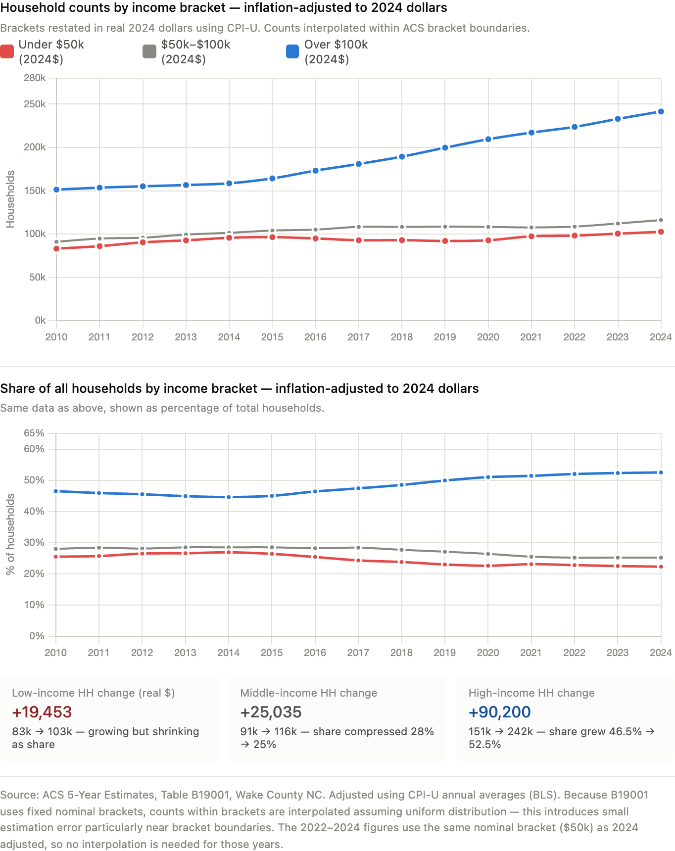
Between 2010 and 2024, Wake County grew from approximately 325,000 to 460,000 households — an increase of 135,000. Analyzing how that growth was distributed across income brackets reveals a striking pattern.
In nominal dollars, the number of households earning below $50,000 per year fell from 128,269 to 102,575 — a decline of 25,694 in absolute terms — while the county as a whole grew by 135,000 households. Households earning above $100,000 nearly tripled from 94,664 to 241,514.
Adjusting for inflation using CPI-U annual averages and restating all brackets in 2024 dollars changes the picture partially but not fundamentally. In real terms, low-income households (under $50,000 in 2024 dollars) grew in absolute numbers from approximately 83,000 to 103,000. However, the county added roughly 135,000 total households over this period, and approximately 90,000 of those — two-thirds of all new households — went to the over-$100,000 bracket. The share of households in the low-income category fell from 25.5% to 22.3% of the total, while the high-income share rose from 46.5% to 52.5%.
| Income Bracket (2024$) | 2010 Households | 2024 Households |
|---|---|---|
| Under $50,000 | 83,122 (25.5%) | 102,575 (22.3%) |
| $50,000–$100,000 | 91,051 (28.0%) | 116,086 (25.2%) |
| Over $100,000 | 151,314 (46.5%) | 241,514 (52.5%) |
| Total | 325,486 | 460,175 |
Source: ACS 5-Year Estimates, Table B19001. Inflation-adjusted using CPI-U. Counts within brackets interpolated assuming uniform distribution.
The implication is direct: Wake County’s population growth has been overwhelmingly concentrated in income brackets associated with better health outcomes. When county-wide health averages are computed across this population, they are being computed across a progressively more affluent mix of residents. An improving average does not require improving conditions for any specific income group.
3.2 In-Migration Does Not Explain the Shift — Growth Does
A natural hypothesis is that wealthy in-migrants are arriving and driving up averages. The B07011 median income by mobility data complicates this story. People who moved to Wake County from a different state in 2024 earned a median individual income of $53,441 — nearly identical to the $54,424 earned by long-term residents who stayed in the same house. The gap that existed in 2010 ($7,400) has essentially closed.
The more accurate description is that the county’s existing economy is generating income growth that accrues unevenly, and that the new households forming and arriving are overwhelmingly high-income. The displacement story is less about wealthy outsiders pricing residents out than about a county growing in a way that systematically adds high-income households while the low-income population grows much more slowly.
The S0201 data on in-migration by race adds texture. Asian residents moved to Wake County from different states at a rate of 4.7–7.8% per year across the 2015–2024 period, compared to 0.8–3.4% for Black residents. The Asian population in the county nearly doubled in absolute terms over this period, from approximately 71,000 to 140,000. The Asian median household income in Wake County in 2024 was $156,317 — nearly $50,000 above the White median and $80,000 above the Black median. When a fast-growing, very high-income population doubles in size within a county, it mechanically pulls county-wide averages upward.
3.3 Poverty Rates Show Persistent Gaps, Not Progress
The county-wide poverty rate has declined from 10.9% in 2012 to 8.1% in 2024 — a genuine improvement that the CHNA reports accurately. But the ACS poverty data stratified by race tells a different story about the distribution of that progress.
Black residents’ poverty rate declined from approximately 18.9% in 2015 to 12.4% in 2024. White non-Hispanic residents’ poverty rate declined from 6.3% to 5.7%. The Black-to-White poverty ratio throughout this period remained roughly 2:1 — from 3.0x in 2015 to 2.2x in 2024. Nearly 14 years of being ranked among the healthiest counties in North Carolina has not meaningfully closed the gap in which group bears the greatest economic vulnerability.
The CHNA does not present this trend line. The 2025 report shows poverty rates by race as a single snapshot, without comparison to prior years, and without connecting the persistent gap to the county’s improving aggregate health statistics.
3.4 Within-County Health Disparities Dwarf the County’s Advantage Over Peers
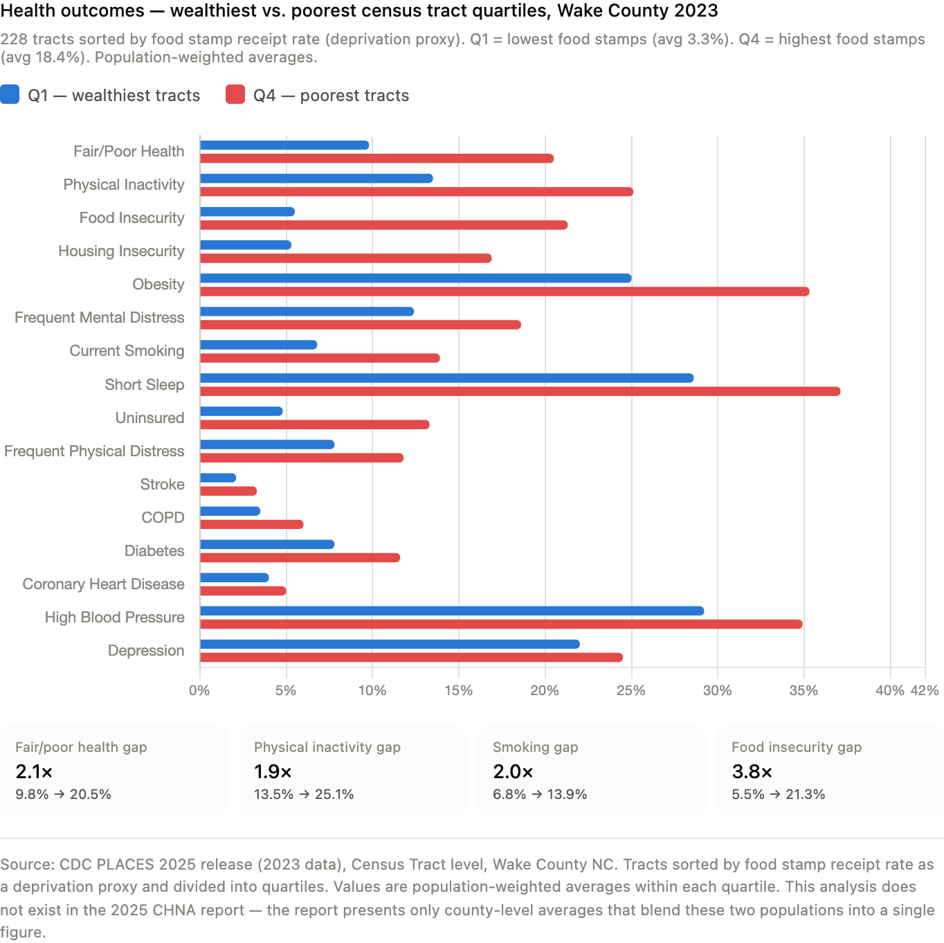
The most direct evidence for the compositional change argument comes from the CDC PLACES census tract data. Stratifying Wake County’s 228 census tracts by food stamp receipt rate as a deprivation proxy reveals health outcome differences within the county that are far larger than the difference between Wake County and its comparison counties.
| Health Measure | Wealthiest Tracts (Q1) | Poorest Tracts (Q4) | Ratio |
|---|---|---|---|
| Fair or Poor Health | 9.8% | 20.5% | 2.1× |
| Physical Inactivity | 13.5% | 25.1% | 1.9× |
| Current Smoking | 6.8% | 13.9% | 2.0× |
| Frequent Mental Distress | 12.4% | 18.6% | 1.5× |
| Obesity | 25.0% | 35.3% | 1.4× |
| Diabetes | 7.8% | 11.6% | 1.5× |
| Uninsured (18–64) | 4.8% | 13.3% | 2.8× |
| Food Insecurity | 5.5% | 21.3% | 3.8× |
| Housing Insecurity | 5.3% | 16.9% | 3.2× |
Source: CDC PLACES 2025 release, Wake County NC census tracts. Q1 = lowest food stamp receipt (avg 3.3%, n=57 tracts). Q4 = highest food stamp receipt (avg 18.4%, n=57 tracts). Population-weighted averages.
The county’s headline health ranking is computed across both these populations blended together. As the high-income population grows faster than the low-income population — which the income distribution data clearly shows — the blended average moves toward the wealthier tracts’ outcomes regardless of what happens to the poorer tracts. The county can celebrate improving health rankings while residents of its poorest census tracts experience no meaningful change.
This analysis does not exist in the 2025 CHNA. The data to build it was publicly available.
3.5 The CHNA’s Data Choices Systematically Favor Favorable Comparisons
A systematic review of the 2025 CHNA’s data presentation reveals a consistent pattern: indicators where Wake County compares favorably to Mecklenburg County and the state are shown as time-series figures with trend lines. Indicators showing within-county disparities are presented as single-year snapshots.
Indicators with time-series visualization:
- Uninsured rate 2018–2022 — declining, Wake better than peers
- Unemployment rate 2013–2023 — declining post-COVID, Wake better than peers
- Diabetes prevalence 2016–2021 — flat, Wake similar to peers
- Opioid overdose mortality — Wake below Mecklenburg and state
Indicators shown as single-year snapshots only:
- Black/White infant mortality ratio (3.53 in 2023, no prior years)
- Median household income by race (2022 only, no trend)
- Black homelessness rate (51.5 per 10,000, no trend)
- Racial poverty rate gaps (current year only)
- High school graduation by race (2020–2021 only)
The 2022 CHNA included racial breakdowns for prenatal care access (Black: 53.5%, Hispanic: 46.0%, White: 74.6% in first trimester) that do not appear in the 2025 report. The 2025 report shows prenatal care as a county-wide figure only (71.1%), having improved, without showing whether that improvement was distributed across racial groups.
This pattern means that the CHNA’s narrative of improvement is built on trend data that consistently shows Wake looking good, while the disparities that would challenge that narrative are shown only as static snapshots that cannot convey direction of travel.
3.6 The Accountability Gap
The 2022 CHNA identified three priorities: mental health, access to healthcare, and affordable housing and homelessness. The 2025 CHNA identifies the same three priorities. Before 2022, the 2019 CHNA also identified the same priorities. The 2022 report noted that only 7.8% of community survey respondents saw improvements in housing and homelessness from the 2019 cycle, and only 6.4% saw improvements in mental health.
The 2025 report’s accountability section for the 2022 priorities covers approximately two pages and describes a series of initiatives:
“Live Well Wake facilitates workgroups for each of these priorities. Since 2022, Wake County has made progress on these priority areas through a variety of initiatives described below. These efforts show that Wake County is dedicated to the priorities identified in the CHNA and working hard to improve the overall health and wellbeing of the Wake County community.”
— Wake County 2025 CHNA, p. 20
The section describes a mobile health clinic operating weekly at one shelter, the Familiar Faces collaborative, expanded hospital facilities, and $35 million in ARPA funding for affordable housing. No outcome data is presented. The 1,258 people experiencing homelessness in the 2025 PIT count — up 38% from 912 in 2021 — appear elsewhere in the report without connection to this accountability section. The 2025 report does not ask whether the 2022 initiatives worked, because no baseline performance metrics were established in 2022 against which to measure them.
The HNC 2030 Scorecard, a companion document that does contain trend data for some indicators, shows that the strategy-level performance measures — the measures that would tell you whether specific programs were reaching people — are almost entirely blank, listed as dashes with no data.
4. Discussion
4.1 What “Healthiest County” Actually Measures
The County Health Rankings model, which produces the designation Wake County’s CHNA opens with, is a county-level summary statistic. It measures health outcomes and health factors averaged across all residents of a county. When a county’s population composition shifts toward higher-income residents — who are healthier on average — the county-wide average improves. This is not a flaw in the methodology; the rankings measure what they say they measure. The problem is in how the designation is used: as evidence that the county’s health system, public health infrastructure, and collaborative partners have delivered health improvements.
The CHNA’s opening letter makes exactly this attribution. The data examined in this paper suggests a different interpretation: Wake County’s improving health rankings primarily reflect that it is increasingly a county where wealthy people live, not that health has improved for the residents who have been there longest or who face the greatest barriers.
4.2 The Within-County Reality
The CDC PLACES tract analysis makes visible what the CHNA’s county-wide averages obscure. Residents of Wake County’s poorest census tracts are not experiencing the county’s headline health status. They are experiencing fair-or-poor health rates of 20.5%, smoking rates of 13.9%, and food insecurity rates of 21.3% — outcomes that would place them among the least healthy populations in the state, not the healthiest county.
The CHNA’s own data documents this disparity in scattered places: Black residents have a life expectancy of 76.5 years versus 81.7 years for White residents; Black infant mortality is 10.6 per 1,000 live births versus 3.0 for White infants; Black residents experience homelessness at 51.5 per 10,000 compared to 3.7 for White residents; the food insecurity rate for Black individuals is 24.0% compared to 11.1% overall. These figures appear in the report as isolated data points. They are never assembled into a picture that challenges the opening claim about the healthiest county.
The CHNA does acknowledge gentrification once, in the context of community cohesion:
“Additionally, gentrification has altered neighborhood demographics, leading to a diminished sense of belonging and reduced communal support.”
— Wake County 2025 CHNA, p. 38
The report does not follow this observation to its statistical implications: if gentrification is altering neighborhood demographics, it is also altering who is being counted in county-wide health measures, and in what direction.
4.3 Limitations of This Analysis
Several limitations constrain the conclusions of this paper. First, the CDC PLACES tract analysis uses food stamp receipt rate as an income proxy rather than actual tract-level median income, because network constraints prevented direct Census API queries during this analysis. A more rigorous approach would merge ACS Table B19013 tract-level median income data with the PLACES outcomes, which would allow precise income quintile stratification.
Second, the PLACES data provides a single cross-section (2023). Without tract-level PLACES data across multiple years, it is not possible to determine whether health outcomes in the poorest tracts have been improving, declining, or holding flat while the county average improves. This is the most important missing piece of the analysis: it is possible that health outcomes in lower-income tracts are genuinely improving, just more slowly than in higher-income tracts. The county average would still be partly a compositional artifact, but the picture would be more nuanced than simple stagnation.
Third, the argument in this paper applies to the county-wide framing of the CHNA. The CHNA does contain substantial data on racial and geographic disparities. The critique is not that the CHNA ignores these disparities — it documents them — but that the framing of county-wide improvement obscures them, and that the data choices (what gets a trend line, what gets a snapshot) consistently support the favorable framing.
4.4 Implications for the CHNA Process
The problems identified in this paper are not unique to Wake County. They are structural features of how CHNAs function in rapidly growing, affluent counties. Several reforms would address the core issue:
- Income-stratified health outcome reporting. The CDC PLACES tract data makes this feasible for any county with sufficient tract coverage. A rigorous CHNA would present health outcomes by income quartile, not just county averages.
- Consistent time-series presentation for disparity indicators. If the uninsured rate gets a trend line, so does the Black/White infant mortality ratio. Selective time-series presentation is a form of framing, whether intentional or not.
- Accountability metrics with baselines. Every identified priority should have at least one measurable outcome indicator with a baseline established at the time the priority is set, so the next CHNA cycle can assess whether anything changed.
- Explicit acknowledgment of population compositional change. In fast-growing counties, the CHNA should explicitly note that improving averages may reflect changing population composition and present per-capita measures for low-income subpopulations alongside county-wide averages.
- Separation of compliance documentation from community health communication. The IRS-required compliance document and the community health communication product have different audiences and different purposes. Conflating them produces a document that serves neither well.
5. Conclusion
Wake County is not a healthy county for all of its residents. It is a county where wealthy residents — an increasingly large share of the population — experience excellent health outcomes, and where lower-income residents experience health outcomes that would be unremarkable in a county with no health ranking distinction at all. The 2025 CHNA documents both realities, but frames only the first one in its opening claim and in its time-series data presentation.
The county’s income distribution data shows that two-thirds of all new households added between 2010 and 2024 landed in the over-$100,000 income bracket. The mobility data shows that people arriving from other states earn nearly as much as long-term residents. The poverty data shows a persistent gap between higher- and lower-income populations that has not meaningfully narrowed over 14 years. The PLACES tract data shows that residents in the poorest quarter of Wake County’s census tracts are twice as likely to be in poor health as residents in the wealthiest quarter.
None of this is secret. All of it is available from public data sources. Most of it appears, in pieces, in the CHNA itself. What is missing is the analytical step that connects these facts to the county’s headline health designation — the step that asks whether the designation measures what it is being used to claim.
Until that step is taken, community health needs assessments in fast-growing affluent counties will continue to produce documents that celebrate a county getting wealthier while calling it getting healthier. The people who bear the cost of that conflation are the ones who already knew the difference.
Data Sources
- Wake County 2025 Community Health Needs Assessment. Live Well Wake / NC Institute for Public Health.
- Wake County 2022 Community Health Needs Assessment. Live Well Wake / NC Institute for Public Health.
- U.S. Census Bureau, American Community Survey 5-Year Estimates, Table B19001 (Household Income Distribution), Wake County NC, 2010–2024.
- U.S. Census Bureau, American Community Survey 5-Year Estimates, Table B07011 (Median Income by Geographic Mobility), Wake County NC, 2010–2024.
- U.S. Census Bureau, American Community Survey 5-Year Estimates, Table S1701 (Poverty Status by Race), Wake County NC, 2012–2024.
- U.S. Census Bureau, American Community Survey 1-Year Estimates, Selected Population Profiles (S0201), Wake County NC, 2010–2024.
- CDC PLACES: Local Data for Better Health, Census Tract Data 2025 Release (2023 data). Centers for Disease Control and Prevention.
- Bureau of Labor Statistics, Consumer Price Index for All Urban Consumers (CPI-U), Annual Averages, 2010–2024. Used for inflation adjustment.
- Hedquist A, Blumenthal D, Dai D, Phelan J, Orav EJ, Figueroa JF. Structural Discrimination in Nonprofit Hospital Community Benefit Spending. JAMA Health Forum. February 2025.
- Harvard T.H. Chan School of Public Health press release on the above study. March 2025.
- North Carolina-specific CHNA spending study. Population Health Management. 2018.
- Lown Institute. Hospital Fair Share Spending. 2024–2025. lowninstitute.org
- County Health Rankings & Roadmaps. University of Wisconsin Population Health Institute. 2025.
Methodology and Data Analysis Annex
Supplement to “Counting the Healthy: What Wake County’s ‘Healthiest County’ Designation Actually Measures”
This annex documents the data sources, extraction methods, analytical procedures, and limitations underlying each finding in the main paper. It is organized by analysis, in the order each appears in the paper, so a reader or replicator can trace any figure or claim back to its source data and the specific steps used to produce it.
A.1 CHNA Document Analysis
A.1.1 Source Documents
- Wake County 2025 Community Health Needs Assessment (full report), Live Well Wake / NC Institute for Public Health, UNC-Chapel Hill
- Wake County 2025 CHNA Executive Summary
- Wake County 2022 Community Health Needs Assessment (full report), for longitudinal comparison
- UNC Rex Healthcare 2025 CHNA Proposed Action Plan
- HNC 2030 Scorecard: Wake County 2025–2028 (companion accountability document)
- Live Well Wake Reports page (web capture)
A.1.2 Extraction Method
Each PDF was converted to plain text using pdftotext -layout to preserve table structure and column alignment, producing searchable text files for the 2025 report (7,704 lines) and the 2022 report (18,965 lines). Targeted keyword searches (grep) were used to locate sections addressing: comparative time-series data, racial and ethnic disparities, accountability for prior-cycle priorities, methodology and limitations statements, and direct quotations subsequently cited in the paper. Surrounding context (typically 10–50 lines before and after a match) was reviewed manually for each search hit to confirm accurate quotation and avoid misreading tables or footnotes as body text.
A.1.3 Comparative Analysis Procedure
The 2022 and 2025 reports were compared section-by-section on four dimensions:
- Trend presentation — for each numbered figure in the 2025 report, we classified it as either a multi-year time series (two or more data points across years) or a single-year snapshot, and recorded whether the comparison shown favored Wake County relative to Mecklenburg County and North Carolina, or whether it documented a within-county disparity (racial, geographic, or income-based).
- Indicator continuity — every quantitative indicator appearing in the 2022 report was checked against the 2025 report to determine whether the same indicator was reported in 2025, and if so, whether the report connected the two values explicitly (i.e., stated a change) or presented them independently without acknowledgment of the prior figure.
- Accountability structure — the “implementation strategy” and “progress since prior cycle” sections of both reports were read in full to assess whether any baseline metric, target, or outcome measure was established and subsequently evaluated.
- Disclosed limitations — both reports’ stated methodology and limitations sections were reviewed for any acknowledgment of population compositional change, demographic shift, or the validity of county-wide averages in a fast-growing county.
A.1.4 Limitation
This is a qualitative document analysis conducted by a single reviewer (assisted by AI-supported text search and synthesis; see Section A.6). It was not independently double-coded. The classification of figures as “favorable trend” versus “disparity snapshot” involved judgment calls noted transparently in the paper; a reader may wish to verify specific examples against the source PDFs directly.
A.2 Income Distribution Analysis (Table B19001)
A.2.1 Source
U.S. Census Bureau, American Community Survey 5-Year Estimates, Table B19001 (“Household Income in the Past 12 Months, in [Year] Inflation-Adjusted Dollars”), Wake County, NC (FIPS 37183). Downloaded from data.census.gov for each year from 2010 through 2024 (15 annual files, each covering a rolling 5-year window ending in the stated year).
A.2.2 Bracket Structure
Table B19001 reports households in 16 fixed nominal income brackets:
| Census Column | Bracket (nominal $) |
|---|---|
| B19001_002E | Less than $10,000 |
| B19001_003E | $10,000–$14,999 |
| B19001_004E | $15,000–$19,999 |
| B19001_005E | $20,000–$24,999 |
| B19001_006E | $25,000–$29,999 |
| B19001_007E | $30,000–$34,999 |
| B19001_008E | $35,000–$39,999 |
| B19001_009E | $40,000–$44,999 |
| B19001_010E | $45,000–$49,999 |
| B19001_011E | $50,000–$59,999 |
| B19001_012E | $60,000–$74,999 |
| B19001_013E | $75,000–$99,999 |
| B19001_014E | $100,000–$124,999 |
| B19001_015E | $125,000–$149,999 |
| B19001_016E | $150,000–$199,999 |
| B19001_017E | $200,000 or more |
A.2.3 Nominal-Dollar Aggregation
For the nominal-dollar analysis, brackets were summed directly: “Under $50,000” = columns 002–010; “$50,000–$100,000” = columns 011–013; “Over $100,000” = columns 014–017.
A.2.4 Inflation Adjustment Procedure
Because B19001 brackets use fixed nominal dollar thresholds that are not adjusted for inflation across survey years, a household counted as “low income” in a 2010 file and a household counted as “low income” in a 2024 file are not economically comparable. To address this, we restated the analysis in constant 2024 dollars using the following procedure:
- CPI-U annual averages were obtained from the Bureau of Labor Statistics (All Urban Consumers, U.S. city average, all items) for each year 2010–2024.
- For each survey year y, we computed a deflator: deflator(y) = CPI(y) / CPI(2024).
- We computed the nominal-dollar threshold in year y that is equivalent to $50,000, $75,000, and $100,000 in 2024 dollars: threshold_nominal(y) = threshold_2024 × deflator(y).
- Because these inflation-adjusted thresholds fall within a Census bracket rather than exactly on a bracket boundary in most years, we estimated the household count below each threshold using linear interpolation within the bracket containing the threshold, assuming households are uniformly distributed across the dollar range of that bracket. For example, if the 2024-equivalent $50,000 threshold falls at $47,300 in a given year, and that falls within the $45,000–$49,999 bracket, we add 86% of that bracket’s household count (the fraction of the bracket’s dollar range below $47,300) to the cumulative total of all brackets fully below it.
- This produces an estimated household count below each inflation-adjusted threshold for every year, expressed consistently in 2024 dollars.
A.2.5 CPI-U Values Used
| Year | CPI-U Annual Average |
|---|---|
| 2010 | 218.056 |
| 2011 | 224.939 |
| 2012 | 229.594 |
| 2013 | 232.957 |
| 2014 | 236.736 |
| 2015 | 237.017 |
| 2016 | 240.007 |
| 2017 | 245.120 |
| 2018 | 251.107 |
| 2019 | 255.657 |
| 2020 | 258.811 |
| 2021 | 270.970 |
| 2022 | 292.655 |
| 2023 | 304.702 |
| 2024 | 314.175 |
A.2.6 Limitations
The uniform-distribution assumption within brackets is a simplification; actual household income within any $5,000–$50,000-wide bracket is not perfectly uniform and likely skews toward the lower end of each bracket in most real-world income distributions, which would mean our interpolation slightly overstates the count of households just above a threshold and understates the count just below it. This effect is small relative to the magnitude of the trends reported (a multi-thousand-household shift over 14 years) but should be treated as an estimate rather than an exact figure. The 5-year ACS estimates are rolling averages, meaning each “year” label (e.g. “2024”) represents data collected from 2020–2024, which smooths year-to-year volatility but also means adjacent years in the time series are not fully independent observations.
A.3 Median Income by Mobility Status (Table B07011)
A.3.1 Source
U.S. Census Bureau, American Community Survey 5-Year Estimates, Table B07011 (“Median Income in the Past 12 Months by Geographical Mobility in the Past Year for Current Residence”), Wake County, NC. Downloaded for each year 2010–2024.
A.3.2 Columns Used
| Census Column | Mobility Category |
|---|---|
| B07011_001E | Overall (total population) |
| B07011_002E | Same house 1 year ago (non-movers) |
| B07011_003E | Moved within same county |
| B07011_004E | Moved from different county, same state |
| B07011_005E | Moved from different state |
| B07011_006E | Moved from abroad |
A.3.3 Method
Values were extracted directly without transformation; all figures are nominal dollars for the stated survey period, as the comparison of interest (relative income across mobility categories within the same year) does not require inflation adjustment, since all categories within a given year are measured in the same dollars.
A.3.4 Limitation
B07011 reports individual income, not household income, so absolute values are not directly comparable to the B19001 household income analysis. The table also does not cross mobility status with race or other demographic characteristics; a finding that in-migrants from other states earn similarly to non-movers does not indicate anything about the demographic composition of either group. This table additionally cannot capture outmigration — people who left Wake County are not represented in a Wake County survey, since the ACS asks respondents about their residence one year ago relative to their current residence. A full accounting of who leaves Wake County and their income would require Table B07411 (residence one year ago, profiled in the destination geography for each origin) or Public Use Microdata Sample (PUMS) analysis, neither of which was performed for this paper. This is flagged explicitly as future work in Section 4.3 of the main paper.
A.4 Demographic and Racial Income/Poverty Trends (Tables S1701, S0201)
A.4.1 Poverty by Race (Table S1701)
Source: ACS 5-Year Estimates, Table S1701 (“Poverty Status in the Past 12 Months”), Wake County, NC, years 2012–2024.
Method: Because the column ID mapping for race/ethnicity subgroups in S1701 changed between survey vintages (the Census Bureau periodically reorders subject table columns), we did not use fixed column IDs across all years. Instead, for each year’s column metadata file, we programmatically searched for the column whose text label matched target phrases (e.g., a label containing both “percent below poverty level” and “black or african american alone” identifies the Black poverty rate column for that year, whatever its column ID happens to be in that vintage). This label-matching approach was applied to extract: overall poverty rate, White alone non-Hispanic poverty rate, Black or African American alone poverty rate, Hispanic or Latino origin poverty rate, and Asian alone poverty rate, for each available year.
Limitation: Self-identified single-race categories (“alone”) undercount individuals who identify as multiracial. Margins of error, which were present in the source files, were not propagated through this analysis; year-to-year fluctuations within roughly 1–2 percentage points should be interpreted cautiously given typical ACS margins of error for subgroup estimates at the county level.
A.4.2 Population, Income, and Mobility by Race (Table S0201 — Selected Population Profiles)
Source: ACS 1-Year Estimates, Selected Population Profiles (S0201), Wake County, NC, for each available year 2010–2024. Unlike the other tables in this analysis, S0201 1-year estimates are only published for geographies with populations above 65,000, and are organized as one row per population subgroup (“POPGROUP”) per file, rather than one row per geography.
Population groups extracted: White alone or in combination (POPGROUP code 003), Black or African American alone or in combination (005), Asian alone or in combination (031), and Some Other Race alone or in combination (071, available beginning 2021).
Variables extracted per group, per year:
| Census Column | Variable |
|---|---|
| S0201_006E | Total population in group |
| S0201_120E | % same house 1 year ago |
| S0201_123E | % moved from different county, same state |
| S0201_125E | % moved from different state |
| S0201_126E | % moved from abroad |
| S0201_214E | Median household income (nominal $) |
Note on 2020: No 1-year ACS estimates were published for 2020 due to data collection disruptions caused by the COVID-19 pandemic; this year is absent from all S0201-derived time series in the paper.
Population share calculation: Because S0201 reports each racial group’s population independently (and categories overlap for multiracial respondents), we calculated “Black share” and “Asian share” as a percentage of the combined White + Black + Asian total for each year, rather than as a percentage of total county population, to provide a consistent and interpretable denominator across the time series. This is explicitly noted wherever the resulting percentages are presented.
Limitation: Because S0201 categories are “alone or in combination,” a person identifying as both Black and Asian is counted in both the Black and Asian totals; the sum of group populations therefore exceeds total county population, which is why a fixed denominator (White+Black+Asian) was used rather than total population. 1-year estimates also carry wider margins of error than 5-year estimates, particularly for smaller subgroups in earlier years before NC’s Asian population grew large enough for stable 1-year estimation (this is why several years show “N/A” for Asian-specific figures before 2014).
A.5 CDC PLACES Census Tract Health Outcome Analysis
A.5.1 Source
CDC PLACES: Local Data for Better Health, Census Tract Data, 2025 Release (underlying survey year 2023), filtered to Wake County, NC (County FIPS 37183). This release covers 228 census tracts within Wake County and reports model-based estimates for approximately 40 health outcome, prevention, and risk behavior measures, derived from the Behavioral Risk Factor Surveillance System (BRFSS) using small-area estimation methods.
A.5.2 Deprivation Proxy
A true income-stratified analysis would merge this tract-level health data with tract-level median household income from ACS Table B19013. This merge was not performed because the analysis environment’s network configuration did not permit direct queries to the Census Bureau API during this session, and no offline tract-level income file was available. As a substitute, we used the FOODSTAMP measure already present within the PLACES dataset — the modeled percentage of households in each tract receiving SNAP/food stamp benefits in the past 12 months — as a proxy for economic deprivation.
A.5.3 Quartile Construction
- All 228 Wake County tracts with both a valid FOODSTAMP value and a valid value for the outcome of interest were retained.
- Tracts were sorted in ascending order of FOODSTAMP rate.
- The sorted list was divided into four equal-sized quartiles (57 tracts each): Q1 (lowest food stamp receipt, used as a proxy for highest income) through Q4 (highest food stamp receipt, proxy for lowest income).
- For each health outcome measure and each quartile, we computed a population-weighted average: ?(tract_value × tract_population) / ?(tract_population), using each tract’s TotalPopulation field as the weight, rather than a simple unweighted average of tract values. This ensures the quartile-level figure reflects the share of the population experiencing that outcome rather than treating a sparsely populated tract and a densely populated tract as equally informative.
A.5.4 Outcome Measures Compared
Sixteen PLACES measures were compared between Q1 and Q4: fair/poor self-rated health (GHLTH), physical inactivity (LPA), food insecurity (FOODINSECU), housing insecurity (HOUSINSECU), obesity (OBESITY), frequent mental distress (MHLTH), current smoking (CSMOKING), short sleep duration (SLEEP), lack of health insurance ages 18–64 (ACCESS2), frequent physical distress (PHLTH), stroke (STROKE), COPD (COPD), diabetes (DIABETES), coronary heart disease (CHD), high blood pressure (BPHIGH), and depression (DEPRESSION).
A.5.5 Limitations
This is the most important set of limitations in the paper, and is flagged explicitly:
- Proxy validity. Food stamp/SNAP receipt is an indicator of low income but captures only households below approximately 130% of the federal poverty line who are both eligible and enrolled; it does not capture middle-income variation, and SNAP take-up rates vary by demographic group independent of income, which could introduce some distortion into the quartile assignment.
- Cross-sectional design. PLACES 2025 release data reflects a single underlying survey year (2023). This cannot establish whether the gap between Q1 and Q4 tracts is widening, narrowing, or stable over time — only that it exists in this snapshot. A genuinely longitudinal version of this analysis would require pulling multiple PLACES annual releases (available back to the 2020 release, covering survey years from roughly 2017 onward) and tracking the same tract boundaries across years, which is complicated by periodic census tract boundary redefinitions (notably the 2020 decennial redistricting).
- Small-area estimation uncertainty. PLACES tract-level figures are themselves modeled estimates derived from BRFSS using established small-area estimation methods, not direct tract-level surveys; the source data includes confidence intervals (Low_Confidence_Limit, High_Confidence_Limit fields) that were not propagated into our quartile averages. Outcomes for tracts with small populations carry proportionally wider uncertainty.
- Ecological inference. This is a tract-level (ecological) comparison, not an individual-level one. It demonstrates that tracts with higher deprivation have worse population-level outcomes; it does not demonstrate that any specific individual’s income causally determines their health outcome, and it cannot rule out that some of the gap reflects other tract-level characteristics correlated with food stamp receipt (e.g., access to grocery stores, the built environment, healthcare facility proximity) rather than income per se.
A.5.6 Recommended Follow-Up
The methodologically stronger version of this analysis — and the natural next step for this research — is to merge PLACES tract data with ACS Table B19013 (tract-level median household income) directly, replacing the food-stamp proxy with actual income quintiles, and to repeat the exercise across multiple PLACES release years to establish whether the gap is widening or narrowing over time. This would require either direct Census API access or manually downloading B19013 for all Wake County tracts from data.census.gov.
A.6 Use of AI in This Analysis
This paper and its underlying analysis were produced through an extended conversational research session using Claude (Anthropic), in which the author directed each analytical step, supplied all source data (CHNA PDFs and Census Bureau CSV downloads), and reviewed all outputs. The following division of labor applies:
Author-directed (analytical and interpretive decisions): the research question; which Census tables to pull and which years to request; the decision to test the income-distribution hypothesis against the racial-displacement hypothesis and to report the result honestly when the data did not support the simpler version of the argument (Section 3.2 of the main paper); the decision to inflation-adjust the B19001 analysis after recognizing the nominal-dollar version was misleading; the choice to seek a within-county health outcome stratification once the demographic and income analyses were complete; and all conclusions and framing in the Discussion section.
AI-assisted (execution and synthesis): extraction of quotations and structured data from CHNA PDFs via text search; writing and running Python scripts to parse, aggregate, and compute statistics from downloaded Census CSV files; performing the CPI-U inflation adjustment calculations; constructing the food-stamp-rate quartile stratification of PLACES data; drafting prose synthesizing the findings; and verifying citation URLs via web search.
Not independently verified beyond what is documented here: the underlying accuracy of Census Bureau and CDC source data itself (taken as authoritative); the statistical significance of any reported difference (no formal hypothesis tests were run; all comparisons are descriptive); and the PLACES small-area estimation methodology (taken as documented by CDC).
Readers seeking to build on or challenge this analysis are encouraged to use the data source citations in the main paper to independently reproduce any figure.
A.7 Reproducibility
All source data used in this analysis is publicly available without cost from data.census.gov (American Community Survey tables B19001, B07011, S1701, S0201) and the CDC PLACES data portal (census tract release). No restricted, licensed, or non-public data was used at any stage of this analysis. A reader with the table names, geography (Wake County, NC / FIPS 37183), and years specified above can download identical source files and replicate every figure in the paper and this annex.