

Saying that we should budget more money or time towards data design is like saying we should increase teacher pay.
You can get a lot of nodding heads from decision makers but when it comes time to actually commit the funds…
That’s a no go.
So you’re left with a few options.
- Option 1: Keep fighting the good fight, trying to get more resources thrown your way.
- Option 2: Give up.
- Option 3: Do more with less.
In all honesty, I’ve tried all three. I prefer option number 3.
In today’s post I’m going to share:
- How a market rate design process kills efficiency.
- What if you can’t afford market rates?
- The way to make data design cheaper.
- The way to make data design easier.
- The way to make data design faster.
- How I could help (even if you have no budget).
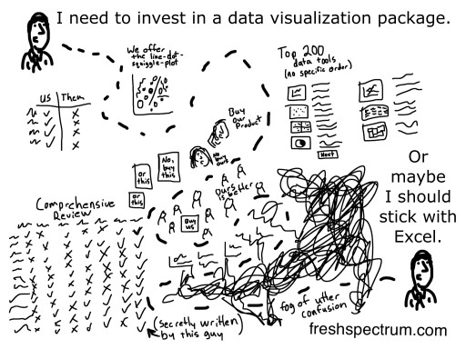
How a market rate design process kills efficiency.
 The market rate for an infographic designed by someone with actual expertise can start at around $3,000. For videos and interactive infographics the starting rates can shoot up to anywhere from $5,000 to $10,000.
If you can afford the price tag (a big IF even for larger research and evaluation projects) market rates are usually pretty good for both parties. For designers, a market rate guarantees a solid payday. For clients, a market rate provides a clear budget.
When I do single design projects, I always use market rates. Because single one-off designs always take much longer and cost way more than they should.
Why?
Say you’re a designer and you price an infographic at $3,000 and a client takes you up on the offer. It’s in your best interest to be as efficient as possible.
Now say you’re the client. Unless you have a really quick deadline, that whole efficiency thing goes out the window. You’re paying for a service that doesn’t cost more if it takes more time, so why not nitpick a little. Might as well get your money’s worth.
All of a sudden the market rate becomes a self-fulfilling prophecy. It’s expensive because it takes a good amount of time and it takes a good amount of time because it’s expensive.
What if you can’t afford the rates?

Only so many organizations and project teams involved in research and evaluation can afford market rates. And the organizations who can afford them can usually only foot the bill for a few projects.
And then after spending all that money, it’s rarely ever a huge success. Because basically, it’s still just one thing. And one thing can’t reach the diverse audiences you need to reach.
The way to make data design cheaper.
You don’t need professional design tools to create professional designs. At least not in the internet age.
The cheapest way forward is to take advantage of inexpensive and readily available tools and design templates. These are inexpensive shortcuts to professional deliverables.
Being completely original is overrated and often ill-advised. Being partly original is the cheapest path.
The way to make data design easier.
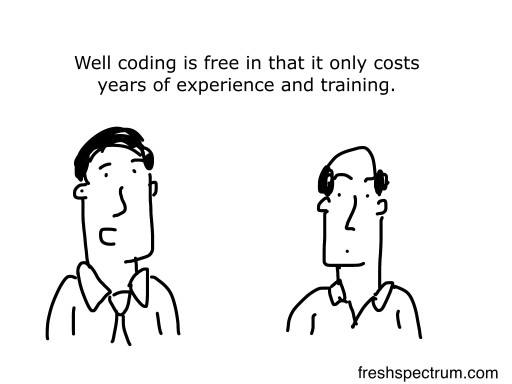
Not all free tools are free.
If you’ve never coded anything in your life, R and Python are not free. There are lots of resources on the web to help ease you into a coding approach, but it takes time.
The easiest way you know how to do something is usually the way to go. The tools you have at hand. The tools that are the easiest to learn and use. Focus on these.
The way to make data design faster.
Faster design is all about preparation. Ready to go templates, design assets, worksheets, and dataset formats can really speed up the design process. There’s no reason to start from scratch every time you start a project.
When you’re prepared, you can actually look forward to quick turn-arounds. The due date is fast approaching so there is less time to nitpick and get lost in trivial design choices.
It’s weird, but now-a-days fast deadlines tend to be my preference.
How I could help (even if you have no budget).
As you may have heard, I am now 100% independent. All this stuff that I’ve been doing on the side for the last 7 years is now my full-time job. So expect more stuff, and at a higher quality.
If you have absolutely no budget, join diydatadesign live, my free weekly webinar series on engaging your audiences easier, faster, cheaper, and better.
If you’re a little more serious about improving your design skills, or just need more flexibility on the times when you can take on lessons, join my full digital workshop.
For only $35/month (cheaper if you pay for a year) you’ll get access to the recorded archive from diydatadesign live, access to a slack community, lots of short design activities delivered by animated video, and weekly coaching sessions where you can ask questions when you get stuck.
Finally, if you would like a little bit of one on one support, access to some design shortcuts, to have me do some of the heavy lifting for you, and/or if you just want to have an expert on call when you need one, I just rolled out a new support package. You can get all that for less than the cost of a single infographic and way less than the cost of an inexperienced new hire.
Thanks, Chris, I hear lots of heads nodding in agreement with you on the internet.
re free tools which do a good-enough job, you might like to look at http://theorymaker.info – it is a free (and open source) web app I created which helps you auto create a graphic from an evaluation Theory of Change just by typing or pasting text. The results can look quite OK – they are not infographic level but you can export them as .svg and fiddle further in Inkscape or whatever.
Thanks for sharing Steve.
Awesome approach! Well done Chris
Thanks Jennifer 🙂