
This is the second in a series of before and after designs. With each post I’ll take a real publicly available resource or report and adapt the writing, format, structure, and illustrations in order to increase the accessibility. You can see the first post on adapting a UNICEF Strategic Plan by following this link. In this post I’ll walk you through some of the key design decisions I made along with way.

How it started – The CDC Evaluation Framework, 2024
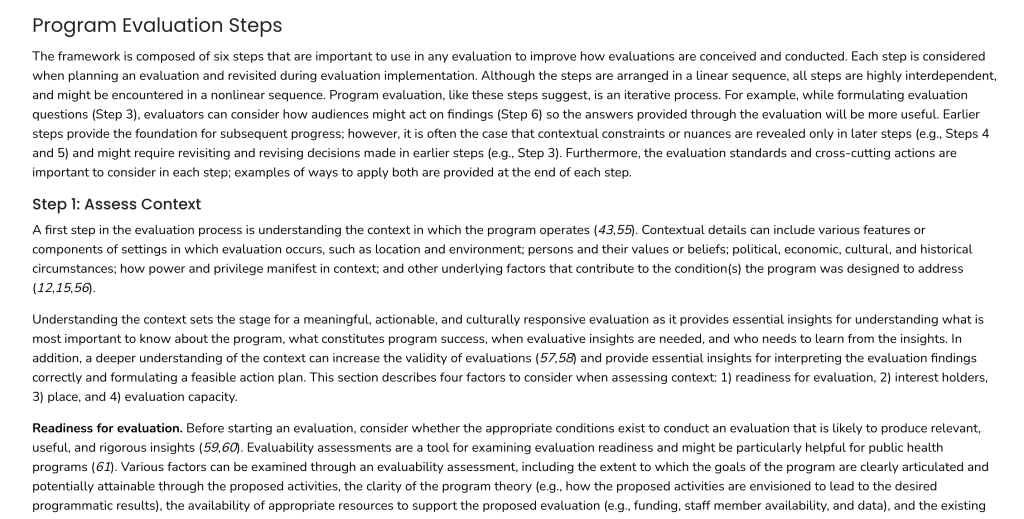
This latest CDC Program Evaluation Framework is a 2024 revision of a framework last published in 1999. The 2024 version has approximately 25,600 words and is written at a grade level of 14-16. If this were inside an average non-fiction book with 300 words per page, that would make it about 85 pages.
This one is published in HTML so would be auto-translatable and readable on a mobile phone. That said, the sentences and paragraphs are long for the web. And while there are images, they don’t show up until you reach the appendices. (There is also a downloadable PDF version, which is formatted a bit differently and includes a couple of the images in the main body of the article).
There is also an action guide.
The CDC also released a companion Program Evaluation Framework Action Guide. The web version of the action guide is made up of 11 different pages with total of around 9,000 words. So it’s about 35% the size of the original. The writing is only slightly more accessible, at a grade level of 13-15.

Shorter is not always better.
When long documents get reformatted for the web, there is a tendency to break them up into little pieces. But length is not really the issue people think it is. Splitting up longer comprehensive resources into little pieces is like trying to serve a hearty meal but instead of offering it in one sitting, you split it into 11 small plates that you serve over time.
On the web, every click is a decision point. So when you split a longer document into 11 pages, people will only read the first couple before they get tired of clicking.
Scrolling is different, people will scroll and skim until they get bored. It only forces a decision when you get to the end.
Step 1. The Rewrite
Before jumping into the design, I started with a rewrite. Even though my intention was to bring down the reading level to a grade 10-12 level, I wasn’t successful. There was just a lot of terminology (3+ syllable words). Ultimately my version is around grade 13, but I’m hoping the structure, design, and illustration will make it feel like a lot less.
I ended up with 5,604 words. So a little over 20% the size of the original, and just over half the size of the action guide. I could have just used the language in the action guide but opted to go back to the original paper and work from there.

Step 2. The Structure
The structure of the original is pretty straightforward. So I’ll just be tightening everything.
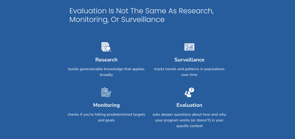
The framework includes three cross-cutting actions, five evaluation standards, and six evaluation steps. All of these are represented in their framework diagram, and the structure of the document follows that sequence.
I’ll do the same, but I’ll combine all the beginning stuff into an introduction and all the end stuff into a wrap-up. This will give me a total of five major sections.
The biggest challenge with the original is that it’s just a lot of text. And without illustration or graphic design, the whole thing just feels like one big block of text. So that’s what we’ll try to clean up.
Step 3. Style
The CDC has a really basic style. It has blues, grays, and a few photos. They use some gradients at times (going from dark blue to light blue), but not everywhere. So I just have to grab a few color codes I’m good to go.
It uses two Google fonts, Poppins for the headers and Nunito for everything else.
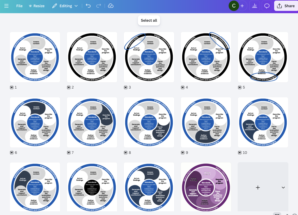
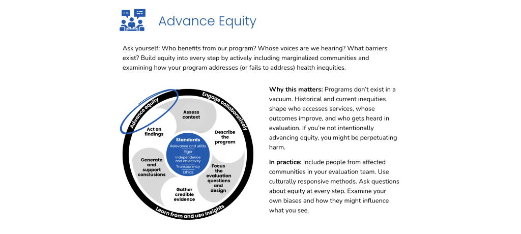
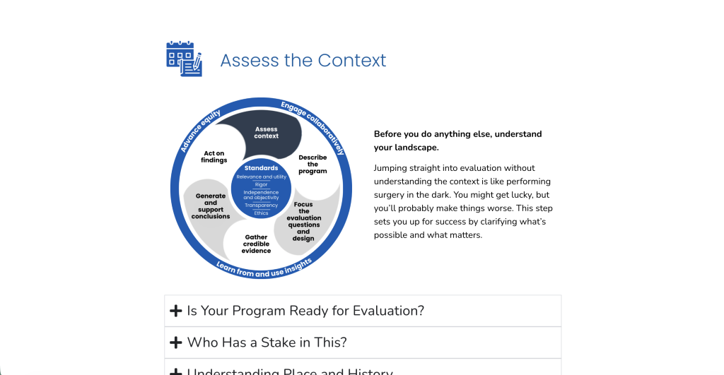
The Framework diagram they use is colored with a set of purples. It’s not just a circle but a wheel. The standards are the hub, the cross-cutting actions are the tire, and the evaluation steps are the spokes.

Redesigning the Framework Diagram
Honestly, if I had found a higher resolution version of the framework diagram I probably would have skipped this step. But the one that came with the publication was pretty low quality. I also want each individual piece to be easy to recolor.
If this was client work, I would have spent a bit more time on the diagram. Likely recreating it in Adobe illustrator. But I wanted to show you that it is possible to recreate stuff like this with Canva. So that’s where I rebuilt it.

You’ll notice mine is in blue and not the purple. I also went away from the different shades of purple for the steps. My vision for the updated report is to use color to highlight the different sections I talk about, so I used white and light gray instead.
I like the way it came out, but it does kind of look like a fan now or an upside down radioactive symbol. But I’m going with it.
It’s okay to repeat yourself.
The framework paper essentially walks you through the diagram, piece by piece. There is a hesitancy to repeat frameworks and diagrams, but if its continuously relevant, repetition is fine. Especially since people often skip and skim.
So I took the diagram, where I have main version. I ended up with 12 different variations, 3 to highlight the individual actions, 6 to highlight the individual steps, and 1 to highlight the standards.
The differences are subtle, and it’s totally possible that people won’t even notice the changes. But I like to add these little guiding tweaks even if the result is only a subconscious awareness.
Starting the web page build.
The CDC is an authoritative source (at least it was back in 2024). So making something super flashy didn’t feel like the way to go. My goal for this one (as with most of my designs) is clarity.

Since the diagram captures the full framework I put it front and center at the beginning of the page.

A lot of the sections are really quite plain. The goal isn’t to dazzle. I just want it to feel easy to read and easy to scroll, so I use lots of white space.
It started to feel too monotonous, so for the next section I flipped the colors and added a few icons. This kind of approach does put focus on an area, so don’t do this if you don’t feel like the information is important enough to spotlight.
What to do with the section breaks.
In a well designed textbook there are always visual cues that tell you when you go from one section to the next. This is the kind of thing that makes it so you don’t feel like you’re reading just one giant block of text.
For my section breaks, I decided to use some stock photos and light gray color blocks. Since this is about an activity and not a specific program, I wanted to use photos that felt like they could be people working on an evaluation of a public health program. I also have them take up full page width, when most of the text lives in a middle column on the page.

Building patterns.
All throughout the page I use a lot of repeated patterns, especially within sections. Patterns create a sense of order, and comfort. For each of the cross-cutting actions, you’ll notice a header with an icon. An intro paragraph. The related visual. A why this matters paragraph and an in practice paragraph.
Icon illustration.
I used a lot of icons with this one. Every standard, step, and action has an icon. It might feel like too much, but since all of these are similar in level of importance, skipping one or two felt like it would de-prioritize those elements.
The Framework paper was also very intentional about all these things not really being sequential. So while I could have numbered things, that also felt like not the right thing to do. I think I would have felt different if they used numbers in the diagram, but they don’t. So I didn’t.
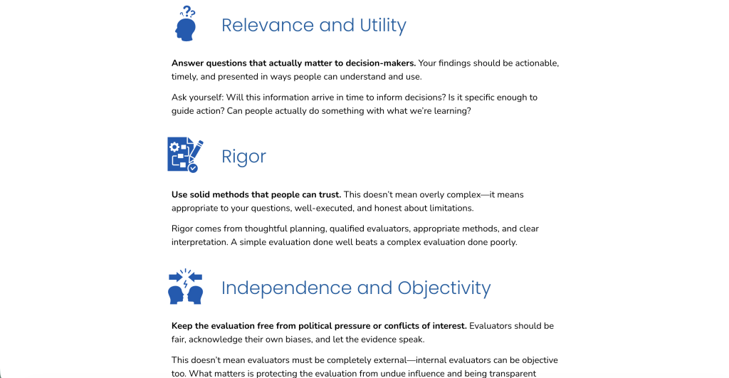
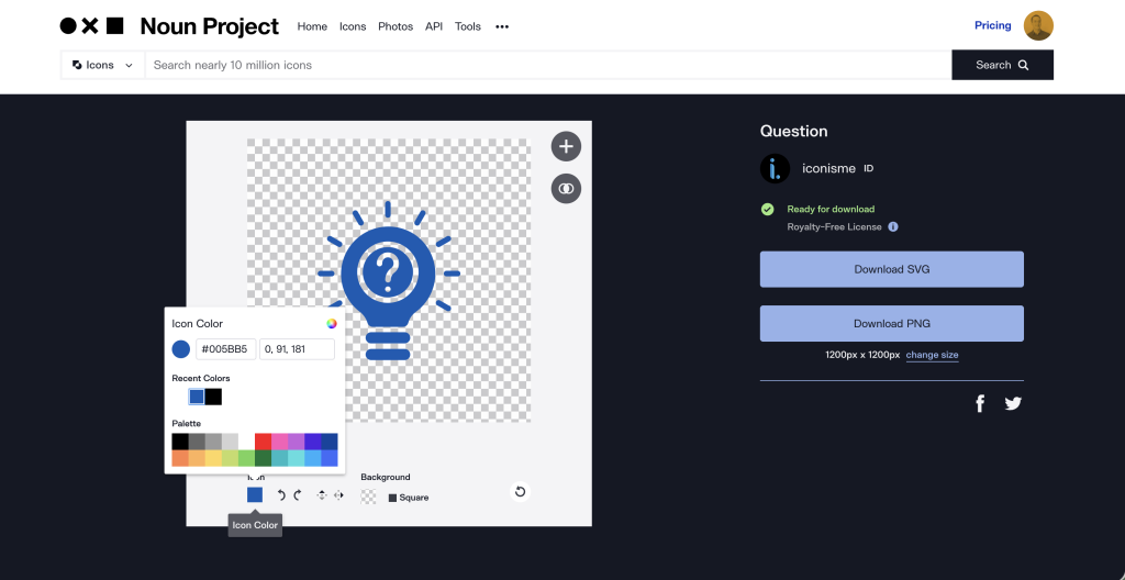
I used the noun project for my icons.
Since all the icons are vector by design (i.e. built with math not pixels), they can also be easily recolored. Noun project actually gives me that ability before I even download the icon, which is a nice shortcut. I just need to have my color codes handy.
The evaluation steps and layering information.
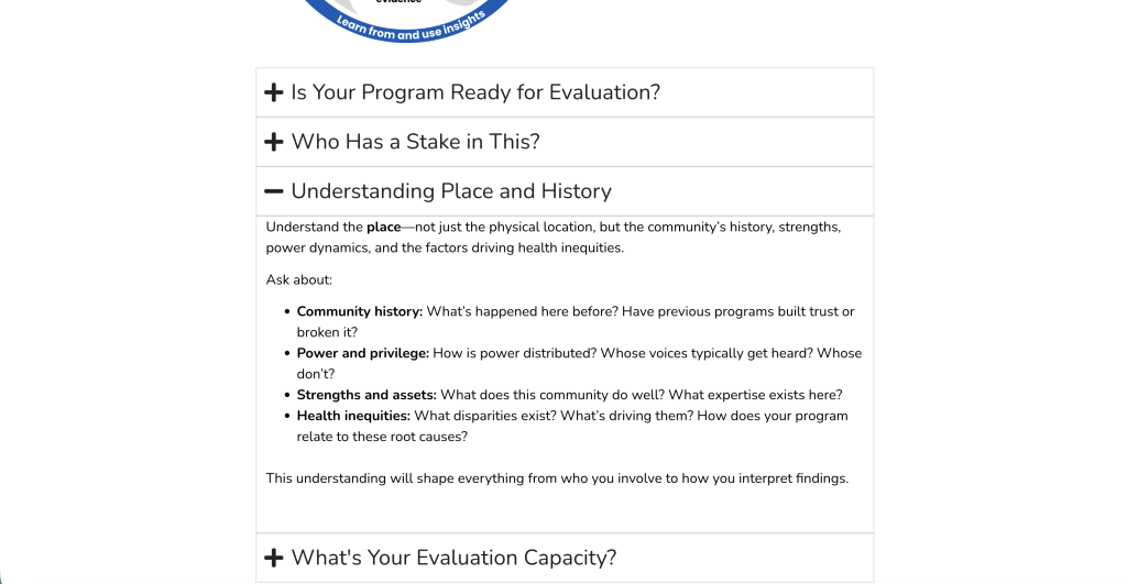
For most of the page, there wasn’t a huge need to layer information (a.k.a. hide a little info so it feels less overwhelming). That is until we get to the evaluation steps. Each step could really be it’s own page, but one my goals with this redesign was to avoid fragmenting the information.
For each step, the pattern looks pretty similar to the actions. There is an icon/title, framework visual, and intro paragraph. The difference is the additional follow-up information.
If I were to put everything on the page, this whole paper would feel like too much. So I used accordion blocks to break down the extra information for each step. Since we often move through steps, I think it’s fair to say that people on a given step (or interested in it) will click the expand buttons.
If not, it’s super easy to scroll by (which is a good thing).
In-Page Linking
By the time I was done, it was pretty clear that there was too much information to not have some kind of menu to allow people to jump to the section they want to read. Especially for this kind of guide that would likely be revisited by someone as they go through their own evaluation.
I kept it really simple. There is a header short menu that sticks to the top of the page with in-page links (a.k.a. anchor links). Clicking on one of the sections will jump you to that section.
It appears at the beginning of the page. The menu also disappears as you scroll down the page. I did this to make it feel like a cleaner reading experience. But the menu also comes back whenever you start to scroll up.
You’ll find these kinds of little touches in all sorts of websites. They can be both super helpful and completely unnoticeable.

Ready to see the final concept?
You can peruse the after version by following this link.
One of my discoveries when I started doing more and more design work, is that it almost never makes sense to completely replace the original paper or pdf resource with a snazzy visual version. Documentation with a flashy design is more of a vanity project than it is useful in communicating anything.
Instead, you keep the original and then adapt for the web. And you end up with the best of both worlds. I can create something clean while still knowing the paper exists, and I can link to it for anyone who wants more detail.
What do you think of my redesign? Let me know in the comments or on LinkedIn.

Looks great. I wonder if a dark border at the perimeter of the “fan” would make it look more cyclical and less fan like…or even just 2 shades of gray.
Thanks Joy 🙂
Definitely could play around a bit, but the fan’s growing on me. I think you’re right that the mix of white and gray that creates the fan effect.
I like the fan, actually as it gives a sense of motion – which is often lost in static pix.
Thanks Isabelle. That’s certainly true. The pattern is a direct copy of the original, but just pulling off a few segments gives it a different feel. I think I like the feel of my version better but the original also has its charm.
I love it, Chris! I scrolled through it and the original, and the original was SO dense–you really can’t see anything at a glance. Your changes make it so much easier to see what is there and where you might want to dive in for a closer read.
Thanks Ellen 🙂
This one was interesting because it already had a solid foundation and structure. But when you throw everything on a page without breaks or any illustration, it just feels so heavy.