So I’m an information designer with a quantitative background who doesn’t care that much about charts and graphs.
I used to to care a lot, and you will find some guidance on this site about chart design (this blog has been going since 2010 which is over half of my professional career). But over time I’ve come to the conclusion that better charts and graphs don’t matter if a resource is never even opened or read. And very few people ever see or read the vast majority of our resources.
What is a broken resource?
I define a broken resource as a report, guide, toolkit, course, ebook, or other resource that just does not reach its target audience or audiences in a meaningful way.
My perspective. The collective wisdom about why these resources don’t reach their audiences is flawed and based mostly on assumptions.
- What we see. A resource is really long.
- What we assume. The resource needs to be shorter if we want it to reach an audience.
- What we see. The charts are ugly.
- What we assume. The charts need to be better if we want to reach an audience.
- What we see. The resource is poorly organized.
- What we assume. The overall design need to be better if we want to reach an audience.
- What we see. The resource is too technical.
- What we assume. The resource needs to be simpler if we want to reach an audience.
- What we see. Very little evidence that anyone has seen our resource.
- What we assume. The resource is too long, ugly, technical, and poorly organized to be read.
What I’ve discovered over the last 20+ years as a researcher, evaluator, and designer, is that all the stuff we see as being wrong are really just symptoms. And our treatments for those symptoms are kind of like filters on a cigarette. They look positive, but they don’t actually fix the underlying problem.
The real problems behind most broken resources.
To understand the first problem you have to understand the research and evaluation process.
For most data folk, a report is not just a communication tool. It doesn’t just get written after the project is done. The report is actually the backbone of the research and evaluation process. It starts being written at the proposal stage when we outline methods. Even if it’s not technically called a report at this stage, all this stuff is usually documented in Microsoft Word.
The writing continues as we monitor data collection and then start compiling results. We don’t come up with analyses and recommendations then go add them to the report. We come up with analyses and recommendations at the same time as we write. Then when the project is close to the end, we PDF our Word document and send it along.
In other words. We think as we write and write as we think. And the result is a PDF we call a “report.”
Problem 1: This PDF is NOT really a report.
It wasn’t created for an audience exactly. It was created as we thought through the project and what we should share with our audience. It usually has a very consistent basic structure that is logical for a systematic study, but not for a presentation.
The PDF is a thinking artifact. You can also call it project documentation or the technical report.
If you share this PDF with your client. The client then might say back, this is too long, too technical, too wordy, and the charts need work.
For the researcher or evaluator this might feel like an attack not on the report, but on their actual thinking. They are picking apart how you process the information behind the report and asking you to cut a lot of it away.
The same goes for most other learning resources and frameworks.
We often create toolkits and guides with the same approach as an annual report. It’s written collectively in Word with comments and track changes. This produces a resource that reflects the thinking of the subject matter experts. Because most of these people are highly educated and academically trained, the resulting resource will feel more like a journal article than a good presentation.
Common symptoms of a thinking artifact masquerading as a report or resource.
- No pictures. A good modern resource designed for wider audiences will be systematically illustrated. Most technical resources usually only have charts, models, and the occasional photo.
- Big words and long paragraphs. Good resources for smart audiences usually top out at a 10th-11th grade reading level. The ideal for general audiences is around 8th grade. A lot of technical resources are at a post-graduate reading level.
- Fragmented narrative. You should be able to read a good resource, start to finish. Sometimes technical reports are shortened and copyedited but leave behind seemingly disconnected fragments lacking any narrative flow.
- It’s only in PDF. Modern websites are mobile-responsive, auto-translatable, and search friendly. PDFs are none of those. But PDF is the easiest digital format for someone working inside of MS Word. It’s also usually the first choice of a graphic design team that was handed over a technical report.
Problem 2: The sharing problem.
Do you know the saying, “if you build it, they will come?” It’s a slight variant of a quote from a 1989 movie called Field of Dreams about a guy who follows a voice in his head to build a baseball diamond in the middle of a cornfield.
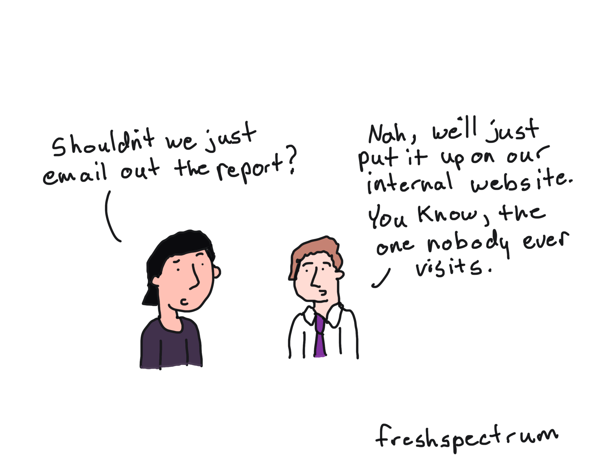
Lots of evaluation and research teams seem to follow the same mantra when creating reports. They bundle all their best insights into a PDF, make it pretty, and hope someone who can use it will find it. Even in organizations with sophisticated communications teams, sharing the report is almost always secondary to creating the report.
What I’ve learned both through my client projects and the stuff I do for this blog, is that good dissemination almost always leaves footprints. If you can’t find evidence of sharing, it’s probably because nobody bothered to share it. At least not effectively.
A good report that never reaches an audience is an oxymoron kind of like deafening silence and the living dead. Good communication requires both sending AND receiving information.
The 5 Preconditions for Use
- There needs to be a Real Audience. Actual humans who can use the work. If there is no audience, there is no reason to evaluate use.
- You need Useful Insights. We’re not fiction writers, the goal of research and evaluation reporting isn’t entertainment. If you have nothing useful to share you’re just making noise.
- You need a Mechanism. You need something to get your insight from point A (your head) to point B (the head of someone who can use it). No mechanisms (or faulty mechanisms) means no sharing.
- If you do have a mechanism that you believe can get your insight to an audience, this is almost always measurable in some way. If you can prove Actual Reach, now you can start talking about use.
- Evidence of Circulation is the next level. This looks at whether your insights are circulating in areas outside your control. If you have a small audience, you don’t really need circulation. But if you’re trying to make a bigger difference with your insights, this is what does that.
How to actually fix our broken resources.
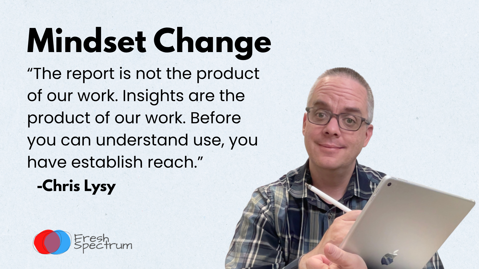
If you’re really serious about getting your work into the hands of the right people, then I suggest you actually start with problem 2. It’s the place where you can usually make the biggest impact as most dissemination strategies are just habits built before the internet was a thing.
Modernize your Dissemination Strategy.
I’ve been writing about this a lot lately. I also have a practical framework I’ve been building called Theory of Use that I’ve been using with my clients (the results have been fantastic). A simple mindset change, and a measurable framework, can revolutionize how your team approaches reporting.
You can read more about my framework here: Theory of Use. I also teach a custom workshop called Useful Dissemination Strategy where we apply the principles to one or two of your team’s active projects and work through the implications.
Workshop 1 – Useful Dissemination Strategy
Together we’ll work through building a measurable dissemination strategy that actually works in the digital age using my Theory of Use framework.
Then Modernize your Information Design Process.
It’s important to remember that most researchers and evaluators have not taken classes in graphic design, copywriting, storytelling, and illustration. Information design incorporates all of those skills.
Here are the things to learn about that I think make the biggest difference.
Graphic design and format choice.
A good modern information design process should be able to effectively create a set of visual reports including one-pagers, infographics, blog posts, and slidedocs. You don’t need fancy tools to do this just Canva or PowerPoint. This is what I teach in my Everyday Visual Reports custom workshop.
Workshop 2 – Everyday Visual Reports
Learn how to design and structure my “big-four” visual reports; one-pagers, infographics, blog posts, and slidedocs. Taught using Canva.
Copywriting and storytelling.
Being able to construct a narrative that can grab and hold a reader’s attention is more important than ever in our overwhelming world. I have a couple of go to storytelling frameworks I use with my clients all the time. I teach this in my Effective Data Storytelling custom workshop.
Workshop 3 – Effective Data Storytelling
We’ll dig into a couple of my favorite storytelling frameworks you can use to create engaging reports and presentations.
Illustration.
In the digital world, pictures are no longer optional. Definitely when anything is shared on the web but it’s true even if you only deal with PDFs that get sent via email. This is particularly important with qualitative data as those reports are often more dense than quantitive chart-filled reports. My custom workshop on this topic is called Compelling Qualitative Data Visualization.
Workshop 4 – Compelling Qualitative Data Visualization
I’ll show you how to improve the accessibility of text heavy reports through illustration (using my O.S.E.E. framework).
If you want to learn more about my workshops or the capacity building consulting you can find more on my consulting page.
Don’t have the resources to hire me?
I understand, that’s why I write this blog and send weekly emails. I suggest signing up for my weekly newsletter.