
This is one in a series of before and after designs. With each post I take a real publicly available resource or report and adapt the writing, format, structure, and illustrations in order to increase the accessibility. You can see other before and after posts in the series by following this link.
How it Started – The American Evaluation Association – Guiding Principles for Evaluators
The guiding principles are one of the most important resources shared on the American Evaluation Association website. To pull directly from the source, “the Guiding Principles reflect the core values of the AEA and are intended as a guide to the professional ethical conduct of evaluators.”
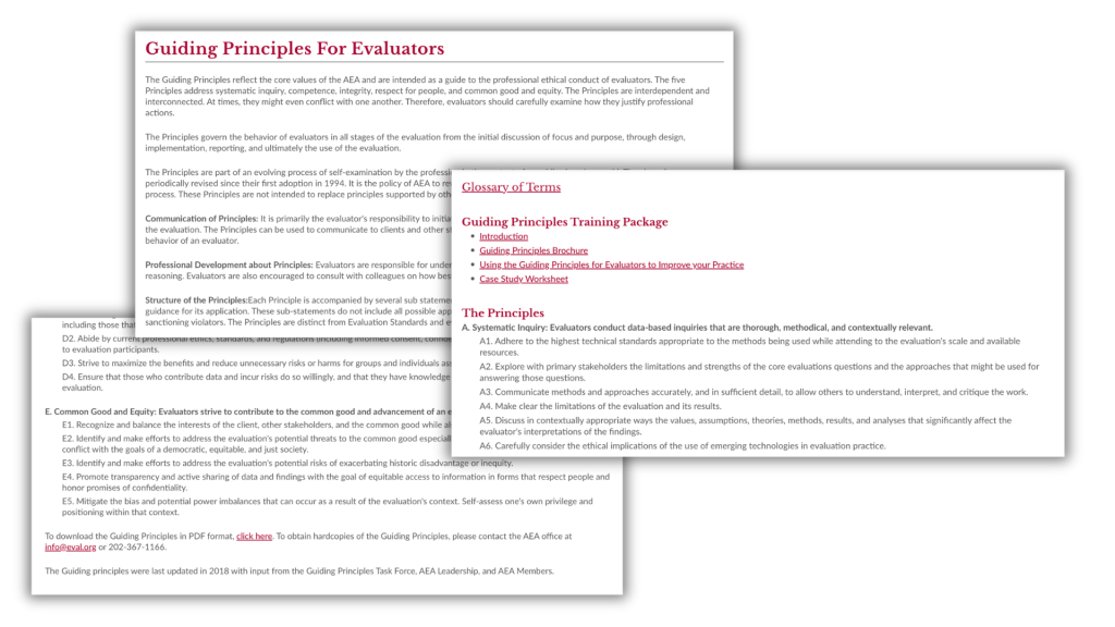
Unlike some of the other before and afters, this one is short. It’s just a little over 1,000 words. It features some pretty big words, registering a grade level of around 16. So even though it’s short, it’s also dense and completely lacking in illustration.
The problem, it’s just a big block of text.
Usually when people complain evaluation and research resources it’s because they’re both dense and long. So when you have something that’s short, it doesn’t feel like such a problem.
But here’s the thing. The American Evaluation Association continues to play a fundamental role in shaping the field of evaluation, and not just for its members. These principles are one of the key resources the organization uses towards fulfilling that role. But right now, they are really easy to look at and then quickly forget. There just isn’t anything sticky.
Step 1. No Rewrite This Time.
Could the Guiding Principles be written with simpler language? Yes, no doubt.
But they were also written by an official committee. So I tend to balk a little when considering changing the language with these kinds of resources. Luckily though, there is a lot we can do through simple illustration.
Step 2. The Structure
My goal for the structure is to slow down the reader. I want to spotlight the important information but also create enough space so that the reader will linger.
The base structure/order is fine. The pacing is off. Instead of taking your time going through the sections, somebody just gives you everything in one breath. Right now it feels like a terms of service agreement. You know, like the ones social media companies make you accept that you just skip over so you can get back to doomscrolling.
I think we can also add in some extra info to make the reading more worthwhile.
Step 3. Style
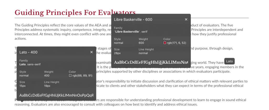
Currently the AEA website uses Libre Baskerville for the headers and Lato for the body. Both of these are common Google fonts. Although I’ll usually up the font size a bit.
As for color, for the most part AEA really only uses one (maroon) outside of the typical gray scale. You’ll find some gold here and there but it’s used sparingly.
Following my O.S.E.E. Framework for Illustration.
I think the biggest need is just some basic systematic illustration. I talk about my O.S.E.E. framework in my latest free-to-read book. So that’s what I’ll use to illustrate.
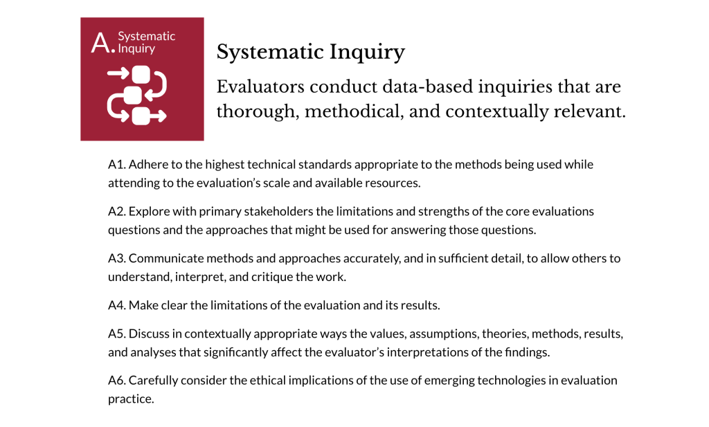
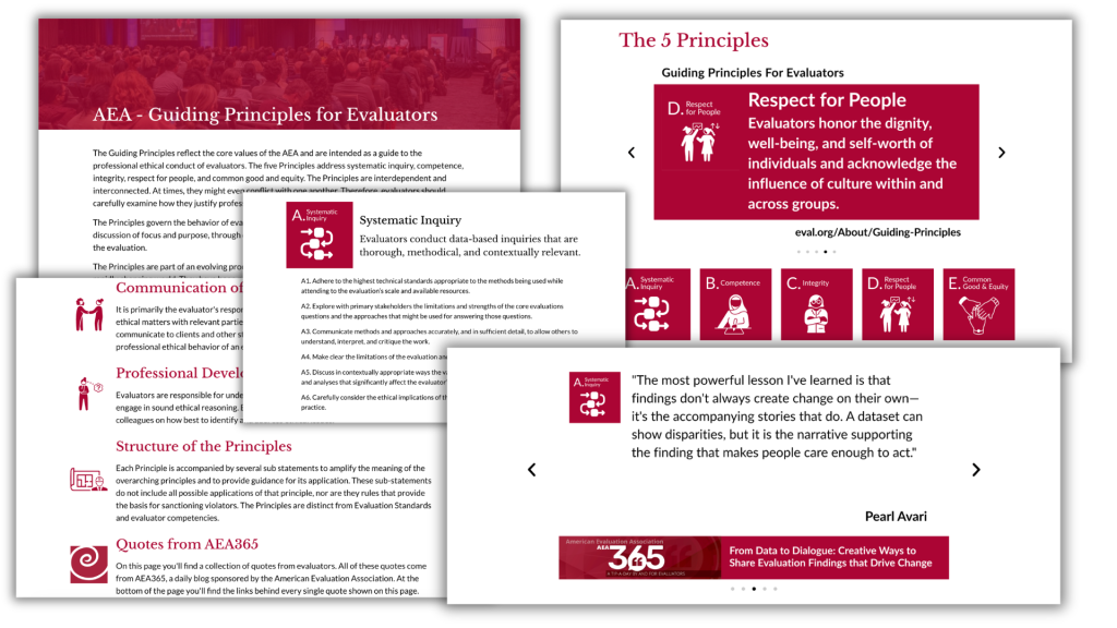
I don’t want to go overboard and illustrate every point and sub-point. But the main five principles should each have their own icon. But even five icons will definitely help with organizing and spotlighting. So that’s where I’ll start.
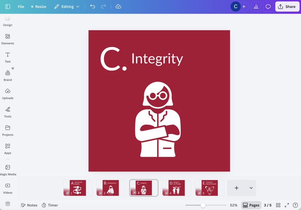
When you’re creating a series of icons sometimes putting them in white on a solid color background helps tie everything together. It also helps to search for sets/collections of icons designed by the same creator.
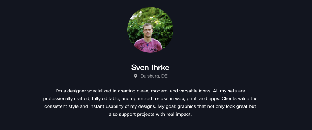
I didn’t want to be too literal with all the icons. For the most part I really wanted to just feature people, because these are really about evaluators not the concepts themselves. I found 5 I liked on The Noun Project that were all created by the same designer, Sven Ihrke.
Engagement and Enhancement
I thought about using some of my comics to help create some engagement on the page, but then I decided to go a different direction.
The biggest asset an association has is its members. But even though these principles were created through a committee and updated multiple times over the years, there isn’t really a face or voice on the page. Let’s change that.
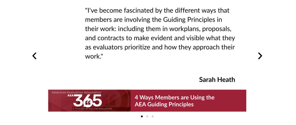
AEA has an amazing resource we can use in AEA365. The community blog that pulls in voices from all sorts of evaluators has consistently put out daily blog posts since January 1, 2010. The archive has over 5,000 blog posts and most are written in the voice of the authors, not academic speak.
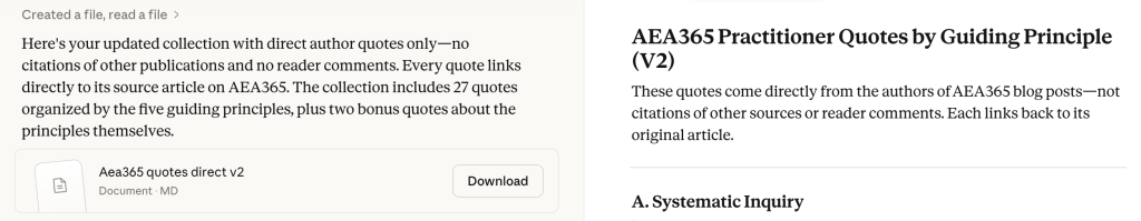
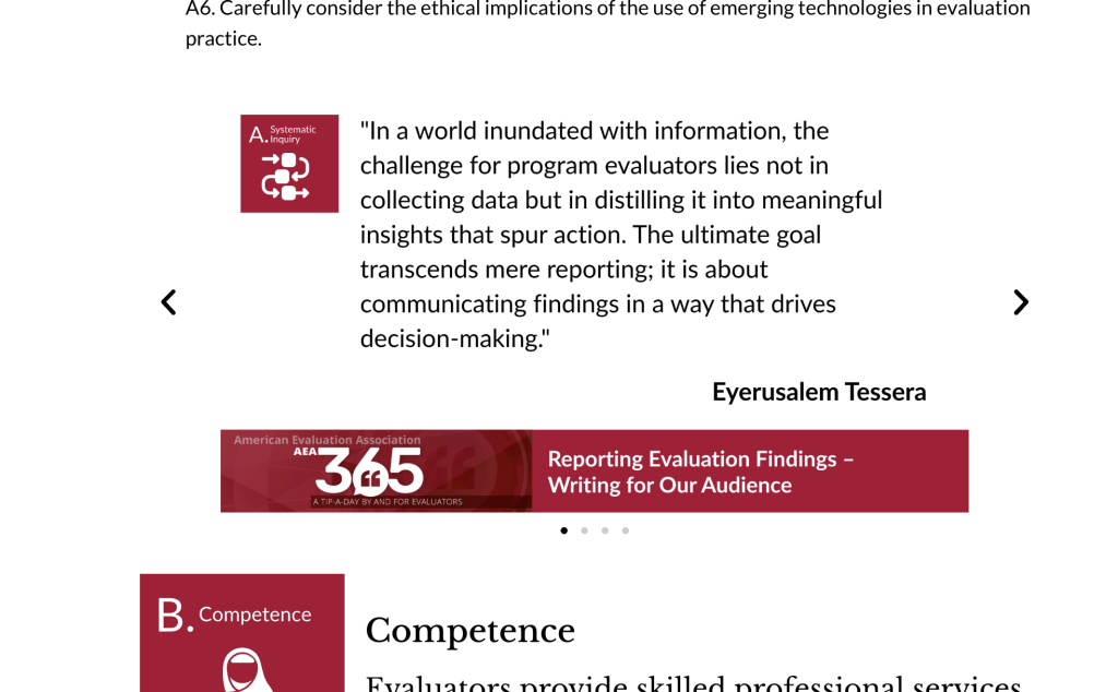
I used Claude’s AI to scour the AEA365 library looking for direct quotes from blog posts that would be relevant to each one of AEA’s principles. It took a little back and forth but I ended up with a really solid collection of interesting quotes.
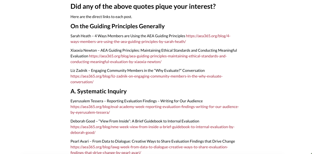
One of the cool things about this is that every single blog post is public and linkable. Meaning, if there is a quote you like and want to dive in deeper, you can do that.
In total I now have 26 direct quotes, with at least 4 quotes for each principle, and a few quotes I can use as part of the overview.
Creating a Collection of Little Infographics
There are definitely ways to directly include quotes in the body text of the web page that could be interesting. But one of the things I like about enhancement illustrations is that you can also create them in a way that they can have a life of their own.
By mixing the quote, the icon of the principle it connects with, and a footer that gives the AEA365 post, I ended up with a pretty big collection of PowerPoint slide sized infographics.
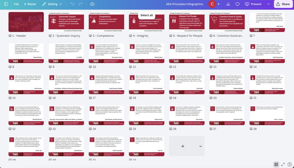
While I was doing this I decided to create a few basic single slide infographics showing each individual principle. Now that I have all of this, it’s time pull everything together.
Starting at the top.
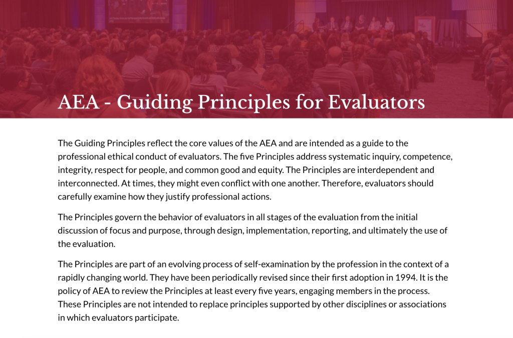
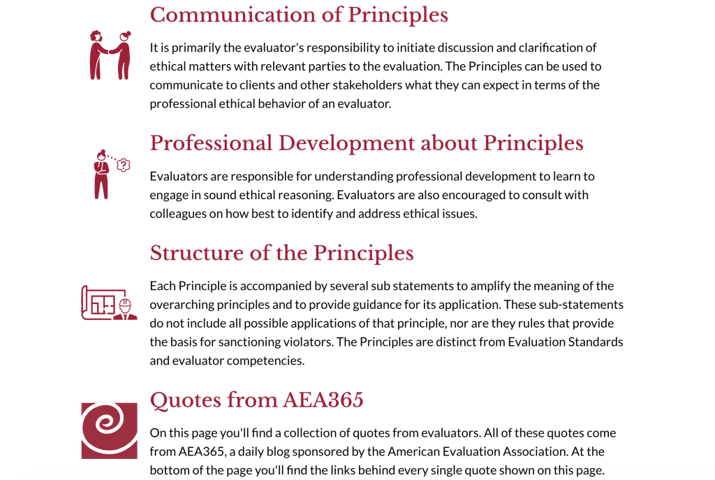
I didn’t dwell on this part too long. There were three basic intro paragraphs followed by three paragraphs that each had a bolded word in front. I decided to split them and just used an image from a past conference as the backdrop for the header. I really want to connect this to evaluation people almost immediately.
To create a split and slow things down, I used some icons in front of the bold word paragraphs. I also added a paragraph to intro my addition of quotes.
In the original we just jump straight into a text block with all five principles and sub-principles. I want to slow things down a little so I start by separating the top line of each principle and the single sentence that goes along. Here is where I’ll drop the little guiding principle mini infographics.
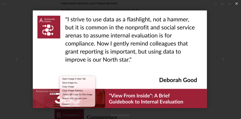
If someone were to click on them, they would still be able to scroll and they could also right click and download the infographic. Since the link is written on each one, attribution is already attached so this could easily fit into a slide deck (this part’s for you, evaluation professors). It’s also already sized for a presentation deck.
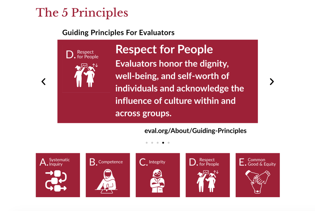
I included the set of 5 icons below that. If this were a longer page these could easily be in-page menu links. But for now I just want to show all five at the top without someone being forced to scroll through each one.
Right after that I dropped in my first set of quote infographics. All of these are set to autoscroll, but the reader could also take control and go back and forth. Like the previous one, every single quote is it’s own little infographic that can be downloaded and added to a slide deck or shared on social media.
Now for each section I’ll lead off with the icon, and make the principle and associated one line sentence header sized.
Then following each sub-principle I can drop in the set of associated quotes.
Here is what it looks like when you click on one. It opens up in a light box that still lets you scroll but also gives you the chance to right click/download.
And then I just repeat that approach for each principle. And at the end I went through and added a link to each and every AEA365 blog post referenced via the quotes.
Want to see the final after version?
So how did I do?
My ultimate goal here was to use illustration to slow down the reader and provide some extra benefit. By adding voices I think we get to put the principles in their true context. The Guiding Principles should not look like they are just the word from on high, but a living a document built through the dialogue and experience of a diverse member organization.
But what do you think?
Leave a Reply