
What makes a person an evaluator? Is it the job they do? Is it the training they received in grad school? Is it through membership in a big professional association like AEA? Is it because they’ve taken enough courses and paid enough money to get a certificate from somewhere like the Evaluators’ Institute? Did they […]

Awkward Evaluation Networking
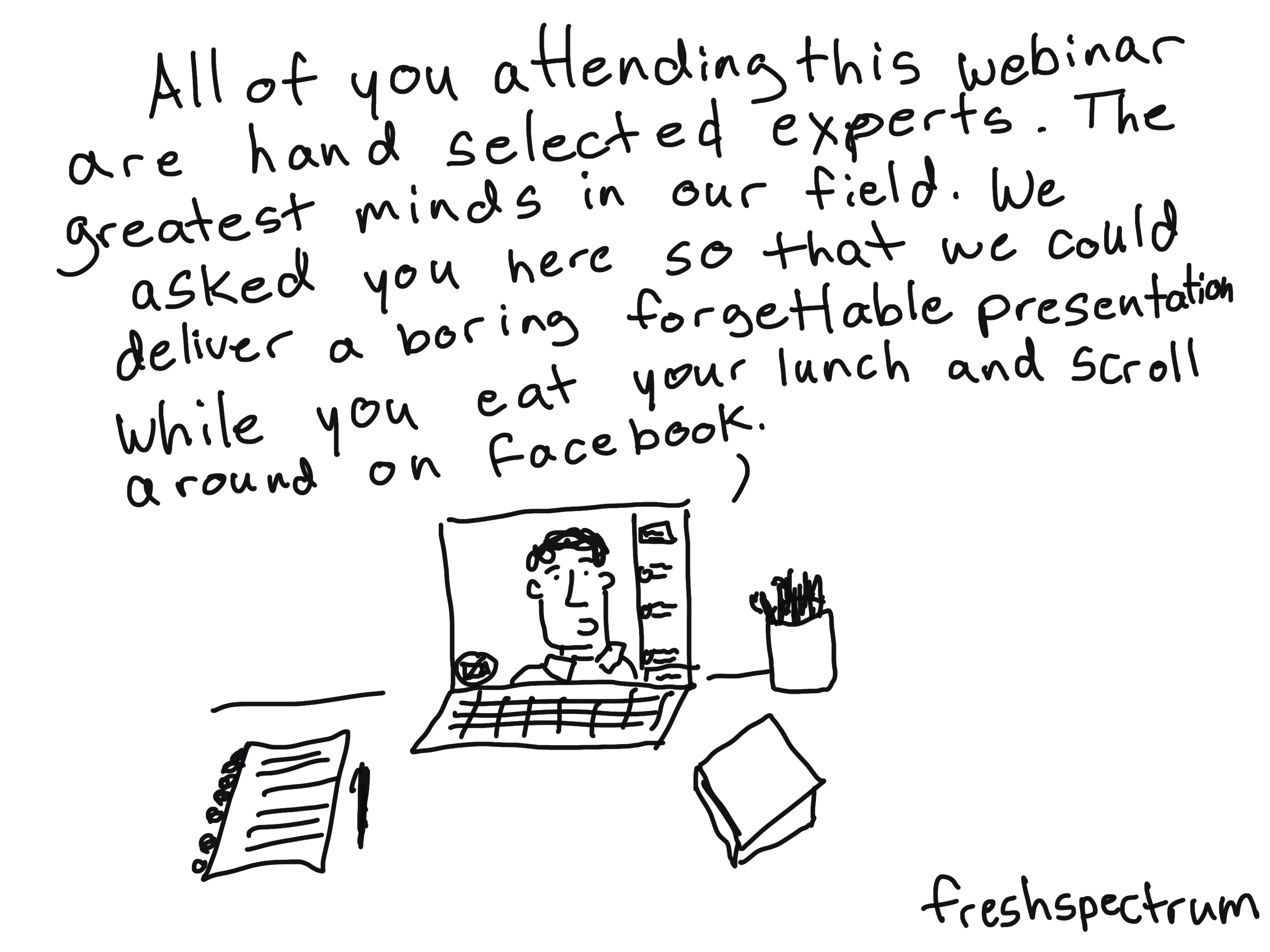
Our new evaluation networking series is live! Skip down the page for more info. Not sure if you’ve noticed, but COVID has done a number on our networking events. Yes, we’ve been having virtual replacement events. But many of those are in the form of traditional webinars. There is a speaker who gives a talk, […]

Rejecting the Null
Today’s graphic novella is inspired by the concept of rejecting the null. I created a cartoon about the null hypothesis almost a decade ago. I still find the concept really useful in thinking about evaluation. There is incredible power and importance in the choice that gets made when we don’t choose to change. So that’s […]

Schrodinger’s Outcome
Today’s post is a little evaluation graphic novella inspired by Schrödinger’s cat. No cats, real or fictional, were harmed while creating this post. I’ll drop a plain text version at the bottom. Plain Text Version Schrodinger’s Outcome Imagine a nonprofit program. Let’s say a food pantry. The food pantry was created to provide free emergency […]

What are Social Objects? [Behind the Cartoon Podcast]
So I decided to try out podcasting. Today’s first ever episode is about Social Objects. Why? Because it basically covers the theory behind my cartooning. Show Notes: Just in case the embed above is not working, you can find the podcast by clicking here. Social Objects: Everything You Ever Wanted to Know! (2007 blog post […]

How do people read reports and just what is an F Pattern?
When I talk about report design there is always one message I make sure to deliver. People scan reports before they read reports (if they end up reading them at all). But what does that mean really? That’s what this post is about. We’ll walk through a couple of common reading patterns identified through eyetracking […]
How to build an online community of practice (8 Tips)
For a little over a year I have had the pleasure of designing and facilitating a specific public health program focused evaluation community of practice. I have had a great partner in this work and have learned a lot about virtual community building. Today’s post highlights just some of the tips I have learned through […]
How to Create Power Point Infographic Templates Using Canva
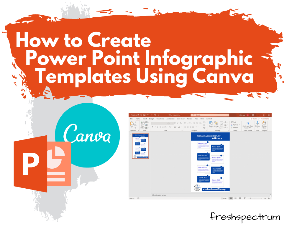
In the research and evaluation worlds where I tend to do most of my work, Microsoft Office reigns supreme. I have nothing against Word, PowerPoint, or Excel. But I just find some other tools are just easier to use for certain tasks (such as creating infographics). And while that’s fine when working independent, so much […]

What is an Infographic?
So let’s not overthink this one. Infographics are the result of asking graphic designers to illustrate data and other information. We can find examples across history of people mixing pictures and text to convey information. There is no singular style and an all encompassing definition is probably not all that useful. For me, infographics are […]
6 Report Design “Quick Fixes”
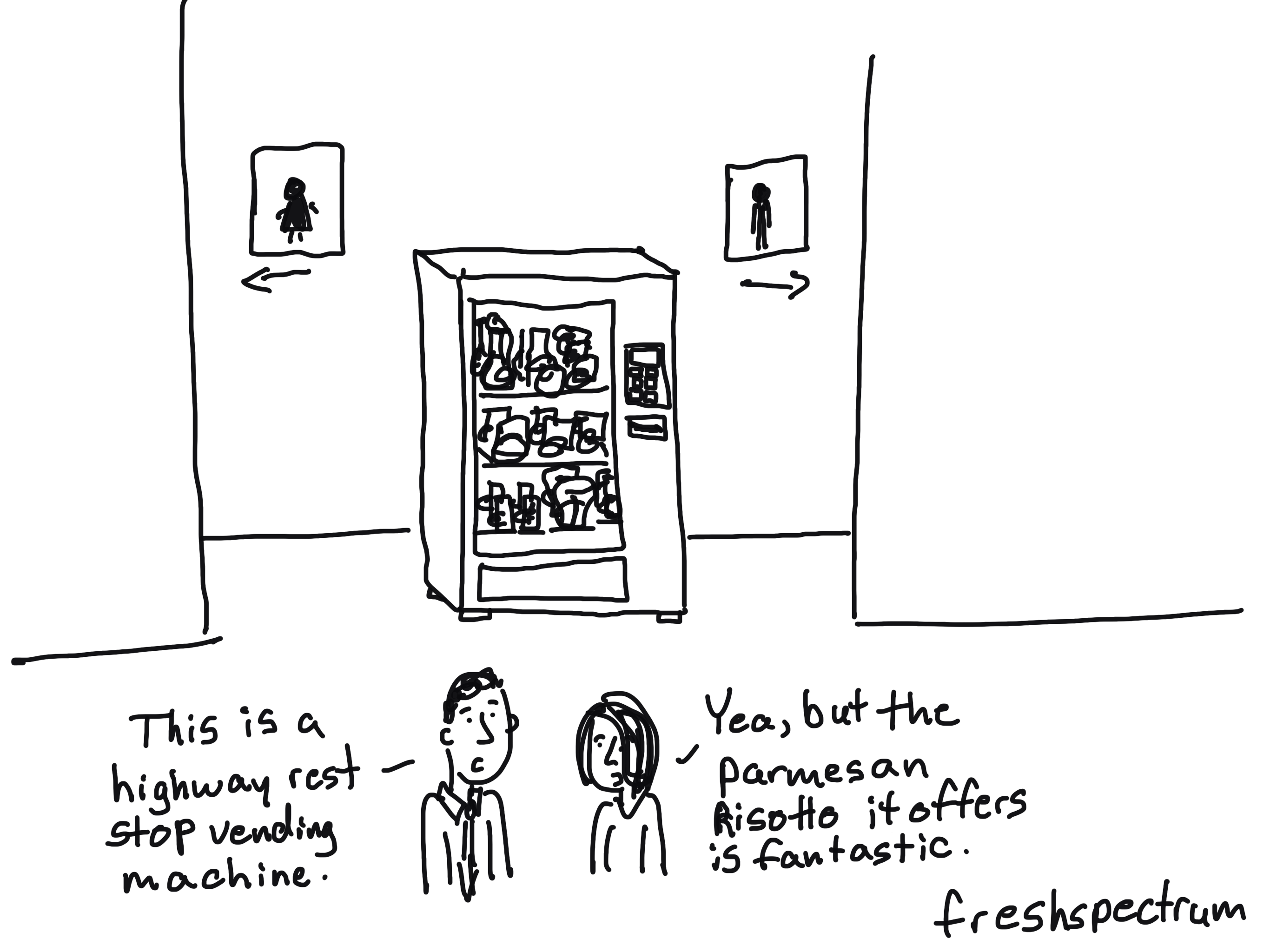
Imagine going to a fancy restaurant (pre-COVID). The dish you order is fantastically presented, it looks and smells phenomenal. It looks so delicious you consider taking a picture and sharing on your favorite social media account. But what would happen if you surrounded that dish with a grungy atmosphere and put it on a dirty […]