
Systemic report failure is when structures, formats, and habits consistently prevent reports and other resources from reaching the right people in ways they can actually use. In evaluation and research we treat this systemic failure as if it’s a skills issue. It’s not. Better charts, interesting stories, and well-designed PDFs are not enough to make […]

Start Here
Ready to learn how to fix broken resources? Did you just stumble upon this blog through a post and want to know what else you can find? Or perhaps you just want to know how this site is different than others that talk about data, design, and evaluation. Whatever the reason, this is the right […]
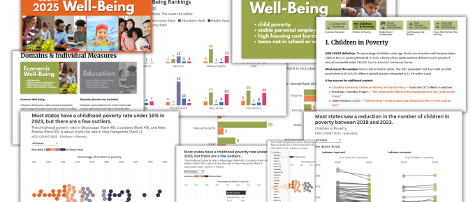
KIDS COUNT 2025 – Before and After
This is one in a series of before and after designs. With each post I take a real publicly available resource or report and adapt the writing, format, structure, and illustrations in order to increase the accessibility. You can see other before and after posts in the series by following this link. How it Started – […]
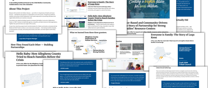
Qualitative Storytelling Dashboard – Before and After
This is one in a series of before and after designs. With each post I take a real publicly available resource or report and adapt the writing, format, structure, and illustrations in order to increase the accessibility. You can see other before and after posts in the series by following this link. How it Started – […]
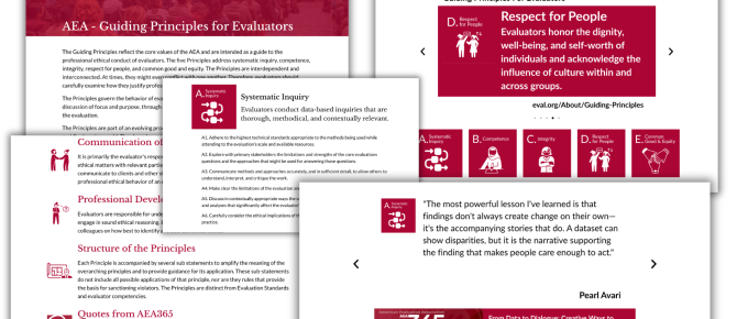
Guiding Principles for Evaluators – Before and After
This is one in a series of before and after designs. With each post I take a real publicly available resource or report and adapt the writing, format, structure, and illustrations in order to increase the accessibility. You can see other before and after posts in the series by following this link. How it Started […]
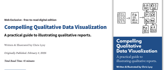
My qualitative dataviz book is now live! (and free)
Compelling Qualitative Data Visualization, my latest free-to-read book, is now live. Here is a little synopsis. What’s the book about? In the book I talk about my approach to illustrating mixed-method and qualitative reports. It’s a very practical book. Wasn’t this a workshop? Yes, I’ve actually delivered the workshop live a couple of times. Since […]
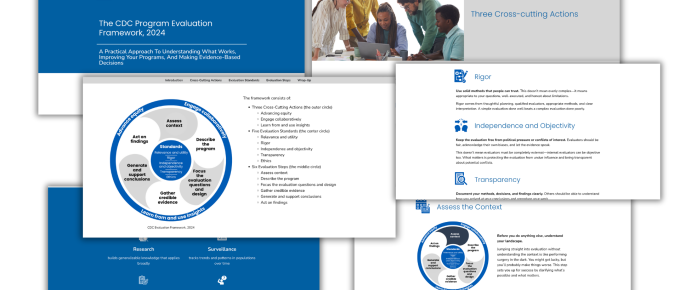
CDC Evaluation Framework – Before and After
This is the second in a series of before and after designs. With each post I’ll take a real publicly available resource or report and adapt the writing, format, structure, and illustrations in order to increase the accessibility. You can see the first post on adapting a UNICEF Strategic Plan by following this link. In […]

UNICEF Strategic Plan 2026–2029 – Before and After
I’ve decided to create a few concepts to show you exactly how I approach adapting pdf reports for the web. These will be unofficial concepts adapted from real reports and resources. My goal is to show you what’s possible. How it Started – UNICEF Strategic Plan 2026-2029 I originally set out to find a regular […]

Einstein had a day job.
It’s been a rough year. A lot of evaluators, researchers, and scientists have lost their jobs. And finding new work, which is always hard, is made even harder when it feels like your field is collapsing. I hope we see a resurgence in funding sometime sooner than later. If you’re out of work I hope […]

My latest book, now Free-to-Read
Want to read my book without paying for it? Now you can do that. There is a title page, introduction, and five chapters. Each is on its own page with navigation to help you go through. It’s digital, not a pdf, so that means it is auto-translatable and mobile-responsive. To access just follow this link: […]