So I know I’ve been quiet lately. You know how it is, something comes up, you overextend and then all of a sudden you are knocked out of a habit. Then once you’re out, it can be really hard to get back in. For me there is only one way out. Cartoon my way! Daily […]

The Future of Data Visualization: Three Predictions
Prior to the holiday season Ann K Emery asked a group of us bloggers to come up with some data visualization predictions for the upcoming year. Here are 3 of my own predictions based on some of the things I already see happening (a.k.a. projections). What are your predictions? Let me know in the comments. […]

Qualitative cartoons from MQP’s latest book
Michael Quinn Patton just came out with the fourth edition of his Qualitative Research and Evaluation Methods book and in it you’ll find 9 of my cartoons. The new cartoons are based largely on a series of ruminations added to each chapter (you can find a few rumination examples over at better evaluation). Today’s post […]
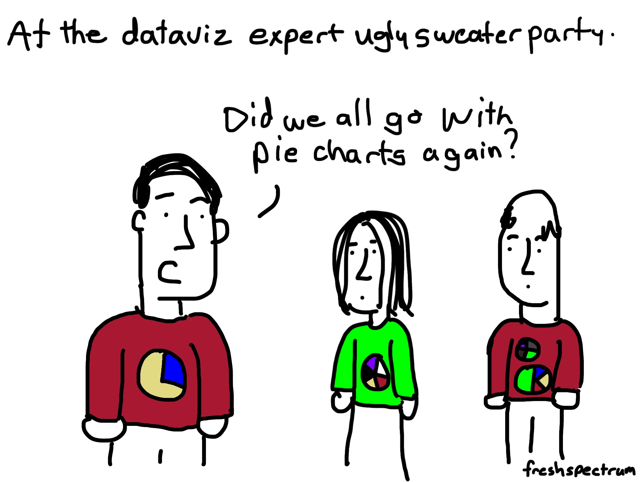
It’s a #dataviz Christmas cartoon post
This kind of cartoon post happens when you’re writing about data visualization in front of a Christmas tree. An Infographic to Santa Santa’s naughty list dashboard Dataviz Sweater Party

Thankful for the attention
One of the things I’m thankful for this year… In a sea of competing voices you’ve chosen to listen to mine. For those of you in the US, have a nice Thanksgiving! And for everyone, have a nice week 🙂
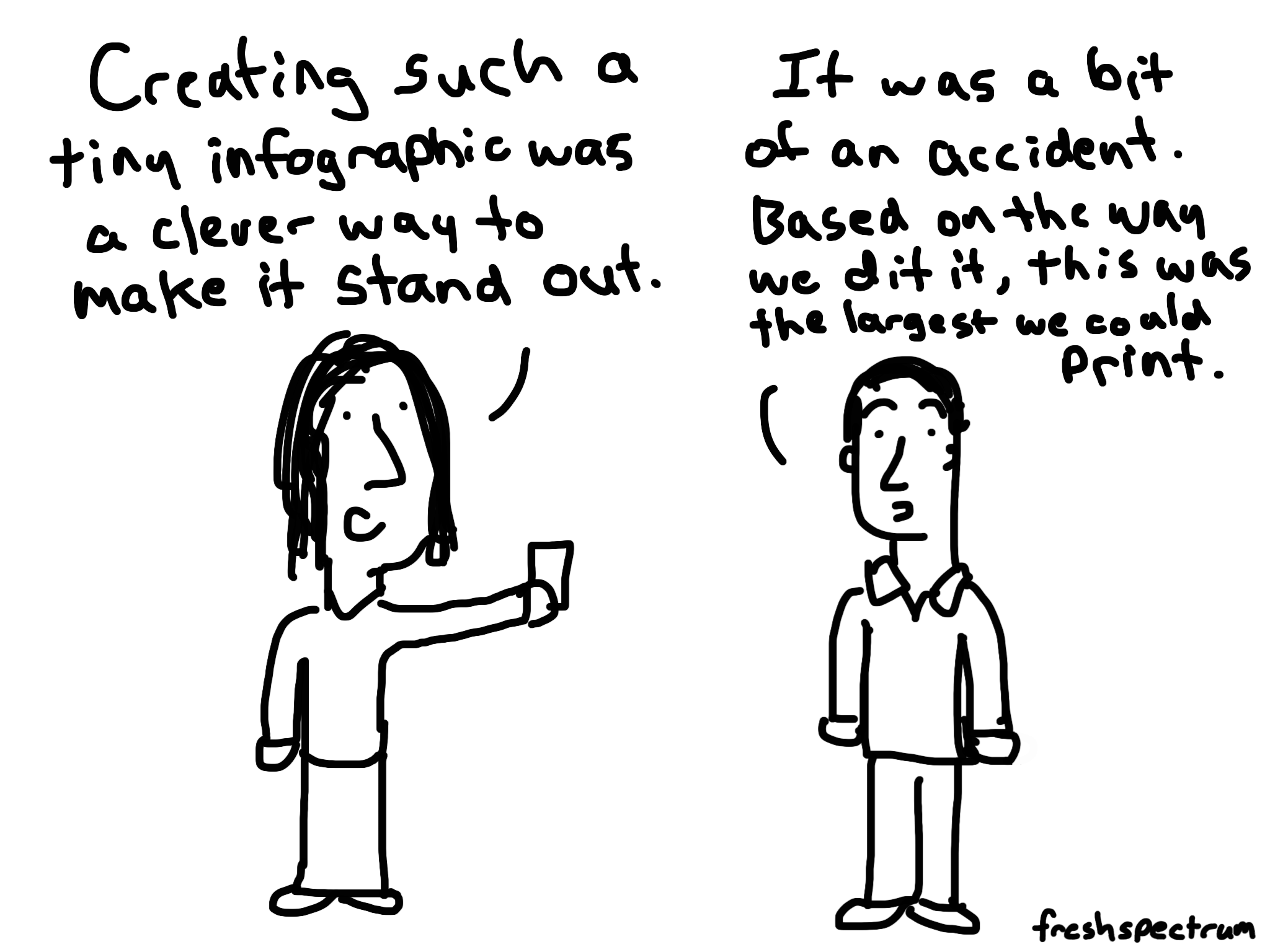
Why you should create a minimum viable visual
The infographic was not going to be a finalist in any design competition. The font was tiny. The few colors just didn’t seem to gel. It was printed small with strange dimensions. Definitely not going to find this one on any blogger’s top 100 list. But that’s out of context. Listening to the evaluator talk […]

The four words that can kill any visual project
I don’t like it. Data visualization experts love to talk about effectiveness, which chart type is better than which other chart type. And while I think the discussion can be helpful sometimes it also misses a big point. Most researchers and evaluators are not making bad visuals, they’re making no visuals (or very few visuals). […]
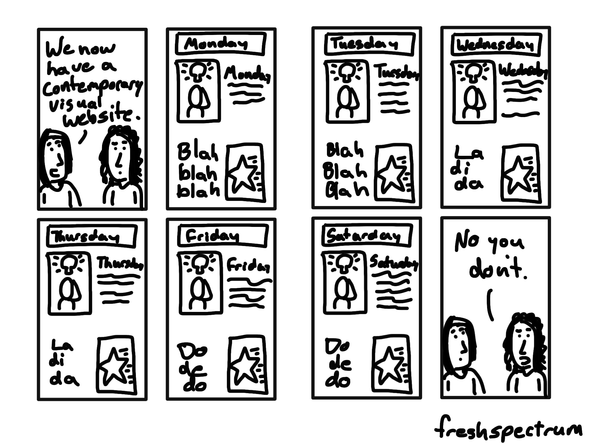
Featured image paradigm
Featured Image Paradigm > Every article has a picture. It’s really a simple rule, but you can look at almost any major website on almost any topic (news, sports, fashion, food, science, technology, etc., etc., etc.) and you’ll see it being followed. Even if the image for an article is not showing on the front […]
You would forgive me
It was 2 AM and I was sitting upright, head leaned off to the right on the makeshift pillow that usually serves as my jacket. The crying of a small child carried through the dark cabin as my fellow passengers and I attempted to get a little rest on the three hour flight. I felt […]
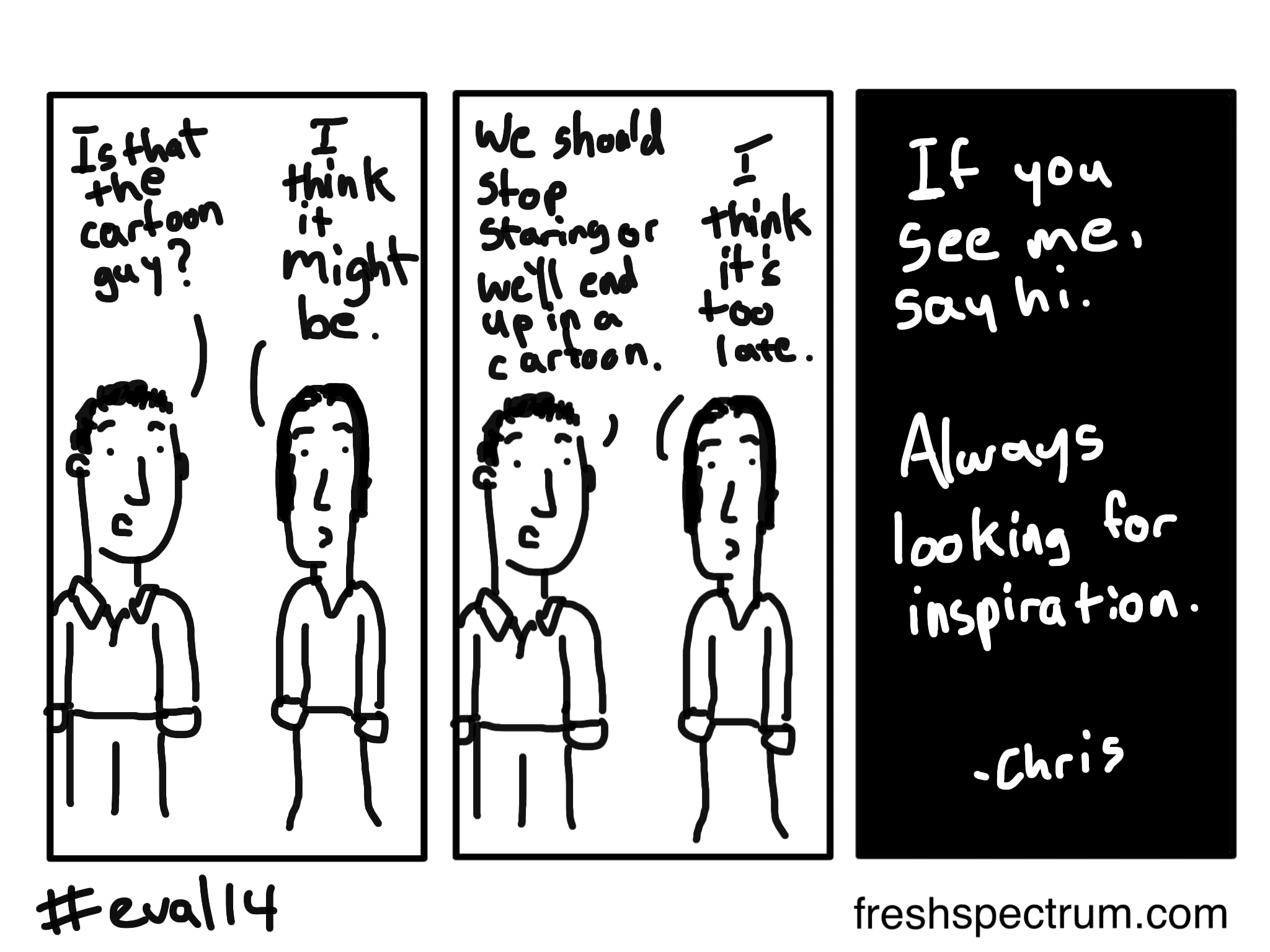
Cartooning Evaluation 2014
From Wednesday through Friday, I'll be attending the American Evaluation Association conference in Denver. As in past years, I'll be cartooning the event. This year instead of writing a string of posts, I'll be building up just one (this one). When I have a new cartoon I'll update, so feel free to share this link […]
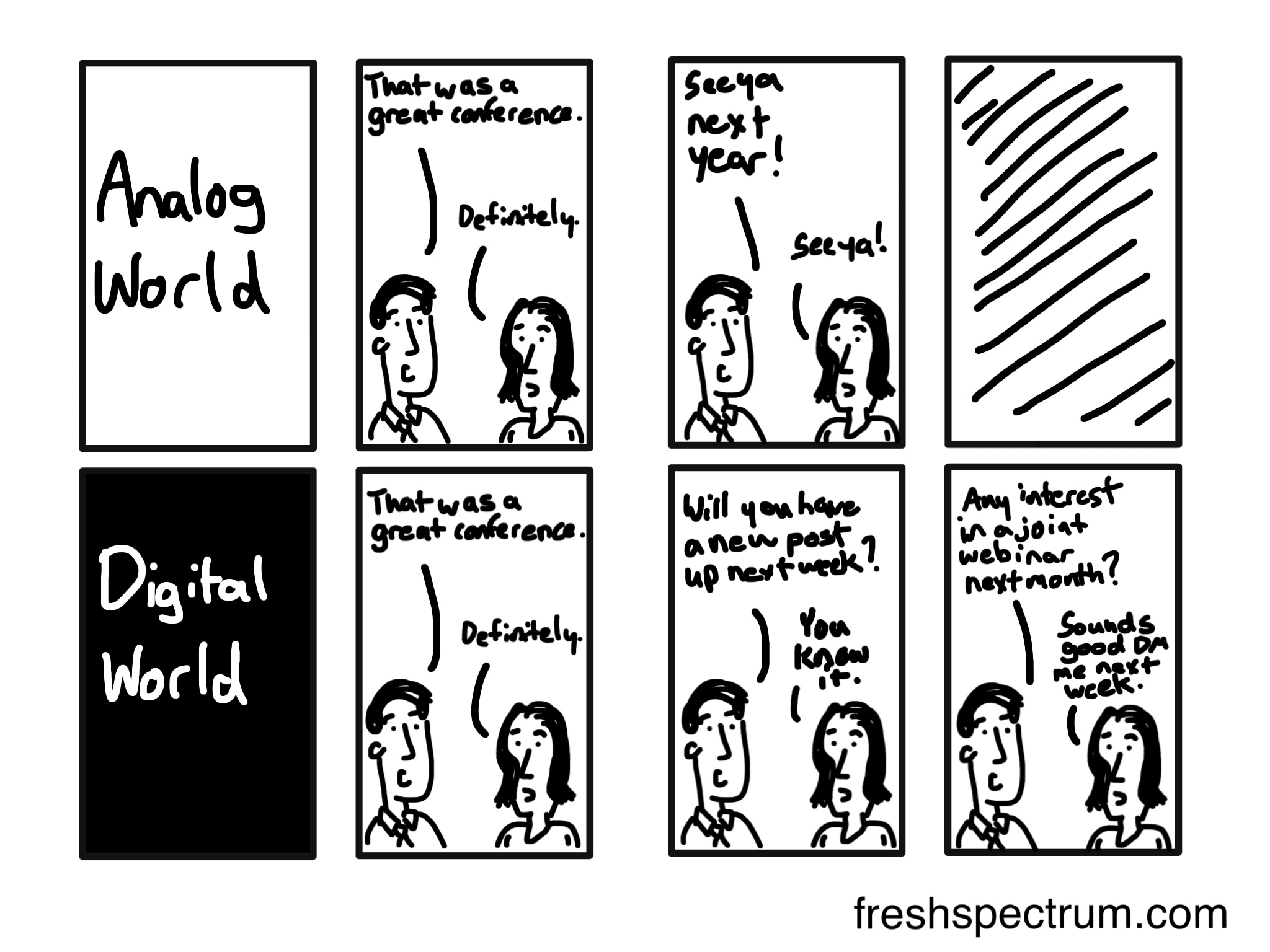
Evaluation conference memory lane
Next week I’ll be heading out to Denver for Evaluation 2014. This will be my fourth evaluation conference. I’ve cartooned each one and this year will be no exception. For today’s post I decided to take a little walk down memory lane. Here are a few of my favorite cartoons from past conferences. To see […]

How to design your research or evaluation business website
Web design, for most researchers and evaluators I know, includes a good bit of DIY. I recently had the opportunity to work with my friend and fellow RTP evaluator Karen Peterman on an update to her business’ website design. I helped with the overall design, provided some input on the text and added a set of illustrations. Karen wrote the […]