
Slidedocs are an incredibly useful reporting format for sharing your work with all sorts of audiences, from executive leadership to your peers and the public.
In this walkthrough, I’ll show you how to create your own simple but effective slidedoc template in Canva, starting from scratch. Prefer to read instead of watch? Here’s the whole process, step by step.
Start with a basic presentation
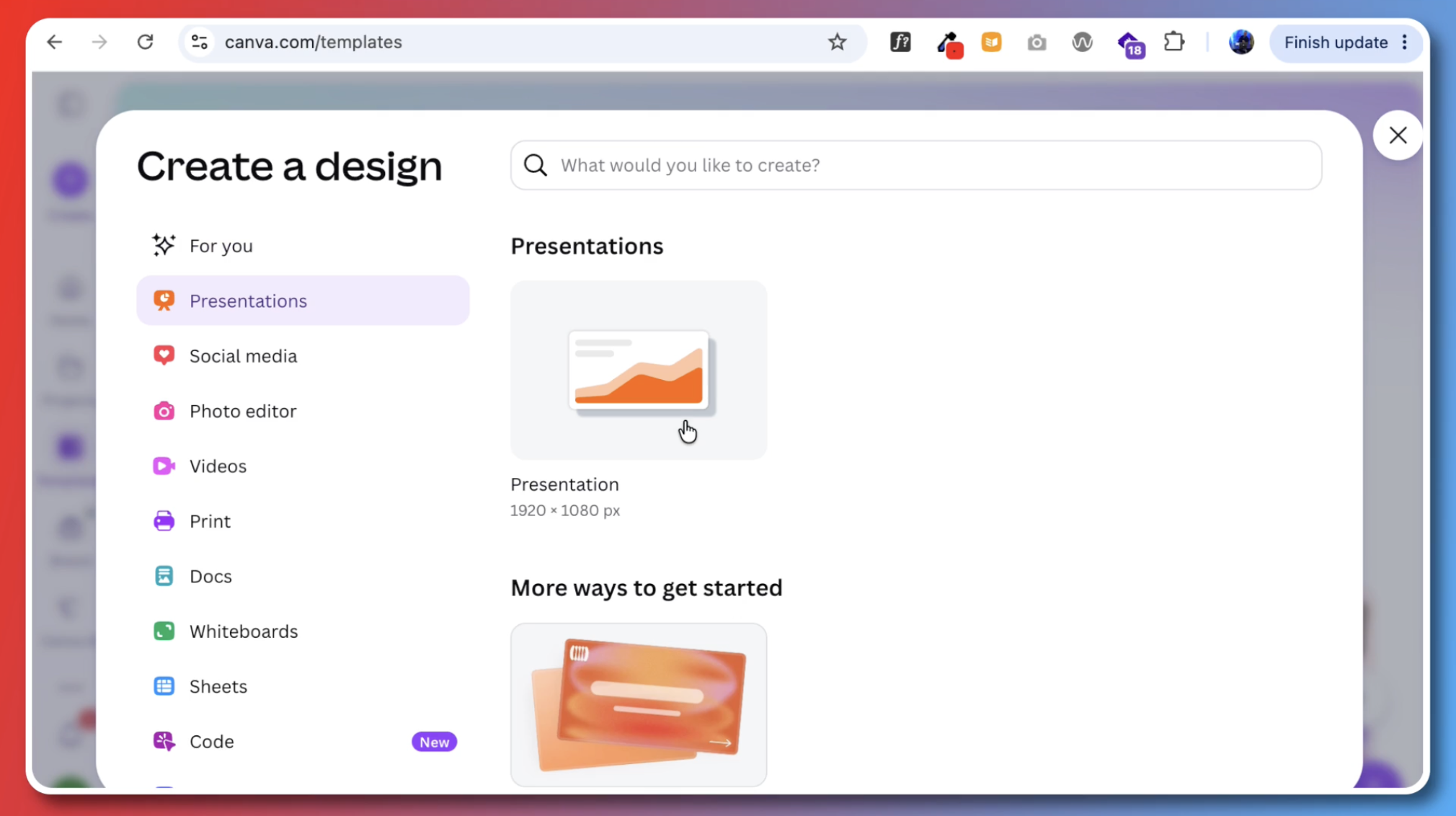
Head to Canva and create a new presentation. The default size is widescreen, 1920 by 1080 pixels. Canva will offer you some sample templates, but for this walkthrough we’ll be designing from scratch.
Block out your pages with color
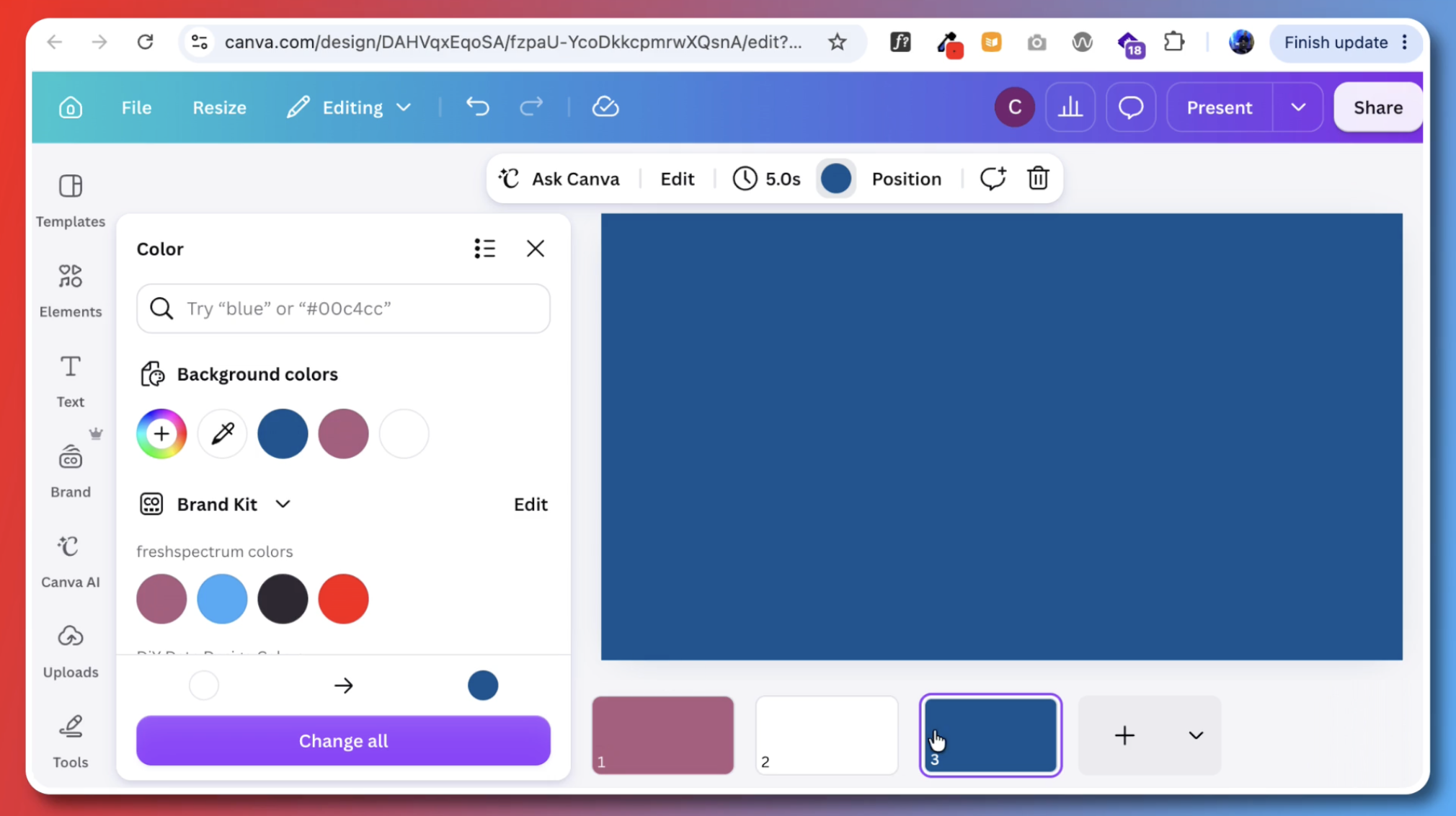
The easiest way to get started is to use blocks of color as stand-ins for the three main page types: the cover, the section intro pages, and the report body.
In my template, I used:
- Purple for the cover
- Blue for the section pages
- White for the report body
Design the report body pages
Let’s start with the report body, since that’s where most of your slidedoc will live.
Add a text box and pick a font
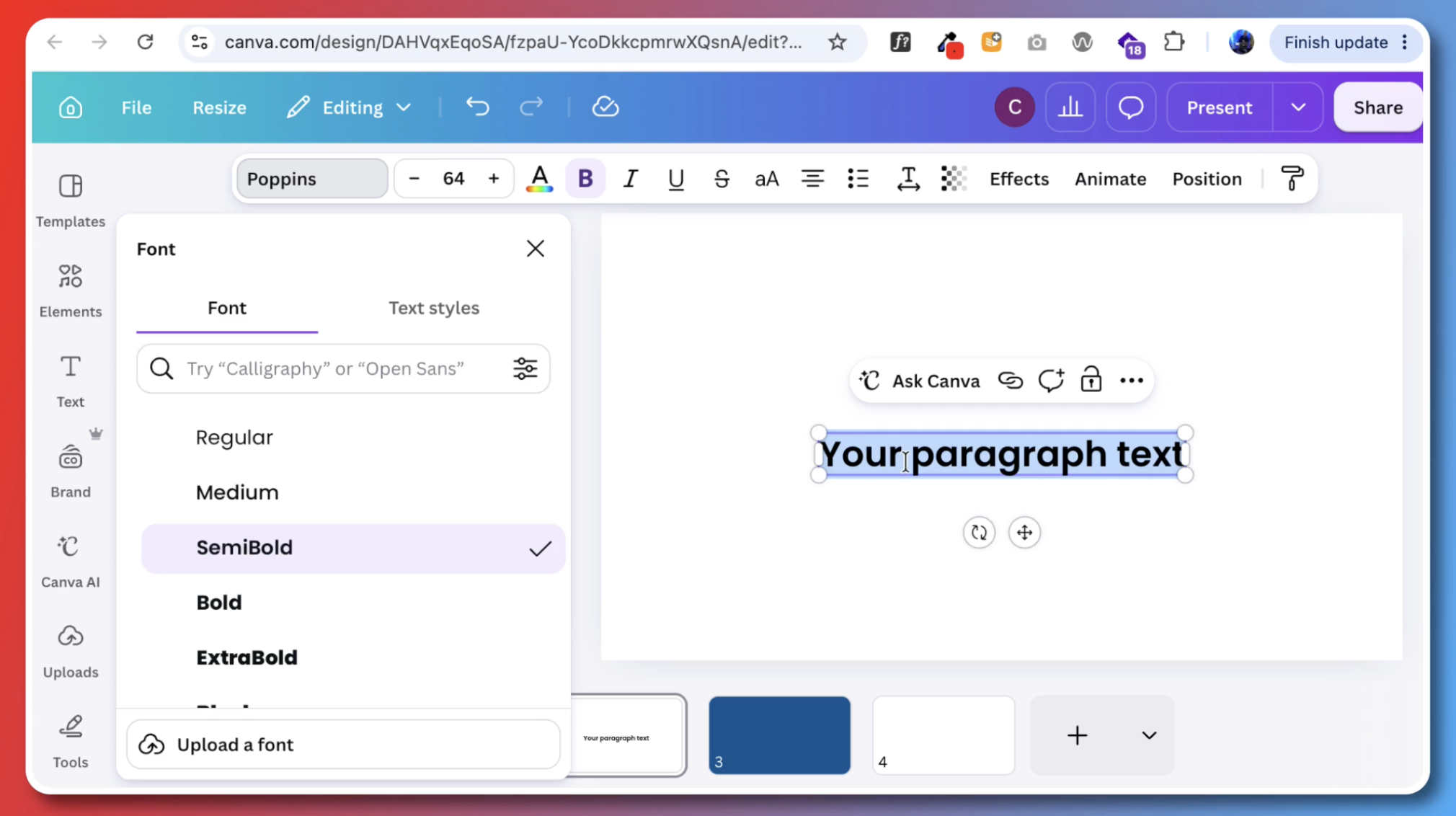
Drop in a text box from the menu on the side of the page. There’s also a keyboard shortcut: just press T. Then pick a font. I went with Poppins for this one.
Structure the page
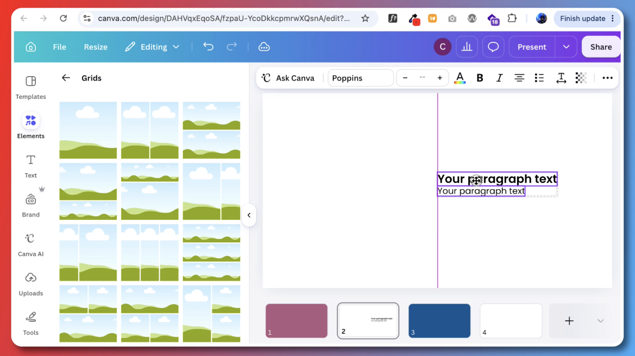
One trick for structuring a page is to use Canva’s grid elements. They’re designed for dropping in images, but they work quite well as measurement tools.
For this template, though, I just eyeballed it with the help of Canva’s default guides. As you move elements around, you’ll see guidelines pop up:
- One running down the middle, top to bottom
- One running across the middle, side to side
- A full box around the outside that acts as a handy margin
- Additional guides triggered by other elements in your design
Add a heading and body text
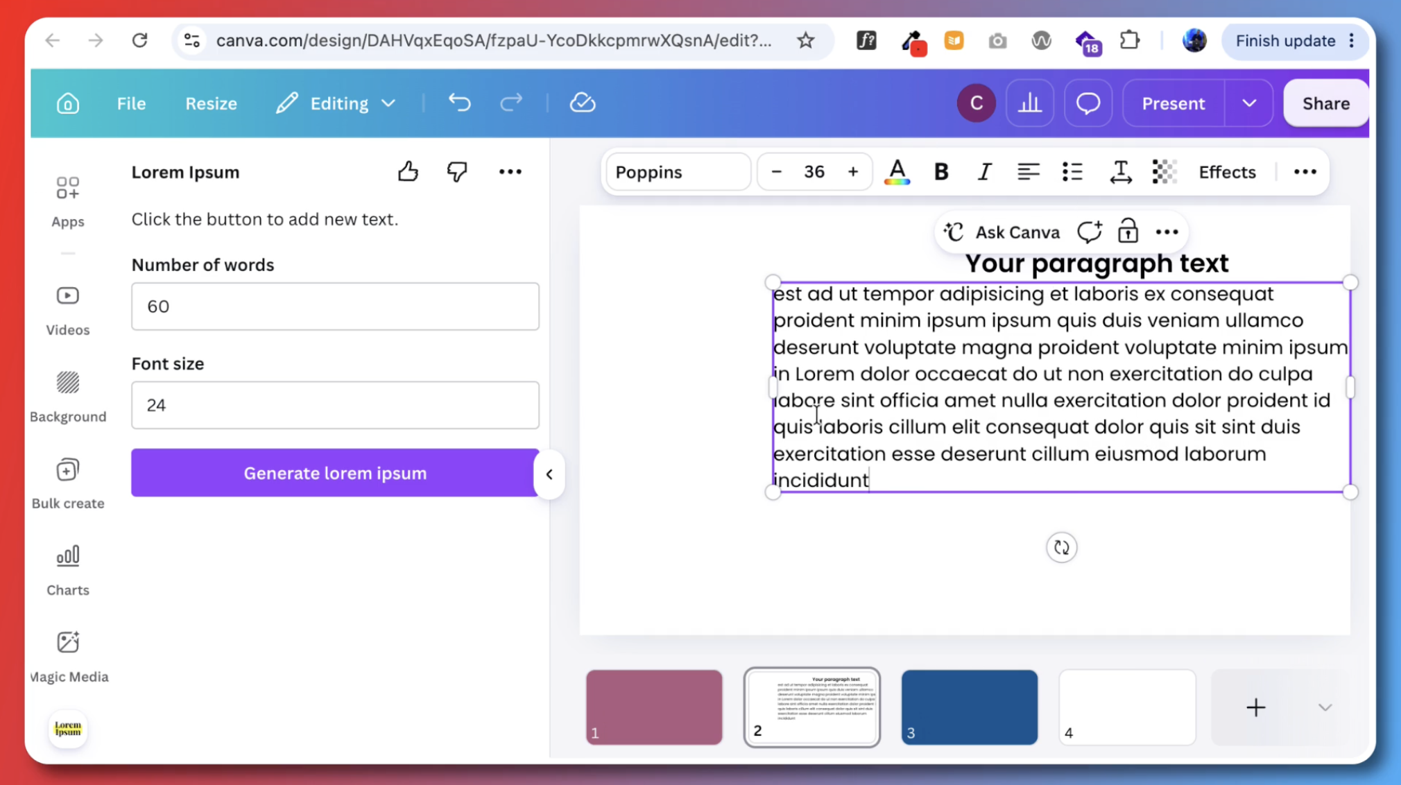
Create a second text box. The first is for the heading, the second for the body text.
For the body, it helps to have some dummy text. Open the Apps menu on the side, where you’ll find the add-ons built into Canva, and search for Lorem Ipsum. Pick whichever one you like best. I’ve tried a few different ones.
Build a consistent layout, then duplicate it
Once you have a page you like, duplicate it. For this design, I’m using a simple two-column grid, with text on one side and images or white space on the other. Consistent layouts tend to give a polished feel, even when they’re simple.
From there, play around with duplicating slides and creating a few different simple layouts. Since you’re building a template, you want to give the person filling it in some options.
Create your section break pages
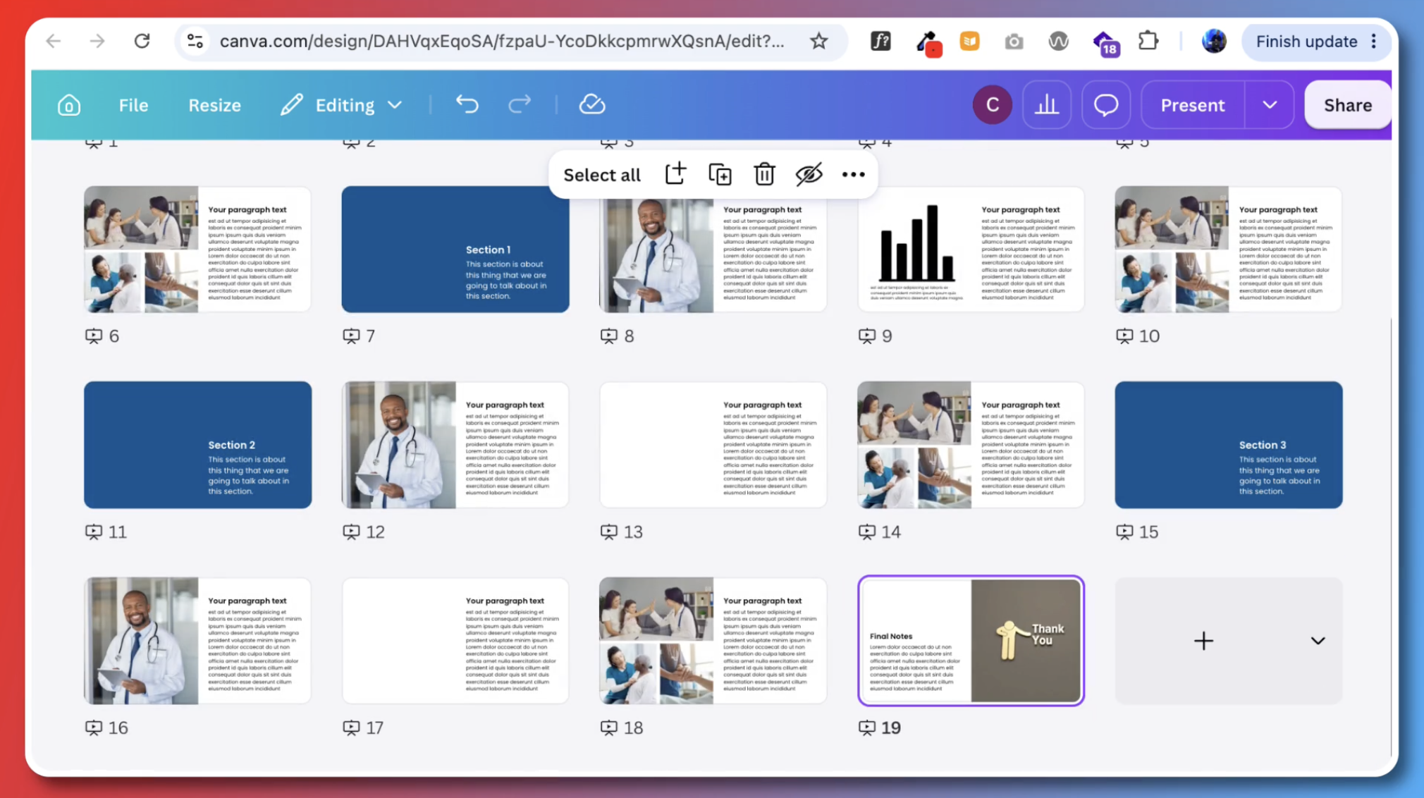
Once you have a string of pages, you can select them together by holding Shift, then right-click and choose Duplicate.
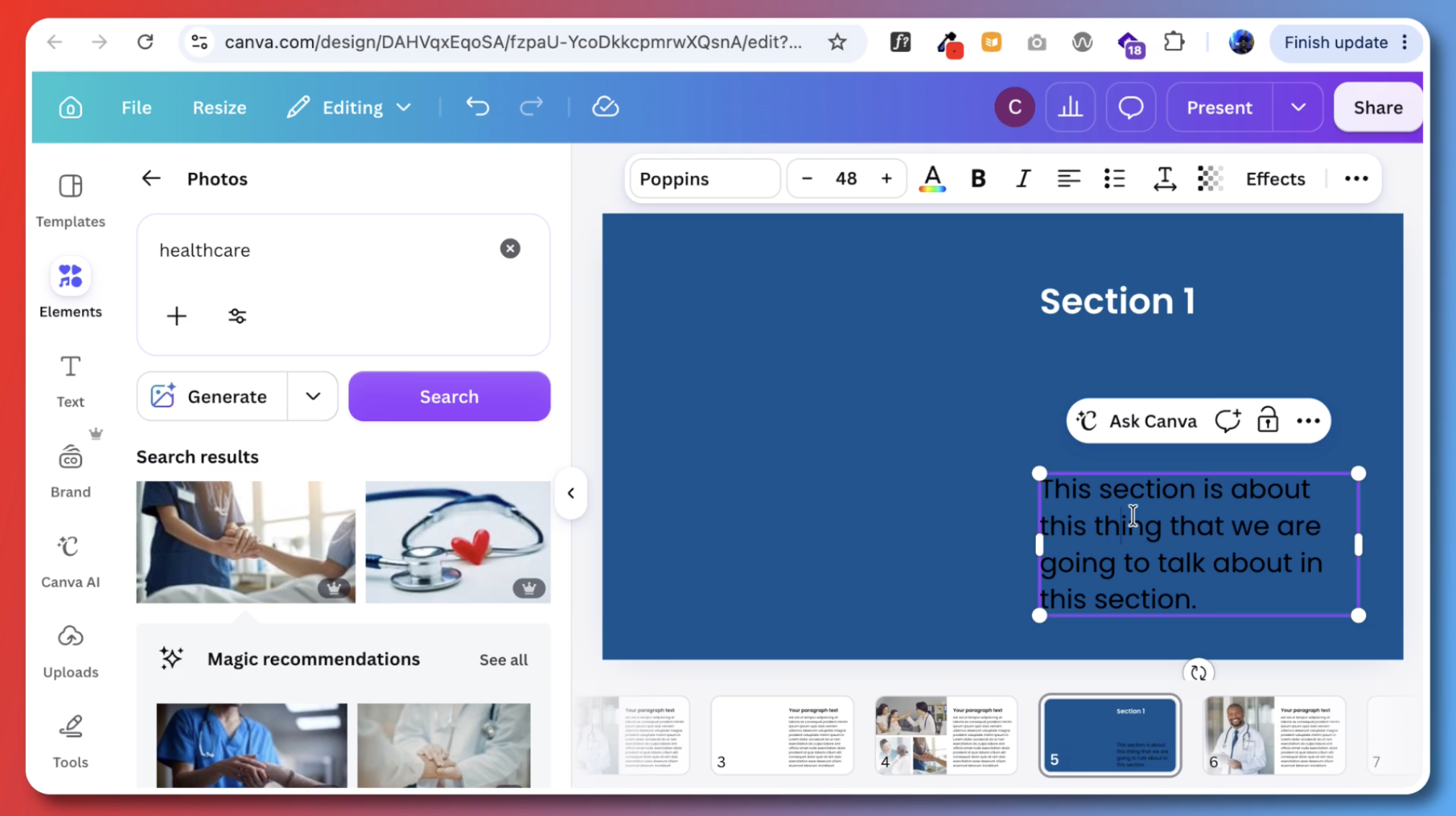
For the section breaks, I copied the text from one of the report body slides onto the blue pages, switched the font color to white, and increased the size a little.
Tip: You can also change the view at the bottom of the screen to see all your slides at once. It’s a nice place to duplicate pages and move them around.
At this point, you already have a really basic, easy-to-use template.
Add a chart page
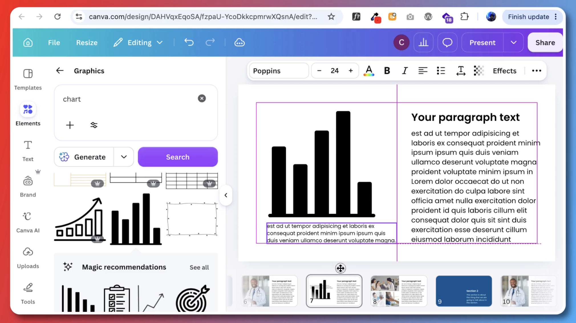
Let’s add a couple more page types. I stuck in a graphic as a stand-in for a chart. With charts, I also like to add a small text box for any important notes.
Dress up the cover
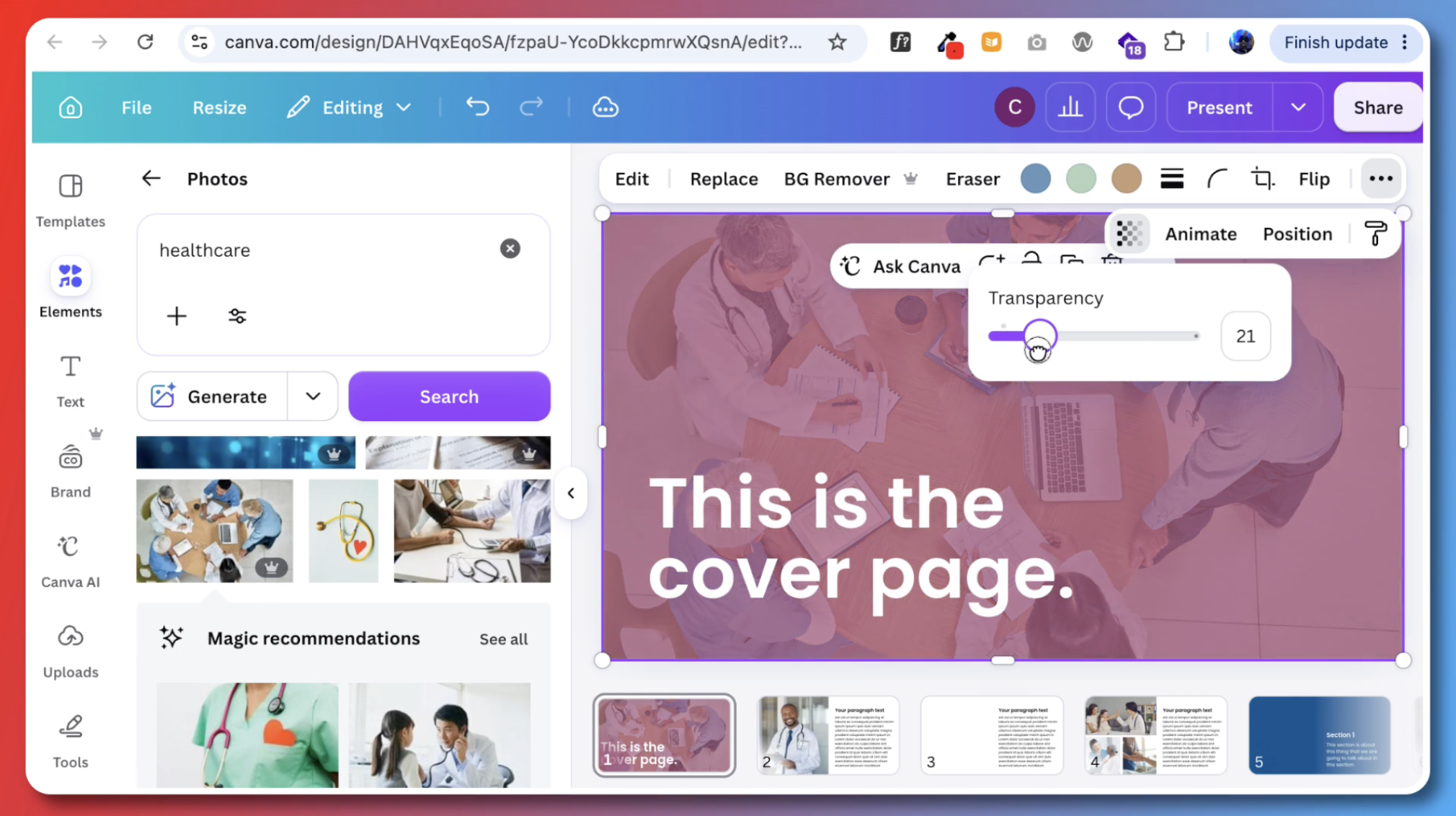
Right now the cover is just a purple block of color. Give it some text and make it big. Then, to make it a bit more visual, add a picture.
One of the best ways I’ve found to bring in brand colors is to use them as backgrounds, then drop a photo over the top and turn down the transparency slider.
Depending on how much contrast you have with the background, you might also need a text effect to make your title pop. There are a few to choose from. I went with neon at full intensity.
Create an author page
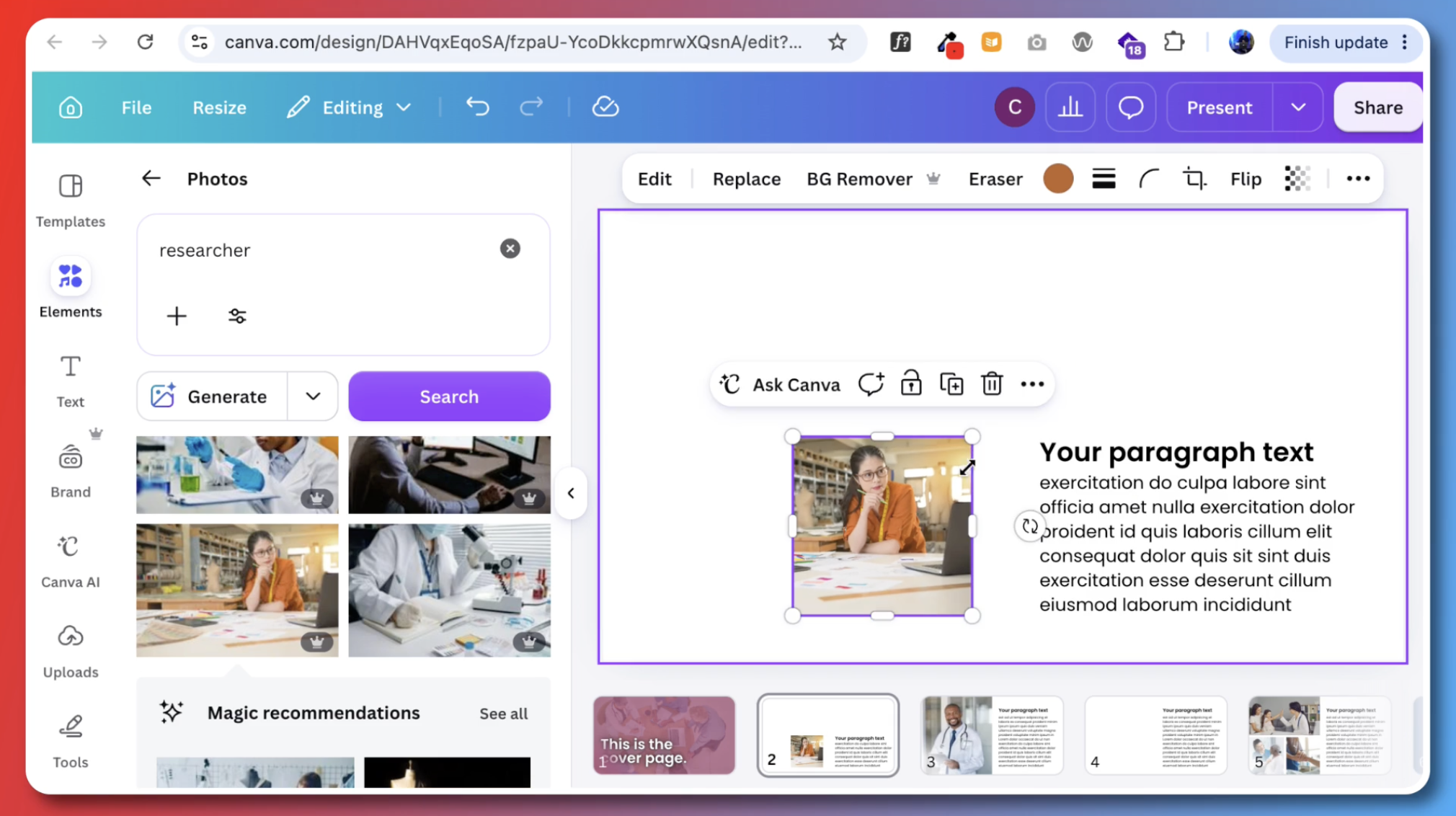
Next, a little author page. I duplicated one of the other pages, cut down the text, and found an image that felt like it could be someone’s profile.
A confession
I really considered cutting this section out of the video. As I sat down to record it, I spent several minutes moving text around, resizing elements, adding shapes, and taking them out again.
In the end I had a very simple page that doesn’t feel like it should have taken that long to create. But that’s the thing with design: occasionally you fall down a rabbit hole of your own creation. And that’s okay. It’s part of it.
Close it out
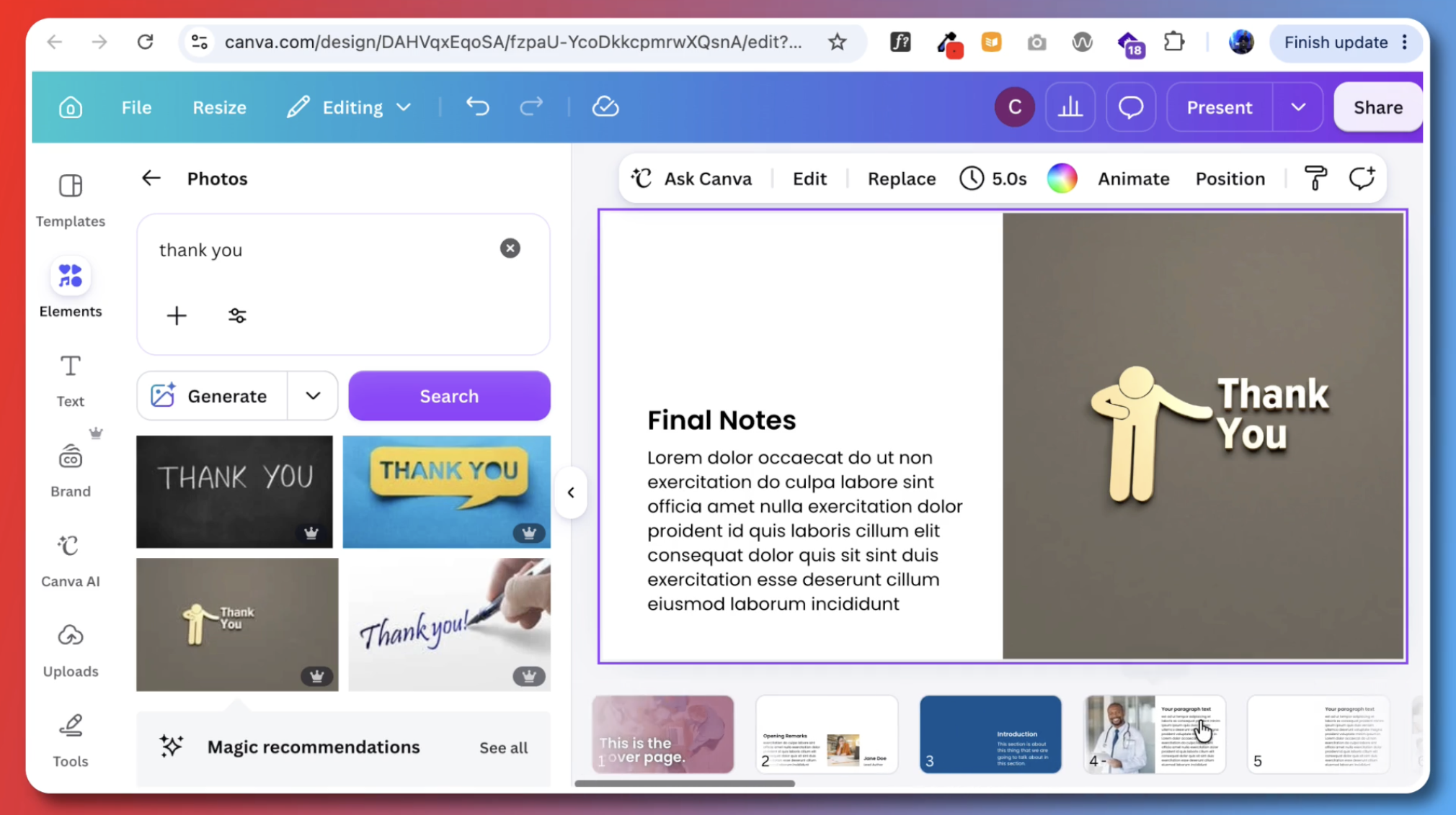
The last thing to do is create one final page to close out the template. It’s good to give things closure.
You might notice that the text sits on the left side of the page only twice in this slidedoc: on the author page at the beginning and on the closing page at the end. Mixing things up intentionally gives the whole thing a nice rhythm. But remember that mixing things up randomly just makes it feel like a mess.
Share your template
That’s it: a very simple slidedoc template. If you plan to share it with others, you can duplicate and share the specific design. Or, if you have Canva Pro, you can even share the template link.
Want more?
If you liked this and want more free templates, ebooks, comics, and more, visit freshspectrum.com/library.