This is one in a series of before and after designs. With this particular post I am sharing lessons from an actual client project. You can see other before and after posts in the series by following this link.
How it Started – SECPI Resources
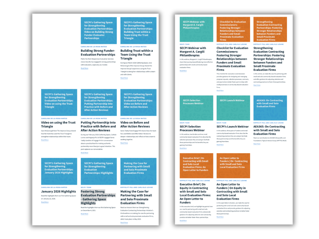
I started working with SECPI (Strengthening Evaluation Contracting Partnerships Initiative) at the end of last year. In addition to running regular open monthly gatherings and other webinars, SECPI also features a resources page with a variety of posts, webinar recordings, journal articles, and pdfs.
The original website design used a simple approach to illustrating individual resource pages. Each one has a basic textured color block with the name of the resource. These featured images together then become the main visual feel for the main resources page.
The Problem – Everything blends together.
This is a pretty common problem with many resource websites. By giving every resource the same visual treatment, every resource ends up feeling the same before the click. There are color differences to show that some of these resources might share common traits or categories. But a simple color change is just a subtle cue and isn’t enough of a signal when resources are radically different.
The fix you can see in the grocery store.
I started writing a series of cartoon illustrated blog articles to help unhide some of SECPI’s stories and recommendations that currently only exist in PDF. While I could draw comics for EVERYTHING, it would be a little over the top for this particular site. We would also end up with the same “everything blends together” problem. So I decided to take a different strategy.
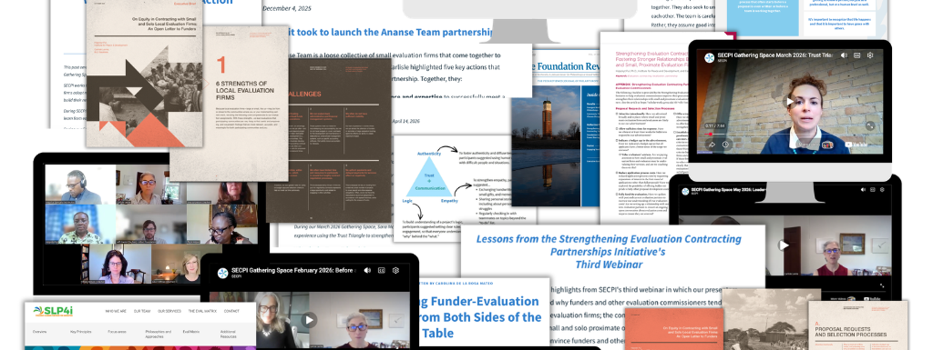
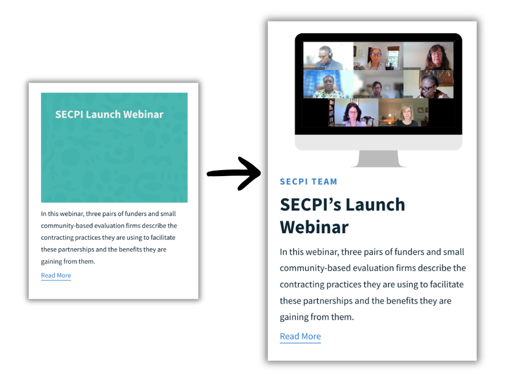
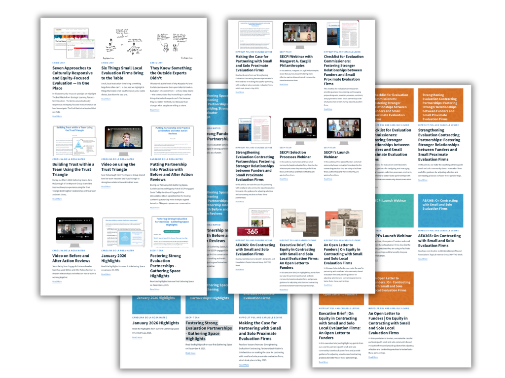
Instead of the color blocks we’ll just take screenshots of the actual resource. The goal of the illustration will be to simply show what’s inside, just like food packaging. But as you’ll see, when we pull it all together we get a completely different look.
Journal Articles
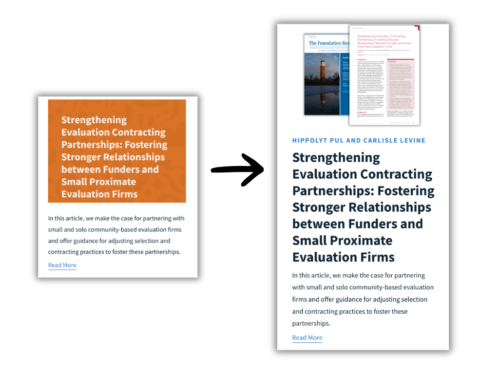
For the journal articles I took a screenshot of the main article page and put it alongside the cover of the journal.
PDFs
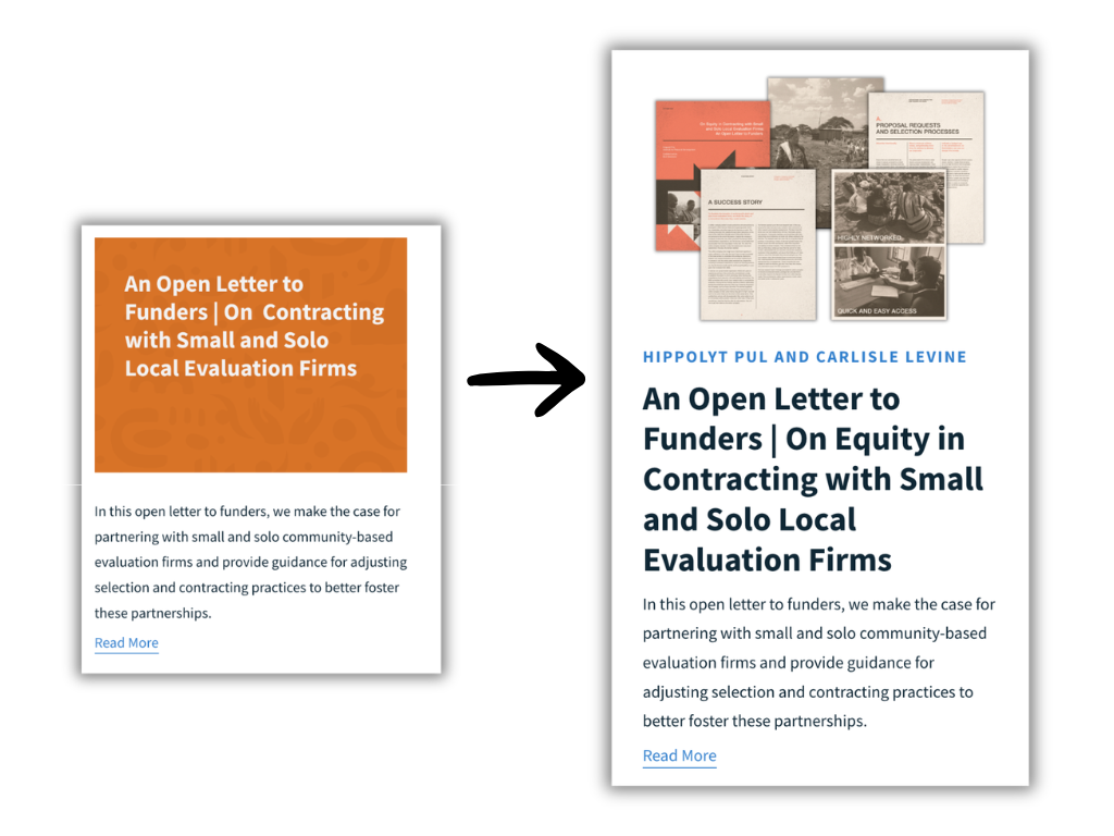
For the PDFs I wanted to get the cover, but it’s usually internal pages that give the best insight on what you’ll find inside.
Group Webinars
The webinars have been engaging and well attended with different voices and faces. A lot of webinar illustrations use the title slide, but I find it far more interesting to just take a screenshot mid-recording.
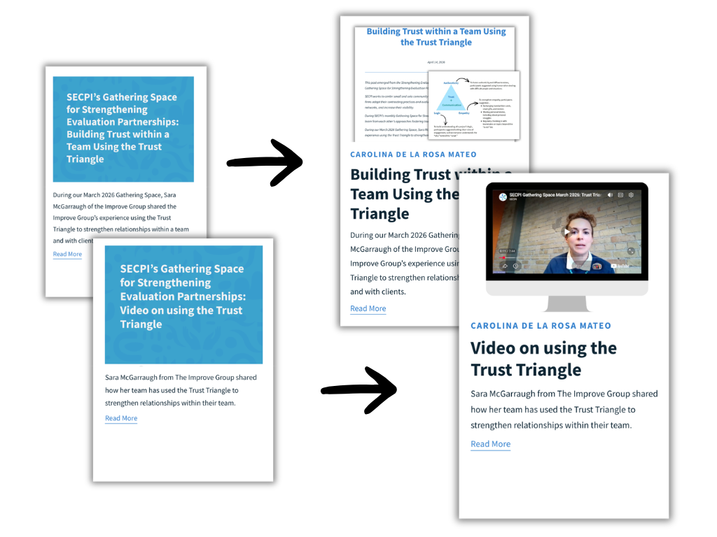
Blog Articles and Video Presentations
With articles I grab the top of the article and also pull in any interesting images. With presentations, I follow the same process as the group webinar but grab a screenshot of the presenter.
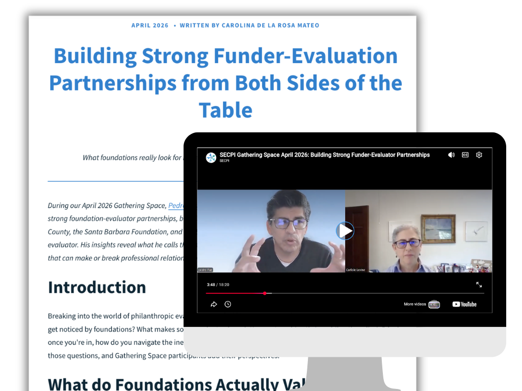
Multi-Media
For the gathering space webinars there are both webinar recordings as well as recap articles. So for this one I just show both together.
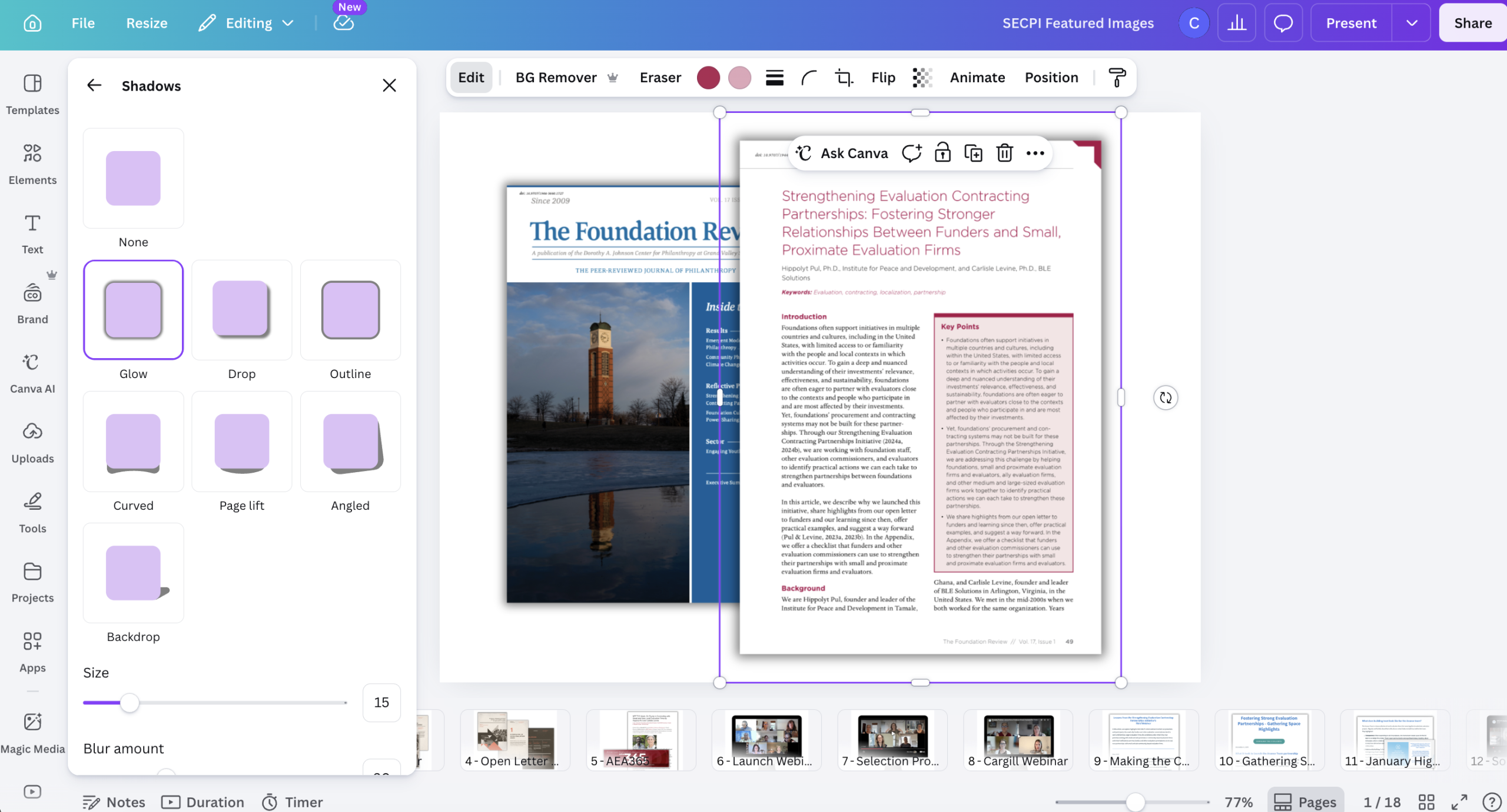
Where Canva comes in.
I used Canva so that the actual featured images would be consistently sized (PowerPoint would work just as well for this). I used a little computer monitor frame for the webinar screenshots and added a little shadow to provide just a little depth. I didn’t need any fancy graphics for this approach.
The Final Result
The final feels very different from the original. Instead of seeing just a bunch of color blocks we actual see a wide range of resources with webinars, articles, and pdfs. And with all the people pictures, the page feels alive in a way it didn’t before.
To see the final for yourself, go check out the SECPI Resources page.
This is awesome! Thank you.
Thanks Denise 🙂
It’s always fascinating to see how small visuals that don’t take much effort at all – like a screenshot or the first page of report – can make such a huge difference.
As with all of your examples, the result is so much more engaging. It really invites people to explore the individual items and click through, far more than the blocks of text in the original version ever could.
Thanks Evelyn 🙂