I’m sick this week, so instead of writing something new, I thought I republish something valuable from 11 years ago. This cartoon was inspired through a conversation with my good friend Ann K. Emery.
This was back when Ann was a full time evaluator and before the launch of her super successful training academy and professional development business Depict Data Studio [affiliate link].
All of the comics shared in this post are based on true stories…which is probably why they hold up so well!
Low Response Rate
Evaluator: “Here are the survey results for your program. The results suggest that _____, but here’s a caveat – there was a low response rate, so we need to take these results with a grain of salt.”
Client: “No problem. Send me the link to the survey. I’ll take the survey a dozen times, and then the response rate will be higher.”
Evaluator: “Sorry, that’s not how it works.”
Client: “Then give me a paper copy of the survey and I’ll make photocopies until we have enough responses.”

Formatting Issue
Evaluator: “Here are the results from your program.”
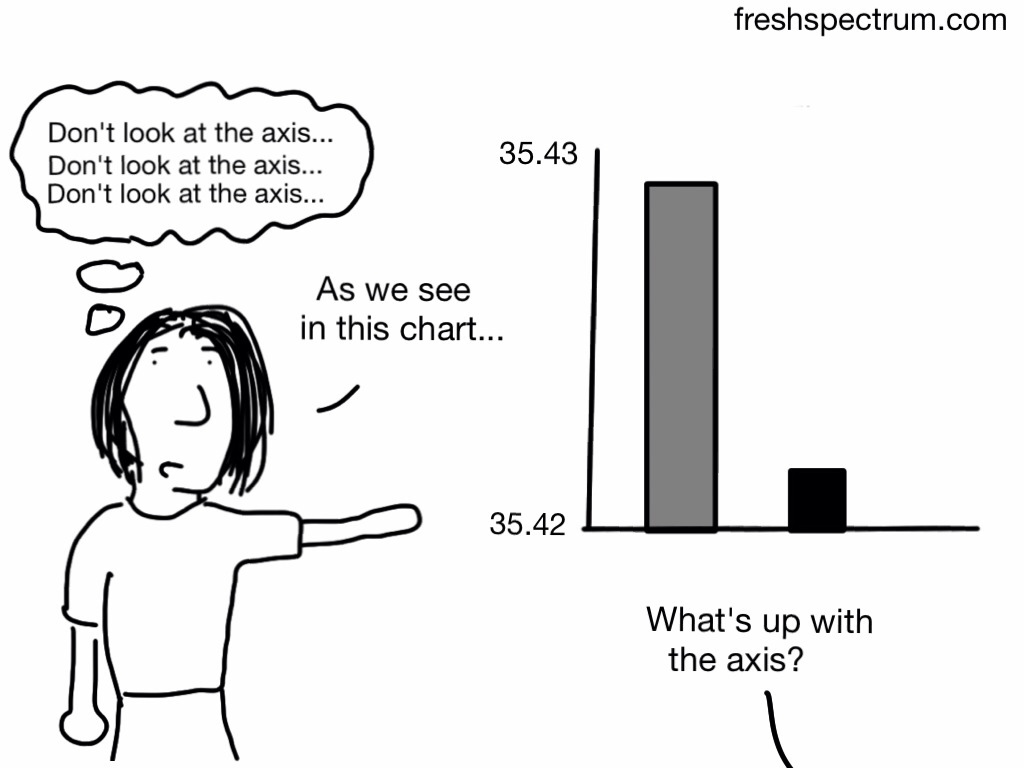
Client: “Uh oh, the results don’t look good. The graphs aren’t going up. Can you re-format the graph to make sure all the bars are going upwards over time?”

Defining Outlier
Evaluators: “Here are the results from your program.”
Client: “Those results aren’t accurate.”
Evaluators: “How so?”
Client: “The bad results are obviously outliers. You need to remove those people from the sample.”
Evaluators: “We define an outlier as (1.5 x the interquartile range) below quartile 1 or above quartile 3. Other evaluators define outliers as 3 standard deviations above or below the mean. We checked, and those people are not outliers. In fact, their experience in the program was pretty typical.”
Client: “Sorry, I didn’t realize it was such a hassle to fix. I didn’t mean to create more work for you. Just send me the Word version of your report and I’ll delete that section myself.”

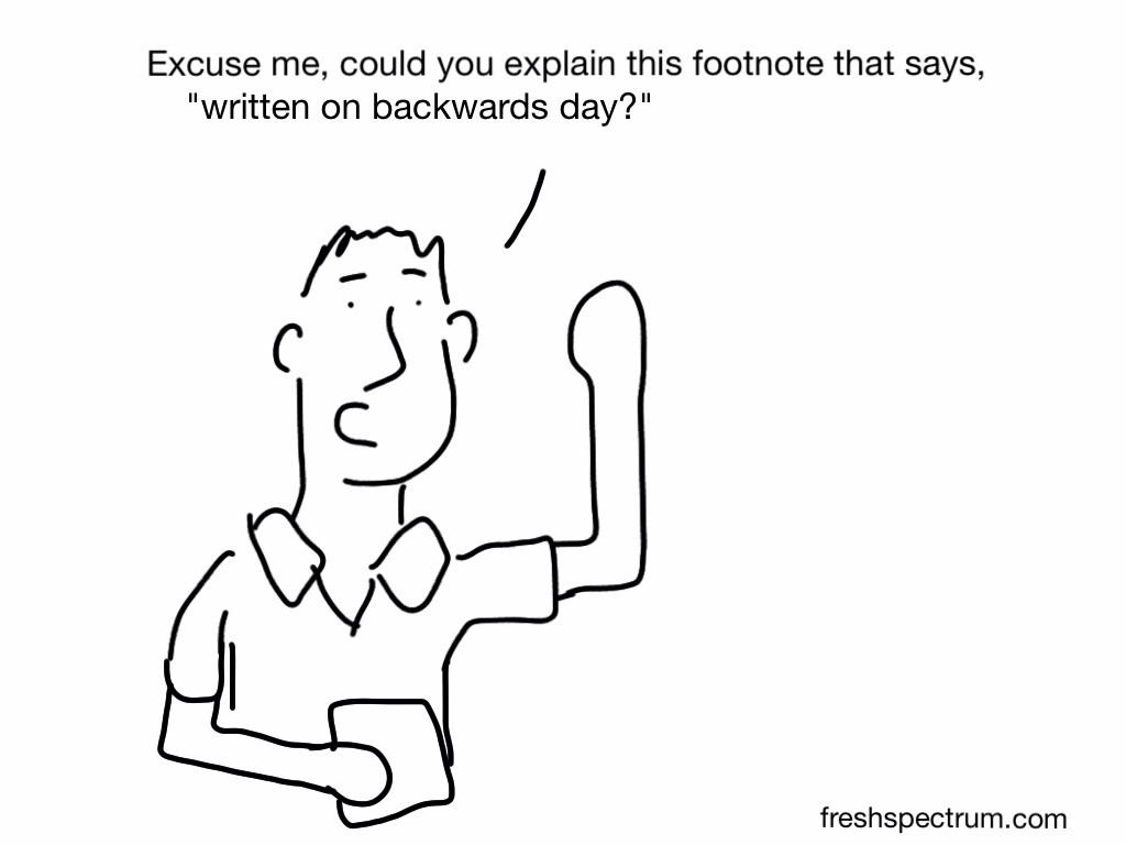
Whoops Typo
Evaluator: “Here are the results.”
Client: “I know our program only had a 38% success rate, but can you type 83% in the report to our funders? 83% sounds better than 38%. If anybody notices, just say you accidentally made a typo.”

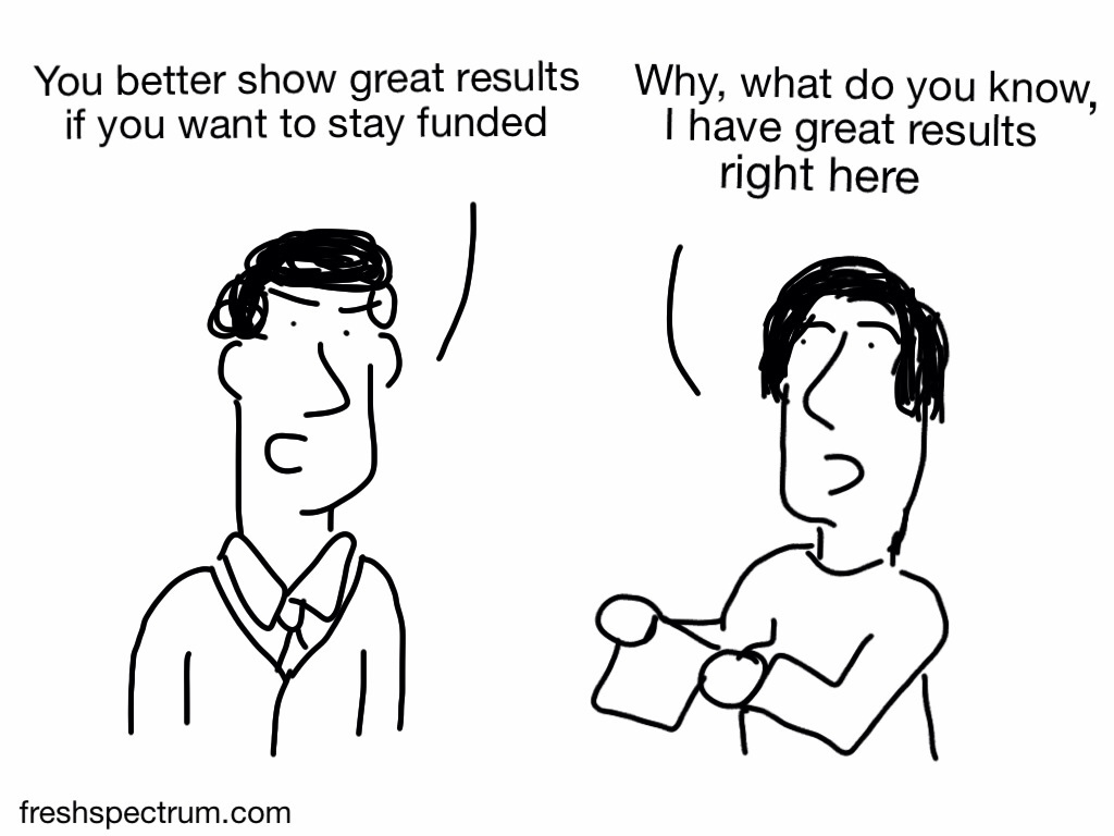
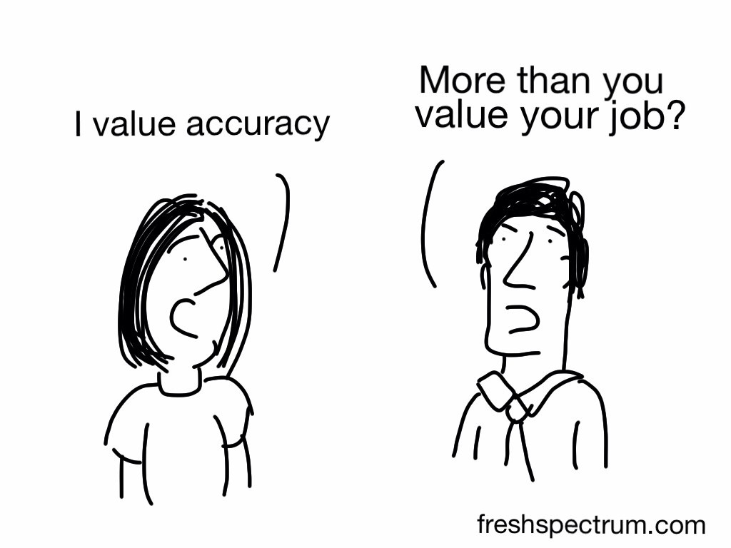
Staying Funded
One more cartoon, just to put the fails in context…

Additional Cartoons
I’m curious, what ethics fails have you witnessed? Anything you can share or would you need the blurry picture and garbled voice treatment too?
Update 1: Cherry-Picked Sample
Thanks to Maria Gajewski for the comment that inspired this cartoon!
My favorite is the cherry-picked sample. I was involved in a project where directors only wanted to survey students whose families were still involved in the program. It’s not too difficult to figure out families who had a bad experience would not remain with the program, but the directors just couldn’t seem to grasp this when I pointed it out!
Next time, send this cartoon to the directors 🙂

Update 2: Consequences
Ok, here is another comment inspired cartoon (thanks bridgetjones52). And a big thank you to everyone else for all the comments and shares!
When presenting results of evaluation, very very senior manager ‘informed’ us that there would be consequences!!!

Update 3: “Positive” Rewrite.
I too have experienced an ethical conflict with an internal client. They asked me to remove “negative” pulled quotes to make their work sound 100% appreciated. I reexamined the data and made sure pulled quotes were balanced, but explained that I could not remove everything that hinted at room for improvement. Apparently, that wasn’t enough for them. Even though the report was quite positive, they rewrote the section and removed or qualified any quotes that even hinted that they were not perfect. It completely shocked me!
This one inspired by Robin’s Comment


I know I just posted this, but a little surprised there are no comments.
What do you think? Ever come across any of these situations? At what point is it an ethical gray area and when does that cross into a full ethics fail?
I love the graphs! The distorted axis that doesn’t start at 0% is great. The story reminds me of a scene from The Campaign (with Will Ferrell and Zach Galifianakis). Will Ferrell is doing a horrible job as a politician and his campaign manager shows him the dismal approval ratings scores over time. Will Ferrell responds to the negative results: “Hey, it’s not so bad! Just rotate the graph 90 degrees on its axis!” 🙂
Thanks Ann, I’ve never seen The Campaign but now that I know it includes graph humor. Also, it needs to come up on Netflix streaming 🙂
My favorite is the cherry-picked sample. I was involved in a project where directors only wanted to survey students whose families were still involved in the program. It’s not too difficult to figure out families who had a bad experience would not remain with the program, but the directors just couldn’t seem to grasp this when I pointed it out!
Good example, cartoon added!
Fund-raising participation fudge. Too often we see reports of very high percentage of fund-raiser participation from an in group, say for a private school or a board. They say high % is important – “100% participation is our goal” – for going after grants and I agree. So once upon a time I was custodian at a private school, found two pennies in my sweepings, and gave them to the development director suggesting she rub them together to make babies. That year there was a 90-some % participation rate by faculty/staff and my name got into the annual report.
Nice, did you claim it in your taxes?
Love ’em Chris! I used to teach stats and for most classes we’d do a two-minute review of a graph in an unnamed major national newspaper with graphs in each section. The sad part was, only once in five years did I not have an example of a bad graph just by choosing from the 3 or 4 available that day. Many were indeed of the ‘don’t look at the axis’ kind.
You rock!
Thanks Susan 🙂
Definitely with you there, graph distortion is an epidemic. It’s misrepresentation in plain sight since so often the axes are labeled. Who knows how much of this is intentional and how much is just a poor understanding of data and chart design.
Unfortunately have run into all of these! Here is one more:
When presenting results of evaluation, very very senior manager ‘informed’ us that there would be consequences!!! The team leader asked if the eval team was going to be fired for writing a report. Guess that isn’t a grey area, it’s black (as in black and white). Have lots more examples….like ‘use this report and the data in it’. The data supported our findings and was the polar opposite of what we were told to write. Unfortunately the ‘teller’ was a very very senior manager – of the eval team – and used to lead the program being evaluated. Can we spell the word ‘recuse’? Apparently not. Yet another case – being told to write the recommendations before the data was collected. Again, unfortunately, the ‘teller’ was the eval team manager, who did not understand how this was not ethical practice.
Thanks for the comment Bridget! Check above, it inspired a new cartoon.
LOL Love it! I even look like her too! Have lots more….like the company who was evaluated (according to their ground rules, this had to happen) – their list of suggested interviewees consisted of senior managers (such as VPs) and included not one company client!
I wish I could’t identify with these but unfortunately I think I have encountered all of them. One that I experienced that is not here is cherry-picked results. I submitted a 20-page evaluation report on the pilot test of a curriculum which included, in most cases, easy fixes for the problems. The report that my client sent to the funder was two pages of cherry-picked text that gave a glowing review with nothing wrong with the curriculum.
Thanks for the story Joyce. One of my really early cartoons touched on this topic:
http://freshspectrum.com/toon-cherry-picking-data/
Great cartoons! I’d love to use them in my Evaluation 101 presentation, especially in the section on the standards and guiding principles. I think they’re a great way to start the conversation about ethics and the “do’s and don’t’s” of evaluation with people who are new to evaluation, whether as evaluators or clients. I don’t see any sort of Creative Commons or other licensing. Wait! There it is down at the bottom. Thanks so much!
Thanks Sarah, I love the realization that came mid-comment 🙂
I too have experienced an ethical conflict with an internal client. They asked me to remove “negative” pulled quotes to make their work sound 100% appreciated. I reexamined the data and made sure pulled quotes were balanced, but explained that I could not remove everything that hinted at room for improvement. Apparently, that wasn’t enough for them. Even though the report was quite positive, they rewrote the section and removed or qualified any quotes that even hinted that they were not perfect. It completely shocked me!
Thanks Robin!
You’ve inspired a new comic 🙂