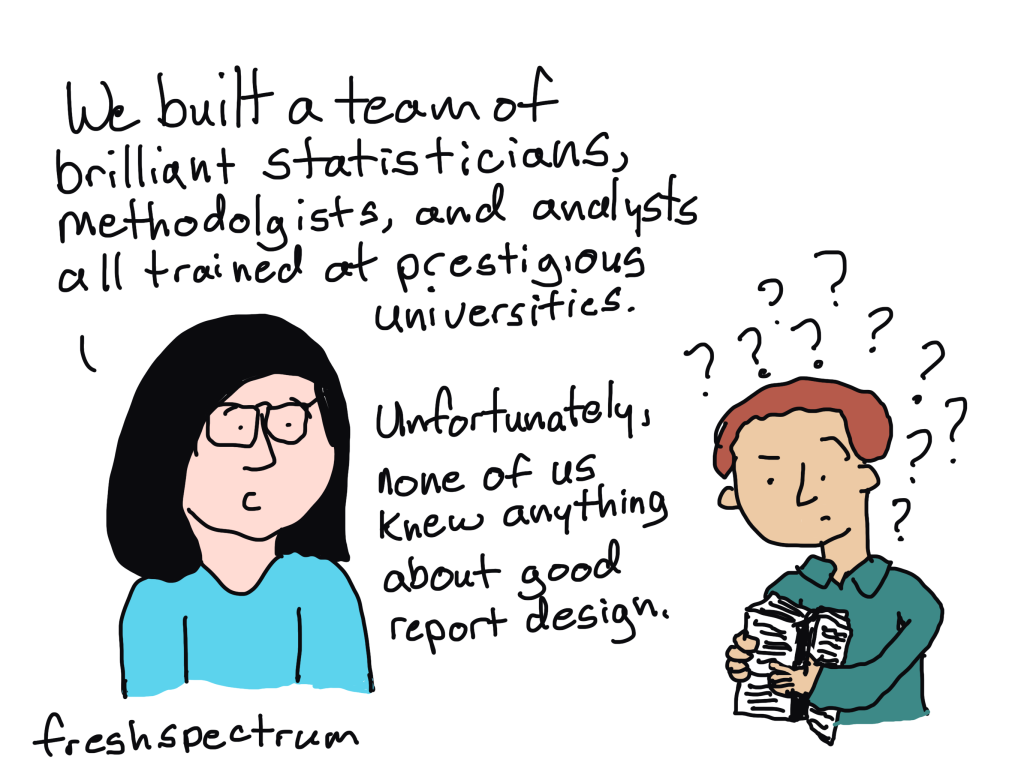
Ever wonder why some data teams deliver really nice looking reports while others seem like they’re stuck in the late 90s?
The more I work with different research and evaluation teams, the more I find that reporting quality usually comes down to the skills of just a few people.
First, you need a manager who is willing to allow their team to try new things and occasionally break from the status quo. They don’t have to be creative themselves, or even have a good eye for design, but they have to trust the people on their team and give them the time and flexibility required to grow.
Second, you need at least one member of your data team with the interest, and the skills, required to do the hard creative work. Most research and evaluation teams are small, even teams that work in larger organizations. And one member with the right creative skills can make a big difference in how effectively data is shared internally and externally.

The much needed role on every evaluation, research, and data team.
At least at this point in time, you are rarely going to find someone on a data team with the title of data designer. But while the position doesn’t often exist, the role usually does.
The data designer on your team is the one everyone goes to when there is some kind of creative project. Need an infographic created, that’s a job for (insert person’s name here). Need someone to run a social media account, call (insert person’s name here). Is someone asking you to turn your long pdf into a shorter visual report, time to email (insert person’s name here). Want some really nice looking charts, reach out to (insert person’s name here).
If you have a good data designer on your team, that person usually becomes a linchpin. And if you don’t have a good data designer on your team, you will likely struggle with creative requests.

What is data design?
Data design is a blend of two very different skillsets. It requires a mix of skills in research methods, data analysis, graphic design, communications strategy, UX design, and data visualization.
That skill mix allows an individual to create useful data products, find and tell good data stories, uncomplicate complex information, connect with audiences across multiple platforms, increase reporting effectiveness (a.k.a. create better reports), and increase reporting efficiency (a.k.a. implement a faster design process).
These skills are usually not taught together in graduate school. Most data analysts, researchers, and program evaluators leave university without taking a single course on graphic design, communications strategy, or UX design. So the people who take on the data design role are usually university instructed data people who also happen to be self-taught creatives.

First, how NOT to become a data designer.
There is not just one way to develop your creative side. But try not to do what I did and attempt to learn EVERYTHING.
I spent over a decade teaching myself web design, dataviz, coding, BI tools, professional graphic design tools, UX design, UI design tools, communications strategy, and more. I would go from one rabbit hole to another. Trying to learn a bit of everything can be fun if you love learning, and it does make you really well-rounded, but it’s not very practical.
I also don’t suggest focusing on learning a specific software product. Most design challenges faced by data teams can be met using simple tools, whether they are freemium web software products or just the basic software you already have installed on your computer.
Instead, here are some things I suggest you do learn.
Learn some graphic design.
The modern digital world is a visual place. Graphic design is critical to your ability to uncomplicate complex information, which is super important for data products. Whether you are formatting reports, designing graphs, creating social media content, or building web pages, a solid grasp of graphic design fundamentals will serve you well.

Learn some user experience design.
You need a design process that can get you from nothing to something useful. And that’s what UX design can do for you. UX design is not interface design, instead it is a design process where you let the needs/desires of the end user guide your process. I have found consistently that a good UX design process results in better data products.
Learn some modern communications strategy.
“If you build it, they will come,” is bad advice in our modern digital world. The web has fundamentally changed how people send and receive information. Knowing a bit about communications strategy can help you to increase the likelihood that your audience will actually experience your work.

Learn how to create basic graphs and maps.
Most of the time, you can get by with really basic charts, graphs, and maps. And often, the simpler the better. Knowing a bit of data visualization best practices is helpful for any researcher or evaluator as charts, graphs, and maps are some of those most common and impactful illustration tools we have in our creative toolkit.
But just keep in mind, that data design is so much more than just data visualization. Knowing how to create a good graph will only get you so far.
Learn a basic set of software tools.
In the field of web development there is this concept of a software stack. Basically it’s a set of software tools that allow you to do something (like a host a website). The stack itself is made up of individual pieces of software that can be somewhat interchangeable. I suggest building off the concept for your own work.
Here are some basic categories to consider.
- Writing Tools: Word, Google Docs
- Graphic Design Tools: PowerPoint, Canva, Adobe Illustrator/InDesign
- Data Visualization Tools: Excel, Flourish, DataWrapper, R, Tableau, PowerBI
- Web Design Tools: WordPress, Squarespace, Wix
Most data people start by writing in Word, designing in PowerPoint, and creating charts and graphs with Excel. This is the stack people know, and are sometimes forced into by their organization’s software policies. But as many have shown, you can still do impressive creative data design work even if you are stuck with MS Office.
My favorite stack right now is to write using Google Docs, design and illustrate using Canva, visualize data using Flourish, and design interactive web reports using WordPress. The tools are all user friendly, inexpensive, and help speed up the data design process.
There are certainly data designers that have built impressive portfolios using tools like Adobe Creative Cloud, Tableau, and R. These professional tools do provide benefits but also come with steep learning curves and sometimes high subscription costs (R excluded).
Continue building your creative skills through practice.
After you have a firm grasp of the fundamentals, you continue building your skillset through practice. Seek out inspiration from people and organizations you admire, then try to replicate those products using the tools you know. Give yourself specific creative challenges and work through the design process.

Want a guide to help you learn? I can be that guide.
I teach courses designed to give you the skills you need to become a confident data designer. To learn more about the courses I offer, visit diydatadesign.com.
