
I get it. You already know Excel. Tableau is just plain confusing (and annoying, and expensive). I've been there. But Tableau can do things that Excel cannot. Like directly weave a bunch of …
Quantitative Qualitative Visualization
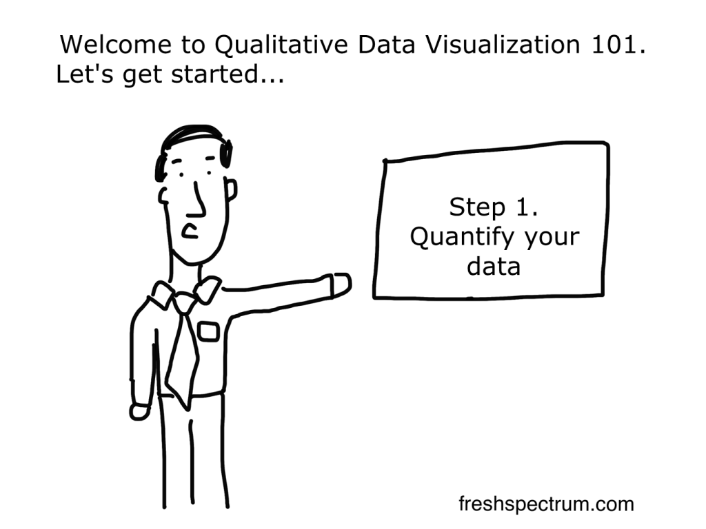
Most "qualitative data visualization" is really just quantitative data visualization. There are tons of qualitative researchers and evaluators who have spent careers fighting the notion that their …
Continue Reading about Quantitative Qualitative Visualization →

A dashboard you can’t update.
My preferred way to create a dashboard is to start with something simple, crude even. Then over time, adapt. The faster the dashboard goes live, the better. This is the way most web software is …

Can you influence your dashboard?
A lot of organizations get tied up with the whole "car dashboard look." That's all surface area stuff. Real dashboards give us access to information we can use to make decisions. Our actions …

The Original Qualitative Visualization
I'm pulling from my archive this week. Cartoons will be all about data visualization. …
Continue Reading about The Original Qualitative Visualization →

Serve up Survey Data with a Menu Infographic
During this week's Thursday discussions over at diydatadesign we'll be talking about different strategies for visualizing survey data. Preparing for that call inspired this post. The …
Continue Reading about Serve up Survey Data with a Menu Infographic →